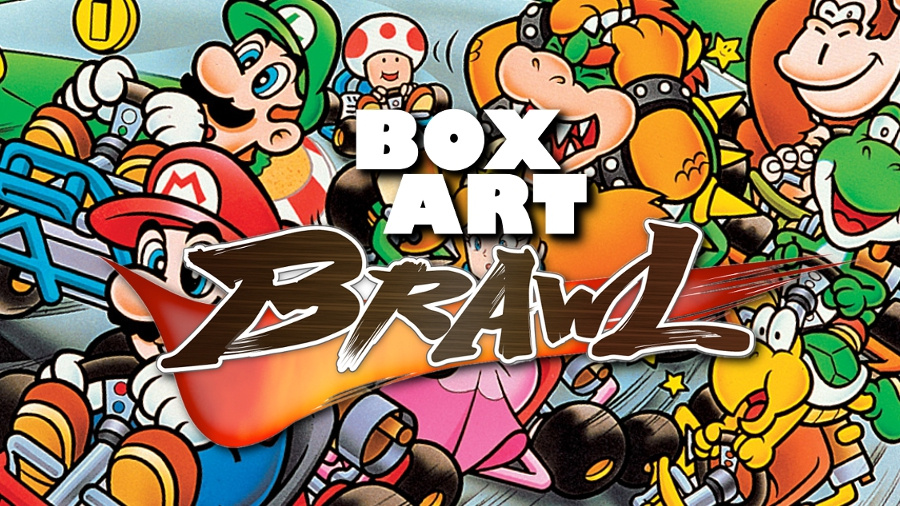
Welcome to Round 5 of Box Art Brawl, where we take a gander at the box art of a certain retro game and crown one regional variant as champion. Last week the classic NES brawler River City Ransom duked it out with its counterparts until the Japanese version emerged bloody-nosed but victorious, beating down the North American version while the lowly PAL cover never really had a look-in and slipped out the back, unloved and unmissed.
This week we're heading to the races with the progenitor of an entire genre, Super Mario Kart for the SNES. As you'll see, there's no shortage of colour and energy here, and with today's competitors very evenly matched it'll be interesting to see which has the horsepower to take the chequered flag.
With just three contenders everyone's guaranteed a podium place, but although we may tell ourselves it's the ‘taking part’ that counts, anybody who's trying to get all the stars on a 150CC Cup knows that coming second is worth precisely nothing. The heat is on.
Let's take a look at the starting lineup...
Europe

First on the grid is the PAL version with its trademark colour border around the main art featuring the Mushroom Kingdom’s wacky racers. There's vim, there's vigour, there's a slightly larger-than-necessary empty block of teal-y blue next to the Nintendo Seal of Quality, but the tag line "When racing becomes an adventure!" is disarmingly cute.
Japan
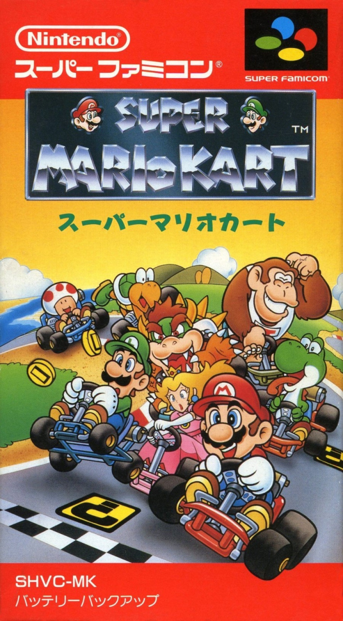
Featuring a very similar concept and obviously providing the basis for the others, the art for the Japanese version is slightly different for nearly every character. Some of them appear to have been copied directly for the western version, but Mario and Bowser get a complete overhaul. The sky turns from blue to gold and the items from the PAL version are missing here.
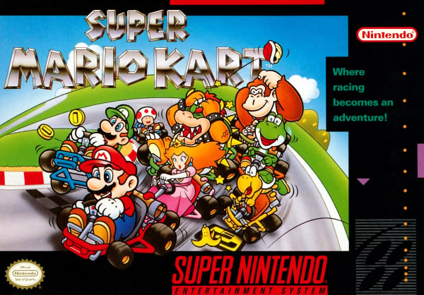
North America

The North American variant has everything featured in the European version, just slightly rejigged. The black border contrasts with the blue sky nicely and the tag line moves from left to right, but the key art is the same. The title breaks out onto the border above like Mario’s kart does at the bottom, but we’re really hunting for differences here. The same, but different, then.
So much colour! Those are your three competitors this week - a very evenly matched pack indeed, but who will win the day? The race is now on to pick your favourite so take another look below, click your pick and hit the 'Vote' button:
Which region got the best Super Mario Kart box art? (778 votes)
- Europe
- Japan
- North America
Please login to vote in this poll.
That's all from the Brawl this week! Feel free to voice your thoughts and predictions below and we'll catch you again next time for another crack.


Comments 44
[GIF of Gary Oldman yelling "Everryyyyyyoneeeeeee"]
Bowser's attempts at groping Peach go unpunished in Japan where chikan is rife, whereas he is aptly bonked over the head in the US and Europe. Vote carefully, soldiers!
Have a feeling Japan will win most of these.
I was actually tied between NA and Japan nearly. I think the black bordering makes the picture look more in place and neat... But the orange skies are definitely nicer.
Hmm, took me a moment to choose between NTSC and JP. I definitely prefer NTSC's and PAL's colour scheme (border notwithstanding here) which is not only pretty but makes for a better contrast, too. However, character placement feels way more dynamic/lively to me with the JP version - it looks like they're actually racing on a track instead of looking like a single group being all huddled together, and like they could be about to skid off the road. It gives a way better feeling of motion there. It gets the picture of racing across better and gets me more excited.
Or to go for a different phrasing... karts go nyooom!
Why did the west remove all the colour and variety from the background?
Japanese cover gets my vote this week. Bowser looks like he's trying to still grab Peach (any opportunity I guess) and Yoshi is sticking his tongue out (which, at the time, was his thing ). With the inclusion of water in the background, it suggests something more interesting than track racing. It's more colourful and full of character. It's like kart racing hasn't gotten in the way of their usual agendas lol.
You can tell it took Luigi years to develop his death stare.
Japan has more cuteness IMO
The Japanese one is the best, it looks the most engaging and lively.
I’m going with Japan on this one. Like @GrailUK said, it seems to keep everyone in character better, and I have fondness for that title block because I actually enjoyed the SMB movie.
@StormtheFrontier exactly. If they had a poster of it I would choose for that one as well. The other is just like any other race game but with Mario Theme. But the JP gives you full fantasy/mario/race game feeling. That's absent in the EU/US versions
This one's a bit challenging because all 3 of them look almost the exact same. In fact, most of the Japanese characters are the ones used for the other box arts. (As in the same exact PNGs) But I'll give it to Japan purely because it has a few extra differences, not in the other 2 versions. Such as Yoshi's expression.
The Japan boxart benefits from a nicer overall layout and a better drawn Yoshi, but the image just looks weirdly static. The Europe and America box art has way more movement in it. I really like the teal on Europe so that wins out for me!
Japan gets the best box art pretty much 100% of the time.
While I am more used to the PAL box I don’t remember all that blue on the box. The US box art is much cleaner in that regard so gets the vote for me.
I actually like the North American box art the best here. Probably because it is what I am used to.
Japanese easily. I most cases I think the Japanese box will win to be honest.
@Siddif
NOE version was similar to US combined with black surrounding.
What NL is showing as European is the UKV version. FAH is basically the same, only multi language cover.
Europe definitely, bright, blue and breezy. Totally the best one lol 👍🏻
Pretty poor choice, considering two of the three regions have basically the same cover.
Europe had some regional variations with language differences depending on your country - including a black version almost identical to the NA one, and the red Player’s Choice variant.
Japan but I vote Europe
Not surprised Japan is winning this one. I am surprised the US version is second though. Look at that hideous bit of the black border sticking out! All wrong.
Went with NA. Koopa Troopa is in a better position at 4th than Japan's 7th.
I like the NA box art the most.
But why is Toad in last on all the covers? He’s my main in this game, and no way he would place behind DK Jr.
i think the Japan box art looks a bit too bunched for my liking. Voted for North American box art because their is a bit more space and to me looks a bit more like a race
I don't know. They're all very charming and the differences between are subtle.
Box Art Brawls Current Total:
Europe: 1
Japan: 3
North America: 1
Why does Toad gotta be in last?! At least he’s having fun though.
This is a hard pick. All 3 look good. But if i’m gonna pick one choice, it will have to be Japan because I like the yellow skies in the background. It looks like a sunset. And the water detail looks pretty nice too. But seriously, why is Toad in last place on all 3 box arts? Give the dude some respect.
I always won with Toad. He should be out in front!
Isn't the difference between the US and PAL cover art simply the standard regional differences?
Looks like it was standard early on for PAL cover art to put the console name and apparently the tag line on the left side, while for the US boxes, it was Nintendo's standard design to have a black border while the console and publisher logos on the right, with taglines in that one spot and in that teal color.
A few years in Nintendo also added a bright orange background to the Nintendo logo with text to point out the games that were "<- ONLY FOR" the Nintendo console.
It seems like later in its life, the PAL boxart started to copy the US template.
The vertical box art of the japanese one puts me off, but I do like the different artwork.
The artwork on the North American one is way too close to the left and looks like some of it's cropped off.
My pick is the Pal version due to the location of the artwork and the blue box.
I think the EU has the best composition and placement except that teal empty stripe on the left. Also, why teal? The US has the best backround being almost all black. BUT the japanese box has the best colors on the picture even though I think those in the US and EU box give more of the impression of speed. I also like the colored buttons on the snes controller more than those on the US one, so points on EU and JP cover for those. I also think the picture works better landscape. So overall maybe it's the US one but as the JP picture is the best, I might pick it up if I had all three in front of me.
All of them look good, but I picked the Japanese box art. I like the sunset and it has a slightly larger scale (you can see Koopa Beach in the background). Not to mention I like Mario's reaction to getting first place
I like how the US and EU covers show the use of items, but where's that banana peel being thrown from? It wasn't thrown by any of the racers, for goodness sake. lol
And yes, poor Toad bringing up the rear. He's my best character, too. At least he's still having a good time!
I was going to vote for Japan since the artwork looks more clean, but it also takes up most of the front of the box, making it look a bit cluttered. Besides, the Western box art has Donkey Kong Jr. hitting Bowser with a red shell and looking rather smug about it. I prefer the black border, so NA wins this one for me.
This is probably my bias and nostalgia showing, but I'm going with the NA cover here. The Japanese one is great though.
They're all pretty. I'd say NA is slightly better looking than Europe, but Japan wins for me
l say Japan has the best art box
In general I prefer the colourful boxes of PAL SNES games over the always black US ones (artwork aside, naturally). Same goes here, the PAL box is much more colourful. However the Japanese box art is easily the best of the 3, it works better in portrait and the characters are larger and closer.
I don't like the vertical orientation of the Japanese box, but I still prefer it because the borders on the others detracts from the artwork, in my opinion.
Why do you keep juggling around the region order, NL? It's a little weird...
The Japanese art easily. I don't know why both the PAL and NA versions of SNES/Super Famicom boxes shrink the picture so much and waste all that space with the huge borders.
Japan FTW. The borders on the US and European boxes are less appealing.
Japan. The quality aspect is better here with regards to the drawing and presentation
(An all time great video game)
Show Comments
Leave A Comment
Hold on there, you need to login to post a comment...