Earlier today we shared a 'Random' post on a slightly naff LEGO Worlds app icon on the Nintendo Switch, which fell into the trap of being rather dull and unimpressive on the HOME screen. Well, hats off to TT Games, because it's owned it and offered a notable improvement.
The old logo is below.
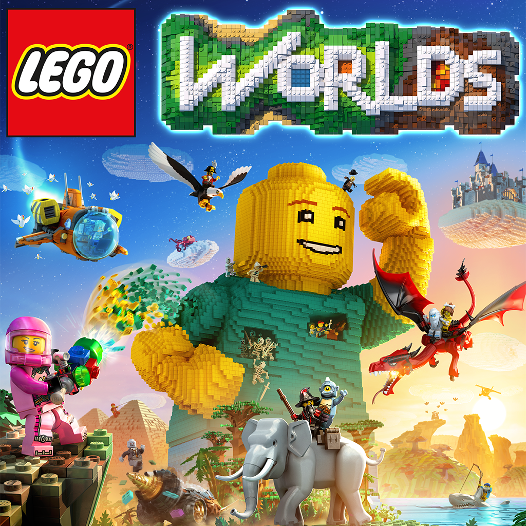
Here's the new one, which will be rolled out in a patch soon.
A big and easy improvement, which has been warmly received on Reddit. It's such a small thing but earns good will, something that Sumo Digital should perhaps note as it persists with an unpopular amended icon for Snake Pass.
Well done, TT Games.
[source reddit.com]


Comments 65
It's definitely a nice gesture from an extremely large company, props to them. Not sure why anyone would buy this over Minecraft due to the reviews though.
Glad they listened to complaints even when they didn't need to. We need more third party devs like them.
I'm a lot more likely to buy it now, that was nice of them indeed.
Colour me surprised! Quick to react too, well done!
Sort of related, Lego is laying off 1,400. Not so nice.
http://fortune.com/2017/09/05/lego-staff-cuts-sales/
So they gave into SJW complainers.
The first one just looks as if some lego due took a picture outside, the new one looks as if some lego dude took a picture of lego anime when he stepped outside to have a bizarre lego adventure DAT one Tuesday.
That's awesome. Every major third party developer should follow suit when looking presentable to the consumer
Was going to download it anyway regardless of the icon! I've put up with the Mr.shifty 1 for long enough now none can offend me
@Samus7Killer Not so much social justice but much rather: "What the heck? This is from a major third party company and this is the way they present the game to us?"
People moaning over a bloody Icon. First world problems lol. Sad really when you think about it lol
People will complain over the most trivial things.
@Samus7Killer I left you a heart because I assumed that was a tongue-in-cheek joke post. Assuming it is, well played.
@Moms-Meowth The firstest of problems. It had literally never occurred to me that an icon could be bad.
@PanurgeJr But does it really impact the game? No. Just people in this SJW internet age kick up a stink about anything they deem offensive and sh17 hits the fan because something hasn't gone their way lol
I'd say good for them, but all they did was appease some redditors, which in today's day and age is just as bad as giving in to a child throwing a tantrum.
I refuse to buy / play Snake Pass until they update that crap icon
The problem is the game isn't exactly highly rated on other systems, the app icons is the least of its problems. Just look at reviews for it on PC and consoles, I'd love it to be great, but I bet the performance will be rubbish.
@Samus7Killer how is complaining about a cheap looking icon related to social justice?
It doesn't effect the game, it's still the game regardless of the icon (which you will see about 1% of the time) I do not understand the outrage, some people have too much time on their hands.
@RedMageLanakyn
Except nobody was throwing a tantrum. People simply said they didn't like it. Which I completely understand because it looked like crap. Then the developer swoops in when they didn't even have to acknowledge the conversation on Reddit whatsoever, and offered to change it as a gesture of goodwill to the community.
That right there commands respect. Not because of the icon, but because a major third-party developer is listening to their Nintendo fanbase. A small gesture that worked a mountain of goodwill.
@PsylockeRules
It wasn't "outrage". It was just people noting that it looked like crap. Which... it did. Nobody petitioned them to change it. They saw the community by and large didn't like it and they responded by changing it. End of story. Not every instance of the community not liking something is "outrage" or a "tantrum" or any of that nonsense.
From a design standpoint I actually prefer the minimalist original, but hey, props to the studio for listening. Conversely, buckling to popular opinions too often can lead to generic-town.
Too bad the game still sucks... I was really looking forward to it, until I actually got a chance to play it
Nice.
I think it was a mistake all among. The original is the loading screen on the Xbox version. The icon on Xbox is the same as the one the switch will now get. I'd suspect a placeholder got left in by mistake.
That's a nice gesture. The new logo is way better.
Old logo was better
People just wanna complain about everything
Wait, I'm confused.
Wasn't the gospel that "the creator's artistic vision is the most important factor" and "no outside influence should change that"?
Where are the cries of "self-censorship"? Where is the indignation that the studio gave into public pressure? We can't let this happen, can't we? Why the praise for a studio that gave into this???
/irony
Sigh. I personally love the new one, but my parasitic side would do well to take this fake "love" and shove it. One can only hope they're fine with either icon (although that would make you wonder why they hadn't gone with this one at first - unless it was a quick placeholder to begin with). Otherwise, this would be nothing to celebrate. We fans have no good will to offer in the first place since we're fans - and any "shotgun way" to earn good will can go to hell with its wannabe mafia-esque odor. :/
Really, though. It's just an icon. Who really cares?
So much better. Thanks for listening! Coughsumocough
@WKE more like /hypocrisy. The perrenial one you can expect when customer interest and fan mentality are concerned.
Never minding how stupid this WHOLE thing is.
Why would you want to replace a cool, simplistic graphic that still clearly shows you what the game is with something as generic as the boxart full of logos and random garbage?
But I'm one who strictly stands by the notion that almost every boxart is designed to inform, and not to actually look good. Heaven forbid this actually look nice.
First icon was ugly. Needed logo at least. Still won't buy.
So they tried to do something creative and conceptual, and the masses complained and asked for more commonplace, cluttered, visual-overload imagery. Congratulations. You got what you asked for. More eyecandy. More colors. Just keep throwing those colors at us. It's never enough. More explosions. More lighting effects. More! More! More!
@edcomics Is there anything you need to talk about?
This is nice. It's something TT didn't need to do, and could have just left alone. But they decided to change it to something more pleasant, and I respect that.
Not complaining about TT's response but, why would anyone complain about something like that in the 1st place!
It's a small thing, but its nice to see developers take notice.
@Grawlog They do, but even those guidelines state that they don't have to follow them, just that its encouraged to follow them.
This whole "story" is a perfect example of how gamers will always find something stupid to kvetch and whine and complain about.
Oy.
Looks at Sumo Digital Just change the Snake Pass icon for god's sake. Enough with the iOS cheap game app looking icon!
I liked the old one better, wtf
@the_shpydar And this post is a perfect example how someone will always find a way to call gamers entitled.
I fail to find anyone seriously enraged about this. It was a basic design criticism.
@MrYuzhai That's just pathetic.
@DrRandle Problem was that the first image was way to vague to actually tell what the game was. Imagine not knowing this game was on the Switch, and you see that imagine on a friend's console. How would you know what it was?
And, personally because of my faulty eyesight, if I was more than three feet away from the screen I wouldn't even be able to tell that the first image had legos in it.
I mean. At least include the logo.
@Seacliff
Hmm, i must have missed the part of my post where i called anyone "entitled". Or "seriously enraged".
Oh, that's right, i didn't say either of those things at all. Nice try.
@Nintendoforlife All Minecraft blocks and posts are the same shape, Lego's on the other hand have many different block types and sizes, some have circular shapes you'll never see in Minecraft outside of a mod.
@the_shpydar so you don't care about this issue while others do, why be a jerk about it?
Lovely that we live in a world where people get fired up because of those insignificant things. Thanks to those people you all can enjoy a update that eats up your precious memory space. Thanks guys!
Good on them for being proactive and changing this admittedly minor thing that was annoying fans.
@Nintendoforlife I like the aesthetic of Legos more than the generic pixel look of Minecraft. It's just personal taste.
See, they listened. It's not hard.......Snake Pass.......Nintendo.
C'mon people, the old icon was definitely not up to the standards it should have been. No need to complain about the people complaining.
Don't let the social media craze get to ya; there are small things worth discussing just as there are small things that aren't.
Nice, now Sumo Digital can fix that awful Snake Pass logo. And while we're at it, Sega should add Sonic Mania to accompany Sonic's head.
Slow news day?
Maybe Nintendo should define a kind of "standard" like it does with its game boxes. So, you might always have to have the name of the game somewhere on the icon for example. This way the overall look and feel across all game icons would be somewhat consistent, and it wouldn't stress people with slight OCD (like me) when a couple of icons clearly don't fit in with everything else. This also wouldn't have any kind of negative effect whatsoever on the people who don't care either way, so it's really just a win all-round.
@19wonders @sp_initiate-001 Fair enough, personally I'm geared more to the online capabilities Minecraft provides, but to each their own.
@Seacliff If you select the icon in the menu it tells you exactly what the game is in big letters above the icon. Why do you need more? Also, if I was at a friends and saw a cool logo that maybe looked like legos, I would say "Oh that looks cool, what is that?" which could be a gateway into me finding a cool game. If I see that big dumb box art there, I know what it is and I already don't care, so there's no chance in being surprised.
The old one was classy tho...
Liked the old one better. Thanks everyone...
Games should have multiple icon options, like reversible cover art. One that's just the regular physical boxart (or what would be the physical boxart if it were physical) and one that's more abstract or artsy or whatever. I'd love to have that original icon on my home screen, and have Zelda use the reverse boxart, etc.
@Samus7Killer
Hello..just to say that my first impression of the game judging from the icon on my home screen was rather underwhelming and not very encouraging. Personally i welcome an update.
Show Comments
Leave A Comment
Hold on there, you need to login to post a comment...