After the Snake Pass game icon debacle which ran to 16 pages of annoyance and jokes on NeoGAF we thought we had seen an end to unconventional game icons on the Nintendo Switch. We overlooked Sonic Mania's rather minimalist icon as the game itself was so good.
But now the can of worms has been opened up again with the imminent arrival of Lego Worlds on the Switch later this week. A few lucky Lego fans have got their hands on the game early and have voiced their displeasure about the choice of game icon:
It is minimalist to say the least, but not offensive as such. At least not in our humble opinion, but it certainly seems to have attracted the ire of many on NeoGAF. One forum user quickly booted up PhotoShop to show WB Games how it could be improved:
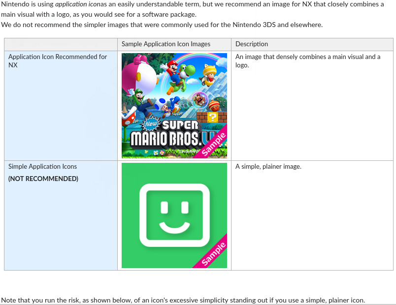
A screengrab of Nintendo's own guidelines given to developers has been doing the rounds, which does make you wonder why nobody at Nintendo is enforcing this policy:
As we said above, we don't hate the icon; it's just the lack of consistency with other Switch game icons which makes it look a bit out of place. Then again, there are bigger events taking place in the world right now and a game icon looking "a bit different" is perhaps bottom of the pile.
Let us know your thoughts on this latest Switch game icon debate with a comment below.
[source neogaf.com]


Comments 81
Perhaps they're trying to rival Snake Pass for worst icon.
Unlike them not listening to people's complaints, maybe Warner Bros. will if they get the message.
it looks like it's for minecraft.
It'll be updated... still hoping the Snake Pass one will revert to what it used to be.
It's a Lego game, I don't go in expecting something complicated.
Yuck. They could've done waaay better...
@SLIGEACH_EIRE I'm still irritated that the Snake Pass team didn't reverse the icon after all the complaints they got. It makes the game look like a mobile app.
@olrodlegacy me too. I have uninstalled the game just because of the terrible icon.
It's fine as a background. Maybe if they wrote the name of the game on it somewhere...
@LaVelle Yeah the fact that they wouldn't reverse the change after universal mass disapproval was just mind boggling. I think I've only played the game once since that whole thing went down. Maybe subconsciously I lost interest in the game because they didn't care what players thought... Or maybe I just got plenty more games on Switch to play now...
NeoGAF might as well rename themselves NeoFWP, although the icon doesn't hook me much either. As for the guidelines screenshot, I guess "recommended" proves to be the key word there.
@LaVelle and on the contrary, the team still has my respect precisely for not changing the icon just because of people's complaints they got (and I'm speaking as someone who liked the old icon more, too). It's not some kind of bug impairing the game, so if Ninty is fine with this, what icon to feature is entirely up to the team themselves, not to someone's subjective aesthetics. Customers have voiced their opinion, they've been heard. Caving in under audience meddling isn't and shouldn't be a guarantee.
Call me crazy but I like my game icons to look like box art and to, you know, actually include the name of the game. I'm willing to overlook Sonic Mania though because I've waited more than half my life for another good Sonic game...
Is it a coincidence that since Snake Pass changed it's icon I've had no temptation to play it and it's slipped down to the 3rd last place in my library,with only the Snipperclips and Disgae 5 demo's behind it?I think not.I'm not a fan of Bulb Boy's icon either but still it's nowhere near as bad as that stupid looking snake.The Sonic Mania icon I quite like actually,it's fits right in with the colourful icons of Splatoon 2,ARMS,M&R,Puyo Puyo Tetris.My favourite though is the Retro City Rampage icon with ARMS a close second.
It really looks like they just took a screenshot, like they had a deadline and just before burning the data to send for production realised they hadn't done it.
Hit prnt scrn button and Bob's your uncle.
That is the worst icon, how on earth did they manage to make such a rubbish looking one?!
I own this on the ps4 and it's the same icon used there, and I imagine on other platforms too. It's a port. Don't get me wrong, it looks rubbish on the ps4 menu too, but when you get a port it's usually warts-and-all. I don't think this was ever advertised as being enhanced or remastered in any way.
Yeah, the point of the larger icons on the Switch menu is meant to be like album or box covers, not application icons you'd see on a desktop or smart phone.
Didn't stop Sega either actually.

Both screenshots contain multiple user account icons and those don't match either. That bothers me just as much.
Looks cheap...
Guys are going do review on lego worlds this week? As i may be picking it up on friday but wanna make sure extra am money spending on it is worth it.
Sonic Mania doesn't look too bad I think.
Bulb Boy on the other hand.
Retro City Rampage is 1st in the middle row,if it isn't obvious.
Sonic Mania should have at least a logo for its icon to feel more complete but it feels like a low key icon for a great game
Honestly it's not the end of the world, but it's really a weird choice.
Did they really run out of budget so much they couldn't afford to have someone spending few minutes photoshopping some official arts and logo into an icon? Sounds a little too extreme to me.
people getting upset at an icon.
I do understand what the article is about in general, and I can see why some might be irritated (though I will probably never understand why some seem to feel personally insulted by such things and make it look like the end of the world). I also get how the very plain Lego Worlds icon irritates some users.
However, strange as it may be, on a personal/emotional level I find myself liking the understatement of the very plain hills (haha) for some reason. It gives me relaxed vibes (if that makes any sense at all).
I do not care too much either way, as long as it's not just the white on green smiley from the Nintendo guidelines, but really something unique from within the game, which stands out in contrast to all the other games in some way to make it recognizable.
That feeling when the Troll and I icon looks better by comparison...
@OorWullie That Bulb Boy one actually made me laugh out loud. There's a reaction/MFW meme waiting to happen there, I'm sure!
I actually really like the Sonic mania icon... The Lego world one is poopy tho 😂
I think people could use their time and energy more efficiently by just playing the game they've paid for and presumably enjoy.
Game icons?????? We are female dogging about game icons. Lol must be a really slow week
@M_thoroughbred so if you don't like something you shouldn't complain? Yes there are far more important issues in the world right now - but this is a gaming site. Where else can you discuss things like this if not here mate.
Consider the guidelines say "NX" twice and "Switch" zero times I'll give Lego the benefit of the doubt for dismissing the guidelines if Nitnedo can't be bothered to update them to contain the name of the system the game icons are actually on.
Though the icon is useless, that photoshop one is really good though, game box art FTW.
@OorWullie "Sonic Mania doesn't look too bad I think."
It is kind of cool and colorful, but what if you buy Sonic Mania and Sonic Forces at the same time and both games just have a pic of Sonic's face? How do you know which game you are booting up then? Sonic Racing. Sonic Collection.
Snake Pass will probably only ever get one game, but Sonic has a bookshelf full, they can't just all be mugshots, as cool looking as that icon may be.
i can't believe there is an article about this. i really don't understand what's wrong with the icon
Wow, that icon is terrible. The least they could do to make it look better is put the logo in the center of the icon at least.
"It is minimalist to say the least, but not offensive as such."
It's an icon! Unless it has f*** you written on it, of course it's not "offensive". People just love to claim they are "offended" over any stupid little thing.
If ugly icons are that big of an issue in your life, I'm think your doing pretty well.
Everything is not awesome. This is not awesome.
@nhSnork If they think the new icon looked better they are well within their rights to keep it, of course - but that doesn't stop the fact that I wish they hadn't made that choice. It's such a small thing and not the end of the world, but I'm still surprised they thought it was better.
These are a bit annoying to look at and I do wonder what would happen if these games ever got a sequel, how would I see which was which? Imagine if all games went down this route and you have to remember what all these icons mean. They don't do this with box art so why do it for the icons, especially when the majority have what is the full box art.
Ultimately it won't affect my decision to buy a game that I'm interested in but it does annoy me, just like the Megadrive days when some felt the need to make their own shaped cartridges to ruin my displays 😡
Am I the only one who couldn't care less? It could do with the name on it, that's the only flaw as far as I can see.
Whoever took that screenshot is a monster if they've played Troll and I more recently than Mario + Rabbids.
I hope the developers of Snake Pass read this article and take notice in the guidelines Nintendo has created.
But that's also the problem: they are guidelines. Recommendations. Nintendo is not enforcing the policy because it's only a recommendation.
When it comes to the Lego Worlds software icon, I wouldn't be surprised if it was just a placeholder image someone forgot to change as it looks like one.
"Attracted the ire of NeoGAF"
And next week: "Stunning discovery ! Water is wet !"
Yeah, go figure. There are very few things that doesn't throw the lot into a hissy fit.
So yeah, this article is as empty as the icon in question i guess.
why doesn't every icon have the freaking game title in it? WTF?
I think Sonic Mania could at least stand to have it's title in the box, but at least I know what it is when I see the icon.
This is so bland I would have no idea what it was if I saw it on my friend's Switch.
I think people are missing the point of the article. It's not that the icon is offensive but a game, with a big third party dev like Warner Bros, is releasing a game that has an icon with NO effort put into it to be presentable, it just comes out as offensive to the customer and to the design of a product. It's scary that Troll and I has a much presentable icon than Lego Worlds
Ugh why. Sonic hasn't gotten a pass from me either.
Gamer: I'm so freaking tired of this!
Me: What's wrong?
Gamer: Lazy developers
Me: horrible gameplay and resolution?
Gamer: No
Me: Game breaking bugs?
Gamer: NO!
Gamer: THE DAMN ICON IS PLAIN AS CRAP CAN BE!
ME:I hate you.
New Super Mario Bros. U on Switch confirmed
@rjejr I think it's safe to say that this was a document made before the Switch got its official name. Why else would it have NSMBU as an example?
@JunkRabbit That was how I felt about the icon, too. It's so relaxing and nice. It's quiet. And as far as Nintendo's warning that being too simple might make their game stand out, why exactly would that be a bad thing? Shouldn't you want to stand out so that your game gets noticed and then played more? Anyway, I think people are crazy for making a big deal out of this and I really like it.
That Lego Worlds icon is really pretty and tasteful. They should have just tossed in some small san serif white text in the center so it scan faster in your library. Snake Pass one is god awful though.
@Spustatu
Thanks for the confirmation. Glad to hear I'm not alone.
But I guess understatement isn't all that popular these days (I know, "Welcome to the Internet...") with everyone trying to be as loud and in-your-face as they can... Personally I'm a great fan of understatement though, and this is a nice example.
whats the old saying ah yes "never judge a old book by it's cover?" if you think a icon means much, most will disagree as its whats behind that icon that matters. i mean when buying i look at the game play videos/screen caps of the game not the silly covers.
In the case of Snake Pass and Sonic Mania, its akin to kids DVDs/Blu Rays of movies/TV Shows where the cover art is nothing more then a main character's face. I dunno if that's popular with today's kids or not (Gimmie poster art or just a busy cover any day) but it sadly the fad doesnt seem to want to go away. :/
Honestly, why does it really matter what the bloody icon looks like? Jesus people, just play the game and stop moaning.
Dammit, @TheFatPlumber beat me to the comment.
@JunkRabbit It most certainly is. The thing I find odd is that the world of design is very much into minimalism right now and I thought most people liked it. For example, my wife loves Swedish minimalism when it comes to interior design, but I don't really like it. I'm more a fan of the Victorian-era archaeologist sort of look with trinkets and mementos and the like. I guess I like calm and minimalism when it comes to UI design, though.
I can't stand the title not being in the Icon!!
I actually like that logo quite a bit. Fits right in with something like a mobile icon or something. As long as the name of the game is listed above ,why is there such outcry for this? Do people really not have enough to be angry about in the world right now?
I think they're planning on changing it:
https://www.reddit.com/r/NintendoSwitch/comments/6y90vs/lego_worlds_you_wanted_an_updated_app_iconyou_got/
"I mean, I'm so glad they took the time to port it to the Switch in the first place, but the icon is garbage. 1/10."
@coxy100 I don’t know why you’re so serious it’s like you said it’s a game site. All I stated was my opinion on the matter lol. I just love how people always fall back to “I know that there are bigger problems in world” And you are right there are more important things in this world....... like 3rd party support, onboard memory on the Switch, games cartridges needing a micro SD card. And yet we are complaining about game icons. Lmao!!!!!!
An icon's job is to tell people in one small image what it is they are about to click on. Sonic Mania's works just fine, given its vibrant art style and instantly recognizable, discenable character. No title is needed (especially since you get the title when you highlight the icon.) Snake Way's icon does okay in this regard too, while we're at it.
All we see for Lego Worlds is a bunch o' blocks. What is it? Is it Minecraft? A Minecraft clone? Who knows.
But still... calm the frick down. There's a lot bigger things to be outraged about in the world right now.
I was pretty disappointed when I first downloaded Sonic Mania to see the icon that they chose. I really like all of my icons on my home screen so far: Breath of the Wild, Arms, Splatoon 2, Mario Kart 8 Deluxe, and Mario + Rabbids: Kingdom Battle, but Sonic Mania sticks out a bit like a sore thumb. It's not terrible, because Sonic is so iconic, that an icon of just classic Sonic's face is sufficient, but it definitely just looks off next to the other 5 icons. I think I'd be incredibly frustrated were I to get LEGO Worlds and see this icon next to the rest, Sonic Mania does get a pass because it still looks like a game when you see the icon, but honestly I see that LEGO icon, and I'm not sure thats a game at all, and even if I think its a game, I have no idea what game it even is until I look at the title that floats above it when you highlight it. Definitely not a good choice on TT Games' end.
I'm also one who deleted snake pass. I only had a few games at the time so it was very much in your face and it irritated me. Worse money I have spent on a switch game so far. Not only did I not get on with it for more than an hour, now I will never come back to it and give it another try.
@carlos82 add a number next to the name of the game
@rjejr When you tap on an icon or select it with the controller the title of the game appears above it,just like on the Wii U.If the Switch let you organise your games like on Wii U,it wouldn't be too confusing even with multiple Sonic's. as you'd just need to flick through them.Problem is,it doesn't. It only displays your games in the order you last played them.This is fine for the home screen,I quite like that actually,but having them all randomly displayed in the full list isn't ideal.It's do-able for now but in a year or 2,when I might have well over 100 games,trying to find 1 of my multiple Sonics that are randomly scattered in a crowd of icons will be tricky.Even if it gave you an option to display them alphabetically instead of last played,it would be better.I'm sure an update will arrive in time.
As for the Snake Pass and Bulb Boy icons,they're that bad you wont forget what game they are.I find it a bit arrogant of an indie to have an icon without the title of their game on it.Mario and Sonic can get away with it as they're so recognisable but not an indie unless it's someone like Shovel Knight.Some of The Beatles albums never had their name on the cover,they could get away with it,The Kinks couldn't.
@NintendoFan4Lyf Just a little bit haha.There's actually another row of games in between those 2 and another at the bottom with poor old Snake Pass and a coupe of demos.I've got 16 Neo Geo games in all and will be buying Blue's Journey tomorrow,love them.Even the games that are not the best are worth playing just for the High Score Mode I think.
@OorWullie I kind of fear for humanity that it's 2017 and we're still using the Beatles and Kinks as reference points. Better than The Biebs and TS, true, but sometimes it feels like it's been all downhill since 1968. Well for me personally it's been all downhill since 1986, I'm a Mets fan. They actually had the audacity to lose the 1st game of the 2000 WS on the last night on my honeymoon in Cancun. Talk about coming home on a down note.
Oh, BTW, Ray Davies called and he said to tell you FU.
@rjejr That made me laugh,tell Ray Davies no offence intended,I'm a big fan of his.I used to play my Dad's vinyl of Lola/20th Century Man when I was still a wee nipper.I probably should have said "indie band" instead,considering I was talking about indie games.
As for using The Beatles as a reference point I think that's fine,they're the masters after all and can never be topped.Agreed though,it's been nearly all downhill since.Early 70's had some cracking bands/albums and the 90's saw a kind of 60's revival in guitar bands but apart from that it's just got progressively worse.I don't listen to any music from this millennium except for the Oasis and Radiohead albums that aren't as good as the 90's ones.
As a supporter of Celtic FC,i'm used to my club winning.With 48 league titles,loads of domestic cups,trebles,doubles and regular Champions League Qualification.Domestically there's only one side that can compete with us and they're in a right mess now so it's just pure domination from us.We've even won the biggest prize of them all,the European Cup in 1967.Won with 11 players all born within 30 miles of the stadium,it's unprecedented.We cant compete with the big boys now but that's fine.My sporting misery comes from my national side,Scotland.We are the very definition of 'glorious failure'.They never fail to let us down after getting our hopes up.Every 2 years we're treated to this misery.
@Trikeboy Not something to lose beans over, but if you're here, what's wrong with commenting how you feel about it?
It certainly goes against that NX guideline thing, that's for sure!
Umm who cares?
TT Games has responded on Reddit and they are updating the ICON to look more like the cover art. So they are listening.
This story is quite bizarre. Random paid loot boxes, unfair treatment of development teams in video games, the growing too fast esports scene, micro-transactions in single player games.....but an icon on the home menu?
@OorWullie Dat bulb boy, though D:
@M_thoroughbred that literally has nothing to do with what I said
@OorWullie Oasis and Radiohead
You do realize even they are 20 years removed from their better days. I don't care how many times the Stone Roses are resurrected, they're still old now. Last real band I liked was BRMC, and even they they just past the 15 year mark. I'll be keeping an eye on Greta Van Fleet to see if these teenage boys turn out to be more than Led Zep wannabees.
If Plant sang for the Charlatans it would sound something like this.
https://www.youtube.com/watch?v=zA9txSA9mXI
You guys and your football. It's all the metric system to us.
@Yoshi "a document made before the Switch got its official name"
Well that was kind of my point. It's an old document, so the rules in it may no longer apply, things change, and Nitneod may allow different icons now, maybe companies protested the original restrictions. Or maybe Nintendo just doesn't feel like adhering to an old document.
As a graphic designer, it's generally a good rule of thumb to try and keep things consistent when it comes to these things. So yes, keeping close to the box art, or official art of the game is the best way to go.
Show Comments
Leave A Comment
Hold on there, you need to login to post a comment...