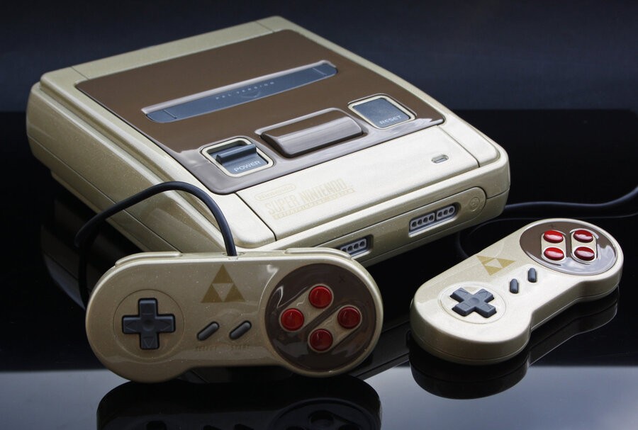
It's common for enthusiasts to take existing hardware and apply their own twists with alternate shells, skins and paint; just recently a surprisingly attractive 'Luigi 2DS' looked good enough to be official. The practice of tweaking consoles is perhaps most common with retro consoles, however, as the old are made new once again.
Slovenian console artist Zoki64 is well-known for his impressive work on enhancing the looks of old Nintendo systems, and the Zelda-themed Super NES pictured above is no different. The light gold and brown scheme (including gold flakes) looks rather attractive, to our eyes, and is certainly worthy of playing any number of classic titles on the system.
 Watch on YouTube
Subscribe to Nintendo Life on YouTube844k
You can also check out the video below for a closer look. What do you think of this design?
[source kotaku.com]


Comments 22
WANT!
That looks great! Only wish the US model didn't start with a dash of ugly from the start. I'd love to see a US NTSC model get this kind of overhaul.
Looks alright I guess? I prefer retro consoles with their original look.
This guy clearly likes his gloss.
Not feeling this one.
I normally don't go for Zelda-themed stuff, but as ALttP is the high point of the series and a personal favorite game, I wouldn't mind having this.
It always looks tacky when it's not official.
this looks amazing.
Amazing work. Would love to at least be able to see it in person.
@ungibbed
Yeah, man! The NA SNES was so bulky. Thing looks like a Buick. Even the redesign that come out at the end of the SNES' life didn't look like the Japanese and PAL consoles.
Compared to the Japanese and PAL systems, I have no idea why the NA Super NES looked so awful. It looked like it was made by Sara Lee but the games were still amazingly awesome but nowhere at sleek as the consoles from Sega.
I still have my SNES which has turned half yellow over the years despite putting it away in the original box when I moved on the Sega Saturn and (dare I say it) rather ugly looking original Playstation...
Back on topic, I still have no idea why Nintendo hit the US model with an ugly stick while the successor to it (N64) had the same design worldwide and I love the looks of the N64 as it's design was rather bold when you consider the rest of the system Nintendo released here in the USA.
The only other bold (and questionable) move was releasing the GameCube in purple (call it Indigo all anyone wishes) but the default color choice I feel really hurt the systems market appeal looking more like a toy than a modern game system.
The Wii really looked great and still love it along with my Wii U.
I'd love a Metroid theme system without the tacky aftermarket stickers. Both on the outside but also a themed UI.
That gloss is nasty.
I dunno just a spraypainted hyper-glossed snes.
It looks gorgeous.
wow
Hard to tell be spoilt if the controllers are spoilt due to 3rd party parts
The gold finish is very beautiful. But the emblem on the controllers are to big.
@ungibbed Yeh i really don't know why the US model was soo damn chunky looking. They went back to the Super Famicom style for the European release, so not sure why they changed it. That one still looks slick by todays standards of consoles. But the NTSC model is very Lego looking
I have no problems with the look of the US SNES. (The beauty comes from knowing it is 60hz). The US one still supports RGB.
My Gamecube is black but I think I prefer purple.
My Gamecube is black but I think I prefer purple.
wow thats looks so amazing :3
Show Comments
Leave A Comment
Hold on there, you need to login to post a comment...