'!' Whoops! Looks like you've walked into our path. The exclamation mark has already appeared above our heads. We challenge you to a very special edition of Box Art Brawl!
Before we send out this week's competitors, however, let's recap what went down last time. Marking another significant Nintendo anniversary as Zelda turned 40, we matched up two covers for the OG Link's Awakening, and after a weekend of voting, the decision was split! Like, 50/50 split. Congrats to both parties, we guess!
But anywho, back to this week's battle. To celebrate 30 wonderful years of Pokémon, we're matching up the generations this time to find out which is the very best (like no one ever was). While we've included the enhanced 'third' editions for each gen where applicable, we've stuck to just the Western mainline games and removed any remakes or Legends inclusions to keep things fair — naturally, some Gens will have more covers than others, but do they add up to a better picture overall?
Subscribe to Nintendo Life on YouTube848k
There are the full nine options to choose from this time, so make sure you're stocked up on Potions, and let's get into it.
Gen I - Red, Blue & Yellow
It doesn't get much more iconic than this, eh? While legendaries would go on to take centre stage on the series' box art, Gen I kicked things off with two of its fully-evolved Starters (Venusaur occupies the 'Green' variant in Japan) and the most well-known 'mon of all, Pikachu.
The backgrounds are as simple as they come, but we love the hand-drawn look of the central figures.
Gen II - Gold, Silver & Crystal
The Gen II legendaries are truly some of the best out there. Lugia, Ho-Oh and Suicune adorn this generation's box art, with shiny backgrounds that really sell a 'step-up' for the series. Talk about a touch of class!
Gen III - Ruby, Sapphire & Emerald
By Gen III, you're no doubt spotting a bit of a theme emerging. It's not enough to take away from the three awesome legendary designs in this generation, mind you (heck, they are this writer's favourites). Another good one, all in all.
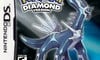
Gen IV - Diamond, Pearl & Platinum
Pokémon really got off to a great start on the DS with this trio. The legendaries look awesome, the dark backdrop suggested there was some drama underneath, and Platinum's glittery sheen is as eye-catching as they come.
Gen V - Black & White (2)
The fact that Pokémon White had Zekrom and Black had Reshiram never sat well with this writer, but we just know that dragon-obsessed kids all over the world lost their minds at these covers — and rightly so!
The '2' variants simply dial things up to 11, and there's no arguing with that.
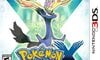
Gen VI - X & Y
The series burst into the 3D generation with this pair of covers. The 'Look! New legendaries!' format returns from previous games, but we were always particularly fond of the giant 'X' and 'Y' in the backgrounds.
Gen VII - Sun & Moon (Ultra)
Our apologies to the Sun and Moon fans out there, but we always found Solgaleo and Lunala to be a little bit... boring. The bright sky backgrounds of each help elevate the covers, it's true, and the Ultra variants spice things up even more (much like Black 2 and White 2 before them). But is it enough to stand shoulder-to-shoulder with the others?
Gen VIII - Sword & Shield
New box shape alert! Pokémon covers went portrait in the Switch generation, and how did TPC make use of all that extra space? With two big old legendary dogs, armoured up to the teeth. Fair play.
Gen IX - Scarlet & Violet
And so we arrive at the latest generation. Say what you will about Gen IX's Koraidon and Miraidon, there's something about the art style here that we find really rather appealing. Perhaps it's the splattered background or the gold trim border, but does anyone else find these unexpectedly... classy?


Thank you for voting! We'll see you next week for another edition of Box Art Brawl!


Comments 52
i really love how the gen 9 boxes look like the scarlet and violet book, it's relevant to the story which is a nice little design detail the others don't have
I voted for Gen VI because they have a little extra effort put into the background, but I have always hated how the just stick the generic portrait they use for everything on the boxes rather than a unique illustration.
Sword and shield are the worst I reckon. I voted gen 2- but nostalgia may have clouded my judgement.
Gen II for me, not only it started the box art legendaries trend, but also the shiny backgrounds are representative of the title of the games and really cool aesthetically, too - in addition to those fundamental aspects, it's also quite nostalgic for me as Silver was my first personal Pokémon game (we had Blue before it, but I shared it with my sister)!
I'm going to be nostalgia biased and vote for gen 1
Gen 2 for me, and not just because it's my favourite generation... it's because the cover for Pokemon Gold is one of my all time favourites. Gorgeous...and shiny!
Gen II, but they are all really good and iconic, except Gen VIII's which is just super unappealing.
Gen 6 put some nice background details so it gets the win from me. But i will predict gen 1 will be voted the most because nostalgia for that game is the highest
gen 7 is my pick. very colorful
I love both the Emerald & Platinum Box Arts but if I were to choose, I'm going with my Gen IV bias.
I didn't care for (Ultra)Sun and (Ultra)Moon as games much, but their box arts are cool for being connected when you put them side by side, so they get points for that.
I still gotta go with nostalgia though, either gen 1 or 2 are my pick, and that's a tough call. I think I'll go with gen 1 for being the only ones that didn't opt for legendary box arts.
Xerneas has always been a pretty nothing legendary, except in it's looks, it's the most beautiful looking legendary and as with the game covers, it's no different.
I personally voted Pokemon X as it was my first time played Pokemon games and I prefer square cover of 3DS with White box.
I put my nostalgia aside and voted Gen VII. Ultra Sun and Ultra Moon have such dynamic backgrounds and eye-catching Pokémon. They're beautifully designed... But I was this close 🤏 to voting Gen I.
I personally really like Gen II the most but there is no denying that Gen I has had the most impact.
I voted Gen 1
Frankly I voted Gen I just because it didn't sport legendaries. Although choosing the starters' evolved forms means discarding one (and yes, I already know about Pokémon Green).
Gen 1 for sure, they’re iconic and every cover after that is just keeping up with the tradition established by the original, even if Gen 2 pivoted to legendaries.
Gen II for a few reasons. The metallic colors go hard and it's the first generation to start the trend of featuring box art legendaries. It still retains the original Ken Sugumori water-color art style. Also it's the last generation where "gotta catch em all" is featured as the slogan, criminal that it was removed in latter gens. Gen VIII is the weakest, feels like a Saturday morning photoshop project.
Platinum has got to be the best one by a mile
I like them all but do agree the Gen 8 boxes (Sword/Shield) are the weakest. I finally went with Gen 2 out of nostalgia admittedly. Those box arts started the legendary trend, feature some of my favorite Pokemon to this day (especially Lugia!), and the boxes IRL have a heck of an eye catching holographic sheen.
I'd say Gen 2 is the best & peak design for the franchises box art.
It uses the infinitly charming hand painted sugimori art (every cover would look far better with that style rather than the homogenised digital art that they've used for decades)
It improves on the gen 1 design by adding a subtle shape design in the background (colours are flipped on the gold/silver versions)
adding a holographic shine to the box also elevates the art & gives good synergy between the video game & the trading card side of the franchise.
I went with Gen 1. No offense to any of the covers, as they do genuinely all look good (and I always love when series find a motif and stick with it), of all of the "I downloaded a .png off the wiki and slapped it against a background" looking covers, at least Gen 1 says "I took the time to draw a Pokémon, cut it out, then slapped it against a background!"
Switch Pokémon games' cover arts looks so bland and simple... Meh.
Gen V for me.
Maybe I'm biased, but I picked Gen VII, specifically for the USUM box art. The black creates a nice contrast against the orange and purple. What makes this box art go above and beyond is how combining both games' box art reveals Ultra Necrozma.
Runner-ups:
Honorable Mention:
If it was an option, Legends Arceus would have been my favorite. It follows the BOTW formula of gazing out into the distance, but boththe emphasis of Mount Coronet and the pleasing watercolor style they went for makes this not just my favorite Pokemon box art, but my favorite box art ever. But wait, there's more: ROWLET IS IN THE ART!!! 11/10
I really like the Sword/Shield designs, especially the logos
Gen 2 purely because of how I felt seeing them in a game shop when I was a kid. Had no idea new Pokemon games even existed at the time so seeing those shiny boxes at the time was exciting as hell, hard to get past the nostalgia of it
Got red for Christmas 98 with a neon green gameboy colour. Can’t vote for any other gen
Has the BAB tied before? That's really funny.
So, the Black/White legendaries were only available in the games that didn't feature them on the covers? That seems rather misleading.
I went for gen 2, but shout out to Ultra Necrozma being visible across the two USUM covers.
Excluding the Legends games because they'd sway the Gen 8 and 9 rankings #noticing
I literally can't pick. :/
Sun and Moon are such lovely games, I would love to replay them. Never did try the Ultra versions
Had to go Gen 1, thier box art are burned into my earliest memories of Pokemon. I didn't get any of the games till Gen 3, but the Gen 1 boxes are iconic and loomed over me as a child going into stores or looking through catalogues, always the one aspect out of my reach
Its between Gen 7 and Gen 2 for me. My favorite gens so I am biased.
Voted for Gen 1, first Pokemon was Yellow with the special edition Gameboy 💛
So many great memories, but the best is yet to come. My brother just randomly bought me a Switch 2 today 👀
He received a bonus at work... Man... I'm one lucky gamer. Very grateful 😁
I voted for Gen VI.
The backgrounds and incorporation of the X & Y theme and logo design all work together nicely. Add to that the terrific legendary design that, again, ties in with the title. Winner for me and I have been playing since the very beginning, so even with my nostalgia glasses on, Gen VI is the best imo.
For nostalgia's sake, I chose Gen I as my vote. I don't really have too much of an opinion on Pokémon in general but I had too many good times with the first generation that I just had to vote for that one. I looked at all of the box arts and none of them really stood out to me.
@JumpingJackson Because slime, magnet, and eggs were the height of creativity, right?
Most of them are good in their own way. Gen VIII are the only ones I actually dislike. My personal favourites are Gen VII.
I must be a basic beyotch because I went with Gen I. I don't even fancy myself a Pikachu tragic either, but there's just no beating that Yellow version art. If the batteries in the cartridges of the first two gens weren't prone to failure, I'd have loved to have tried to get my hands on copies of those early games.
Gen II is my absolute favourite, and I love those boxes too. Platinum is especially gorgeous too. I love them all, but Gen I wins out for Yellow.
Sword/Shield's backgrounds are a little too basic and kind of suck, but I otherwise like Zacian and Zamazenta's poses and their respective logos.
They're all really cool tbh (Other than Sword and Shield). Personally, I'm a really big fan of space, so Sun and Moon, and especially Ultra Sun and Moon, are really fantastic ones.
I will be honest, in my opinion, a lot of these are very eh, I don't know which one to choose, to be fair.
I wish the remakes were there, too, HeartGold and SoulSilver has a great aura.
I went with Gen 1 by a hair over Gen 2, but both have excellent box arts for all their versions. The watercolors hit different. Although not a traditional mainline game per se, Pokemon Legends Arceus has the best Pokemon box art since Gens 1+2 imo.
Regarding the rest:
Not a fan of Gen 3's box arts at all (this includes the Fire Red/Leaf Green box arts); Emerald's is just OK
Platinum's shiny sparkles were a great touch.
Black 2/White 2 featuring the different Kyeurem is an interesting idea, but looks too "over-designed" for my liking.
X and Y are one of the best post-2D Pokemon boxarts imo. The cutout letters are underrated.
Ultra Sun/Moon's look too busy, among my least favorite.
Sword and Shield's are plain, but OK.
I like the contrasting fonts for Scarlet-Violet.
Voted Gen I art but Gen VII are my favorite games.
The originals have an old school line drawing that makes them very cool but in terms of composition I always thought X and Y were above the rest.
No nostalgia for me. I didn't play my first Pokemon game until late 2012. I like the Gen 1 boxes the most. I prefer the true hand-drawn look, plus I think the designs are the most appealing.
I see that this is about box art. But otherwise, aren't BW2 different games than BW1? Different regions, characters, stories, and Pokemon? Or are they enhanced versions of BW1?
@Gryffin
Black 2 and White 2 are literal sequels to Black and White, taking place like 2 years later in the same region which has undergone changes, meaning new Pokémon, new gyms, a different starting town, etc.
On-topic:
Gen 2 is the correct answer for me, not just because of the lovely art but because Gen 2 are the best Pokémon games, forever.
No prizes for guessing who will win this one.
There’s not a lot in it tbf. They’re largely the same format it’s just what rendering style you like best or Pokémon you have the fondest memories of.
Box Art Brawl: Pokémon 30th Anniversary Edition:
Gen I
Gen II
Gen VI
Gen III
Gen VII
Gen IV
Gen V
Gen IX
Gen VIII
Jeez... I've never played a Pokemon game, but from Nintendo Life, Smash Brothers, and various other sources, I feel like I know them well enough. Still... everything after generation III looks exactly the same to me.
Show Comments
Leave A Comment
Hold on there, you need to login to post a comment...