Welcome back to another edition Box Art Brawl!
Last week, we matched up two covers from Capcom's Gargoyle's Quest II: The Demon Darkness and oof, it was a close one! Japan's action-packed cartoony take just about walked away with the win, taking 53% of the vote and leaving Europe and North America's shared design with the remaining 47%.
We're sticking with the spooky vibes this week as we take a look at the brilliant Castlevania: Dawn of Sorrow. This first DS entry in the series might have put some off with its anime-inspired visuals and gimmicky 'Seal' system on the touchscreen, but those who powered through will remember heaps of Castlevania goodness underneath.
North America and Japan share near-identical designs this week, so it's a good old-fashioned duel with the European cover. Let's take a look at 'em.
Be sure to cast your votes in the poll below; but first, let's check out the box art designs themselves.
North America / Japan

There's no mistaking the swerve to the anime visuals with this cover, is there? Our protagonist, Soma Cruz, stands front and centre, surrounded by a bunch of characters that you'll bump into in the game. This "everyone is here" approach doesn't leave much room for background detail, but we still get to tick the 'spooky castle', 'full moon' and 'bat' boxes, all the same.
Europe

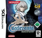
If there was any doubting who the Dawn of Sorrow protagonist is by looking at the North American / Japanese design, the European variant has you covered. The Castlevania ensemble has been cut here, leaving Cruz alone to draw our attention and giving a bit more credit to the spooky surroundings. It's certainly more pared back, but just as eye-catching.
Thanks for voting! We'll see you next time for another round of Box Art Brawl.
Comments 39
The european cover is better for sure, the other one is way too busy. What a downgrade of artstyle though from previous castlevania games. The game's great and all sure but the saturday morning anime style they had in this game is so ugly.
No Konami's Best option?
Clearly we're missing the best box art

I think that the Europe cover is moodier, and more atmospheric, so I went for that one. The NA / Japan cover is rather nice, but I prefer the sombre tone of isolation for Castlevania games.
North America/Japan for me, it has all the elements of the European box art plus more characters than just the protagonist.
I really looked DS. I know other people like it too. And I know people love Symphony, but it's so freaking hard for me. I've tried multiple times, and I just die instantly, and I don't have the patience at all to keep trying. There are way too many games to play.
NA/Japan (and by extension, Australia), and it's not even close.
@EarthboundBenjy : How could we have forgotten that gem? 😂 What in the hell were they thinking?! Those kinds of budget releases just make me want to go and cough up extra for the nicer cover. 😅
Again... Why the differences. I am not even going to vote. I like the EU one more, except for the 25 different "stickers" added to it, so... No vote from me this time.
NA/Jap for sure. A much better composition, no empty space to be covered with stickers, and no impression that the protagonist has to do everything alone.
I voted for NA / Japan. The additional characters and vibrant colours make it more eye catching and interesting.
I miss Ayami Kojima’s artwork for the Castlevania games, this is so generic in comparison.
@Expa0 agree with everything you said.
I was actually reluctant to play the DS castlevanias because of the art... but in game is fine and they are great!
I don’t vote Europe very often in these things, but Japan/US is giving me Ace Attorney energy, which is not what I come to Castlevania for.
@EarthboundBenjy Who at Konami thought that cover was okay?
I'm actually a pretty big fan of how the anime-styled Castlevania games look (Rondo of Blood, Dawn of Sorrow and Portrait of Ruin) but in terms of these boxarts? Yeah EU is definitely getting my vote this week.
Here's the thing right: I like the idea of putting emphasis on the main cast of the game (because the Sorrow games have....a lot of characters to put it mildly XD), but the anime style they went with for the cover ends up having them all clash together in a pretty unappealing way in terms of the overall colour scheme. The EU cover then focusing exclusively on Soma serves to balance out the black and navy of the background wonderfully.
My only real critique is the clutter of all the 'Best Of' stickers they plastered on the right-hand side but apart from that? Yeah its a good one and it reminds of just how badly I want to experience both Aria and Dawn of Sorrow down the line 🦇
The European box art is definitely moodier.. but they already bungled the artwork with that sterile anime art style anyways, so might as well lean into the excess. NA/JAPAN FOR ME.
Rondo and Portrait did the anime look better in more befitting styles for the franchise. Dawn looks like a 4Kids Saturday morning cartoon.
Ayami Kojima's artwork is of course the gold standard, but Masaki Hirooka's artwork for Order of Ecclesia is also a perfect match for the series. But this? Not even close.
@PLATINUM7 best box art in the world.

Easiest answer yet, definitely the N/A Japan versions
@LadyCharlie This can't be real, right?? ^^'
Yeah, this needs the US re-release boxart, with a photo of the boxart.
The American one looks like Scooby Doo more than Castlevania.
@EarthboundBenjy Seriously the funniest box art ever made. There’s no way the artist who made that wasn’t laughing the whole time
NA/JP for me. Sometimes more isn't necessarily the best, but this cover managed to do that and still keep the moody background and creatures.
North America/Japan gets my vote easy.
One of the worst Castlevania box arts. I second the person that said it looks like Scooby Doo. Good game, but still…
Inevitably Japan will win because if there is one thing I have learned through these Box Art Brawls it’s that for most people here more characters = ‘better’ art.
I prefer the ambience of Europe’s and the general toned back colour palette. However those scan lines are weird (I think, I haven’t played this game) and they could have worked some additional characters in, in a more in keeping way. Not necessarily all of f them from the Japan box, but some to make it less lonely.
So neither are great but Europe gets my vote for having more atmosphere.
Don't let the atrocious art style throw you off though. Dawn's still a fantastic Castlevania and one of the best in general.
The art's less jarring in game when you get used to it and it's not exactly the most dialogue heavy game, so you're rarely subjected to it while exploring the castle.
@Expa0 I can understand not thinking the style fits, but ugly? I think that's a little dramatic.
@somnambulance @sketchturner Are we looking at the same box art? I don't get how it looks like Scooby Doo, an American cartoon. It looks like an anime. Lol
Great game btw. One of only a handful of Castlevanias I played. The Japan/NA one for sure as there is more acknowledgment of other characters and work gone into the game.
The main character's pose looks more awkward when he's alone o the cover. It works better with the other characters there. There's also a significant amount of wasted space on the bottom of the Euro cover, and too many logos overall. So it's NA/Japan for me.
Regarding the switch to a more typical anime aesthetic, I would say the actual art is very good. The issue is that it's not necessarily the best fit for Castlevania. Kojima's art was especially moody and seemed like a perfect fit for the game. If this anime style was for a different game, I don't think it would get as much criticism. It's technically very good and far from ugly as far as I'm concerned.
Hm...I'll pass on voting but...uhm...@JimNorman? Might I suggest Phantasy Star Zero for next Box Brawl?
NA/JPN easily.
@Ogbert
Agreed. The “everyone is here” design is lazy trash.
@EarthboundBenjy the only one!
My copy of the game has that awful Konami's Best art posted by a couple of other commenters. I had a professional printer make a replica of the original box art just so it doesn't look so awful on my display shelf.
(Of course, if I ever sell the game, I will remove the replica art.)
I'm sure this looked so cool at the time, and it still does, but I am so tired of floating heads posters and box art. It's one of the most overdone designs these days.
Box Art Brawls Current Total:
Europe: 81
Japan: 80
North America: 93
Australia and New Zealand: 1
I love the Europe design because it takes away the busyness, but it doesn't excite me at all. Despite the NA/JP image being busy, it gives me an idea of who I'll be encountering and that all of these people are important to this game somehow. So my vote goes to NA/JP.
The European one is moodier. This is a Castlevania game. Make it dark. I don't want any of those people in the NA/JP art to get in my way while I'm exploring Dracula's castle. Except maybe the woman in the red dress on the right. Bet she's a witch looking for some ritualistic chalice and could offer advice. And professor plum in the blonde bob would probably sell me something or turn into a monster. He can stay too. Everyone else can go back to the non-horror anime from whence they came.
Leave A Comment
Hold on there, you need to login to post a comment...