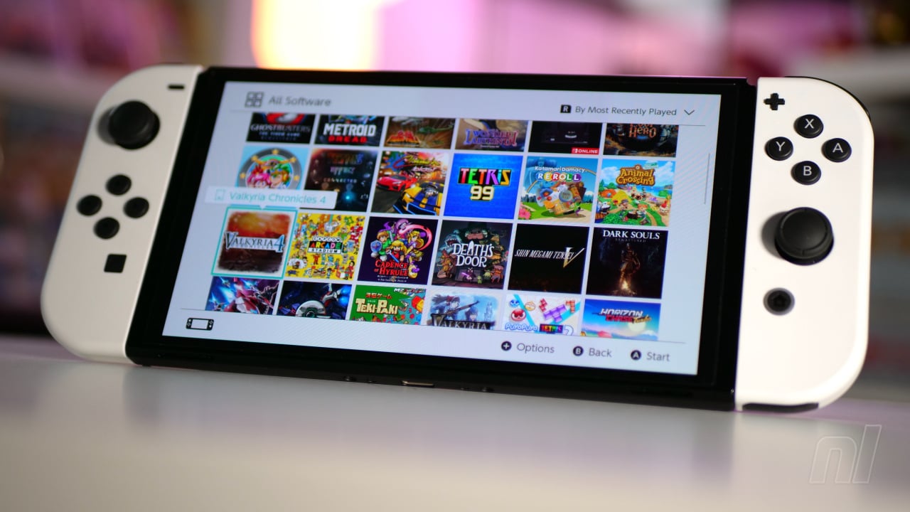
Do you ever look at the home screen of your Nintendo Switch and wish there was a bit more colour? A bit more chaos? Or that it was a bit less monochromatic? Well, thanks to German translator PaulFelixKelly, we've had a glimpse at some of the ideas and mockups Nintendo had for the menu.
Kelly managed to get hold of a prototype Nintendo Switch unit which was used for early production and development. The Prototype Switch NAND comes with 64GB of storage, but it's also home to some development secrets, which include these menu mockups.
Now, it's worth noting, as Kelly does on Twitter, that these are all just mockups — essentially, placeholders for whenever Nintendo settled on the final design. But you can see from Kelly's screenshots below that many of the placeholder menus look very similar to the Wii U's own menu.
These mockups are dated from 2015, although these dates are often provided for app display purposes. You can see many of the game icons have been pulled from the Wii U and 3DS, with titles such as Super Mario Maker, Nintendo Badge Arcade, Triforce Heroes, and the original Splatoon present.
But you can see from these screenshots that there's a greater variety of icons, including pixel art Yoshi and Donkey Kong. Two folders full of these — titled 'Friends' and 'Avatars' — give a few lesser-loved Nintendo characters some time in the limelight. Who thought we'd see a Nikki icon, hey?
We've linked both of these threads above, but you can also have a look at the icons below:
If menu mockups aren't doing it for you, then Kelly also found design concepts for the Nintendo NX — which we all know eventually became the Switch. Looking at these pictures, the design of the console was nailed down pretty early on, and there are very few differences from the final product.
Sharing the designs and photos of a retail unit, Kelly outlines the key difference, that being the black Joy-Con with unique joysticks. The dock also lacks the Nintendo Switch branding, being just a regular black dock which houses the Switch itself.
There's some fascinating stuff on show here which gives a little bit of insight into what developers were working with before the Switch hit the markets. We kind of love the more colourful menus that are shown above, but we understand Nintendo's decision to go with something a bit more clean and concise with the current model. The burning question we have, though? Was there menu music? We miss menu music!
What are your thoughts on the menu mockups for the Switch? Do you like them more than what we got? Head on down to the comments and share your thoughts.
[source twitter.com]


Comments 39
Its interesting to see that while some things changed, Nintendo really knew what they wanted to do with the Switch from the start.
Why are these all better than what we got? For everything the Switch did right, the menus were a dud.
I find the Switch home menu/UI incredibly barebones and frankly quite depressing and isolating. It even puts me off of playing my Switch sometimes, to be honest.
Yes it's fast and fluid, which I appreciate. Yes it's just a game launcher and doesn't matter when you're playing a game. Still, it's my opinion/feelings on the matter.
Looks pretty clean if you ask me.
Glad they were able to distill it down to the current UI. My favorite UI of the modern era.
I don't mind the current menu UI. At most I wanted more color options for customization.
It doesn't need to be a flashy menu that'll eventually bog down the experience, or similar to other consoles requires its own chunk of RAM just to function in the background.
My biggest take from this is: Nintendo robbed us from those Mystery Mushroom sprites from Super Mario Maker as avatars.
Seeing the battery of the Joy-Cons on the HOME Menu without having to enter the Controllers setup would've been greatly appreciated.
And those black Joy-Cons are the real deal for someone who has a black Wii U next to the Switch.
Sometimes I forget how sad a Switch without Homebrew looks. I have full sized box art for each game, a beautiful background for the menu and a different one for each sub menu and really nice looking UI buttons/placement. I'm a big nerd for aesthetics, I hope they bring back the old charm for the Super Switch (even though I'll mod that too anyways).
It's good to see Nikki again
This is lovely but the main takeaway is Nintendo Badge Arcade should return!
I'm glad they went with the more simplistic UI; less is more. I never plan on spending time or looking at the UI, I strongly prefer it to be fast and responsive.
Frothing over the Home Screen. It seems super simple but highly stylised. The switch Home Screen works fine but bloody heck it's boring
Ooo not gonna lie, I sort of wished they went for that UI
the Switch development console has black Joy-Con's
Looks like they were planning to release 2 Triforce Heroes games on Switch
Those preview pictures for each game, that alone would have made a huge difference in improving the UI feel. Especially if animated with a little unique jingle, like the Wii or 3DS. Out of all the current gen console menus around, Switch is the best by far imo, but god I hope the successor mixes that Nintendo magic back in again. Music and themes when 😔.
Wii u and 3ds nailed their home menus I wished their organization format would come back. Even this looks just as simple yet sleek but still shows more games at a time
WE WERE ROBBED 😭
I like the current switch menu. it's simplistic and does the job quickly. I hope with the next stronger system, they keep the quick boot up and feeling while adding a bit more personality. would love themes, maybe quick way to pin games in the menu.
but honestly I don't tend to be in the menu for longer than like 10 seconds if I don't need to.
Thanks goodness they didn't go with the claustrophobia-inducing and overly busy prototype main menu. A header banner that takes up a huge chunk of screen estate alongside with medium-sized game thumbnails and small icons wouldn't work.
That being said, I'm not fond of the currently dominating utilitarian UI design pushed by Microsoft's Windows 8 in 2012, where Switch took inspiration from.
It's fine at what they're meant to do, but it lacks the "going for extra mile" vibe that's arguably essential for establishing lasting impressions.
For the latter, GameCube's BIOS menu is a good example without dragging the user experience down. It drops you straight to the game when a disc is read, but there's also cool-looking and simple cube menu that's effective at doing basic stuff. Which can be accessed by leaving a disc out or holding the A button while booting.
The Switch menu is barebones and I kind of like it that way.
It’s boring sure… well, it’s really boring…. But it works. It does its job flawlessly and is the cleanest, least confusing menu ever. No questions.
I think themes with accompanying sounds (aka 3DS) would be the next evolutionary step but everything works great as is so whatever.
Now, I will say, browsing the eshop is like walking through the swamps in never ending story. I be looking for Artex up in there. 😭
That’s a RAM issue though, yeah?
game companies need to get on the ball when it comes to social community with this system. TO THIS DAY the only company that pretty much has it down is Microsoft. Hands down the best social software for players anywhere....
unbelievable the beta of Switch menu, is way superior of what we got, also Switch UI is so dead, we got a very sleek UI at the expense of kiiling all it charm
Hrmm seems to me they just used Wii U and 3DS style as a placeholder? I don't think these are actual designs that were being considered.
@SpaceboyScreams why are you playing games of a company you clearly hate?
Modding the Super switch (switch 2) as soon as it comes out so you can steal games that could be easily bought.
You're trying to be all big and clever but in reality you are just a common thief and it's because of people like you is the reason why supermarkets put security lock boxes on meat and cheese because if you're not paying for easy to find games, you're obviously going to the shops to rob.
Love to see mockups, design concepts etc. for the Switch!
That said, since it obviously came up again in the comments, I'm among those who don't mind the UI we ended up getting, especially considering how fast it is compared to other systems... but of course wouldn't mind if they added more colors or even themes etc. as options for those who want them!
@CharlieZee Modding a Switch to run custom firmware does not equate to 'stealing games'.
I hope they give us a much better eshop, on the next console.
It's the worst digital storefront of all time.
It was much easier to find stuff on the Wii U, which also had more personality to it.
The Switch feels as sterile and boring as an Apple product, when it comes to this.
@CharlieZee
Modding a console doesn't mean your a pirate.
By modding the console, you can unlock the GPU and CPU clocks, and get better perfomance in games, while playing docked. Plus as mentioned, make your own themes etc.
@dmcc0 but that's what he'll do though, let's face it.
@Steel76 but stealing games is always an option.
No.
The Switch home screen is perfect. We do not need anything else.
@CharlieZee I modded my Wii so I could play the games from an external hard drive without having to use the discs - haven't got a single pirated game. Modded my Dreamcast for the same reason - playing the games from SD card instead of the disc, 3DS is next to get rid of the region lock for buying imports from eBay etc. Haven't done the Switch as I haven't got a spare and don't want to risk a ban for going online with a modded console and don't really need any of the benefits modding brings at this point - maybe in the future.
@dmcc0 then maybe I've misunderstood modding. I've always associated or with downloading pirated games.
@CharlieZee "modding" a Nintendo Switch device, i.e. hacking, also commonly referred to as jailbreaking, the system's kernel to run unauthorized code or applications could be used for nefarious purposes, such as dumping and distributing ROM files of paid games/DLC on the internet or cheating, however this is not always the case, as the community that facilitates other aspects of free and open-source modding, such as loading custom firmware (which is not capable of piracy on its own), enabling CPU/GPU overclocking for better hardware performance and installing mods for games themselves for a better experience such as bug fixes, cosmetics, etc., generally frowns upon piracy and see the modding scene as a way of enhancing and, arguably, improving the user experience Nintendo failed to provide with the Switch. Also along with growing concerns among video game preservationists due to continuous growth of corporate pushing of purchasing digital games, which are license only, meaning you don't actually own it yourself as stated in Nintendo's ToS, the only way to retain games you own in the event that the ToS is updated and makes them unplayable (because the Switch needs to connect to the internet), you need a modded Switch running CFW to dump those games onto some sort of external storage media preferably. As @dmcc0 stated, be wary of connecting to the internet with a modded Switch as Nintendo can detect whether a device has been modded and will result in a permanent ban, but there is CFW that lets you revert back to your systems OFW (official firmware) to avoid this. I would suggest reading more into the modding scene as it provides a way more in depth explanation. Youtube is free after all.
@KSC2003 thanks for clearing this up.
3ds: Let's make different backgrounds and a game where you can play claw machine for badges you can use on the background and on folders and many other things!
Switch: Let's have a plain white unchangable background
In some ways I prefer this but in some ways I'm happy with what we got. The battery power being on the bottom is very jarring to me in particular.
@EllaTheQueen6 You can change it to black!
Tap here to load 39 comments
Leave A Comment
Hold on there, you need to login to post a comment...