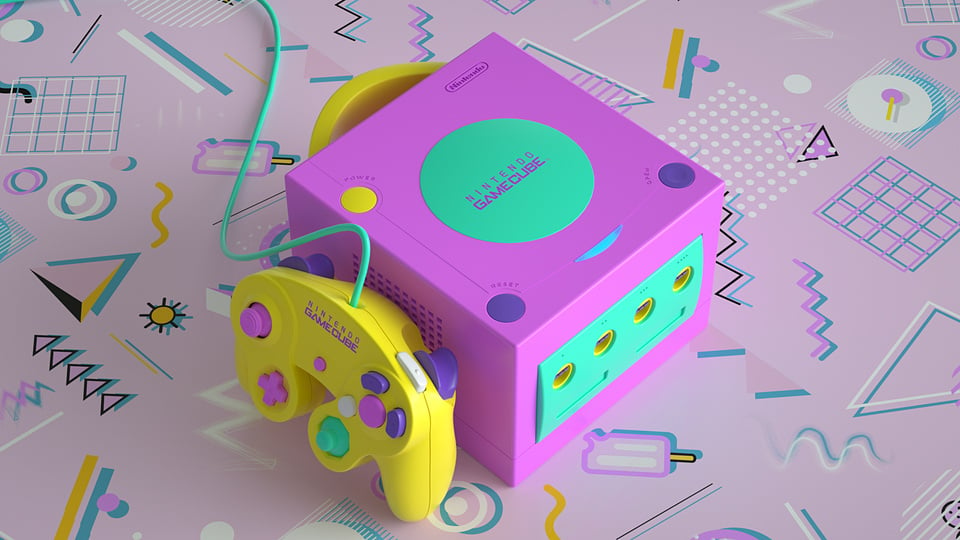
You know how it is. You're scrolling through Twitter of an evening, admiring beautiful retro game box art and hardware and intricately detailed scale starship models (everyone does that, right?), and suddenly see an image so jaw-droppingly amazing that it stops you dead in your tracks.
The image above had just this effect on us when we happened to scroll over it recently. As highlighted by @digituba, the original post appears to be two years old but we simply had to share the majesty of this Vaporwave-styled GameCube concept with you, however late to the party we are. It's just... well, look at it!
Subscribe to Nintendo Life on YouTube846k
It's the work of artist Trey Trimble, who posted the awesome 'AesthetiCube' to Reddit back in June 2020. We missed it then, but oh Lordy we've caught up now.
If you're unfamiliar with the Vaporwave aesthetic, it's essentially an electronic music sub-genre that morphed into a meme based on late '80s, early '90s vibes. Think Miami Vice with a good dose of early Internet imagery and a dusting of psychedelia and you're not far off.
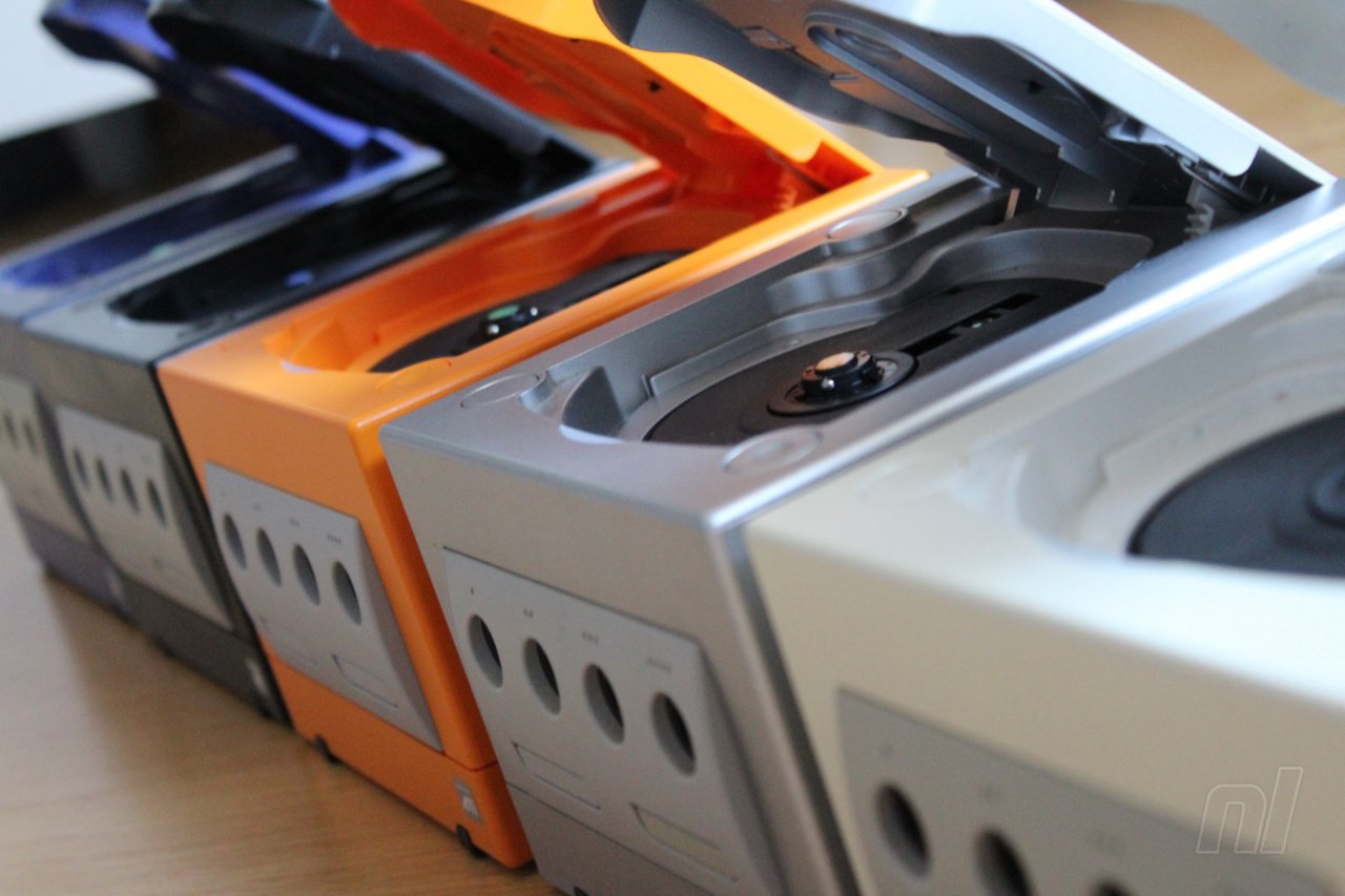
Nintendo's beloved GameCube came in a variety of very lovely colours which this writer has a specific weakness for. No-one needs more than, what, three GameCubes, do they?
If someone were to make this Vaporwave GameCube livery a reality, though, we'd have trouble resisting adding to the collection. In fact, we've got tabs open already researching 'how to paint your Gamecube'. Oh dear.
Let us know below how much you'd pay to make this console of unfettered, unimaginable beauty a reality. We're off to watch airbrush videos on YouTube.
Further reading:
[source reddit.com, via twitter.com]


Comments 35
That is one of the ugliest color schemes I have ever seen.
I think it looks good on the photo but maybe not so much when everything else in your living room doesn't match with it
I would kill for this if it glows in the dark.
Very luxurious looking GameCube I must say. If that system had really come out in 1995, abeit with the power that could be expected at the time, and the 200MB storage that could be expected of a CompactDisc of that size, it would still have been... I believe the term is "hella sweet, dude!".
It looks cute, but I prefer White Wii machine to play both Wii and Gamecube games.

Simple and clean.
@Pod it did not come out in 1995
wow. best GC ever
Aesthetically I prefer white or black.... But I would buy this in a heartbeat
It’s tacky and has personality, I’ll take it!
@MJF Yeah… hence why they said “IF that system HAD really come out in 1995”. They’re describing a theoretical scenario, not what actually happened.
That's not vaporwave, that's neo-memphis. Certainly more accurate to real memphis than most neo-memphis projects I've seen though. Others will usually try to tone down the colours only keep the triangles.
“You know how it is. You're scrolling through Twitter-“ nope can’t relate.
I really do miss bolder color options for my consoles.
Modded my Switch for Atomic Purple a while back.
Dang... they really captured the essence of the late 80s, early 90s. I could totally imagine someone with acid-wash jeans and a rat-tail sitting down to game on that.
Abit too bright for me.
Went from a black standard cube to a xeno modded swiss enable cube.
Ahhh, the overt 90sness... it hurts my eyes..
Wow that's impressively ugly.
@OldManHermit Nobody had stuff like this in the 90's lol. It would have been more beige or gray.
@JayJ I was referring more to the pastel colours and patterns. Reminds me of elementary school math text books and the like from that era.
@blindsquarel Words of one born in the year 2000 or later.
@Bubsy The background it's sitting on is neo-Memphis, but the color scheme of the system itself isn't necessarily attached to just that art style. That said, neo-Memphis gets utilized often in the vaporwave world, so they're not exactly mutually exclusive.
@JayJ
@BAN I feel like you’re replying to the wrong person lol, I didn’t mention Memphis
@blindsquarel Just imagine having LIVED through those color schemes...on EVERYTHING.
@JayJ Oh, we certainly did. The CONSOLES were grey/black, but the Trapper Keepers, folders, phones, pencils, shirts, headbands, signs...
I'm pretty certain that Nickelodeon and MTV cornered the market on Neon.
She's a beaut! Looks like one of those gorgeous custom Gameboys Mizucat paints 😍😍😍
That gamecube looks like caca!
I’m a fan of bright, colourful, uncommon, vibrant, luminescent, colour schemes so this sort of thing is appealing imo (like the turquoise & hot pink Hyperkin, the sky blue & mint green Animal Crossing Joycon-Switch, translucent N64 consoles etc.).
So yea it’s a cool concept! Tbh it looks like something someone could/would create in Xbox Design Labs… which is actually a feature other companies like Nintendo should adopt for unique personalization & customization of hardware. Hope more companies have these type of more daring and a wider array of cosmetic options available in the future.
… Wun can only hope.
@BAN
Your not wrong
Neon is the new Atomic Purple
I quite like the colour scheme, but I'm not macho enough to be caught dead with any possession in that colour scheme.
@Markiemania95 lol
ok then - if the ps5 came out in 1995 that would be amazeballs!
@mjhopkins81 Is this the zoomer take?
@JayJ Gen X-er, dear.
@MJF
REALLY?
Show Comments
Leave A Comment
Hold on there, you need to login to post a comment...