And welcome back, box art enthusiasts, to the latest entry in Nintendo Life's Box Art Brawl canon. Yes, this week we'll be taking another look at some retro game covers and it'll be up to you to pick the best of them.
Last time we took a look at Blue Ninja Shadow of the Kage Dragon as Natsume's variously-named 2D side-scroller for NES is not called. It was a close-run, valiant three-way battle, but ultimately North America emerged victorious ahead of Europe, while Japan trailed in third.
After the big Mario news this week and the arrival Super Mario All-Stars as part of the Nintendo Switch Online subscriber offering, we thought it the perfect time for a little plumbing action in the brawl. We'll be enjoying Super Mario 3D All-Stars in a couple of week's time, but in today's Duel we're looking back at its Super Nintendo predecessor from 1993.
Four games, two covers, one vote. Let's see what they've got...
North America / Europe

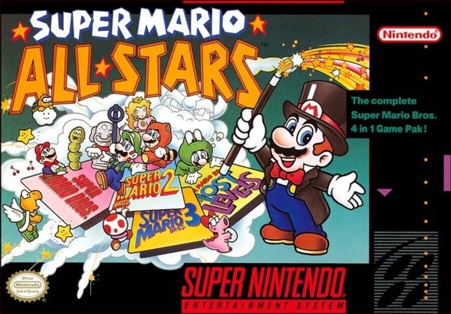
The European cover was essentially the North American cover, hence this week's Duel. It had a yellow border in certain countries (and the addition of a Super Mario World logo if it was the version that bundled that game in as well - one hell of a cartridge, that one), but the key art was identical.
With multiple Marios in different suits, various enemies and allies dotted around, Bowser appearing as a cloud behind it all, and the whole menagerie presented by Mario in a magician costume wielding a star-spouting wand, we reckon this captures the zany spirit of the adventures within very well. It's lacking focus, but there's a lot to like.
Japan

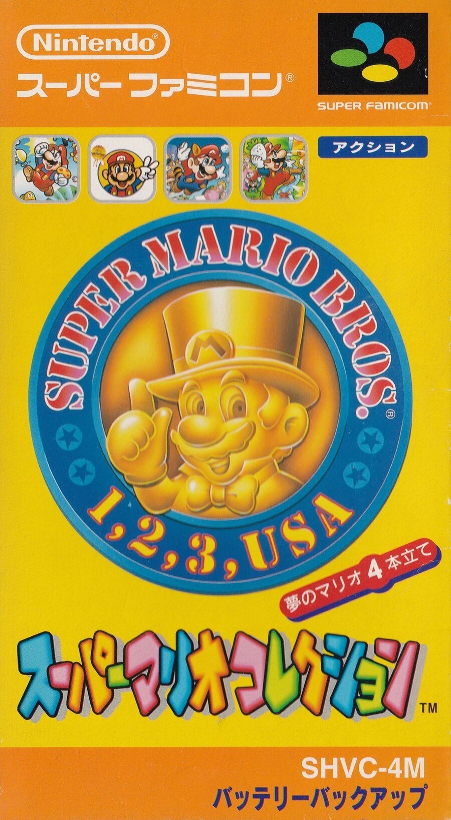
The Japanese version, on the other hand, replaced the madcap magic with a solid gold effigy of Mario in his magician get-up. Icons along the top show artwork from the four included games, with Super Mario Bros. 2 carrying its Super Mario Bros. USA Japanese title in the blue border of the big 'coin' in the centre.
We're not sure about the stencil font of 'SUPER MARIO BROS.', but it's a colourful, classy cover, to be sure. Perhaps it's a bit much, though. After all, all that glisters is not gold, right?
Yes, we do mean 'glisters'! Ask Alex.
Bonus!
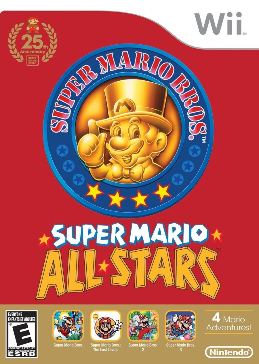
And as a cheeky little non-polled bonus, let's have a look at the cover of the 25th Anniversary release for Wii (yes, that's a decade old now), which channels the Japanese cover but tones it down with a velvety red background:

So, two very different covers this week, but which one is the best? Pick your favourite from the options below and hit 'Vote' to let us know:
And that's the end of this week's brawl! After last week's Mario blow out, we're off to gather our strength. Thanks for voting and we'll see you next time.


Comments 46
I would say Japan but they ruined the sleekness with having the little squares of the old games on it.
The NA/EU one just looks more FUN, y'know? It's easily the best of the two IMHO, even if it looks a little cluttered. The Japanese one here simply looks a little bit boring in comparison. Not bad, just boring.
I have the one with the yellow border, it's way purdier than the black border.. Should've been it's own option imo
Japan keeps disappointing me. What gives, guys?
On the Japanese cover, Mario looks like the Monopoly guy! Overall, it just looks a bit bland, almost sombre... so I went with the other one, which is more fun and playful.
NA/EU version, no contest. xD
There’s a reason why the Wii release follows Japan’s original concept so..💁♂️
Yeah, went with everyone else here.
@Francema simple & sophisticated. Like my nads
@kukabuksilaks couldn’t agree more
Looking at this makes me sad that the 3D All Stars is just promo art with a logo instead of something custom like this.
On topic, casted my vote for the Western art just for the pure nostalgia since it was one of my first SNES game.
@noswitchbutidc “nads” as in “North American Dual Screen” or..?
I always wondered where the Wii boxart came from. I thought it was something made for the rerelease of it honestly.
@syrupdash Honestly it's kind of in line with the games themselves, too. SNES All-Stars received a graphical overhaul for all the included games along with getting custom art for the box. Switch 3D All-Stars has no graphical overhaul (aside from a bit of an HD-ish look), and no custom art for the box. Unless you count the logo I guess.
Would've been nice if they made a 3D render of that SNES All-Stars Mario with the magic wand, same pose and everything, for that 3D All-Stars version.
You need to sort out your warped review.
Uk/NA. I have the yellow box
That North American box is one of my all-time favorites. Good memories there.
A/E, just more details. With out being to much of a mess.
@Kid_Sickarus men's dangly parts
Most of the time my vote goes to JP. But this one has won IMO US/EU
When the European cover launched, I remember seeing it in shops and it looked amazing. Mario dressed as a magician was appropriate, because as a child it looked magical. Especially as an outsider looking in, as we were unable to afford a SNES.
Japan's lacks contrast, it just washes out.
Very easy pick this week. The SNES box art is absolutely glorious, while the Super Famicom one is pretty bland.
Yes, the western one captures the craziness feel.
Oddly, that gold Mario icon on the Japanese boxart I believe got reused in Europe for its equivalent of the SNES "Player's Choice" re-releases (replacing the American Nintendo gold ribbon).
Gotta go with NA/Europe. Mostly fueled by nostalgia. The box art is more colorful in general.
We're brawling a day early this week? I picked the western cover. I like the overall concept. It's full of color and I like seeing the various characters from the series depicted in the classic art style. The Japanese cover is not very interesting or exciting to me. I would say the Wii version is an improvement due to the red background, but the concept seems weaker.
Japan was crushed again hehehe
NA/ Europe eeeeeasy.
Na/ Europe.
Just realized even though NA stands for North America, it could also stand for Not Available. 🤔
Even Japan voted...
1...
2...
3...
USA!
Sorry Japan.
That's all I can think of to say, Nintendo Life.
@BabyYoshi12 thats usually n/a
@Francema Probably because they were too lazy to change it to match the US/EU box art in those countries. Wouldn't really surprise me considering how lazy the release itself was lol
I never even noticed Bowser's form in the clouds before.
I think the Wii has the best cover.
I prefer Japan’s. The weird 90s cartoon Mario never did anything for me.
Still reeling from the 7/10 review for this. To each her or his own, but it surprised me to see anything less than a 9 for such an iconic piece of Nintendo history.
NA/Europe. I like when box art has a little more going on.
The European/US one is one of the most iconic Nintendo covers period!
The NA/EU box art is by far, the best looking.
I went with the North American cover, simply because it's what I grew up with and I actually do like it.
What about https://art.gametdb.com/wii/cover2/US/SVME01.png
The Western NA & Europe cover art, is just more epic looking. Gives more clarity to the games and it works with the landscape format. The artwork is more thoughtful and shows more effort.
Box Art Brawl Duels Current Total:
Japan: 1
North America / Europe: 4
Japan. The cartoon artwork of the Mario characters turns me off the EU/NA one.
The Japanese art looks too Ctrl+C, Ctrl+V
Show Comments
Leave A Comment
Hold on there, you need to login to post a comment...