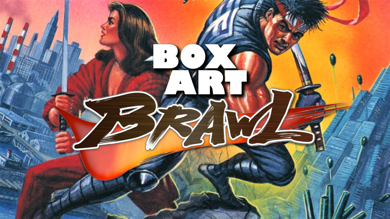
Welcome back, one and all, to the latest edition of Box Art Brawl. After a week-long hiatus to charge our hadouken, we're returning with another bout featuring regional box art variants battling for your pleasure (and votes).
Last time we took a look at Paper Mario: The Thousand-Year Door in a particularly close-run duel between East and West. Ultimately, Japan that emerged victorious from that bout with 58% of your vote. The European / North American variant came away with a bloodied nose, then, but it can still hold its head high. Good game, good game.
This week we're back with a three-way bout as Natsume's NES side-scroller Shadow of the Ninja takes on its deadliest foes and dances around not one, but two of its own shadows. Released in Japan in August 1990, this co-op action game is available to play on Switch for anyone with a Nintendo Switch Online subscription, so check it out if it's a new one on you.
Let's see how the game with three names holds up thirty years on...
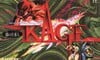
Japan
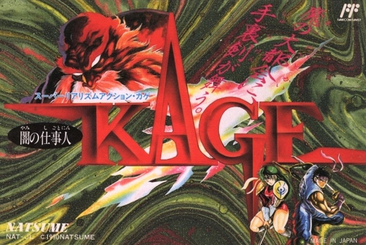
Known in Japan as KAGE or Darkness Worker Kage, the ninja protagonists Kaede and Hayate feature in the bottom right against a swirling green mass in the background. The red-hued 'KAGE' logo, styled and embossed with red blade-like lettering, takes up the majority of the landscape-oriented Famicom cover, with the intimidating white-eyed chap in the opposite upper left corner to the heroes.
We enjoy the sharp lettering of the title, but otherwise it's all a bit messy and hard to pick out individual elements on this cover.
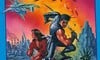
North America
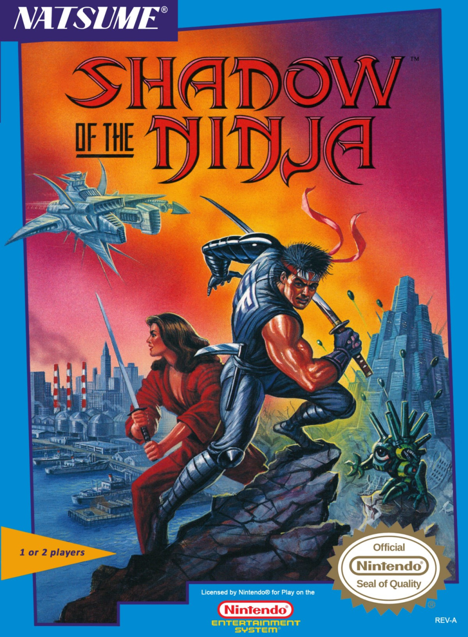
The North American version again features curved, blade-like stylings in its logo, with the retitled Shadow of the Ninja in red again. The protagonists take centre stage this time, with Kaede adopting a very similar stance to the Japanese cover as they battle against robotic enemies in a retro-futuristic cityscape. It certainly gives you a better idea of what to expect from the game.
The fiery orange and red background brings to mind the Ninja Gaiden cover, and the off-kilter border gives the whole thing a shifting, unpredictable nature; it keeps your eye from getting comfortable and has you cycling around the image looking at different elements.
The logo could be a little bolder, perhaps, but we like this a lot. Plenty to chew on.
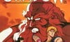
Europe
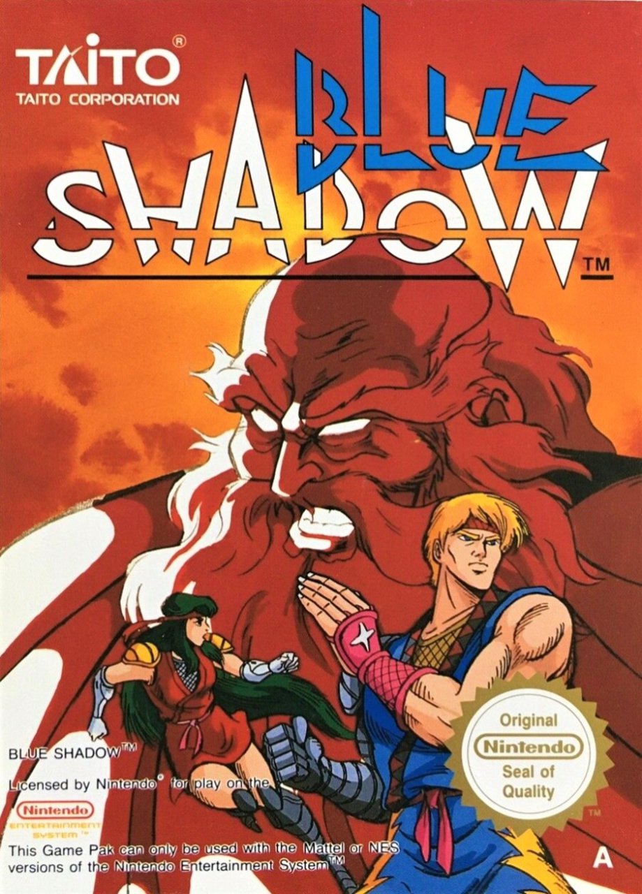
Kaede and Hayate are interpreted a little differently on the European cover, as if Axel and Blaze from Streets of Rage were on their way to a fancy dress party. The white-eyed, red-skinned, beardy guy (Emperor Garuda, we presume) is the star of the show here, and we like the heat of the colours on this cover.
Retitled Blue Shadow in Europe, we're torn on the logo. It almost looks like someone started with a shark stencil and carved away the negative space around the letters, adding a strikethrough line for good measure. The less we think about it, the more we like it (yes, that definitely makes sense!), and the logo of European publisher Taito is always a winner.
So, three very different covers, but which one is the best? Pick your favourite from the options below and hit 'Vote' to let us know:
That's all for this week, folks! Thanks for voting and we'll see you next time for another round.


Comments 38
Went NA. Just prefer the more realistic approach.
I kinda like the anime style boxart for the European cover but the American one is a close second since I really dig that 80's art style as well. The Japanese one is just a mess... xD
They are all different kinds of awful, IMHO... Bad composition, unappealing art or weird logo... That one was a tough one to choose...
Not a fan of any of them but I went with Europe.
By the way, it was retitled as Blue Shadow, not Blue Dragon.
I prefer the North American one by a mile.
Europe has the best proportioned art - simple as that. Also, it’s really cool. None of them are bad - even Japan would win against some of the other entries we’ve seen here - but Europe’s is among the best NES boxes I’ve seen.
That was the hardest choice for me out of all of these. While none are great they all are good enough.
NA for me. If you’re a kid in the early 90s and you’re renting/buying a game based solely off of the box art, NA’s has a lot of action and scenery. It would be the obvious choice.
It was a toss-up between the Japanese and European cover for me this time, so ultimately I picked the former
American version. No question.
Japan has the best design for Kaede, but isn't good otherwise.
I like the idea behind the EU art (which in general looks good), but it's more reminiscent of a western comic book than it is a manga or anime, which is what kills it for me.
So I went with US. Typical 80's action shot, but it looks good.
@Pineapple_Mohawk Yeah, I couldn't choose. I ended up not voting because they are all really terrible.
I went with the North American box art, it was a tough choice between that and the Japanese cover.
@OorWullie That was a test, of course. You pass
Blue Dragon is a different game, but at least it's a game. Shadow of the Ninja is a great game. The Japanese cover is disappointing. I like the character art, but it's so tiny. The US cover is okay, but not terribly appealing. Also, the female warrior's hair looks like beauty-pageant hair and looks silly on the game cover for a ninja game. I really like Blue Shadow's cover. Yeah, the guy shouldn't be blond, and he could have a more dynamic pose, but everything else looks rather good to me. In my opinion, the European cover is easily the best of the three.
All 3 are great. Bit NA just edges it out because it better suits the game.
Pleasantly surprised ny the EU one. Didn't expect that one to be so good.
Ps. You call it a duel but it's actually a regular brawl.
North America wins for me, Europe is second and Japan is last.
Really like the European art. NA is OK. Japan's is oog-lay.
The japanese one looks really stylish and makes me want to play the game. The other two have the exact opposite effect on me.
Europe is generic, ugly art
Japan is better, like a art canvas from museum
This is a tough one. They all look good in their own ways. The Japanese one pops with the abstract background and the European one has some good Anime-style art and detail on both characters. The characters look a little too generic on the American cover, but the background detail really stands out. I just can't pick yet.
I know that there are (or at least were) issues with putting "ninja" in titles in Europe, but surely they could have chosen a more attention-grabbing name than Blue Shadow.
Never had this first time round so there's no nostalgia at play, but I'd have been more inclined to take a punt based on the NA art than the others.
For once, I say the Japanese cover is the worst. The main characters are shrunk and squished off to the bottom right. It's a tie between the American art, which is really well-drawn, and the European, which still has elements of the original Japanese art style but has better composition than the Japanese cover.
The EU one is least "the worst" and reminds me of a manga cover.
The US one is dingy and the JPN is just a mess.
@Daniel36 Well done - that was also a test. Oh yes.
It's interesting how the guys pose is completely identical in both Japan and America.
Prefer the more obscure Japanese cover, though I totally understand the appeal of the European version.
I like the European art (why is he blond now though?) but that logo is uuuuugly. Went with NA for slightly more balance. (The Japanese has a little nice art but...it's really not very appealing to look at.)
Box Art Brawls Current Total:
Europe: 15
Japan: 21
North America: 17
I voted Europe this time round. I really love its style more than NAs (not that NAs is bad but I just find Europe’s far more striking). Japan’s art is just a mess this time, what were they thinking?
The NA one has a dope ass young adult sci fi ninja fantasy book cover vibe.
@dartmonkey Haha. No problem.
they're literally all bad lol
American cover has that generic art style you saw on all the sci-fi and fantasy novels in the 70s and 80s. The European cover stands out being different among NES cover art.
Surprised at these results. I assumed Japan would win.
The North American one is the best of the bunch, the design is nice, detailed and cohesive.
It's kind of odd that the European one is the most Japanese and anime looking.
It looks nice though.
Sorry, the Japanese cover isn't particularly attractive.
I never played this or heard of the game before.
It must've been retitled in Europe due to their strange hang-up over ninjas at the time, the same reason the Ninja Turtles were Hero Turtles back in the '80s and '90s.
Show Comments
Leave A Comment
Hold on there, you need to login to post a comment...