Welcome one and all to Box Art Brawl, our weekly vote on a bunch of regional box art variants. It's Round #53 which means we've got a year's worth of brawls under our belts - thank you to all you box art critics and voters out there! This week we're introducing an ever-so-minor tweak to the format which will accompany the regular three-way version. Yes, today is the first Box Art Brawl: Duel!
Frankly, it's becoming a challenge to find retro games with three sufficiently different variants for a three-way bout to make sense. Usually (although not always), the North American and European versions are very similar and over the past year we've begrudgingly featured a couple of games with little more than a border change or a minor compositional rearrangement between the covers released in the West. A simple two-way bout opens up a whole new world of possibilities. Simples.
Subscribe to Nintendo Life on YouTube845k
But we're getting ahead of ourselves. Last week saw the return of Mega Man to this area of combat in the infamous Mega Man 2. The results were quite conclusive, with North America in last place and Europe not far ahead. Japan, though, raced ahead with a whopping 3/4 of the total vote. Rock beats..., er, Mega.
So, which retro classic has the honour of taking part in our inaugural Box Art Brawl: Duel? Well, you read the title, right?
Japan
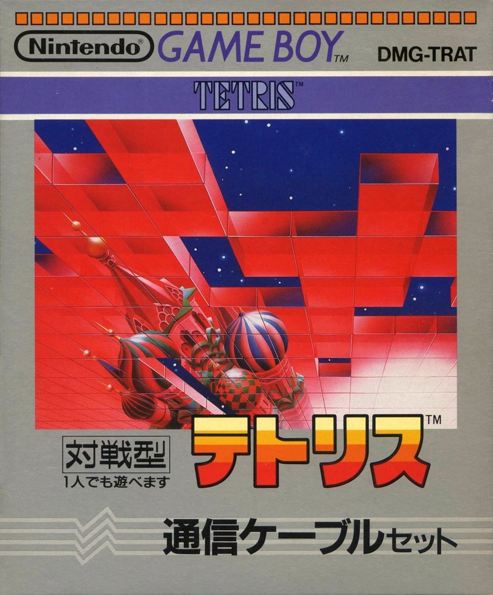
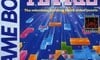
We begin in the East with a variant of Tetris that bundled in the Link Cable (the main difference being that the regular version chopped off the lowest inch of this slightly larger box). The art plays on the Russian origins of the game, with the towers viewed dramatically from above and a backdrop of transparent red blocks against a dark blue starfield.
Add the banded yellow-orange logo with a black outline and the classy blue strip across the top and we like this. A lot.
North America / Europe
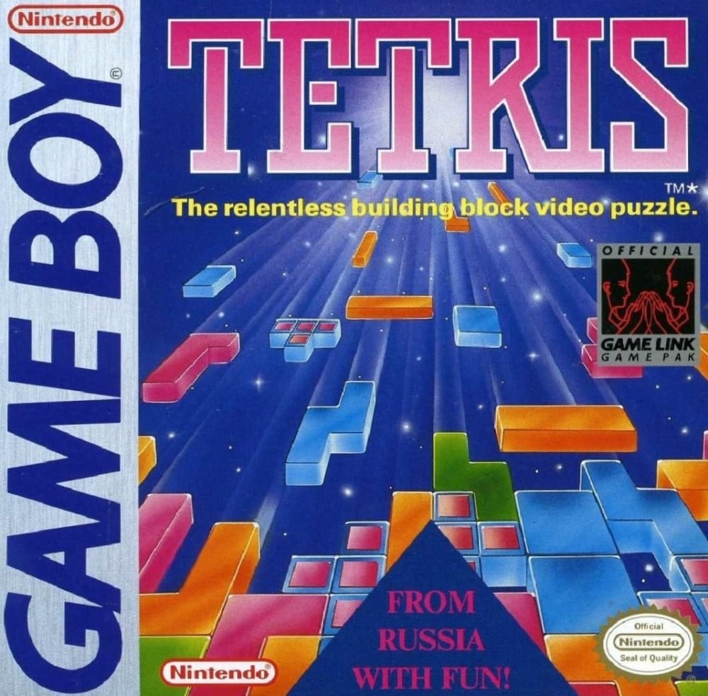
"FROM RUSSIA WITH FUN!" The tetrominoes fly to you on the cover we got in the West. With that big ol' GAME BOY strip on the left and the bold logo across the top, this cover is so familiar that it feels a little boring.
Which feels unfair. The perspective of the blocks falling towards the viewer sets the stage perfectly for the gameplay to come, and we enjoy the fact that the origin point is some undefined celestial light. It's as if some deity is gifting us tetrominoes that will ultimately overwhelm us mere mortals because they don't know when to stop. The Japanese cover will likely be less familiar and more exotic to those outside Japan, but is it better?
Well, that's why we're here, isn't it?
Three covers, one vote... No, it's different this week! Pick your favourite from the two options below and click 'Vote' to let us know:
"Hang on, why isn't it 'Box Art Duel' then?" Two reasons: we're suckers for alliteration, and 'Box Art Duel' would quite literally be 'BAD'. Yes, 'BABD' IS better! Plus, we're attached to the awesome whooshy BRAWL.
Thanks for voting - we'll see you again next week. Will it be a regular Brawl or a Duel?...


Comments 42
Voted for Japan, the use of perspective interspersed with Tetris blocks makes it interesting to look at
To each their own
Prefer the colours of the European/American one plus that you actually get to see the individual pieces rather than just a jumbled mess like in the Japanese one.
The American/European is a classic and iconic one, pretty easy choice.
I voted EU/US. The game does exactly what it shows on the cover. And let's face it, at the time, you didn't really need to do much with the idea of falling blocks as it was so kooky to begin with!
From Russia, with fun!!
NA/ Europe is iconic and much better.
Had to go with NA purely due to nostalgia factor.
Finally the US is winning one of these brawls. I always vote NA because I'm not a traitor.
From Russia with Fun is a tremendous pun, but I think the Japanese cover is cooler.
The buildings on the Japan one look out of place to me.
Box Art Brawl Duels Current Total:
Japan: 0
North America / Europe: 1
The Japanese cover is more aesthetically pleasing and exciting but the na/euro cover gives a better preview of what the game entails with a fun tagline. This is a hard decision imo.
I think NA and Europe accurately describe the game, even if it’s a lil dull. Japan looked better but didn’t really describe the game in any way. At least, I wouldn’t know what the game is from looking at it.
Love the Chemical Brothers reference, if it was one.
NA/EU, despite the terrible 007 style pun at the bottom and the creepy foetuses on the game link logo.
On the plus side, the T tetrominos look like they'd taste really good.
NA/Europe. No contest.
@Slowdive SNES with Mario All stars would like to have a word with you
I had to think about this one for a bit. There are things I like and dislike about each. I ended up picking the western cover. I like the vibrant colors and the depiction of the blocks. The "From Russia with fun" thing drags it down for me. First, I think it's a bad line. And second, I think the cover would look better without that there and so large. They could have gotten that line on the box without taking up so much space.
The Western artwork is so iconic. One of the greatest games of all time! I own both the Game Boy Tetris bundle and the standalone game box.
@hogo_ https://www.youtube.com/playlist?list=PLUiMrVMtq6VFBeBD1jSkkIfAQL4ocoot5
From Russia With Fun is so bad it’s incredible. NA/Europe all the way.
If you’re looking for more 3 way box arts, Castlevania Legacy of Darkness on the N64 has 3 sufficiently different variants. I did add this in the comments a few months ago, not sure if there is an ‘official’ method for proposing candidates?
As others have said, I like the western art better because it actually represents the game. Plus, it's the box art I grew up with!
I love St. Basil's in the Japanese art, but the overabundance of red makes the whole thing look too ominous, even if it also reminds me of the many Tetris knock-offs for PC that used to live store shelves.
From Russia with fun gets my vote.
There are a select few iconic box arts and imo that European Tetris box art is one of them. European/NA all the way.
Not choosing the cover I’ve known and loved for 20+ years feel like sleeping with by best friends girl, but I always settle the box art brawls with whichever one I would rather have as a poster. And based off that Japan gets my vote.
I like the Japanese one's aesthetic... But it's too small and too red.
So the other one wins.
The western version simply because of "from Russia with love". 😅
Japan. I rather like art on the other one, but the big sticker-like logos and taglines covering everything ruin it for me.
How can i vote for anything else than "Russia with fun"
The NA/Europe box actually showed you what the game is about, one look at it and you can tell its a puzzle gsne about fitting blocks, yet the Japan box art doesn't.
If course this only mattered to those who didn't know what Tetris was
NA/Europe for me. Classic, colorful and shows the gameplay well. Many here dislike the tagline, but I personally don't mind it.
The Japan one looks kinda cool, but, those don't look like Tetrominoes, they're just a bunch of squares. Or the person playing is really bad.
The Japan one is less relevant to the game, but it looks nicer.
Both have their plusses and minuses. But I'm in the US and so I have an affection for the Western version. Tetris remains one of my all time favorite games. The art reminds me of my 7th birthday when I got a Game Boy. And there's just something about the large Game Boy stripe that kind of warms my heart. Didn't have many games outside of Tetris, Super Mario Land and Batman for the OG Game Boy (had a color by the time I started playing Pokémon). Even though I'm partly digital now, I still have an affinity for seeing box art stripes.
Japan by far. Which goes for approx 98% of Gameboy boxes.
@echoplex Came here to say the same thing 🤙
ITS RAINING TETRIS PIECES FROM HEAVEN
Fun fact: The Japanese box art is actually used as one of the backgrounds in the game Tetris99
Hey, nice Chemical Brothers reference
I like the NA/Europe one. I like the use of multiple colors and the perspective of the blocks.
Show Comments
Leave A Comment
Hold on there, you need to login to post a comment...