Welcome back to Box Art Brawl, the weekly bout where regional box art variants battle for supremacy and the adoration of you lovely people.
Last week we watched The Legend of Zelda: Majora's Mask celebrate its 20th anniversary by giving itself a sound thrashing in this crucible of public opinion. Ultimately, the Japanese version took the gold medal with a comfortable win over Europe, while North America trailed behind and picked up the bronze.
This week we head into the garden with Pikmin 2 for GameCube. Captain Olimar's return in 2004 was a charming sequel which introduced the world to Louie and both White and Purple Pikmin. The game also got a New Play Control release for the Wii in 2009 and it really is worth digging out either of those consoles if you never got around to Pikmin 2 back in the day (at least while we wait for the ephemeral next entry in the series).
Let's reacquaint ourselves with Hocotate Freight's favourite employees.
Japan

The Japanese cover for Pikmin 2 retains the theme of the original game's art (which had a lineup of the three primary coloured Pikmin against an orange background with flowers) and updates it with the new Pikmin in a Usual Suspects-style lineup.
We like the clover design and the little flowers spread throughout, and the reminder of the Japan-exclusive Pikmin 2-e e-Reader game for Game Boy Advance in the bottom right. Understated, solid stuff from the East, then.
Europe

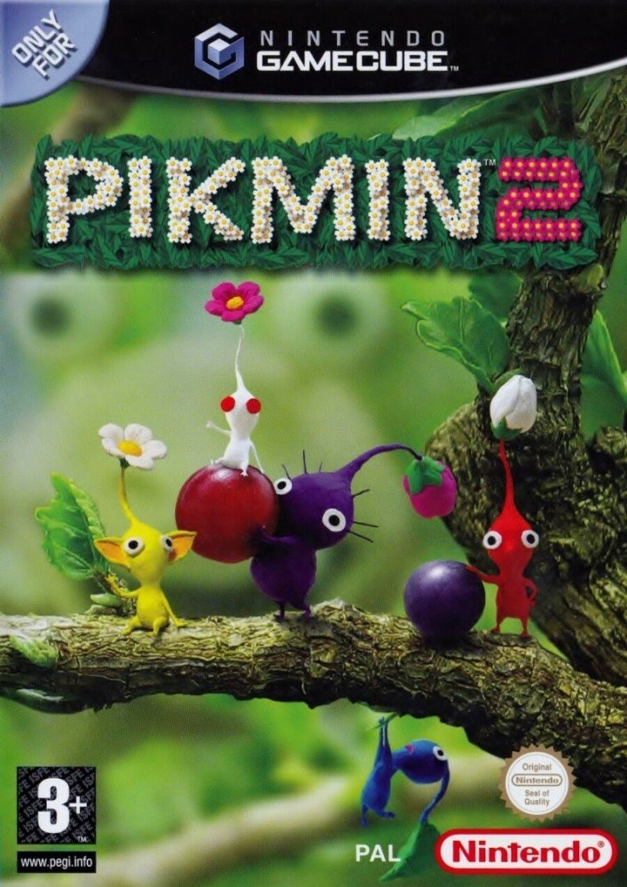
The key art used for the European release again highlights the natural setting with one of each Pikmin on a branch and some beautifully juicy fruit on display. It wasn't until we examined the shot recently that we noticed the ominous Bulborb eyeing them in the background.
With the magenta-flowered new Pikmin forming the '2' in the logo (as they do in the Japanese version), we very much enjoy the charming, calming look of this cover. It's good to get back to nature now and then.
North America

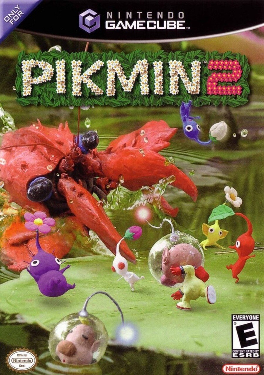
Specifically we're looking at the US version here, not the Canadian cover which was the same as the European variant. The logo is the same but the art shows Olimar on a lily pad lobbing Pikmin at a huge red beastie attacking from the water. All five Pikmin are present and correct, and we also see Louie taking a dip at the bottom.
It's dynamic and packed with that Pikmin charm, although it arguably lacks the focus of the others. We like a good action shot, though. It's a tough choice this week, that's for sure.
And that's your lot. We reckon it's gonna be a tight one, so click your favourite and hit the 'Vote' button below to... do what it says on the button:
And that's the end of Brawl #42. Yes, last week was #41 despite what the headline said originally. Are you suggesting we can't count, or have taken one too many blows to the head after all this senseless cover art violence? Whatevs. Stay safe everyone, and join us next week for Box Art Brawl #311.


Comments 50
Europe's not bad, but the North American art is way more dynamic. The hidden Bulborb is a nice touch though.
Japan is too simple and North America is a bit busy. Europe is definitely the best balance, keeping that neat clay aesthetic while focusing on the Pikmin.
The Japanese one is adorable in its simplicity while the European cover is probably the best overall as it provides a little glimpse into the mannerisms of the characters and better encapsulating the spirit of the franchise.
The chaotic U.S. cover would make a fantastic promo image, but I think it makes for an awful cover, as it seems to take a leaf out of Nintendo of America's "angry Kirby" songbook. I'm a little surprised that they didn't add frowns to the covers of Let's Go Pikachu and Let's Go Eevee while they were at it.
I went out of my way to pick up the Australian Wii releases of Pikmin 1 & 2 because I liked the US art for 2 so much.
Europe by a nose. I prefer the cute over the attacking. Dont like to see my Pikmin die.
Damn! One of the first times that I was genuinely torn between them... They are all great in their own way, but I went with the NA on this one because of the more action-y feel and overall cooler composition
@dartmonkey Japan and Europe got Wii Pikmin 2 in 2009 but its North American release was held back until something like 2012 when it was released as a Nintendo Selects game.
Europe.
We need pikmin
If there should ever be a reversible cover, it's the European and American one. Both are just so awesome!!
EU for me this time. It seems to strike the perfect balance between too much (NA) and not enough (JP) going on, plus it seems the most representative of the meat of the gameplay (gathering supplies while avoiding obstacles/enemies).
Went with NA cause I liked the action. But the blurry bulborb on Europe’s made that a much harder choice than expected.
After all this time... I never noticed the sinister Bulborb in the background of the EU Pikmin 2 cover. I'm spooked.
Went with Europe. It’s clean and I like the Bulborb in the background. Japan is too minimalist for me and NA is too busy. Although I like the plasticine look and the action in the NA cover.
NA's box is terrifying. Went with Europe. I've always liked the art in that one.
The Japanese one is too simply, the NA version too chaotic to represent the actual game. Europe all the way on this one!
Europe is certainly the most charming and full of personality. Not a fan of the 'action packed' US version. Gives me the wrong vibes. Japanese cover is a lovely clean design but I'm going EU this week
I don't know why exactly, but I find the NA cover to be a bit nasty! The creature looks absolutely nightmarish. Damn... am I going soft? I love the calm of the European cover, so I went for that.
I really like all of them! It’s a tough call. I went with the EU cover in the end, I just prefer seeing them hanging out in the tree, gives them more personality. I have an NTSC copy of this game, but not sure if it’s the US or Canadian version, I’ll check it out.
On a side note, anyone remember the animated short for Pikmin that came out on the Wii U in HD and on the 3DS in 3D? I’d like to see more of those, as well as Pikmin 4 of course!
Never noticed that bulborb until you pointed it out, quite ominous indeed...
They look like they're being lined up to be shot in the Japanese cover.
And that creature on the North American cover is horrific.
@RPGamer Why? There have been a number of decent European covers in these polls, probably fewer wins the others, but that's no big deal.
Went with Europe on this one. The reason is the subtlety of the enemy creeping behind but yet unable to get these high up Pikmin maybe. Also focuses on the main component and charm of the game and that is the Pikmin themselves. Olimar was ok and all, but I always wanted to save as many Pikmin as I could, more so than win the game haha
Europe this time, followed by Na, Japanese one is a bit plain
Box Art Brawls Current Total:
Europe: 13
Japan: 16
North America: 13
Japan is the better image but gave it to Europe because it’s better marketing.
@TJWorks OMGoodness, neither did I. I played this to death on the GameCube and never noticed it before. Only when you pointed it out.
Well I voted for Europe anyway. This was a great game, and I really cant wait for Pikmin to come to the Switch, in one form or another.
europes looks so boring. makes pikmin look like a sim game based off the cover. action olimar is gooooooo. north murica
There is something very pleasing about Japan’s simplistic cover that appeals greatly. But despite that Europe wins my vote!
I like Europe the best. Japan is bland and that crawdad thing on the NA cover is terrifying.
Europe's is iconic. I remember that image being one the first leaked images about the new game and I was so excited to see the new Pikmin types.
You all don't like the action or the creature in the NA cover? But that's what Pikmin is about. The ammount of work that went into that cover is insane. Love it.
For once I think they are all great. Worlds apart but all are awesome in their own right.
I agree with what some others have said. The North American cover is a good fit as promotional art, but it's not the best composition for a cover. Japan's visual style is interesting, but the overall cover is a bit simple and boring. I think Europe's cover is the best laid out. This is a nice case where all three covers have positive things going for them.
You say the Europe cover is calming, but one Pikmin clearly about to fall to its death. 😂
I voted Europe purely for that reason, because the other Pikmin literally couldn't care any less, and that's hilarious.
Europe, by a LANDSLIDE. Japan's cover is way too childish, and the US cover displays an action scene, giving off an ENTIRELY wrong vibe, because it's NOT what Pikmin is about.
The tranquil and natural look of the European cover is the best, by FAR. It simply exudes the calm and friendly vibe that does suit the Pikmin games SO well.
I voted Japan because I like the simplicity. Between the other two I prefer Europe, because I think the setting and staging better reflects the game overall.
The nostalgia-factor is what I blame for the European vote. NA is way better.
I like the European box art the best, the only issue is the enemy needed to be a lil more clear in the background.
I'm actually really surprised the NA cover isn't winning this one.
American cover easily. I actually like all three, but the NA artwork does something the others don't - it makes the game look FUN.
I liked Japan's
I love the Japan one, it's simple and the cuteness of the characters does it all!
Japanese one is cute, NA is dynamic but I don't like Pikmin violence.
European is cute, until you look at the threatening blurry background. European it is.
I like them all, but I like NA the best. It’s got action, and a sense of scale.
No contest, Europe takes this one hands down! That's adorable!
I voted for the North American version for being action oriented.
It's one of the few games of which I own both versions. I imported a PAL copy of the Wii release from Australia, and it uses the NA box art.
It's sad how American video game covers always tend towards violence. I mean, just look up some Kirby covers by region. It says a lot, doesn't it?
Europe for me, the nice display of Pikmin, and the beautiful foliage mixed in with the eerily bulborb makes this box art a masterpiece, maybe even the best on this ‘box art brawl’ channel yet.
The European one for sure.
(Great game. Best in the series so far. Especially the NPC one imo.)
Show Comments
Leave A Comment
Hold on there, you need to login to post a comment...