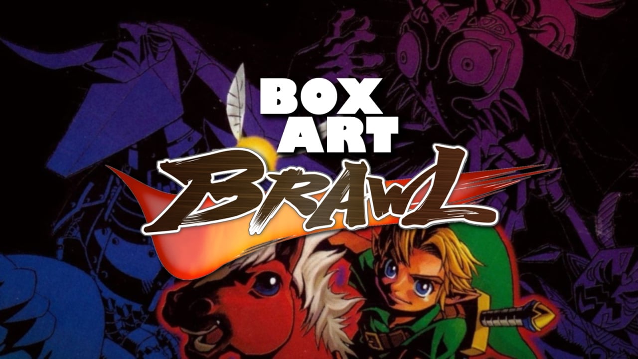
Welcome to the 41st edition of Box Art Brawl, the weekly vote to find the best of a bunch of regional box art variants from video gaming's past.
Last week we had a blast from the past with Mega Man returning to the brawl. Perhaps as expected, the infamously poor North American cover finished in last place, although the European variant managed to oust the Japanese original from the top spot. Congratulations to Europe, although we're sure we haven't seen the last of Mega Man around these parts - keep an eye out for a rematch.
In the meantime we're jumping forward to the Nintendo 64 and The Legend of Zelda: Majora's Mask, a game which celebrated its 20th anniversary earlier this week. The Zelda series previously appeared in Box Art Brawl #9 and this game's immediate predecessor took itself on in a close-fought battle in #27.
That's all in the past, though. Let's take a ride to Termina...
North America
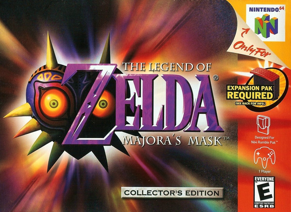
The North American box focuses on the lovely purple logo with the titular mask replacing the Hylian shield of Ocarina of Time. The subtle little 'Collector's Edtion' stone plaque sits at the bottom (the cartridge in the Collector's Edition had a special holographic sticker) and a multicoloured aura emanates from behind the logo. On the right you've got the standard North American red strip and peripheral information.
The logo's a winner in our books. The cover has impact, but the blur of colours in the background says nothing about the game. Of course, you could argue that the logo does all the talking just as it did with Ocarina. Still, with so much lovely, surreal key art available it's perhaps a shame that this cover didn’t highlight some of the game’s oddness.
Europe
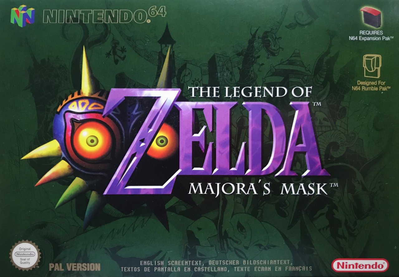
The European version takes the same logo and puts it on a rich green background. If you look quickly, it's easy to miss that the background shows the key art of Termina and its inhabitants, with Young Link on horseback holding the Zora mask.
The subtle gold highlights in the Nintendo 64 logo outline and the 'PAL Version' at the bottom work beautifully against the green, as does the purple of the title. By this time in the system's life Nintendo of Europe had given up on the black borders and this game certainly benefits.
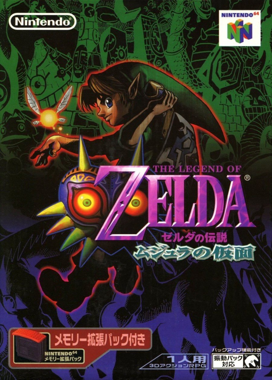
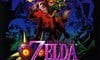
Japan
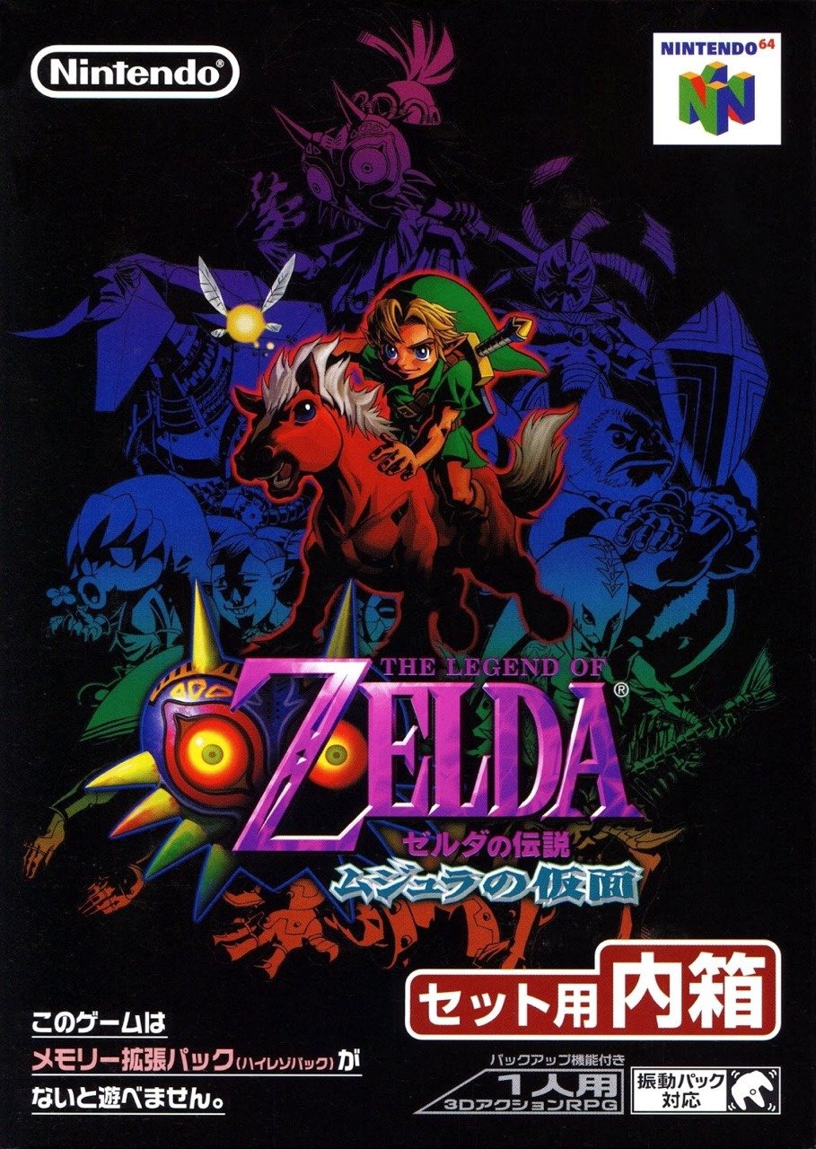
Finally, the Japanese box got another piece of art with Link and Epona above a collection of figures--bosses, mask transformations and even the Happy Mask Salesman--rendered over a spectrum of colour. The logo is present and correct, although it's smaller and gets a little lost in the colour beneath Link and his cute steed. We like how evocative of the game it is, although the richness of the European cover and the boldness of the large logo probably just edges our personal vote. You’re the ones with the power, though.
Bonus!
This week we've got two bonuses for you! In Japan the box above came in a bigger box which included the required Expansion Pak (there was also a separate cart-only release of the game which used the same image as below but put a big ugly red strip along the bottom):
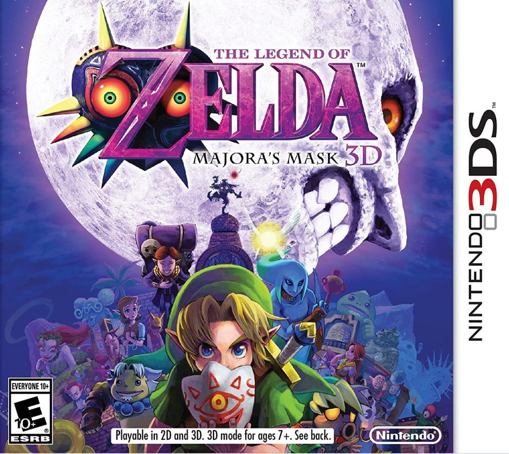
And as another little bonus, here's what Nintendo went with for the 3DS release of the game, The Legend of Zelda: Majora's Mask 3D:
And there we are! They've all got their pluses, but it's the minuses that'll decide this round. Click your favourite and hit the 'Vote' button...
Let us know below what you (dis)like about each of the candidates this week, and we'll catch you next time on Box Art Brawl.


Comments 55
Majora's Mask 3D is the best overall, but I voted Japan out of the N64 originals!
The 3DS one is the best, but out of the originals... either Japan or Europe.
Why is Europe so popular here? you can barely tell what's going on in the image.
I have a lot of nostalgia for the NA cover, but the Japanese cover is objectively best.
As much as I love the European one, I’ve gone Japanese this time, mainly because when I look at it on my phone, Link appears to pop off the screen in some cod-3D effect.
Europe, Japan's is too garish.
Put in a rare vote for EU but agree with many the 3DS art is the best!
"Why is the North American one so bland?"
Keep in mind, we're used to flat (albeit regal) gold backgrounds. So when we saw a box with an absolutely wild outward burst like that in the stores...in our heads, we heard boss music, the main theme of the anime, and "Carry on Wayward Son" all play at the same time. And, the Chu did indeed hit the fan in Termina. So that's why I'm voting NA when Japan had more art - no mood, no impact. But it does require context.
Really like the European one. Nice colour choices, strong logo, and subtle background art that rewards a closer look. Nothing wrong with the NA or Japanese boxes, especially the latter, but PAL wins this one for me.
Then again, I voted for Japan over Europe on Mega Man, and it came second. Taste, subjective, blah blah.
Easily Japan, it's not even close.
Japan is clearly the best, but the other two aren't bad.
I was thinking it has to be Europe's but then I saw Japan's for the first ever time. It looks fantastic and perfectly suits the mood of the game.
@OorWullie The bonus Expansion Pak one, yeah, for sure, and I'd have probably voted for it. But the one in the poll just doesn't do anything for me.
All great. 3ds has a fantastic steel case.
Japan cover looks fabulous! That said, all three are good choices this time around.
Ugh, more bad N64 covers. Japan all day, once again.
@KingBowser86 I like that one too and if the 2 were swapped, Japan would've still got my vote. Not sure I prefer one over the other though.
Japan because I'll always vote a cover that has actual artwork on it rather than just a plain boring logo (or near enough) cover. Though if it were eligible I'd probably go for the 3DS cover.
Europe. Plain and simple I like it
The Japanese one looks awesome. The European one is close though.
The colour choice for Europe was so strange, but it worked very well. The confusing dark background echoed the game's sinister mood perfectly. The golden text was also a nice idea since the cartridge was golden too.
Just my opinion, but N64 may be the worst mainstream system for box art, especially for North America. And Zelda box art often ends up among the most boring there is. Luckily, Japan's is more than just a variant of the logo and has actual art. Japan is my vote. Europe is okay because it also has some background art, and it's almost visible. The removal of borders is nice too. The red border really detracts on NA in general, so those start at a disadvantage.
The background on the Japanese one is phenomenal. It's too bad they added Link and Epona over the top. It kind of wrecks the effect for me.
I picked the European one because I'm a sucker for weird stuff, and that color scheme and background are great. I recognize that I'm going to be in a minority there, though, and that's cool.
I'm guessing the US votes are nostalgia based. It's just a logo swooshing. The rest have the same logo but with some additional art. I have fond memories of buying the EU one and looking at the box on my way home to play it but Japan wins for me.
Japan by far, but I would have been interested in seeing the results of the bonus two being added, if even in a separate poll... :/
I love the Japanese box and the 3DS box equally. 👹🖤🦇 I adore this game and its themes immeasurably.
The Japanese art is gorgeous.
Japan this time. They art piece is too iconic to NOT pick. NA is dead last for me; while the logo looks excellent on all three, the background, while colorful, leaves a lot to be desired.
Japan is way too busy and Link and Epona appear to be a repurposed image just pasted there. I agree that it evokes the game well and though I have more nostalgia for the American one, Europe got my vote for a lush color scheme and for its overall balance (even though Link is awkwardly cut off by the logo; it’s background, fine-line art so not too many points off there).
I’m torn between the Japanese and European covers. I have the UK game and it really is a thing of beauty in person, especially when up against the mostly black boxes of other UK N64 games. But the Japanese box art looks great too, I’d like to own it just for the box.
On a side note, N64 seems to have the most games with different box art across the 3 regions (just from what I’m seeing and what I know). Which is great, because I love the N64! The more box art I see (even the bad ones), the better.
@Noid
This is a European website, it’s no wonder European covers won out.
Though in this case I went with the European version. Zelda is a franchise where less is more. All you need is a clean logo
Japan wins this week for me.
@1UP_MARIO This is why Majora’s Mask is the only game I’ve ever preordered for the special edition. I still have the steel case and poster, great stuff.
Ah, I've been waiting for the Majora's Mask box art brawl. Not only do I think the Japan one is the best of the bunch, it is also one of my all time favorite box arts of any game. I also love the bonus Japan one too.
Whoa. I am surprised at the results, I thought NA was the clear winner...
I must say I'm a big fan of the Japan art, but I can't say exactly why, must be the vibe I get from the colours!
@Supaguy same. It also came with the pin. Great game 👍🏻
No contest Japanese cover art everyday of the week.
The Japanese cover is as thrilling and mysterious (and creepy) as the actual game so i think it represents it really well, sane for the bonus Japanese cover as well!
I was quite smitten with the European box back in the day, but I was always a bit bummed out that so much of the atwork was obscured.
Today I still find the Japanese box to be the best. The 3DS cover is okay, but not at all as eerie and dramatic as the original promotion art.
I voted for Europe, I love how muted it is and how that represents the tone of the game pretty well.
Although my personal favorite has to be the 3DS one, it's just gorgeous.
Box Art Brawls Current Total:
Europe: 12
Japan: 16
North America: 13
Don't know about the others, but if I remember correctly, the European version was on a golden cartridge
The Headline says no.40, but it's no.41.
Europe for me this time, I really like the 'simpleness' of the logo on the green background.
I pre ordered the collectors edition majoras mask on the 3ds that came with the lovely steelbook shown above, but the european box art had a massive age rating in green that took up half the box! Shame as you can see from the NA version the artwork is really nice.
@Enigk I think you need to understand how the US handles Zelda box art. For the most part, Zelda always went for this classy cover art. A simple logo on a gold background. Some people call it boring others call it minimalist and classy. Same reason why I like the Japanese Final Fantasy covers. It's just the logo on a white background. Majora's Mask stands out because it looks like you're being taken through a portal. These bizarre swirls of colours are enchanting almost memorizing, it stood out compared to other Zelda's that came before. Where once was the classy gold and now it's just being taken into blackness and the only thing that greets you is that mask.
I think all of the covers for Majora's Mask are rather great for what they are trying to do. But, I think sometimes people confuse boring with minimalist. You don't need a lot to sell someone on a game. A good example of this is Ultima 7: The Black Gate, which is just a blue font on a black box. But, there is something about it that just spins mystery and intrigue.
"Collector's Edition Majora's Mask N64 cart with holograph sticker" Isn't that actually the MOST common print of the game?
I hear the plain sticker gold cart is actually rarer.
And the gray cart I heard was actually only distributed to demo kiosk usage.
Something to maybe get upset about is that I remember some years ago somebody posted a Halloween costume made up of retro game carts and instead of using common junk games like Super Scope 6 and sports game carts, he actually used SNES RPG carts and even said rare gray MM carts.
This one was bound to be a bloodbath. Clean all the text out and I would totally wear the Japan cover on a shirt
Thank you @Franklin for keeping track. I am truly surprised at how close the results are.
Also try not to get beaten mercilessly outside Torrannce. Wanted to do a better Franklin quote/reference but am nervous that out of context it might be taken the wrong way by other people reading it.
Europe without a doubt. Nice bold txt and the black and green background compliment each other perfectly in a minimal, dark menacing way(just like the story) US just looks terrible all round and whilst i like the colours in the Jap version i think Link looks too cartoony when this game was a dark one. Europe gets my vote this time.
@Wexter I understand what you are saying. I like the simple gold background Zelda and white Final Fantasy box art but stick a picture behind, as long as it was classy and I would choose that. I think I am just going with the art and disregarding the logo for these polls. Which one would I hang on my wall if the logo wasn't there? In this case Japan.
Grew up with and still have my NA box but love that JPN box.
i think the box art of the 3DS remake of Legend of Zelda Majora really evoke the eerie and darker aspect of this game.
The 3DS one is the best cover. Out of the ones that you can vote for, the original European one is my fav here.
(An all time great game and my 3rd fav Zelda. The 3DS remaster is the definitive version so far IMO.)
Show Comments
Leave A Comment
Hold on there, you need to login to post a comment...