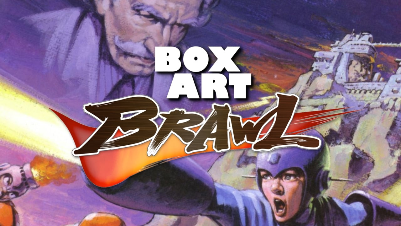
Are we back? We're back. Yes, it's time for another edition of Box Art Brawl, the weekly public vote where you decide the best (or 'least bad') of three regional box art variants.
Last week we watched cult classic Wetrix take itself to task. Following a wet and wild wrestling match, the Japanese cover emerged soaked but victorious. Europe wasn't far behind and North America was left to mop up the mess.
This week we're back with a Capcom classic: the one and only Mega Man for the Nintendo Entertainment System (or Famicom in the East). Few video game covers are quite as infamous as the North American version, but after featuring the blue bomber's third outing back in Box Art Brawl #6, it was only a matter of time before we looped back round and took a look at another game from the little guy's catalogue.
Enough waffle. Arm cannons (and pistols) at the ready, people!
North America
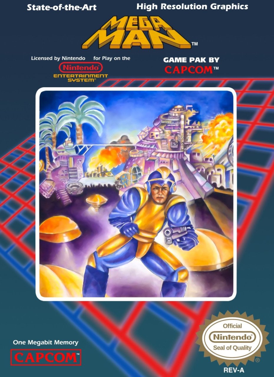
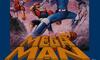
Let's just get this out of the way, hmm? This is one of the most (in)famous video game covers of all time. It's so preposterously bad that it inverts the surrounding space-time and almost becomes 'good'.
The key word in that sentence is 'almost', though. If your 7-year-old brought this home from school, you'd probably overlook the odd proportions of the titular protagonist. You'd concentrate on the lovely colours rather than the fact he appears to have a left leg and another left leg attached to his groin in reverse. You'd praise the pretty colours of the burning city in the background, and admire the lovely palm trees and surreal whatever-it-is on the left...
You probably wouldn't take it in to work and convince them to use it on the cover of this 'Rock Man' game they were bringing over from the company's homeland. No, your 7-year-old's painting would get stuck on the fridge where it belonged until bleached to oblivion by sunlight or ripped to shreds when the cat got hold of it.
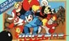
Japan
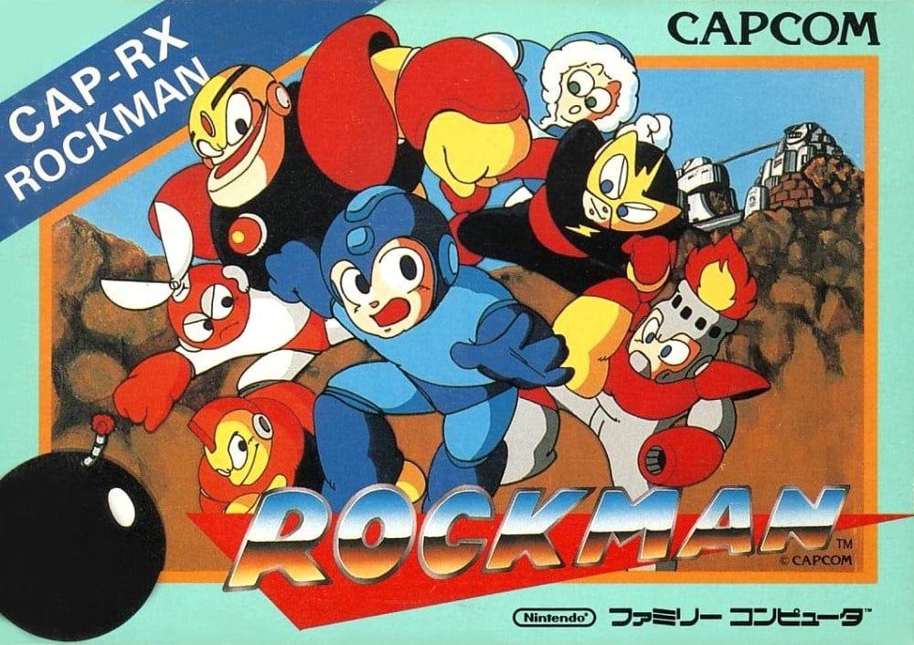
Colourful characters. Sensible composition. Shiny logo. Oversized cartoon-style bomb breaking the frame.
The original Japanese version has it all and gives us a good look not only at Rockman, but also his robot enemies. The brown-coloured blobs which supposedly depict rocks appear more like unsavoury nuggets the more you look, but the central collection of characters is dynamic enough to draw your eyes away from the background anyway.
It's a good 'un. A yellow border might have been better, but this isn't bad at all.
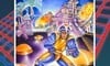
Europe
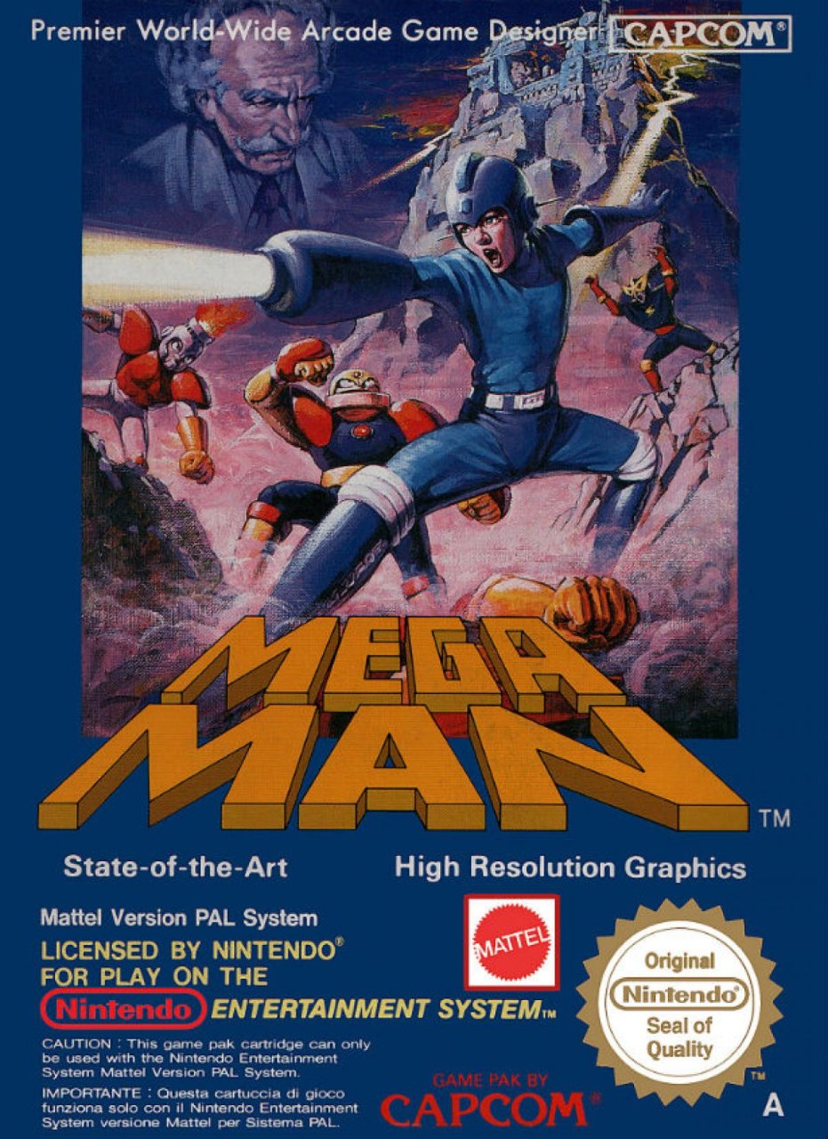
The European version gets a bespoke and rather lovely piece of key art that could very well be the poster for a mid-'80s movie version of the game. The character has a proper arm cannon and the moustachioed Dr. Wily looks down over the valley as robot masters descend on the hero. There's a big lair in the background and a whole bunch of rocks that thankfully doesn't look like they were shovelled off the floor at the stables.
That this cover diverges from the original Japanese version of the character might count against it in your view, but we think the image here is fantastic in its own right. The blue border was a Capcom standard at the time (as was the North American's border in that territory), and you either dig the conformity it provides or you don't. We're split.
And there we are! Kitsch novelty value, original anime intent, or oddly-realistic reimagining? Click your favourite below, hit the 'Vote' button, and look at 'em go!...
The original, and the best? We're sure we haven't seen the last of the Mega Men around these parts, but that's all for this week. Stay safe, lovely people, and we'll see you next time!


Comments 76
Looks like we have a clear winner this time... xD
Talking about a round of bad box art. Went with Japan's less then realistic take.
Oh and the NA one just might be one of the worst cover art of a popular game ever.
I like how bizarre Europe’s is.
While I would normally dig the Japanese cartoon one more, it just looks so bad to me. The flat colors, the fact that all the robot masters are looking at Mega Man's bum, I just never liked it.
The European box art Mega Man doesn't look half-bad, compared to the others. It's composition is readable, MM looks like MM, and the brushstrokes and details are rendered nicely.
Too bad Guts Man and Fire Man's goofy faces clash with MM, and Dr. Wily looks like he's patiently doing his business in the bathroom.
One thing bugs me about the European one - the logo overlaying the prone body of an unknown baddie, kinda looks like MM has somehow shot someone’s arm off.
I just recently discovered the European cover. And it's wonderful, very well done, I love it!.The Japanese one its almost as if someone just traced an professional drawing. Its so amateurish, not particularly good.
Japan because the other two are an abomination. Though to be fair, while the American one is just unspeakably hideous, the European one is actually a really cool cover, it just has the minor issue of not looking anything like how Mega Man artwork should look...
The NA one for me is just too classic.
I had to vote for it because it shows the roots of where that game came from and the total disconnect between whoever was designing the game and the box art illustrator. It’s total 80’s with the baggy sleeves and just total cheesyness.
Love it.
In this case, opposed to many in the NES era, the box art is misleading in a good way! The box sucks and the game is amazing! 👍🏻
Europe's is exciting in an 80's way, Japan's is too average to be worth a vote, while North America's is quite possibly the most ridiculously bad box art in the history of video games.
That's why I voted for North America.
It was a hard choice, but the two with "high resolution graphics" printed on them are disturbingly beautiful in their own ways. The Japanese version is just normal.
I just want to know why Mel Brooks is on the European cover
@OorWullie NA looks like it was made by the winner of a children’s art contest.
He is a loathsome offensive brute... yet I can’t look away.
I voted for it too.
Obviously it's NA.
I voted North America (not even joking...I felt sorry for it. I mean, look at it! Poor thing. Hope I cheered it up.)
Bizarre as it may be, Europe's actually tried! But Japan's ultimately wins despite its decidedly dated art style and strange color palette.
I actually really like Europe’s cover. The JP one is classic but there’s something quite impressive about Europe’s reimagining.
Apart from the dodgy face on America's it looks like he is at one hell of a disco!
I clicked into this primarily to read the blurb about the North American cover. XD I don't know what they were thinking at the time....
I went with the Japanese cover as I feel the art better captures the heart of the series, but Europe's is a close second.
I had to choose Japan.
I was almost convinced on the European cover, except for one detail: isn't Mega Man's buster arm canonically the left arm?
Though I was wondering just how many people would choose NA just because of how famous it is.
Also, did Mega Man 1 have two different PAL region boxarts, or was it just MM2? (looking at GameFAQs, maybe it was Germany that got a different box from other countries?)
(have to be amused at the Mega Man 5 cover art: the PAL version just took the US art and gave it a bit of an anime-faces touchup. Sort of a reverse-Kirby. )
Harder to tell from the box art on GameFAQs due to the washed-out colors on the EU image, but it looks like MM4 just changed Mega Man's face between the two regions.
The NA box art is sooooo terrible it's amazing. It was so bad that it spawned a tribute character in Street Fighter x Tekken (Bad Box Art Mega Man). Clear "winner" for me.
Disappointed NA didn't win. Widely considered the best boxart of all time.
Interesting how on the European cover they even tried to create a more realistic version of the Japanese cover's lair. Then again, even the NA version attempted a somewhat... loose approximation.
Europe reminds me of those "gritty" Mario re-imaginings people loved back in the mid-00s.
The NA write up cracked me up. Nicely done.
The US cover can still make me giggle, even after having seen it so many times. It’s just extraordinary.
As for Europe, it’s Mega Man. Mega MAN. Not Mega 12-year-old Boy. This looks like a sequel to The Last Starfighter or something. As a film poster, it’s not bad. As a Mega Man cover, it’s a fail.
Japan should win - it’s actually good.
Nice Friends reference in the subtitle, that made my day!
The US cover looks so disaster LOL 🤣
Haven't we done this one already?
The US version... 😂
To me, japan wins easily.
I always wondered how in the world that NA box art got approved, it’s horrible. I made better Mega Man drawings when I was 10.
Europe’s the least derpy one
First off, even if people vote for it, NA is horrible. Horrible. The fact that it's hilariously bad doesn't make it good. What's going on with that thing's shoulders? Also, his helmet is sitting straight on his head, but is crooked by design.
I don't know if Europe's cover is a good game cover, but it's well done. I can see how some people may find it creepy in a more realistic style, but I think it's good. It reminds me of some early 1980's game covers, like Night Stalker for the obscure Mattel Aquarius home computer(it was also an Intellivision game, but had a different cover).
As for Japan, I like that art style a lot and find it very appealing for something like a game box. It's simple in style, but it looks good and seems to fit the series. Japan is my pick.
I like the cute Japanese one
Japan and it's not even close. Keji Inafune may not be the most revered game developer, but his art style is awesome.
The US art is so bad this isn't even a fair match up.
Europe is surprisingly really good (maybe even amazing) as an art piece, but it doesn't accurately portray the game's intended tone, and has too much text.
Japan correctly gets the game's tone & style right, but it looks a bit unpolished (almost like a first draft, and the final version should have had a bit more detail).
A toss up between the latter two, but I went Japan.
Box Art Brawls Current Total:
Europe: 12
Japan: 15
North America: 13
I should like Japan's more, but it's kind of lazy: just some robots and a bland background. I would have no idea what the game was about if I didn't already know.
The NA one is funny and nostalgic, but... no.
So I picked Europe. It's well drawn, and strikes a good balance of realism and the weirdness of the game. It reminds me of an old-school Castlevania cover.
That's an easy one. Clearly the North American with his "cool dance moves". 👍
The European cover is really great! Its art style is eye popping, has the arm cannon instead of a pistol and shows off Wily and the Robot Masters! It gets my vote.
Japanese fits the plot/graphics, but the British one is kinda awesome, NA is just misleading.
The Europe one is just a realistic take on Megaman. It's definitely still Megaman though. I'm torn between it and Japan. US is just awful
Pretty sure the "US" version was used here in Holland as well, since I remember it and never saw this EU version. I kinda dig it. Looks like an 80s movie poster. The Jap version just looks lazy to me, honestly. More like fan art drawn by me than official work.
EU version obviously doesnt jive with the game's anime aesthetics, but I do like it.
I had to got with NA for nostalgia's sake. I had it is as a kid and loved the game. Mega Man 2 was my favorite in the series. But I don't think I even correlated at the time that the box art guy wasn't what Mega Man was in the game. I just really liked the game.
Yes I had to go with the NA for nostalgia sake.
North America for the win, for me.
Definitely Europe. It's one of my favorite box arts ever.
The North American box is one of the greatest in game history. Any other choice is ridiculous.
Ohhh come on, North America is the obvious choice. You guys have no taste.
From NA here, and had never actually seen the European one. I kind of like it better than the Japanese one so I voted for it. Though the original one was quite hilarious (I had the game back then, though we threw away the boxes after getting the games).
You can't even deny the NA cover is the most iconic. It gets my vote.
I couldnt NOT vote for the NA version. I tried. None of them are clearly the best choice in my opinion. Maybe Japan because it fits with MM art through the decades. The European version is amazing but very unsettling. It feels more Ender’s Game than Megaman to me.
NA is awful. Awful, awful, awful. As a kid I knew it... I remember thinking “That looks nothing like Megaman.” I didnt call it bad. I just thought it was odd and somehow that added to the intrigue of the game for me.
I’m blathering on, but yeah. NA all the way for me. Not because its good, but because its so bad it corrupted my soul.
How North America isn't winning this, I'll never know.
European megaman is here to kick ass.
I find it interesting that even though the Japanese cover most closely resembles the game, the European one has Mega Man using the correct weapon... Even if it's one the wrong arm. I'm a sucker for 80s asthetics so I went with the European one.
The North American cover is one of my favorites of all time for all the wrong reasons. I just can't stop laughing whenever I look at it.
(But yeah, I voted for Japan, which - wait for it - rocks, man.)
Geez, that European version is beautiful. The North American version is weird but cool. I remember seeing it as a kid, and wondering what that game was about.
It's also interesting to note, considering how people often tend to say things like "Nowadays the video game industry is obsessed with graphics and power, back in the day it was all about gameplay." etc. Well I can't think of many PS4 or Xbox One games that mention "State of the art high resolution graphics" on the front of the box. Point being, the video game industry has always been obsessed with power and graphics.
I voted Europe reminds me of my old french sci fi comics from way back when.
Europe's cover is almost like a "Dark and gritty" reimagining of Megaman a la Bomberman Zero but the characters are more faithful in design to their original pixel forms.
@Haywired Some gamers of the time were also obsessed with power and graphics. I was a kid during the Sega/SNES era so the rivalry between the system on my playground was fairly friendly, but I've seen screenshots of the old BBS boards (a very early Internet forum in the late 80s/early 90s) where people argued about the tech side of the hardware for consoles and computers alike and claimed superiority when their preferred gaming machine was more powerful.
Had to pick the NA box. Such a classic
Ohhh I actually like the european one. It's like the NA box art, but they actually tried
I always kinda liked the goofy looking US boxart, but, after seeing the European version, that's easily my favorite. It's really cool looking.
Loved all these. Europe's seems pretty cool, going for the whole 'envision what this may actually look like' vibe. Still love America's in the sense that it was my first Mega Man box art experience and it's so so so bad it's almost good
NA, it's so bad it's a classic.
Honestly couldn't decide between the 2 contenders, so went with the hilariously bad one. I mean, not many covers have actually made me laugh out loud, but this, this made me burst out followed by little giggles like I was a school kid again.
I mean, it looks like that mega man was having a bad day; First of all, his newly acquired helmet replacement doesn't fit his head... Secondly, a wasp seems to have got caught in his suit when putting it on, leaving his right leg with a nasty swelling because he's mildly allergic to the toxin and to top it all off, he's accidentally followed through when trying to let out a quiet one. Now he's looking around to see if anyone has noticed and find the best route to a public lavatory. Poor guy.
The European one would be a lot better if Mega Man was in a less bizarre pose. Like why are his legs spread so far, almost as if the artist coordinated with the North American artist? And why’s he holding his arms like that? And why is he screaming? Other than those issues it’s great.
Japan by a landslide.
The North American cover though - that's something special.
I can't believe 10% of the people answered the North American version looks the best! x)
I'm sorry but the NA is so awful that it's fantastic. It's one of the most famous box illustrations of all time. Perhaps, THE most famous?
It easily gets my vote. A true classic.
I almost voted NA out of pity... Almost.
There are struggling cover artworks all over America. Deprived of their original source material which we have the luxury of taking for granted. Just one vote can support an under appreciated (I'll not say masterpiece, because what does that REALLY mean) piece of art for up to an hour. So please, use your vote and think about happy accidents and forced errors this season. Thank you.
Vote for NA now.
Europe box art is really good, despite the realistic and movie aspect of the box art.
@Spoony_Tech nope NA isn’t the worst
@AnnoyingFrenzy
The Japanese box art doesn’t look bad. The European looks bad, it’s way too realistic and looks more like a movie poster. That’s not a good thigg no. And no the flat colors are accurate to what Megaman looks like. And the robot masters aren’t looking at rock’s bum. Wtf is you on?
@Zequio Hell no, the Japanese version looks way better and it isn’t amateurish and it IS particularly good, in fact it’s great. The European version looks like a poster to a terrible low budget sci fi movie. THAT is amateurish.
@Cotillion NA verison isn’t bad and Don’t scoop up that NA box and it isn’t a factor nor is it bad.
@Haywired European isn’t an abomination but it isn’t that good. Also nah Megaman should look like that European one as much as he wants.
@TimboSlice There is no disconnect and it isn’t baggy sleeves or total cheeseyness. Stop.
Show Comments
Leave A Comment
Hold on there, you need to login to post a comment...