Welcome back, you beautiful people, to another edition of Box Art Brawl, the series where regional box art variants get subjected to public scrutiny and ranked according to their beauty by you lovely lot.
Last week we had a true classic in the form of The Legend of Zelda: Ocarina of Time, which unsheathed its Master Swords and did valiant battle against itself. We have a real soft spot for the European version, but the gold North American cover eventually emerged as the victor in a competition which was neck-and-neck for a while. NA walked away with 40% of the vote in the end, with Europe banking exactly one-third and Japan taking the rest in third place. An honourable performance from all involved.
Subscribe to Nintendo Life on YouTube846k
This week we're spectating a Mario Bros. bout - the NES port of the arcade original from before Mario and Luigi became 'Super' (you can go back and see how Super Mario Bros.' box art brawl turned out if you’re interested). This title has a long and fascinating history, though many gamers probably know it best as the extra mode you ignored on all those Super Mario Advance games for GBA. Today, though, we'll be concentrating on its NES and Famicom covers.
Without further ado, let's hit that POW block and get cracking.
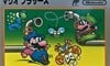
North America

We begin in North America with a cover that mirrors Super Mario Bros. with its enlarged sprites and black background. As with all the black box games, we admire its boldness and Nintendo's choice to highlight and magnify the graphics of the 8-bit titles rather than hide behind an imaginative piece of key art that looks nothing like the game itself.
Big, bold, Mario in blue. What's not to like?
Japan
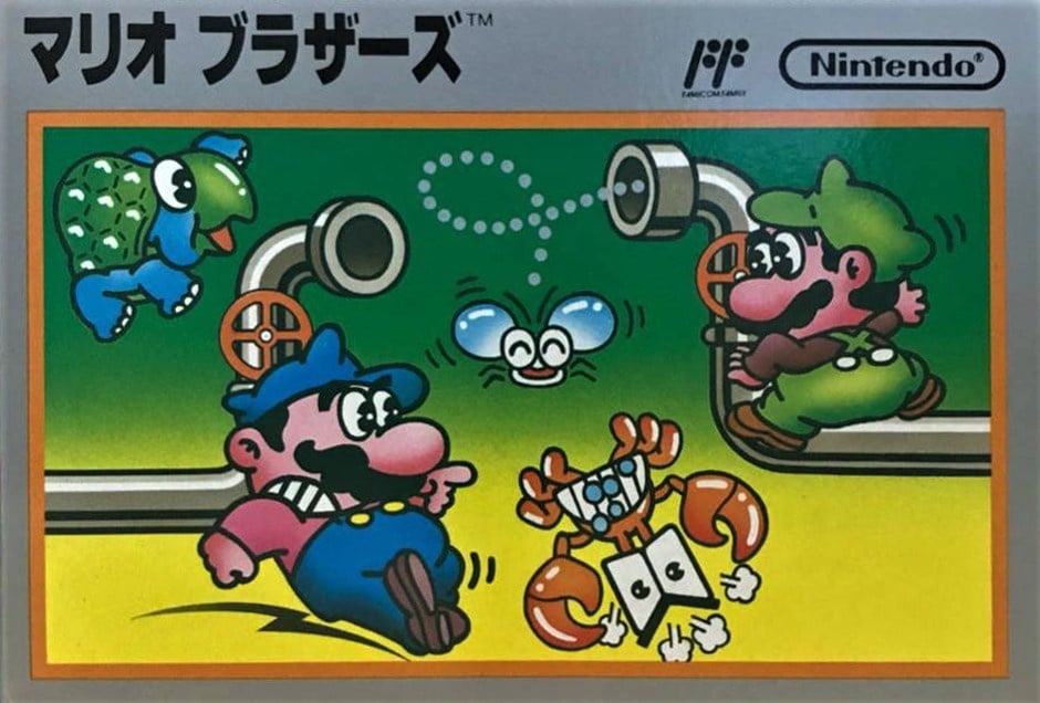
The Famicom port uses a colourful piece of art showing the Mario brothers against a yellow-green background. Three enemies can be seen and the grey pipes coming in from either side give a decent overall impression of the game. This comes from a time when Mario and Luigi were literal palette swaps and that is reflected here.
It's nice. Unremarkable, but very pleasant.
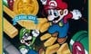
Europe
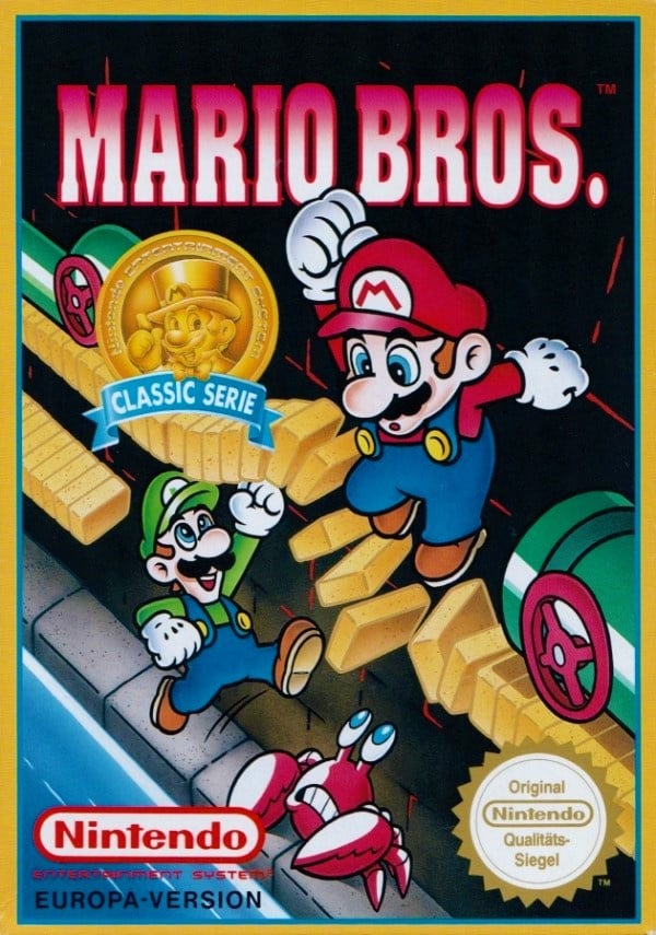
Yes, just as with Super Mario Bros. we've chosen to go with a specific regional variant of the game for the European release. A couple of different versions exist, including one which is more or less identical to the American version, and another short-format version which used the art from the Famicom box.
Here, though, we've chosen the Europe-only 'Classic Series' 1993 re-release, for variety's sake. This version incorporated some changes and gameplay tweaks from Kaettekita Mario Bros., an expanded Famicom Disk System port which improved the visuals a touch and added the ability for Mario and Luigi to change direction mid-air, among other things. If you're interested to find out more check out this video of the original release running alongside this version.
As for the cover, it benefits from the art style we've come to know and love and recalls the perspective of Donkey Kong throwing barrels down on the moustachioed Mario. It's colourful, for sure, although a tad uninspiring for our tastes.
Bonus!
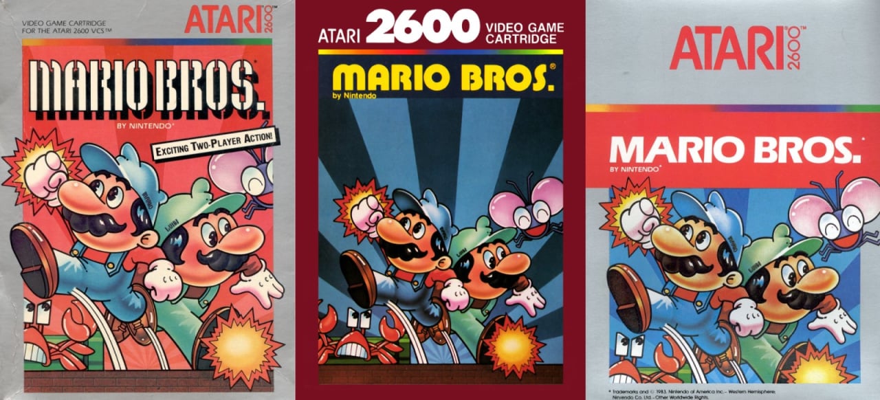
And as a cheeky non-polled bonus, here's a little look at three covers of the Atari 2600 port. Gotta say we like 'em all:
So, three very different covers but which one gets your vote? Click your favourite below and hit the 'Vote' button for cast your ballot:

And that's another brawl wrapped and bagged. We'll see you next time for another round and in the meantime, have a great week.


Comments 66
Unsurprising results.
Europe beyond a shadow of a doubt.
The USA box art is bland while the art of the Japanese one, is just ugly.
The PAL version has the brothers looking like they should.
As well as a more inventive camera angle, making things look more engaging and animated.
( Even if it's cheating, cause by 1993 Mario bros was well and truly established )
Wow, an actual good Europe one for once 😂😂
How about the cover of Holy Magic Century -Quest 64 for the N64 next time ?
I'm slightly attracted to the classic pixel art on the NA box, but I have to go with Europe this time. Granted, the designs were better established by then.
69% ha ha
(Nintendo Life Makes Me Write Too Much)
I was going to choose Europe as it's clearly the best looking box, but the fact that it's from a re-release at later point in time (post SNES & SMW) when the series' art direction was more established makes it feel like it's inclusion is a bit of a dirty move in favor of a Europe win.
With that in mind I went with the NA cover.
Really should have had only the originals. Feels like cheating now.
The Japanese one is my favorite. Sure, the European one looks technically the best, but it's of a very late re-release, so I don't think it should be counted.
I don't really like the American one. Sure, these pixely covers are what they are, but I don't like the fact that they used Mario's sprite from Super Mario Bros. And I get why the box arts were like this at one point, but artistically, it doesn't look great in my opinion. At least the Shellcreeper looks funny.
Which leaves us with the Japanese art: it's charming as heck. Sure, it doesn't have a ton of detail, but it's always fun to see how Mario looked before the more modern times. It's so iconic and fun.
Since NL decided to pick a re-release box art for Europe's release, than we should have included OoT 3D's box arts in the polls since we're counting re-releases and remakes.
This time the EU cover art takes the cake! Yet... I kinda like the JP version, it's a weird but oddly amusing art style.
In France, Mario Bros. had the same cover as the US version. This cover might have been used for budget/classics re-realease.
And the Japanese version might have been drawn by Miyamoto himself as this how he draws Mario.
Europe by far. Really cool, dynamic image. Though does have an advantage over the others as it came out much later, so the character models and colours for Mario artwork were more refined and established by that point. Can't vote for the US one because I hate those old "big ugly 8-bit pixel art on a black background template" NES covers. No cover art should ever be in-game graphics.
Atari 2600 easily.
Japan hands down, you're all crazy.
I’m rather attached to the US pixel art and know why they made that choice, but I like the European one.
I have a mario figurine based on the art of that Japanese version. Same pose, coloring etc. I like that one most and think the European onebis boring. I like the days when they hadn’t solidified exactly the style of Mario and everyone.
Felt I had to vote for Europe's as the best cover even though it released so many years after the other two. Honestly I think the Atari art is probably most endearing.
I voted for the European cover this time around.
Kinda don’t like any of them...
Using the 1993 re release is cheating. Almost 10 years of Mario art to take inspiration from.... So my vote goes to Japan
Why is the "S" in Series missing on the European box? Is that a European spelling?
So around 20- 30% of the voters here are trolls. Ok then.
Blue Mario thinks he can jump on that turtle. Little does he know...
@dok5555555
No , that's German spelling.
The Nintendo seal is in German.
@KitsuneNight Ah! ok thanks.
North America. Though the European Super Mario bros/Duckhunt cartridge looks very similar.
@Henmii
European Super Mario Bros has had several different covers.
Japan all the way. The American one he's about to die, then the UK one isn't representative of the Mario brothers at the time. They didn't look like that when the game was released and I prefer when Mario and gang weren't so cookie-cutter copy and paste models like we have today.
No surprise Europe again. Europe by far has had the better art work time and time and time again. Japan’s was always going to be out there more often than not but North America stinks the place up so often. They like VERY simple things. Explains a lot.
I picked Europe based on the selections provided. I've never been fond of the NA black boxes of the early games. The earlier European boxes seem to have the same general black-box design. If this comparison used an original variant from Europe, I likely would have picked Japan.
I have to go with the North America one as it holds so many memories for me. I remember the first time seeing it thinking it was a sequel to Super Mario Bros since the box art was similar. It was also before I knew that this game existed in arcades years before SMB.
Chose Europe because mario is getting wrecked, not luigi.
Yeah, Europe wins here. Japan is so weird and while I like the NA cover, it only feels iconic with Fire Mario on the SMB box art.
@Haywired That was kind of an important choice in the US. You know, a few years prior, the US had somewhat of a video game crash, mostly due to many games being produced extremely quickly and cheaply, and even if the box art promised some epic action game, the actual gameplay and graphics may have looked and played horrible. That's why Nintendo of America decided to put on the box an artwork that kinda looked like what was actually in the game, so people would immediately know that the game itself looked competent enough, and don't forget that these graphics were very impressive back then compared to what something like the Atari 2600 could do.
The US version looks like they're trying to con people into thinking they're getting Super Mario Bros.
I like the Jap one but the EU conveys the game best
Europe? Really. It looks cheezy and poorly drawn.
For once the Japanese one is clearly the worst. The European version is my favorite but I really like the early US pixel art boxes. It loses points for not being accurate to what the game really looks like though.
The Euro boxart is the best of the NES ones, but the Atari 7800 version is probably the best of the original home ports. It has the icicles that are missing in the NES version and while the animation is choppier, the color and proportions are more correct.
It is a bit of a shame that it was held back from release for 2 years, as it might have given Nintendo a run for their money.
I'm always a sucker for the classic pixel art of the NA covers.
Box Art Brawls Current Total:
Europe: 7
Japan: 11
North America: 10
None of the above, you missed one, the Japanese one with yellow/orange background - https://www.flickr.com/photos/bochalla/5099355811
Well this makes it difficult to vote for the Europe one because I am 99% sure we must have had the variant that matches the American version, so I have to say, this week has to be America, it’s oozing with nostalgia for me.
Reading the comments now, and seeing that the Europe one was a later release makes me so glad I went with America!
Choosing the European art feels like cheating, but it's easily the best. Absolutely adorable, and makes me yearn for those days again.
Mario Bros. was one of my very first video gaming experiences, circa 1993, albeit in the form of a DOS clone called Mario Brothers VGA.
Close! I used to have the Euro one that was pretty much the NA cover whenI was a little kid so nostalgia hits. The fact that the Euro 1993 release has the right colour scheme and both brothers pulls it just forward a little.
Wow, they're all good for once! But using a re-release is cheating. Shame, shame.
The European version is cool but the Japanese version looks timeless.
Atari 2600 the original 1983 silver box release,that's the one on the right.
@Franklin US hands down... the 2600 version.
I like the 2600 cover the best, but of the three we're officially voting on I gotta go with Europe. I also like that this week we actually get three very different cover images to vote on, more often than not we're just voting on different variations of the same cover image.
I don't think the European one is cheating just because it's a later release using the familiar art style. Thing is, even without the familiar art style, it still just looks the best. Even if you were to replace the modern designed Bros on the European box with the older design of the Japanese one, the European one still just looks better.
As soon as I saw the title, I was like "they're going to cheat with the European cover, aren't they?" and they did.
In my opinion, it's a race between NA and JP only.
Oh man, I have nostalgia for that US box but that Euro box art is nice... first time I feel the European box is not garbage (sorry, euro boxes are almost always a small rectangle inside a big black rectangle and for me that’s 🤮
It was a hard decision between the Japanese and the European box art but I'll go with the PAL release for this one.
The Japanese version, for the most part, represents the characters by faithfully displaying their color scheme.
To note Luigi's colors matches his arcade appearance rather than his N.E.S. one but I'm fine with that.
The European version, however, features a more complete scenario with a clear sewer setting with adequate use of lighting.
Plus, Mario's subtle reaction to Luigi distorting the platform is mildly amusing.
The Japanese box is the best.
These aren't the same game, the European version that uses that cover has graphical differences. The European version of the same game box art is just the black box N/A one.
@Hazzerboraco It's also a different game.
I really like this series of box art polls. Please never stop doing them!
I’m surprised by the results. Sure the EU has good art, and it’s certainly better than the JP. But the NA box is timeless and classic.
If I could've, I would've voted for the Atari version, if we're being honest. Which sub-type? The big silver, even though the small silver (red background) is the one that's actually sentimental to me.
That said, out of 28 brawls so far, I think I've been with the majority on maybe 20? 21? 22? 19? I dunno. I haven't kept perfect track. This may be the first time I've voted for the least liked one, though. That's right, I went JP on this. I almost went EU, though. I really had to think about it.
@KitsuneNight,
I know, but mine looks similar.
@Franklin European one looks better lol
When was the European version released? 2006? Doesn't exactly seem fair...
@Skulks
1993
I voted for the North American box. I have always liked the "black box" games' artwork.
Europe here. The art and presentation is the best. The Japan one is the worst one for once!
Show Comments
Leave A Comment
Hold on there, you need to login to post a comment...