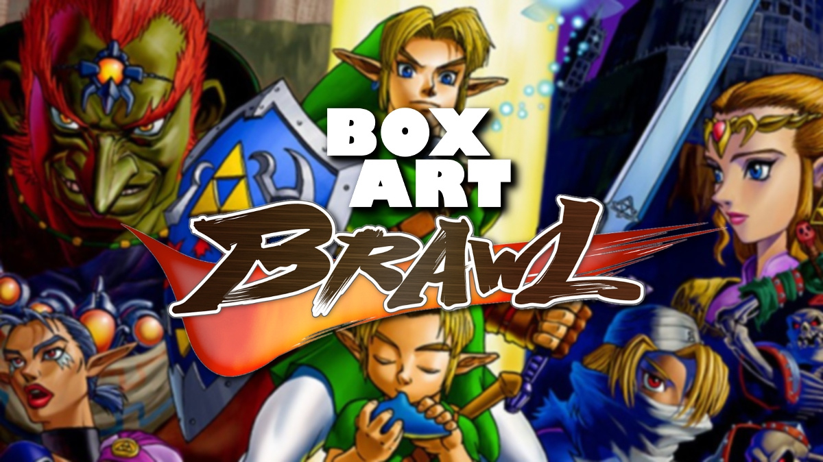
And here we are once more for another edition of Box Art Brawl, the weekly battle between regional variants of retro game box covers to find out which one you think deserves gold medal in the looks department.
Last week Super NES classic Castlevania: Dracula X bared its teeth and got down to bloody battle until the Japanese version emerged victorious having sucked up nearly two-thirds of your vote. North America trailed behind with Europe a distant third.
Today we go back to the Nintendo 64 and The Legend of Zelda: Ocarina of Time, the game which took Zelda into the third dimension in such fine form that you could argue it's not until Breath of the Wild that the series has genuinely moved forward from the blueprint laid out back in 1998. For such a revered series we've got three suitably reverent covers below for your perusal.
Master Sword at the ready...
Europe
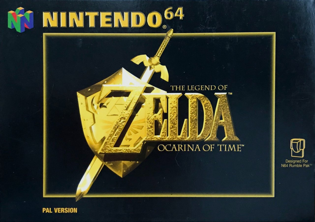
Beginning this week in Europe, we get a stark black background with the logo, here rendered in bullion-like yellow-gold, slap-bang in the centre. The traditional black border of this version works seamlessly here with the frame being broken by the Master Sword in the logo. It's simple, elegant and with just the sword, shield and the glint of the logo, we know an epic journey awaits us, even if it doesn't elaborate on the specifics. It's probably got monsters and stuff, innit.
Japan
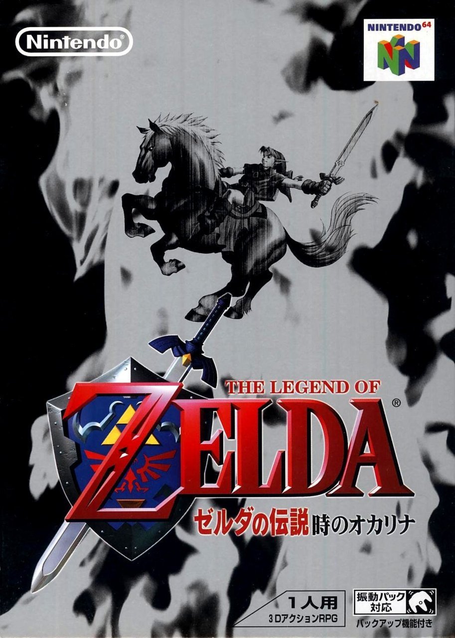
Beyond the colours of the game's logo (and the N64 stamp in the top right corner), the Japanese variant goes for a washed out, smokey monochrome cover that puts Link and trusty steed Epona in the centre.
This subdued example impressed us initially, although that wore off after a while and the more we looked at it the more vacant it became. It gives us a little more context by having the protagonist on the box, but somehow having him alone behind an abstract, flaming veil suggests less about the game than the titles adorning the other two examples. It's not bad, but we like it less every time we look at it. Let's move on, then.
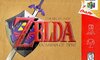
North America
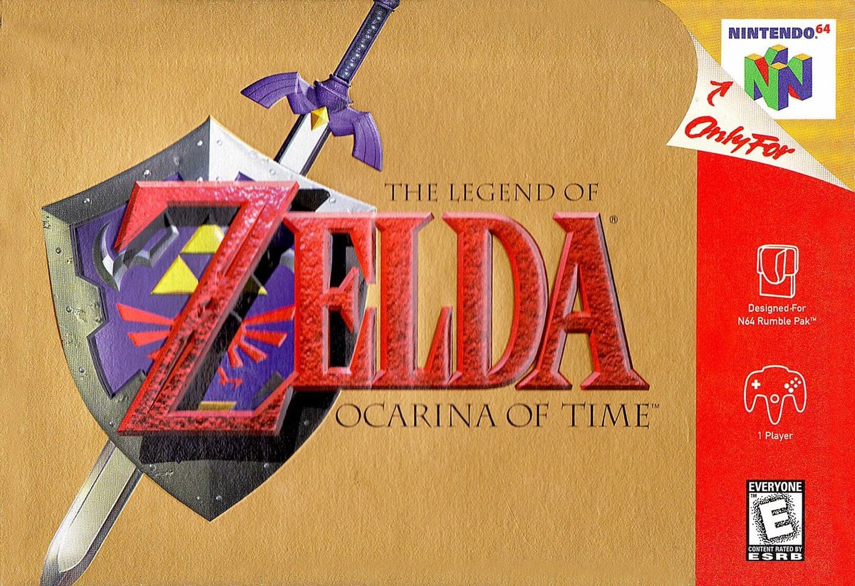
Switching black for gold, the title logo with the Hylian Shield and Master Sword gets its familiar colours here on a simple cover which calls back to the similar covers of A Link To The Past and Link's Awakening DX (which previously had a brawl of its own). The red strip and the peeling 'Only for' label arguably spoils the grandeur a bit, but it's big, bold and classic.
Bonus!
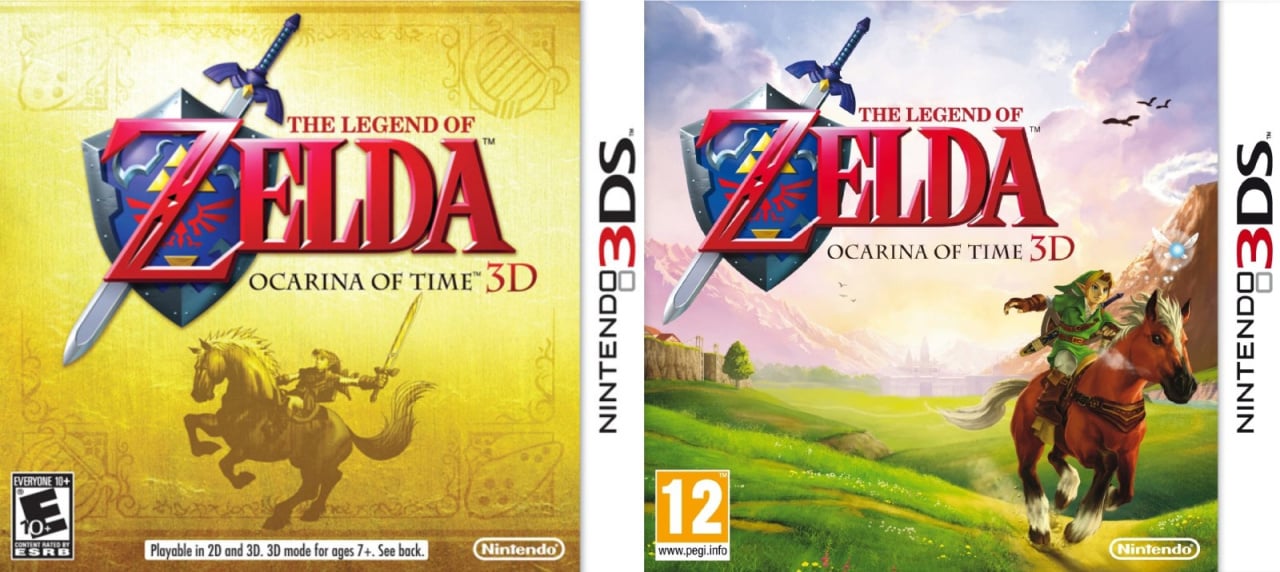
And as a cheeky little non-polled bonus, here are the covers for the North American and European releases of excellent Ocarina of Time 3D on 3DS. The Japanese version was essentially the same as the European variety. Interestingly, us Europeans were also able to get our hands on a more subdued 'gold' version of the US box through pre-ordering and other promotions at launch, so we could switch between using which ever case we preferred (although it does mean we have one extra, empty Ocarina of Time 3D case on our shelf).
So, three covers, but which one gets your vote? Take another look, select your favourite below and plant the Master Sword into vote button to journey into the future:
That's all for this week's brawl! Let us know in the comments if there are any games you'd like to see duke it out for your entertainment, and we'll see you next week for another round.


Comments 63
Clearly Japan once again. The European one looks alright but being boxed in like that ruins it. The North American once looks alright but the Master Sword is a bit cut off on both ends. The Japanese one doesn't have either of these issues AND has some cool art accompanying it to boot.
The European box, in black and gold, is both understated and bold.
The Legend of Zelda: Ocarina of Time
Nuff said!
*I didn't realise at the time that my first line would rhyme
As much as I like the European cover for its simplicity, my vote goes for the Japanese version.
For such a wonderful game it sure did ship with some underwhelming box art. Of them all I prefer the 3DS version, color art with Link racing across Hyrule Field
One of those few times I think that Europe has a winner. An all black cover can’t be ruined by the black borders.
I also really like the box are for the European 3DS game. Always have.
Europe has the best one, and Japan is clearly the worst this week, IMO.
I liked the EU initially but I feel too much detail is lost the golden shield/sword/Z area. Don’t care for the Jp version for once.
USA wins for me, also plays on my nostalgia as that’s the one I had.
It makes me sad to think I’ll never have that same sense of wonder and amazement again from playing a game that I had playing this game for the first time back in 1998.
I still have my blurry memories!
I always hear people’s dislike about the black borders of European N64 box art. I’m not a fan either, but I never hear people disliking the US SNES box art, which has similar mundane black borders and worse still, that horrible grey US SNES logo on show. I’ve never liked them, I always preferred the more colourful PAL and Japanese box art.
I remember driving around with my father (I was 15) to the different shops in my area to find it. It was sold out everywhere and I was beginning to think I would have to wait for a long time before I could play it. We finally found it in a shop that wasn't even a toy/gaming shop but a book store which doubled as a gift shop around Christmas. The game wasn't even on display, you had to ask for it and they would go in the back to get it. Now in the late nineties, you didn't get to see the artwork before buying games because most gaming news were in magazines, and most magazines didn't actually bother showing you the artwork. But when I finally got it in my hands I thought the black and gold artwork was absolutely glorious.
Long story short, I voted for the European version.
Europe all the way, love the black and gold. A legendary look for a legendary game.
Japan as usually the best art (and 3ds the best of all to be frank)
Honestly, I think they could've done better with all of them! At least the remake gives a hint of adventure!
I'm going with the European one that got my mother so entranced she bought this unknown game on a whim (the only time she bought a game that wasn't Christmas or my birthday btw! )
@electrolite77 lol. 100% true
I still have the big poster on my wall, love it.
Wish Nintendo made some animes/manga series in this style. I loved the Majoras mask manga Comic, if only it became an full Anime or made into series man. (Wishfull thinking)
Voted NA,because I have the Collectors Edition. Which should've been in the vote.
No games has ever given me feels like this one did. I would love to go back to 98 and feel that pure joy, excitement and awe as I've come to terms with the fact I will never feel the same from any future release again.
North America
Zelda boxes should be gold.
NA, easily. The ugly photo-negative looks of the PAL cover ruins it, and I don't like the layout or color scheme of the Jp cover.
The American one is absolutely iconic, and bursting with color.
Europe got the better boxart for OoT3D, though.
I definitely have to choose North America. Maybe it’s nostalgia — but I just don’t see the appeal of Europe’s or Japan’s box-art.
Cleary Europe again.
I apparently went with the least popular option (as of this writing) this time. I tend to like the smoky backdrop of the Japanese version, plus it has more than just the dashing logo.
Even though I don't love it, I have to go with the Japanese one just because I hate "just the logo on a plain background" covers. If it were eligible I would definitely go for the European 3DS cover. In my opinion, it was always such a shame that the old-skool Zelda covers in the West were basically all the same boring artwork.
Though I suppose it's kind of amusing, seeing as Link seems to somehow get crowbarred into every other game these days, that back then, he didn't even get to appear on the covers of his own games.
I ended up voting for the European cover, I really like the black and gold design. Hell, even the European box art for the 3DS version of the game looks better than the North American one.
European cover, obviously. This is the perfect example of less is more.
They all are lacking. I picked Japan because of the extra imagery, but it's a little bland color wise. If they had colored Link, Epona, and the fire and kept the black background, that would have been a shoe in win. I think Europe looks the worst with the monochrome gold logo and strange border. Having said all that, the gold box is nice as it is in line with previous NA Zelda releases.
It has to be Europe! I remember buying that box and being so excited to get started. It’s bold and striking in design and had moved away from the traditional Zelda look, as a result it felt like something new was coming.
I have a fondness for the NA box art but Europe's isn't bad. The black borders for once don't intrude on the box art.
Side note: I'm looking forward to if/when Majora's Mask has a Box Art Brawl. The Japanese MM box art is one of my all time favorite box arts of any system.
European version for me stands out, like the great game it was.
Set the gold standard in the 3D era.
I voted for NA. I'm not really a fan of any of these. Japan's cover has Link, but it's underwhelming. I prefer the color choices of the NA cover over the others. I'll take the Japanese box for Link's Awakening(regular and DX) over any of these, even if Link looks funny to some people.
I'd give it to the American version.
Though overall I'd choose the cover for the 3DS remaster.
Wow... I just started replaying this last night on my 3DS. Can’t believe it’s been 9 years since I played the excellent remake.
They had such great official artwork at their disposal:
It seems a shame to me that they went with such plain uninspiring covers.
The Japanese one looks like someone made a graphic for their super edgy MySpace profile.
Missed last weeks so just late voted! No idea what everyone's talking about, that "Vampire's Kiss" logo looked fantastic and sold me to make it better than the NTSC-J cover. Had to go Europe again, because the gold looks too much like the NES cover... Or the Link's Awakening GB cover... Or the Link ot the Past SNES cover... Bit samey, no? I get that the GBC Awakening was similar to the Euro one here, but it's at least a bit different.
@Haywired i vote these.
its like they never care to work hard on the design for north America
Not crazy about any but North American version may be the best of the bunch. Not by much though. In all honesty though, the 3ds versions are the best.
Side note: we REALLY need a 2pack port of the 3ds n64 zeldas on 1 cart. I know it's been said a million times but cmon now, I know it will sell like hot cakes. Heck, throw in ALBW as a prerorder bonus 😊. And if a dude can really wish....some link green joy cons with brown joysticks and yellow buttons.
Always loved the gold background with the game's logo, just like the other 90s NA Zelda releases. It's just so iconic.
Growing up, the European boxart we had in the UK felt important... at the age of seven, I didn't really know why, but it's been my absolute favourite game ever since!
Japanese! But both the 3ds are awesome
Both 3DS ones are better than all the N64 ones haha.
The US version looks too much like Zelda 3 on the SNES...
@BarefootBowser I agree. I think the Japanese one comes off as kid like when you look at it. The European one to me is a bold statement and lets your inagination fill in the adventure to come.
Europe all the way, for both N64 and 3DS versions.
@NintendoByNature Haha. We can’t be too optimistic about it, but we can dream. Like the green joy-cons along with that.
Deku Tree amibo anyone?
@NotTelevision deku tree themed system and dock. Ughhhhhh !!! I need this!!!
I'm not super keen on any of them, I like JP best for the original releases. I think I prefer the NA 3DS cover.
My favourite is the gamecube japan version https://www.play-asia.com/the-legend-of-zelda-ocarina-of-time-master-quest-special-disk/13/28switch_desktop-701pm4
Box Art Brawls Current Total:
Europe: 6
Japan: 11
North America: 10
EU one looks a bit weird, and the Japanese one seems more at home as a manual cover, so NA for me.
I prefer the North American one, Japan for me was a consideration to choose instead as well, but I went with the NA one.
The European one just seems completely off to me. Like the Gold Part but a completely black background ruins it for me.
Votes is somewhat balance for this poll. Interesting.
North America and it's not even close.
I have spoken.
@NintendoByNature Ohh yeah! I’d love that. Imaging the awesome illustration on the back with the dark green joy cons. The dock could be a light brown. Ohh well a boy can dream.
@Kidfunkadelic83 @GravyThief I know exactly what you mean. Playing a game like Zelda in a 3D semi-open world for the first time back then is a feeling we’ll never have again. I wonder what/when the next milestone is.
I swear some people just vote Japanese by default. It's a mess, like something I would knock up.
As other posts have noted, the NA box at launch was a foil gold with a gold cartridge. This was my first pre-order ever, just so I could secure it. My vote goes NA for that reason.
@echoplex
The new HALF-LIFE VR looks pretty close. At least from what I have seen in terms of interaction.
The NA box art is just more iconic and I say this living in the U.K.
This is definitely the style I think of for almost any Zelda game. I don’t like the box art to be too busy.
I have a thing for gold
Europe, so stylish!
That was CLEARLY Japan. The black and white looks so intimidating but cool at the same time.
North America here imo. The japan one would have won if not for the grey and black colour scheme. This is from the voteable choices.
The NA 3DS one is the best herr overall if you count them in as well. Though I can't remember if the European one had a reversible cover.
(An all time great videogame and my 2nd fav Zelda. The 3Ds version is the definitive version IMO).
Show Comments
Leave A Comment
Hold on there, you need to login to post a comment...