Welcome back to Box Art Brawl, the ongoing series where we examine three video game cover variants from across the globe and vote to find out which won is the toppermost of the poppermost.
Last week we looked deep into the eyes of cinematic sci-fi platformer Flashback. It was decided that the Japanese variant, with its minimalist approach, was the best of the three with Europe in second place and North America in third.
This week we're taking a look at a little-known platforming curio which only the true genre devotees will likely have heard of. It's called *checks notes* Super Mario Bros. and was released for the Japanese Famicom and the North American Nintendo Entertainment System in 1985, arriving on European shores two years later...
Okay, we can't keep that up. This is up there with the most famous video games of all time (and is the most expensive ever sold at auction, too). We all know this, we all own this (probably multiple times) and we could probably choose our favourite cover without needing to look at the options. It's going to be most interesting this week to see how you lovely people vote - these images have become so iconic that it's difficult to divorce them from nostalgia.
Still, the way you arrive at your decision isn't for us to dictate - simply browse below and go with your gut. Ready? Let's-a go, indeed...
North America

We kick off with the North American version. We have always admired the 'Black Box' Nintendo games for the way they displayed the pixels, blowing the sprites up loud and proud on the covers. Other companies would concoct some elaborate image to give the player an idea what that jumble of pixels onscreen was supposed to represent, but Nintendo went with the in-game art.
What is there to say? It's so familiar that it's hard to look at this objectively. We like the bold simplicity, and having Mario at an angle that you'd never see in-game sets him apart from the block-and-lava background. The speed lines trailing behind the plumber inject some dynamism. The 'Super Mario Bros.’ font is a little uninspiring, we suppose, and the starfield seems entirely arbitrary.
We guess the question to ask is: if you had no idea what Super Mario Bros. was, would this make you interested to play it?
Japan

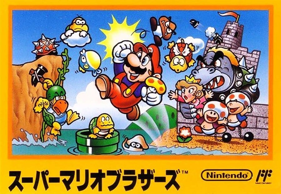
Japan got the typical landscape Famicom box presentation which provides a stark contrast to the NA cover. Using every colour in the artist's palette, we get a lovely bit of Mario key art featuring a host of friends and foes from the game. Bowser and a couple of his minions are looking more than a little off-model, but they're all recognisable and, as an introduction to the colourful cast of the Mushroom Kingdom, it's a winner.
Negatives? Well, we suppose this multi-coloured cover and the yellow Famicom cartridge the game came on might have made the game itself seem a little bland-looking once you booted it up. Yep. Can you tell we're scraping the barrel for cons?
Europe

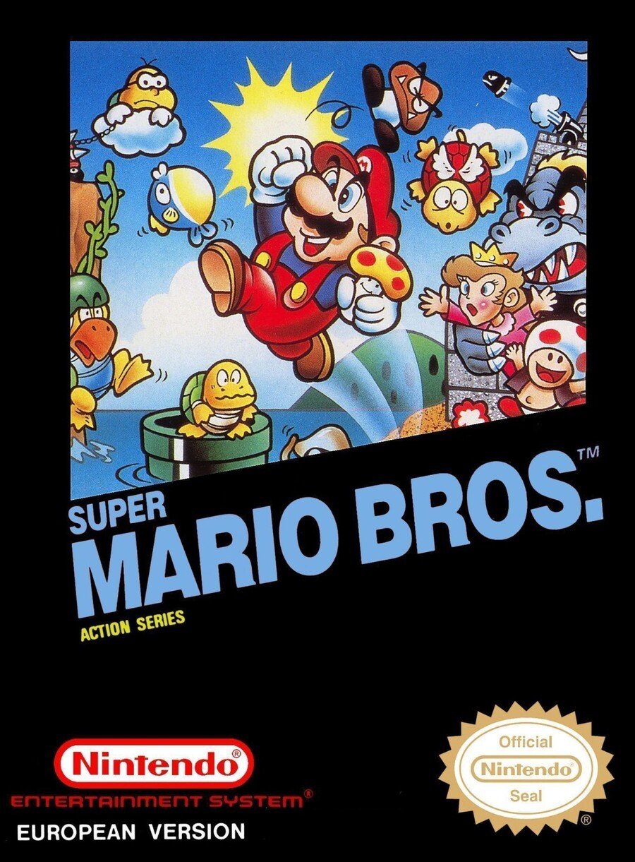
Okay, okay, before UK readers start raising eyebrows, we know this isn't the cover that hit store shelves in the UK. Europe received a few different variants depending on the country, with the UK version being practically identical to the North American one up top. For the sake of variety, we've gone with the mainland European version which blends the 'Black Box' look with the key art of the Famicom box.
Again, there were variations depending on country (some had the 'Action Series' logo just like the NA box, for example), but the main text turns blue and the Nintendo Seal of Quality stands out that little bit more with its white background. Some later NA versions also had the white background on the seal. Regardless, the amount of black in the border gives the impression that we're looking through a window at the craziness occurring behind.
There we are! Three boxes, one game and one decision to make. Take a long hard look below and click on your favourite before casting your vote by hitting that 'Vote' button:
It's a toughie, that's for sure. Thanks for voting. For all UK readers who want to pick 'their' cover, it's up to you whether you go with the NA version, or show solidarity with our continental compadres. Politics in video games, you say? No, no - this is Box Art Brawl! See you next time.


Comments 71
I love the full art work on the Japanese cover, but I went for Europe because the colours are more vibrant, and it just looks more striking.
It's a miracle, all three are actually good this time round!
I voted for Europe, I like the colour scheme and there's more going on than the NA version.
While the US box art is pretty iconic, it’s always struck me as a pretty boring piece of art. The Japanese cover is absolutely charming.
I prefer the european and japanese Box Art. It still kinda weirds me out Mario is about to die in a lava pit in the US Version.
The one, the only, the best there ever will be: (votes for NA box art based on pure nostalgia.)
The Japanese one is the best.
Peach was a brunette! Only Mario knows her true hair color for sure. Maybe Bowser, we have no idea how he treats prisoners
Japan of course
I’m in the UK, and … I got the US box? It was the double pack with duck hunt, maybe that’s why?
I don't remember seeing the hand drawn version in Europe (France). But maybe because I got the game in a bundle with the NES, no box. But the picture on the cartridge was definitely the pixel art from NA.
I chose Europe though.
@ChessboardMan They explain that in the article. UK and US got the same box, continental Europe got a different one.
@ChessboardMan
Gavin says in the article that the UK got virtually the same cover as NA. It confused me at first too! I thought that my old memory was finally failing me! 😆
Japan because it's beautiful artwork; full of life, character and colour. They may now be iconic, but I always hated those old NES boxarts with the 'big ugly 8-bit pixel art on a black background' template. No cover art should ever be in-game graphics.
Despite growing up with Mario in the U.K. I’ve only seen the North American box art before. My first exposure to Mario was Super Mario Allstars which I believe used the American box art in the game select screen.
One of Mario's legs is coming out of where his belly button on the Japanese/European box, and the other is coming out of his... Well... It looks weird. Not to mention his body is shaped like an upside-down egg.
Torn between the Japanese and EU ones.
The Japanese version has more to show but the EU one is more striking.
I'm going with Europe as well. I think the artwork really pops, Mario is better centred too in my opinion.
Japanese box by far. Even though it's not indicative of the actual art of the game ot still looks best.
Although Japan is best America is iconic
I have got mine in the Netherlands with the NES bundle together with Duck Hunt (zapper included). Box art was the same as the NA one, so I voted for that one
I can't not choose NA even if it is arguably the worst one.
Voted Europe this week! In Sweden they looked like that.
On one hand, the NA artwork fills me with nostalgia for my childhood. 💗 OTOH, the other artwork is actually artwork and looks pretty good.
Japanese the best version but love the NA version as well with that gorgeous pixel art mario.
@Steel76 True, but I wonder if there were several issues released, maybe one of them looked like this?
@Daniel36
Just cause you never saw it doesn't mean its not real.
https://www.mobygames.com/game/nes/super-mario-bros/cover-art/gameCoverId,30289/
https://www.mobygames.com/game/super-mario-bros/cover-art/gameCoverId,30287/
@KitsuneNight I deleted my comments because I am an idiot who spoke too soon. Sorry!
The toads are so happy because Bowser locked them in the dungen with the princess because he didn't realize the toads are male.
The Famicom yellow cartridge is disappointing? Writer must either be joking or have not seen many Famicom carts. They used a (small) rainbow of colors over there.
At least it's not the Pepto-Bismol color Super Mario USA got.
North America it just is the game!
That Japan art is WILD. Kinda crazy to see how much certain character’s art has changed while others have remained more or less unchanged.
Anyone voting on the US one needs to take off the rose tinted glasses. It as lazy as it gets.
I’m gonna have to go with North America cause for me it brings back soooooooo many memories from when it was released.
US person here. I like Japan's best. Seems like the more cartoon, the better.
For those who don't know the art on the Japanese box is by Miyamoto, at least the initial sketch, the colouring I think was done by a different artitst
I always liked the "pixel" covers for NA's NES games.
@Ooyah Yeah, it is the best of both worlds and is really well composed. I also think the blue text only helps make the image pop more.
@nesrocks It’s not lazy: it’s being straightforward with the consumer. Think about it, that was a very important stance to take after people’s distrust of the industry due to Atari’s lack of regulation oversight.
@Antraxx777 I disagree, it does not convey anything about the emotion of the game. It's completely lackluster. The box art needs to make up for the fact that it's a still image, not a game, which moves, is interactive, has rules and sound/music. The art needs to go above and beyond to express not only the game's variety but also the world it represents. At the time games were really limited and the box and manual were an integral part of the experience. If the box is a screenshot of the game then it is completely useless.
The back of the box is what is used to show more about the game, but the front needs to be as atractive and emotional as possible. A sprite at an angle in an impossible position with a brick is almost like nothing and doesn't actually show exactly what the game is, even. So they tried to make it something more exciting than the game, but as cheaply as possible. It was not thought through. Just quickly done and sent to the factory.
Japan has the best cover art, but the US cover for SMB is the best of the original 4 Mario games in the US. Every other US cover art is a variation on Mario jumping on a plain background. Just compare the Famicom box art for SMB3 with the NES one and it's no comparison.
NA for nastalgia. Europe for the art. I like the black background for contrast, as opposed to the Japanese cover.
My vote goes to the NA cover.
@nesrocks Dude, as @Antraxx777 already said, that was not the time to be "above and beyond". That was the thing that Atari and company where doing for years at this point. Nintendo needed to be as sincere and direct to the consumer as they could.
Using the japanese box art already available and slapping the "Nintendo Seal of Quality" on it, that would be the lazy thing to do.
@Ooyah Absolutely agree.
Had to go with Europe. I grew up with the US release, but LOVE the full art of JP. Though not a big fan of the Yellow.
NA cover is trash
Japan great, Europe also really good
I thought North America would win by a landslide.
Europe has the vibrant art of the Japanese box along with the nostalgic black border of the American one. The best of both worlds. As brave as it was of NOA to depict Mario falling into a lava pit.
I actually like that Euro variant more than the NA one, but I like Japan most of all for this one.
I've never liked the US artwork. It doesn't stimulate the imagination at all.
The Japanese artwork is absolutely lovely though, and the European version is a nice alternative.
Even though I grew up with the North American version I went with the European simply because it combines the NA and Japanese versions into something I think looks really cool!
Europe all the way.
People only like the NTSC box art because it's iconic. If this game wasn't a success and Nintendo was piloting Bubbles the Pufferfish as their main woman or something, that box art would probably be the butt of jokes for depicting the main character dying on the cover - then again, it wouldn't be the first game to do that, Spider-Man on Atari 2600 also depicted Spidey dying on the box.
Box Art Brawls Current Total:
Europe: 4
Japan: 7
North America: 4
@Borshi Well, if that's the case she is beautiful and valid. TRANS RIGHTS BABY!
Edit: LMAO he edited his post
Japan, easily.
The Japan one would be nice as artwork, but it doesn't really look like a game cover, something the EU one has no problems with, so I went for that.
I would've voted for the Japanese version if it weren't for the horrible Bowser design, so I guess the North American box wins my vote essentially by default.
Yeah never heard of it before. I vote the US one because if it's super retro detail.
Yeah I had to vote NA. Though the Japanese one would look good as a poster on your wall.
The US cover, a.k.a. "Mario dies on the cover".

The N.A. version is iconic but I'm going to have to give my vote to the Japanese version for the fairly accurate and vibrant depiction of the Mario universe.
Although I do like the "framed" look of the Japanese artwork in the European version for the emphasis on Mario while also looking neat and uniform. A part me wonders if I should have voted for that instead.
I choose Japan because I like it's cover. I would have chosen Europe if it had all of the artwork because the black look nice but I prefer the full artwork.
@link3710 Not all the continental Europe because in France we had the NA version as well, so I wonder which countries got the other version ?
@gurtifus
The Netherlands got both versions.
With the Japanese version on this triple cardridge: http://nesrepairshop.com/forum/UserImages/Europe_Mario.jpg
Here is an no doubt incomplete list.
https://www.mobygames.com/game/nes/super-mario-bros/cover-art
@Noid
I didn't edited nor did i said she was ugly because of it.
The mods probably deleted the first sentence as expected.
It was just an observation. I have no quarrel with what you said.
North America is at least somewhat accurate.
The others always irritated me, they are the kind of cover that would get me excited to play only to be let down by the real graphics.
The NA version is iconic, but it's too plain and doesn't speak of what's going on in the game. NES was an era when artistic interpretation was king because a static view of the graphics was never up to the task. The Japan art is iconic in it's own right and actually captures the idea of Mario dealing waves of Bowser's varied forces.
The North American cover is just so iconic. I can't vote against it.
What's funny is I would consider the NA art lame for the 80s, lacking in imagination yet, for nostalgic purposes in modern times, it absolutely nails the retro-nostalgic look-- Almost like it knew it would be all along. Deep...
@Al_Godoy
Glad it didn't
The American covers tend to win by a landslide, because of the stalgias
Show Comments
Leave A Comment
Hold on there, you need to login to post a comment...