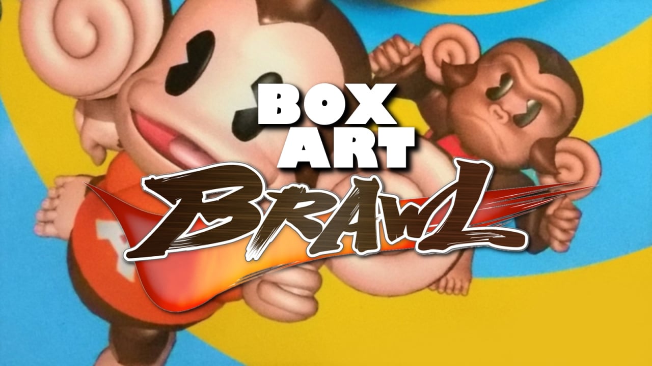
Welcome to the twenty-fourth (!) round of Box Art Brawl, the weekly regional box art battle that sees you settle the score and vote for the best regional cover design or a retro video game. It's the first brawl of 2020 - we hope you all had a spectacular start to the New Year and are ready to scrap once more!
Last week we had a festive foray into the snow with Snowboard Kids racing down the slopes to find out who was the finest. It turns out Japan's Snobow Kids had what it took to best the rest, with North America sliding into the chairlift in second place while Europe bumped its bonce against the boards near the entrance and ended up hopping into third place.
Subscribe to Nintendo Life on YouTube848k
This week we jump forward a generation to ball-based monkey-thon Super Monkey Ball 2 on Nintendo GameCube. We were going to do the original game, but every region's box art is nigh-on identical for that entry. The sequel, however, got a different version in each of our three usual territories. Don't get us wrong, they're all colourful covers filled with monkey business, but compared to the original they're actually different from each other and therefore better candidates for the crucible that is Box Art Brawl.
Most recently we've seen the Super Monkeys (or is it the Balls that are Super?) on Switch in the somewhat disappointing Super Monkey Ball: Banana Blitz HD, but here we're returning to one of the GameCube classics. Enough monkeying around, though - let's roll.
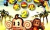
Europe
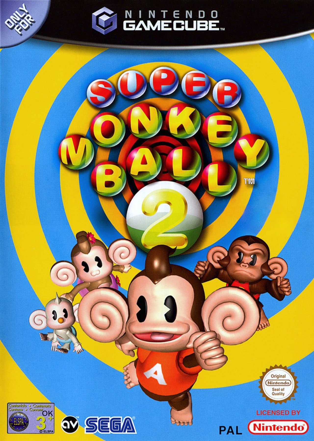
With a blue and yellow spiral providing a psychedelic backdrop to the cute simians, there's no ambiguity as to the sort of adventure you're going on in the European version. With the logo displayed in balls and the '2' contained in its own Monkey Ball, AiAi, GonGon, MeeMee and Baby occupying the bottom half and generally looking cute. Don't look too hard at AiAi's fingers or toes, they're a bit weird.
Colourful and complete with a barrel o' monkeys, what's not to like?
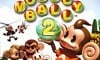
North America

The North American variant attempts to set the scene a little with some grass and the team having what looks like a banana picnic. AiAi cradles the '2' in the Monkey Ball this time and Dr. Bad-Boon choppers in behind them. The misty whiteness of the clouds might make the logo stand out, but the monkeys themselves get a bit lost. The perspective doesn't help.
It's not awful by any means, but the addition of the lawn adds very little and arguably lessens the impact of the monkey group. It sets the scene, we suppose, but is that really necessary for a game called Super Monkey Ball? The concept is madcap crazy and rooting the cover in this quasi-picnic scene feels unnecessary.
Japan
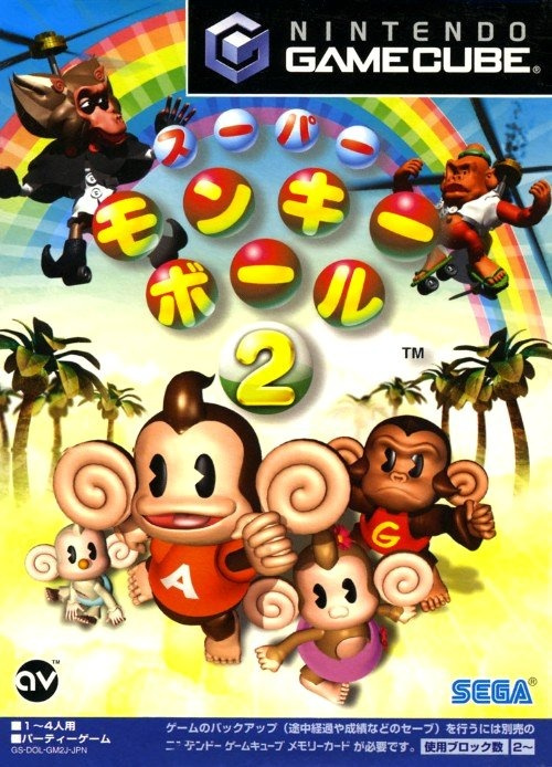
The Japanese cover used the same (repositioned) key art of the monkeys as the PAL version, plus the bad guys from the North American one (although closer this time). It throws in some palm trees and a rainbow in the background while sticking with the same logo design as the others. The GameCube logo or ‘tab’ at the top intrudes on the composition but it presents a dynamic scene radiating out from the centre of the box.
Of all three we probably prefer the boldness of the European design, but our opinion counts for nought - the decision is down to you lovely people. Click the most deserving monkey below and hit that button to cast your vote:
That's it for this week's match. If you have suggestions for candidates who would make for a diverse and entertaining bout, feel free to scribble them below. Who knows? Maybe you'll see them crop up in a future Box Art Brawl. Until then, keep on rollin', folks!


Comments 27
I love them all! But went for Europe... it's just so zany and colourful! 😆
The more I look at the North American cover, the less it looks like a video game and more like a low-budget cgi movie for kids.
Japan’s cover has a nice detailed background. The palm trees and rainbow are a nice touch. Europe’s cover is pretty cool too. It’s very colorful. North America’s cover has not aged well, like holy moly.
Don’t really care which one, just wish they would bring out a collection on the switch
they all look kinda bad
This is where I would have preferred that Super Probotector cover art
These look more like N64 game covers than they do GameCube game covers.
Oh man, I have so many good memories of this game. My uncle bought this for me and my brother when I was about 3 or 4 and we used to play Monkey Target and Monkey Fight against each other. We did try the actual main game but it’s bloody difficult and there were certain levels in that story mode that still give me shivers. Eesh, Arthropod.
EU cover sums up the game in general. Colourful, crazy and goofy
Kinda screams 'Hey, you're going to have multiplayer monkey fun with this game and don't worry, single-player simian silliness is still here'
Very 00s era Sega
I'm meh on all 3, but JP wins out I guess.
No vote from me, they are all abysmall.
This week is a step up since it's not N64. All three of these look better than recent N64 game covers. I think Europe's cover looks the best as a game cover. The North American cover is the weakest one, in my opinion.
Virtual grass on game covers has moved on a lot since then.
Glad to see a set of covers where all 3 are different (even if they share some key art). Many of these Brawls have 2 regions with near identical box art, although I appreciate it may be difficult finding games with different artwork that are recognisable.
Resident Evil 2 on the N64 (or Gamecube) would be a good shout for this as each region has a suitably different cover.
Also Shadowrun on the SNES, each region is suitable different (although NA and Europe don’t stand a chance on that one!).
Erm...I think it's in the small print I have to vote for the Japanese or European cover since I'm using it as an avatar lol. So Japan it is.
The European box art really expresses the aspirational quality of the game. When you see it, you think ‘These monkeys are ready to risk everything to live life to its fullest’.
They all kinda suck, but I'll pull the lever for Europe this time around.
Also, could we add non-Nintendo platforms to the mix as well? Feel like that could be interesting to see...
Hm...I wish the scan quality was higher. I can't quite tell if the Japanese one looks a bit washed out because that's how the art is or because the scan isn't great.
Guess I'll go with Europe this time, but this CGI looks pretty wonky on all three.
I like the European version for being the most unique out if the three. Plus, it's just fun to look at.
P.S. Props for the tagline of this article
Box Art Brawls Current Total:
Europe: 5
Japan: 10
North America: 9
Am I the only one who sees their eyes as black PAC-Man?
To be honest, I don't care for any of them. Pac-Man-shaped eyes only look good on Ms. Pac-Man... er, Ms. Pacman... Ms. Pac Man?
@Bass_X0 I'm fairly certain that aspect was inspired by classic cartoons from the '30s.
It's all about the spiral.
@Bass_X0
No, It's one of the many things i find off-putting about these covers and character designs.
I have watched Nintendo Life on YouTube for generations. After becoming a revitalized fan of the series since the last great games were for the Gamecube I had to make an account to cast my vote for Japan. I was shocked and disappointed. I spent 10 minutes creating my account and profile just to express my disappointment. Love the site.
Europe here for me.
( a great video game. Still the best MB evrr released for me)
Show Comments
Leave A Comment
Hold on there, you need to login to post a comment...