Welcome back to Box Art Brawl, the series where we pit regional variations of video game box covers from back in the day against each other in a savage fight to the death. Okay, it isn't that dramatic - it's just a poll - but let's get into the spirit and pretend that the stakes are incredibly high this lovely Sunday afternoon, hmm?
Last week the North American version of Contra III: The Alien Wars run-and-gunned its way all over its Schwarzenegger-stealing Japanese counterpart and its robotic European cousin by winning over 80% of the vote. Congratulations to Jimbo and Sully; commiserations to Arnie, duckface child soldier, RD008 and RC011.
Subscribe to Nintendo Life on YouTube845k
If you thought last week was an all-out guns-blazing brawl, you're in for a real treat today because bout #20 features the original superstar video game brawler, Super Smash Bros. for Nintendo 64. Each regional cover contender brings a special something this week, and although they're obviously related, they're all unique and special snowflakes, too.
Yes, it's more than a simple border swap between the North American and European ones today! But which region has what it takes to give the competition a good thrashing, six-o'-the-best, trousers down? Let's take a look at how they measure up...
North America

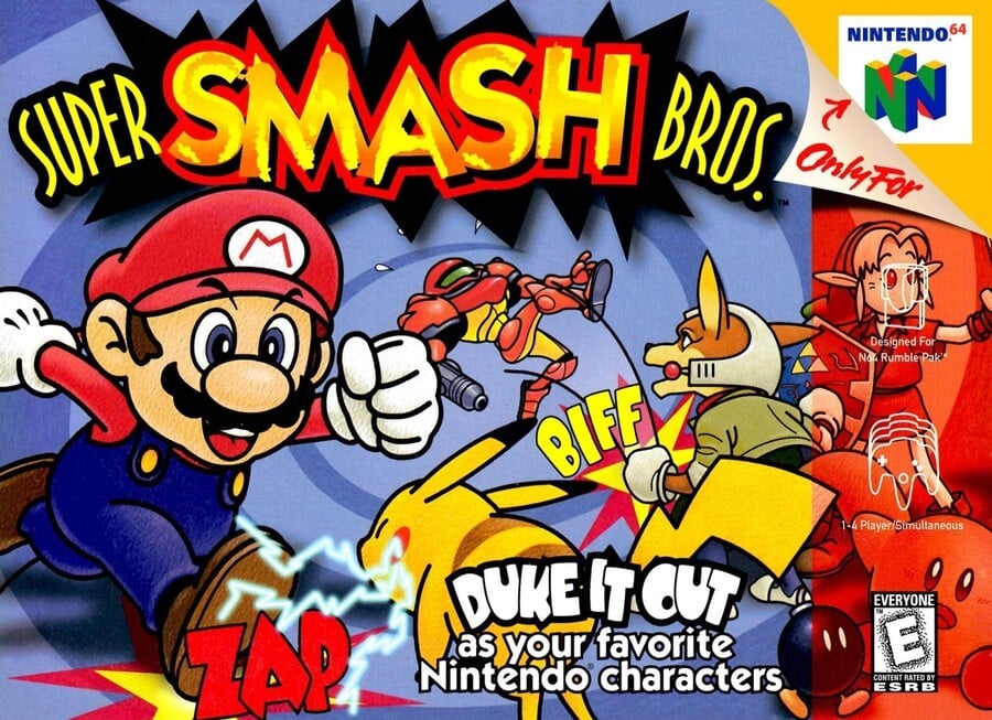
After clocking Mario on the left, your eye tends to hover around the middle of the image for a while until it rests on the title and you try to parse the scrawled yellow over the 'SMASH' logo. Presumably this was done to reinforce the idea that all these characters are part of a child's toybox and it's actually the child who's responsible for having them beat the living daylights out of each other.
Australia got a PAL cover almost identical to this one. The background is a swirling vortex into which Samus is falling comically after getting 'BIFFED' by Fox McCloud. Curiously, both Fox and Pikachu are facing away, and poor old Kirby and Link are hidden behind the red strip on the right. 'DUKE IT OUT as your favourite Nintendo characters' kinda gets lost at the bottom and Yoshi and DK are AWOL.
Overall, despite being playful and colourful, we're left thinking that more could have been made of this most seminal of gaming crossovers.
Japan

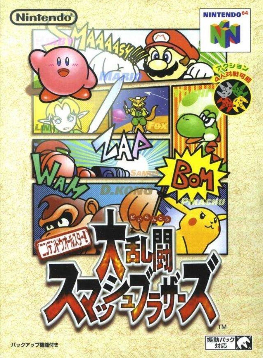
Again, the hand-drawn cartoon stylings of the main eight fighters suggests this is something new and exciting, and as with most of the Japanese covers, there's a novelty for westerners to seeing the portrait perspective. The comic book cells isolate all the main characters, with each one also presenting their names, although they're obscured here, too. Only Kirby sits on top of everything, waving genially and totally indifferent to the punch from Mario in the cell behind him.
Our instant reaction to this was Yeah, that's all right!, but the more we look at it, the more of a mess it seems. We like that it isn't just the eight characters standing and staring at you grimly as they prepare to fight but, again, it seems like a missed opportunity to showcase a pretty momentous moment in gaming. Compare this to something like the Super Smash Bros. Ultimate mural and we're glad Nintendo relaxed a bit on the comic book/cartoon approach.
Europe

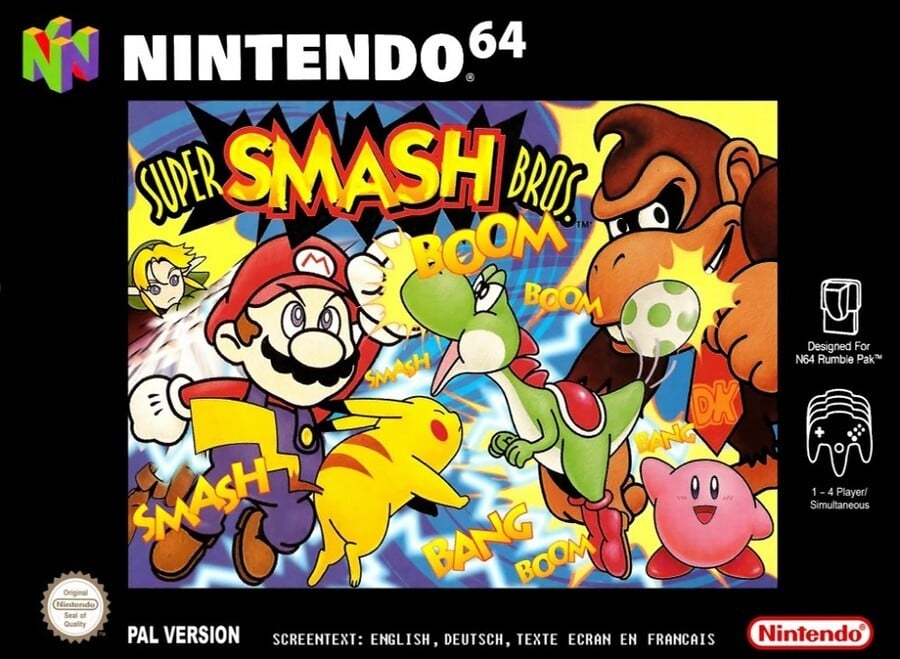
Taking similar elements to the North American version and reconfiguring them, we reckon the European version probably showcases the fighters the best. Samus and Fox don't feature, but the other six fighters are clearly visible. Kirby once again stands apart, seemingly oblivious to the scrap occurring to his right. Yoshi looks to have fired an egg from the very tip of his tail, although DK seems to preoccupied grinning at the camera to be bothered by it, regardless of where it exited the dino.
As usual, the main art is contained by a strict black border, but it's arguable that the contrast really sets off the action of the brawl with its various 'SMASH', 'BANG' and 'BOOM's. It might have been nie if a few of those had broken the border.
It's always tough to take nostalgia out of the equation when looking at these covers, but after looking at the others we reckon this does the best job of capturing the spirit of the game, despite its flaws. Still, what we think matters not a jot - the winner of this bout is entirely down to you lovely people.
So, which one do you think works best? Click on the one you like best below and hit the 'Vote' button:
And with that Round #20 of Box Art Brawl draws to a close. Thanks for voting - may the best fighter win. Until next time, be excellent to each other.


Comments 50
Europe for me.
The Pal box is a lot more focused, where as the American one is more of a mess.
The Japanese box looks more like a comic or an update of Donkey Kong.
Went with Europe, but in retrospect they all could've been a lot better. The only one with all the characters is Japan, but they're all separated into their own boxes, which really doesn't give that Smash feel. NA and EU have the battle going on, but are each missing characters. The battle on the EU cover looks more chaotic, so that gets my vote in the end, even though I really don't like that black border.
This is a win for Europe
Not super into any of them
I really don't remember that European box art.
I love how off brand they all are, like a kid won a competition to design a game.
'All the Nintendo characters kind of fight each other, and I'm going to draw them.'
I’m not fussed on any of them as I’m not a fan of the art style but I voted for the Japan release purely because it Slightly reminded me of the home menu on the new smash bros
while the japanese one is great, i have a soft spot for the american one. come on. how can you NOT love a good ol' BIFF?!
Can't decide which one is the best. The American one is the ugliest one though. I'll go with Europe, as it is most nostalgic for me.
the Japanese version is a work of art.
I remember first seeing this game when it was released, and literally had no idea what to expect from the artwork. It was very mysterious, and the only reason I purchased it was because it reduced to £25 haha.
For some reason I never quite made the connection with arcade games, probably because it was so unlike Nintendo at the time. Of course, I don't regret the purchase, and spent many happy (and frustrated hours) fighting.
I have never heard anyone refer to Donkey Kong as "D. Kong" outside of the Japan box art
Only the most contrarian of weebs would ever vote for the Japanese box art in this case.
I like them all lol ^^. 'Biff' swung it for me this week haha
The Japanese one is the best, aside from the awkwardly placed Kirby. European is clearly the worst.
Definitely Europe
'ADJUST SADDLE!'
What's DK swearing about in the Japanese cover?
Europe would have been actually not bad if not for the horrific black borders. However, the picture itself looks slightly less amateur, little bit charming and no horrible red stripe. The Japan one is like an 11 year old's imagining of a Nintendo crossover. So, Europe, but they could all have done with more thought.
I have no idea how that many people have voted for the North American one, it's easily the worst of the three even though the three really aren't that great. I went Japan but it was a toss up between that and Europe, much of a muchness, but I liked the comic book effect of the Japanese one.
Modern fan art could sadly beat any of these covers. But hey, the franchise was new
I remember Samus being on the NA cover was the sole reason I went after the game as soon as it launched. I was so dying for (what I assume was inevitable) Metroid 64 that I leapt at the chance to play as Samus. I got Prime soon enough after anyways which was worth the wait, but that's how I got into Smash.
Which of you monsters voted for North America?!! It’s easily the worst one!
Wow, I never even noticed that the American and European Smash 64 covers had different artwork. I assumed they were just the same but with a slightly different arrangement.
To me, Europe's is the most cluttered (that black border needs to screw right off!), and there's no interaction between the characters in the Japanese box art. North America seems to have the best composition, even if DK and Yoshi are missing. NA wins my vote, though this is probably the most divisive BAB yet!
Europe is disqualified for no Samus.
I liked the black borders of the EU version. Almost every Nintendo published game had them. There were just a few exceptions like Majora's Mask, Banjo-Tooie, Pokémon Puzzle League, and Perfect Dark. Back then I was stingy about these irregularities, but now I don't care, it's just the box.
However, I still can't stomach the red stripe NA boxes, all of em.
Not a great set of boxes. Both the NA and Japan boxes look like amateur art to me, as others have also mentioned. The US box doesn't have a great layout, and the translucent red bar on the right side doesn't help things. Japan's cover doesn't really work well as box art, to me. Europe isn't great either and has too many sound-effect words, but the art works better overall, in my opinion.
The European one is a bit messy with the characters carelessly layered on top of each other without rhyme or reason.
I prefer the American one.
@ViewtifulJotun
Perhaps the fact that his face is either obscured or simply not featured on each region's box art?
I'm torn between the Japanese and European ones, but the Japanese one wins barely due to the fact that it features ALL the original 8 rather than just 6 of them like the other two regions.
I like the Japanese one for the comic book style art.
Man, this one's actually pretty tough. I want to vote for the NA cover just for the nostalgia, but that Japanese cover is too fantastic.
Wow, I've never seen the European version until today. That being said, I think it's the ugliest of the lot. I went with Japan after much debate!
@bluemage1989 I'd rather be a contrarian weeb (whatever that even means) than a stonecold jerk.
They all look like concept art and nothing near a finished product. So I chose the one I think looks the least messy (Europe)
For the first time I vote for Europe. While I have nostalgia for the US one, it just doesn't give me that Smash feel that Europe have done at least for me.
They all suck. I voted for North America mainly for the reason that it’s the one box where even if the artwork and design suck, at least the Smash Bros. logo is really prominent.
DK looks like he’s been censored for swearing or something in the Japanese cover.
Box Art Brawls Current Total:
Europe: 4
Japan: 8
North America: 8
NA for me. The black borders on European N64 games are bad and in this case, it makes the game cover look to crowded. The Japanese one looks cool with the comic strip esque style, but the NA one really emphasizes a Smash Bros game more.
Love Kirby on the Euro box art. He just wants to say, "Hiiiiiii!"
Never understand why people don’t like the borders on the PAL boxes. You get all the information (language, number of players etc.) framing the picture, keeping the art work nice and clean. But I guess the rumble pak logo covering Link’s face looks better...
I agree with everyone that none of these are great, but to me the European box is pretty much the best. It's dynamic and chaotic like Smash is, gives you a sense of the craziness inside.
Japan did pretty well this time, too. Definitely not as amateurish as some of their early covers. But it's not very lively.
NA is trash. They didn't know what to do with this at all.
Why can't we have an vote option for all the above?
I'm very nostalgic about the NA box art, and still think it's good, but I think Japan wins this one. The comic strip style is neat and all of the OG 8 are right on the front.
The European box art has the characters fighting but not reacting to attacks landing which makes it looks weird while the Japanese box art doesn't feature any fighting at all plus Fox looks like a strange cat.
The American version has its faults (texts and borders obscuring the art) but I think it gets the job done by conveying this a game where Nintendo characters fight each other while being mildly pleasing to look at.
@Quarth I know this is out of nowhere and I don't mean to self-advertise but since we are on the subject of Smash, check out this stage I made if you can. I'm pretty sure you'll appreciate it.
I.D.: 6MQ8JSHQ.
They're all pretty bad, but the European one is nauseatingly cluttered. I went with Japan, although Link's expression in the American one is probably my favorite detail out of all of them.
Didn't vote this time, they're all terrible.
@ViewtifulJohtun it is written "Nintendo All-Stars" on Japanese. Characters are more like "Stars" to each other than "Bros."
Show Comments
Leave A Comment
Hold on there, you need to login to post a comment...