And we're back for another edition of Box Art Brawl, our series of bloody bouts between video game box covers from video game territories across the globe.

Last week North America was deemed to have the best Donkey Kong 64 cover, winning the day with its brazen boldness over the airy Japanese variant and the black-bordered European version. Congratulations to the only cover to feature series antagonist King K-Rool on the cover.
This week we're going back to the Contra series with Contra III: The Alien Wars, or Super Probotector: Alien Rebels as we knew it in PAL regions. No, Europe wasn't ready for muscle-bound, gun-toting deliverers of justice yet, so we got robots. Fortunately, robots are still pretty cool.
It's easy enough to play these days, having been included on the Super NES Classic Mini Console and on Konami's Contra Anniversary Collection on Switch. If you cast you're minds back seventeen long weeks, you'll remember that we looked at the original NES Contra (or Probotector) way back in Round #2 of Box Art Brawl. In that bout the North American variant triumphed, with Europe in second and Japan a distant third.
Will history repeat for this Super NES / Super Famicom entry in the series, though? Let's get down to brass tacks...
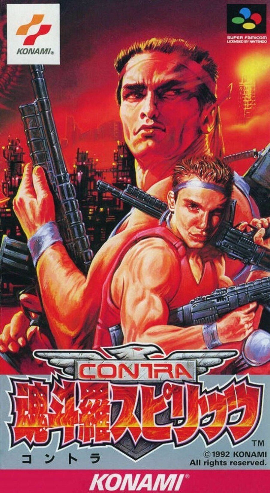
Japan

Konami was up to its old movie poster-pilfering tricks, as you'll have seen from the photo of Arnold Schwarzenegger on the poster for Raw Deal at the top of the page. Still, at least Arnie is properly proportioned, which can't be said for the poor child soldier in the foreground who's been force-fed steroids by the looks of his arms. His face makes us sad, although we like the general composition of the cover, and the bold title at the bottom looks pretty kick-ass.
We also like the pink Konami strip at the bottom. Japanese covers frequently make extensive use of the whole colour palette and we wouldn't be surprised if pink was vetoed in the west back in the '90s as a colour that would potentially put young males off buying the game.
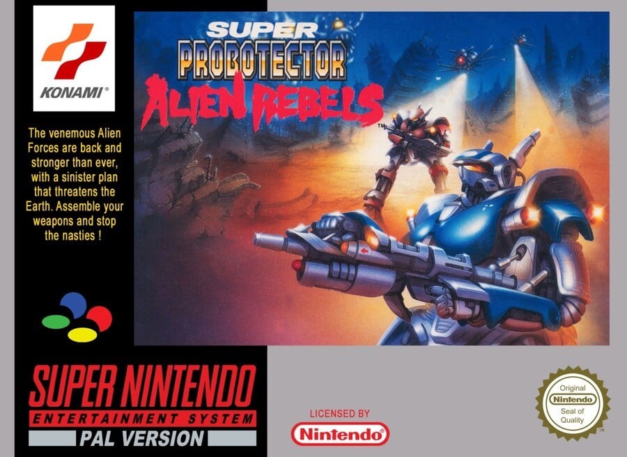
Europe

'Assemble your weapons and stop the nasties!' the box pleads. The EU box is significantly different thanks to the human protagonists getting ejected in favour of Gundam-style robots. We like the relatively sparce key art, but the black and silver borders of this PAL version do little to bring out the best in the image. The 'Alien Rebels' subtitle contrasts well with the Probotector logo, although it gets a bit lost and the whole logo seems to be covering some visually interesting alien nasties while the bottom left of the image is just dust.
There's a better cover here, but despite individual elements we like, it doesn't really gel for us. Nice gun, though.
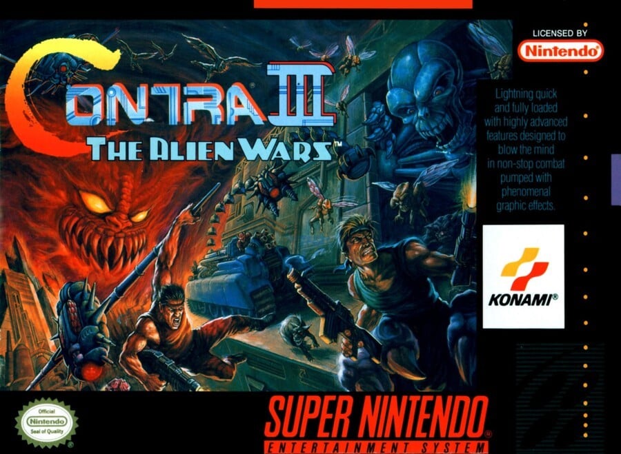
North America

The North American version gets the standard black borders and a lovely bit of key art that went on to serve as the main image for the Contra Anniversary Collection. With a whole bunch of enemies crowding the platforms and Jimbo and Sully - descendants of Bill and Lance from the original - are getting stuck in with enthusiasm.
Again, it's a lovely bit of art that could probably have been better served without the black border and blurb.The image itself tells us the game is going to be 'lightning quick and fully loaded with highly advanced features designed to blow the mind in non-stop combat" - does that really need to be spelled out in hard-to-read text covering up the art?
There you go. Now it's time to vote for your favourite using whatever criteria you deem appropriate, be it nostalgia, how the cover looks to your cold, clinical 2019 eyeballs, or perhaps even a robot fetish - ours is not to reason why. Simply click on the one you like best and hit the 'Vote' button:
And there we go - another Contra goes head-to-head-to-head with itself for your entertainment and amusement. Who'll be in the ring next week? Find out when Box Art Brawl returns.


Comments 46
There is only one right answer here, folks.
Well, this was an easy one.
If ever there was a hands down victory it has to be this month. The Japanese cover just doesn't look good and EU was too vastly different but not horrible for box art.
I'm gonna get a tramp stamp of the NA boxart and wear ill fitting tops just so I can show it off because it is so good.
American, by far.
Not exactly a hard choice.
i obviously picked wrong
Unfair contest this week. Don’t know how anyone could pick anything other than NA. And the typo of “venemous” on the EU cover makes me want to throw the probotectors under an alien bus...
It it wasn't for that face in the Japanese art...
Even though I have a soft spot for the EU cover since that's the version I own, the US cover is by far the best of the three. The amount of action in that cover is outstanding and pretty much sums up what to expect of the game. The JP cover is... atrocious and funny at the same time.
Murica FTW, baby!
The U.S art is just so iconic.
It's not even a contest this week.
That Japanese cover is before it’s time. Gotta be the first instance of trout pout/duck face I’ve seen.
I'll vote for the one that doesn't say "Probotector."
I just like the ubiquitous wrist-sweat-band... like... he's so sweaty, he might drop his gun if it drips down to his hand! Make sure he has a sweat band for his forehead, and maybe his ankles, and definitely his old fella.
Obviously i am one of the few that voted Probotector.
@BarefootBowser hahaha totally mate. Spot on
Man this is one-sided! NA all the way.
@Jojabean44 Shunned!
My...brain...hurts...
Is this a trick question lol?
You do have to acknowledge just how bloody influential Arnold Schwarzenegger was/is but the U.S cover is amazing
I'm torn between the NA and the Probotector one. I mean, mechs are too cool and that cover art's so neat!
Rare blowout win for NA
Tom Dubois is a magician.
Is that the first ever recorded duck face?
What was Nintendo Japan thinking?
One thing I know for sure is that it's definitely not Japan this time. I like the Euro cover. The robots look cool, but it's not particularly interesting or dynamic as box art. It's not bad though. The NA box is a nice piece of art for the game. It's dynamic, though not too chaotic in my opinion, and fits the game. NA is my pick.
2 terrible designs, one classic. Easy.
@BarefootBowser I think it’s more of a ”le tigre”...
Box Art Brawls Current Total:
Europe: 4
Japan: 8
North America: 7
I like robots more than generic muscly men with guns but the North American cover still looks a lot better than the European one.
The guy in the Japanese art looks like a YouTube beauty guru with lip filler addiction.
The American one is absolutely epic.
NA wins in a landslide this week. That box art is simply one of the best ever.
First thing I saw on the Japanese box was the duck face
The NA box art is the obvious choice so I went with the Japanese box art because the European one is just lulzy and bad.
US though Europe gets honorables because robots.
I'm just pleased we got to vote on three very different looking box arts this week. All unique and wonderful in their own way.
Looks like Arnold teamed up with Macauley Culkin for the JP art. Bold choice.
The Probotector one wouldn't look as bad if they made the key art bigger and had the Super Nintendo logo covering up the barren bottom-left corner.
It still wouldn't be as good as the NA boxart, of course, but it would've stood a chance at least.
Those lips on Lance though...
Yeah, NA by a mile. Japan's is ugly and Europe's....that's not even Contra. 😂
Tbh, I don't like any of these. Ah, screw it, NA box art for originality, JP box art comes second because, unlike the EU box art, it manages to look somewhat interesting.
That face on the Japanese box art is just unholy.
Edit: I voted for the NA box art.
Voters, did you ATTACK AGGRESSIVELY?
Gotta stop them nasties !!
Show Comments
Leave A Comment
Hold on there, you need to login to post a comment...