And we're back with Box Art Brawl, the series where box art variants from other sides of the planet meet up and fail to work out their differences without resorting to physical violence.
Last week was a particularly bloodthirsty bout with Final Fight taking itself down to Chinatown. Despite flaws in each of the combatants, you decided that it was the Japanese version that was most worthy, with a very respectable 60% of the vote. North America came second with just under half that as Europe limped home with only a wonderfully bushy 'tache to feel proud of.
But enough about the past - the present is here, now! Today sees the return of Konami and a classic Castlevania in the form of the third NES game, Castlevania III: Dracula's Curse. It's a handsome trio of Belmonts we've got lined up, but which will whip it (whip it good) and which will end up a drippy Mr Whippy?
That's for you to decide. Let's meet the contestants...
Japan

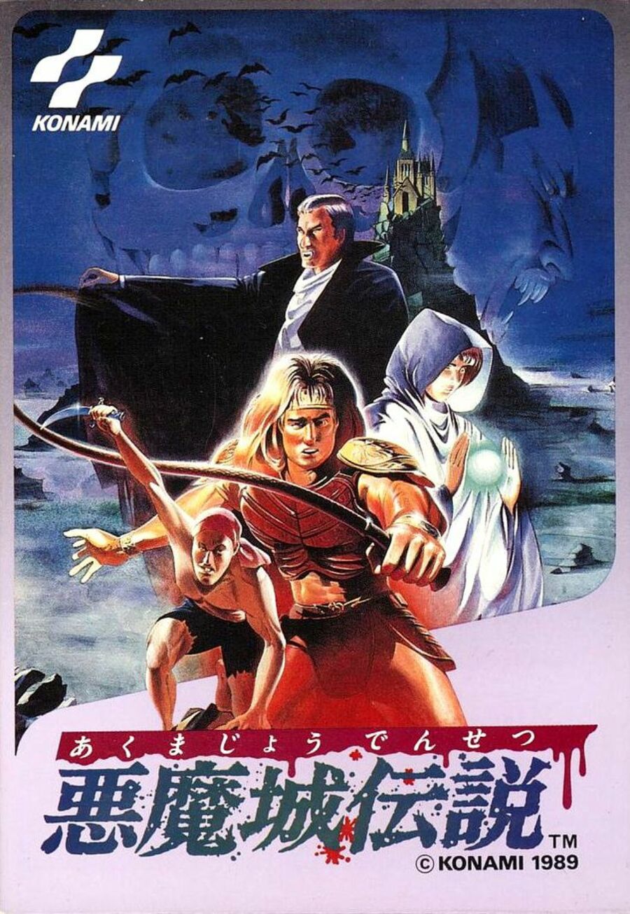
Starting in the east, Akumajō Densetsu as it's known in Japan has a cool blue-lilac palette going on with layered characters leading the eye up towards Dracula's Castle in the background. Bats flock out into a night sky that’s also filled with a skull and Dracula’s menacing mug. The logo drips with blood and some spatter sits beneath. Nice.
Unfortunately, Trevor’s seen better days. He looks like Tom Cruise if Tom Cruise had a plastic surgery problem but didn't have Tom Cruise's money to pay for the best. Or maybe the Mission: Impossible mask machine malfunctioned halfway through producing an Ethan Hunt mask resulting in something Michael Myers might wear at the weekend.
Europe

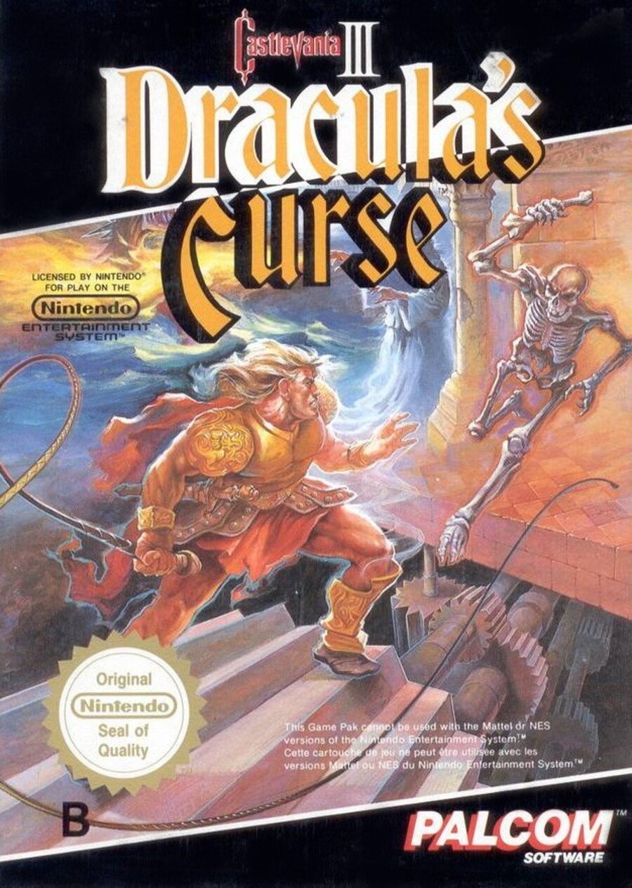
Published by Palcom, Konami's Ultra Games equivalent in Europe, we see Trevor looking suitably epic battling a skeleton in what we assume is Dracula's Castle if the dodgy staircase and cogs are anything to go by. The logo cuts through the angled black border at the top which is mirrored below and the white and gold Nintendo Seal of Quality stands loud and proud in the bottom left.
Disappointingly, there are other background elements obscured by the title, but the action is dynamic and Trevor’s looking a bit sharper.
North America

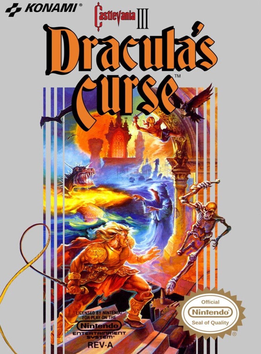
Finally, the North American variant gives us a good look at the background artwork obscured in the European version. We get the classic Konami grey/silver border and the Nintendo seal switches sides. All in all there's much more colour and a great view, although you could argue it loses the focus that the European version provides.
It's a tough one this week, that's for sure!
So, you've seen what's on offer - now it's time to choose your favourite and whip that 'Vote' button below:
That's all for the brawl this week. Don't worry, we'll be back in 100 years or so for another round. Until then, just be awesome, to everyone!


Comments 40
Other than the gray border, gotta be NA.
All 3 are very very ugly... This time I can't vote XD
I’ve never seen the EU box art for this before, I like it so went for that.
I actually own the Famicom version of this game with the box, never noticed Trevor looking that dodgy! I’ll have to get it from the loft for a laugh!
Japan but with reservations. Both Trevor and Dracula look a bit off. Prince of Darkness? More like a failed opera singer with a bad nose job.
The Castlevania 1 box art really nailed it.
Just can't decide between Japan and NA. European one looks awfully washed out, though. And Dracula's face is so odd on the Japan cover. Hmmmm. NA, I think.
Went with NA, but all 3 are pretty bad for such a great game.
easily NA on this one, for sure.
I really like the moodier Japanese one .
Is the Japanese cover’s vampire Dracula... or Alucard? EDIT: Nevermind, I just realized that Dracula is back in the blue background.
Just logged in to be pedantic and say there are no stairs on the NA/EU art - he's just stood on a cog in the foreground.
More on topic, the Japanese cover gets my vote, while not a fan of the character designs, I like the cinematic framing more
Definitely the US cover wins this round. The silver border is a hallmark of Konami covers back in those days and it doesn't look good but overall it's nostalgic.
Usually the Japanese covers win out most of the time, but the American version of Castlevania 3 is definitely the winner. Still like Japanese version though:)
Tom DuBoris artwork strikes again!
Ooh, this one's a much tougher call. I'm not sure which one I'd actually pick here.
@peachflavored Wasn't the "gray" border actually glossy, though? I remember it looking a bit shiny, though that could be nostalgia talking. The way it set Konami games apart and helped the artwork pop beyond it makes the border design an overall win for me. There was real design and thought put into it even if it feels dated and not "in" right now.
As far as the over-saturation, I think it works with that art and the game itself, which had bold colors against black, quite often.
For my eye, at least, the others come off as very sad, in comparison. Someone deciding just cover the up more than half the art in the European version missing the key feature of this game, and the derpy faces on the Japanese version makes this a bit of an outlier in the cover comparisons, so far, with the NA version far and away superior... again, to my eye and sensibilities.
@Xelha Yeah, the Japanese one is the better graphic design (layout, composition, other elements) but the actual artwork isn't amazing.
Was the curse to have awful boxart 3 fails
Japan is the most atmospheric, but Trevor’s face ruins everything. EVERYTHING
Box Art Brawls Current Total:
Europe: 3
Japan: 5
North America: 4
In the PAL and NA versions the thumb on Belmont’s whip holding hand is janky. Backwards? Dislocated? I can’t quite figure it out.
I went for NA. It would have been Japan for layout and color, but I just could get past the distorted human forms.
I gotta go with America this time. Japan has some goofy faces, and while I prefer the no silver border version of Europe, you can't really see Sypha or Grant on it, and multiple playable characters were a big selling point of the game.
@aaronsullivan yes it's actually shinny and these Konami styled boxes stand out quite a bit among other games. I guess it was a good marketing choice back in the day so people could easily identify Konami (Palcom/Ultra Games) releases.
I assume that's supposed to be Alucard in the back of the Japanese grouping of characters. He looks like Rich Little.
Japan, all four main characters get a spotlight.
The North American wins it for me
Went for NA, can’t understand why the EU cover didn’t have the silver cover like my other Konami (Palcom, Ultra etc) games got.
@WhiteTrashGuy Yeah you’re right. At first I was thinking it was Dracula, but then I remembered Alucard. This was before they gave him the more Anne Rice/Anime redesign we associate with him from Symphony onward.
In the Japanese artwork, Trevor looks like the most hideous monster you'll come across in the game. Europe's cover zoomed in isn't bad as composition goes, but the fact that you can see that there's supposed to be more that is just cut off and obscured is bad form, and hurts it a lot. North America has issues, but they're a lot smaller as far as I'm concerned, so I voted for that one.
North America
It was a tough pick between the Japanese and North American box art, but I like that the latter gives you an idea of what you're in for. You got the classic whip slinger, but you can also see a magician, a guy who can climb on walls, and a bat who is poorly conveyed to be the fourth playable character. Props to the Japanese cover for at least making Sypha's gender somewhat distinguishable. The American version gives her old man hands, and the in-game text certainly didn't help.

North America for me. That grey Konami box is so iconic for me. I like Grant's design better on the NA box (where is he in the Netflix series?) and Trevor looks scared in the Japanese version. He's a vampire hunter, not a vampire hunted.
Trevor looks very confused on the Japanese box. Like a "Why am I here?" face.
Who would vote for the Japanese cover? It’s Konami’s equivalent to Capcom’s awful Megaman cover
NA cover wins without a doubt.
@Superzone13
Totally agree.
What a horrible night to have a curse. They all look pretty bad, but the NA one looks better than the rest.
At least Super Castlevania IV has a better international box-art compared to it's Japanese counterpart.
For real I expected the Japanese box arts to blow everyone away all the time, but I guess they only started to become good somewhere around the SNES period.
I thought we had it bad with Megaman, but Japan had an equal amount of stinkers.
Europe is terrible as the colors are so washed out, America is ok but I do prefer the Japan one
Hahaha, the american cover isn't that colorful as it's shown in the picture as the European isn't that washed out. The colors of the painting are the same on both versions. Where did you get those pics? The European cover is the best imo. The focus is on Trevor and his fight against the skeleton and the stylish black border, even in the Dracula's Curse letters are stunning. Unfortunately the worst is the japanese cover. It reminds me of the bad Akumajou IV cover on the Super Famicom.
Show Comments
Leave A Comment
Hold on there, you need to login to post a comment...