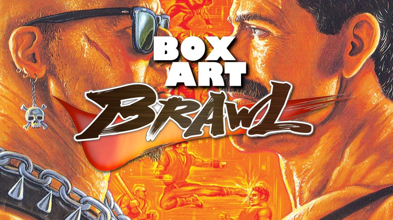
Welcome to this week's Box Art Brawl, the ongoing series where box art variants from around the world face off against one another to find out which is the fairest of them all. Who wins? You decide.
Last week we featured GoldenEye 007 and the world's best known (and therefore presumably worst) secret agent taking on the biggest threat he's ever faced: himself. Japanese Bond came in third after jumping majestically off the dam and forgetting to attach the bungee, which left British and American Bonds to duke it out atop the Cradle. While delivering a questionable one-liner, British Bond took a hit to the kumquats and plummeted to the concrete as his North American counterpart strolled off to meet Natalya in the chopper. Good show, old chap.
There'll be no Martinis or caviar today, though - this week we're gnawing on hunks of trashcan meat washed down with soda. We've got a real street brawler lined up in the form of Final Fight for Super Nintendo. It might not have been the complete arcade experience (most notably ejecting Guy and the two-player mode), but back in the day it was pretty incredible to have Final Fight at home in any form and this port holds great memories for a great many.
So, let's take a look at Cody and Haggar (but not Guy) and see how they shape up in each territory.
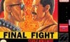
Japan
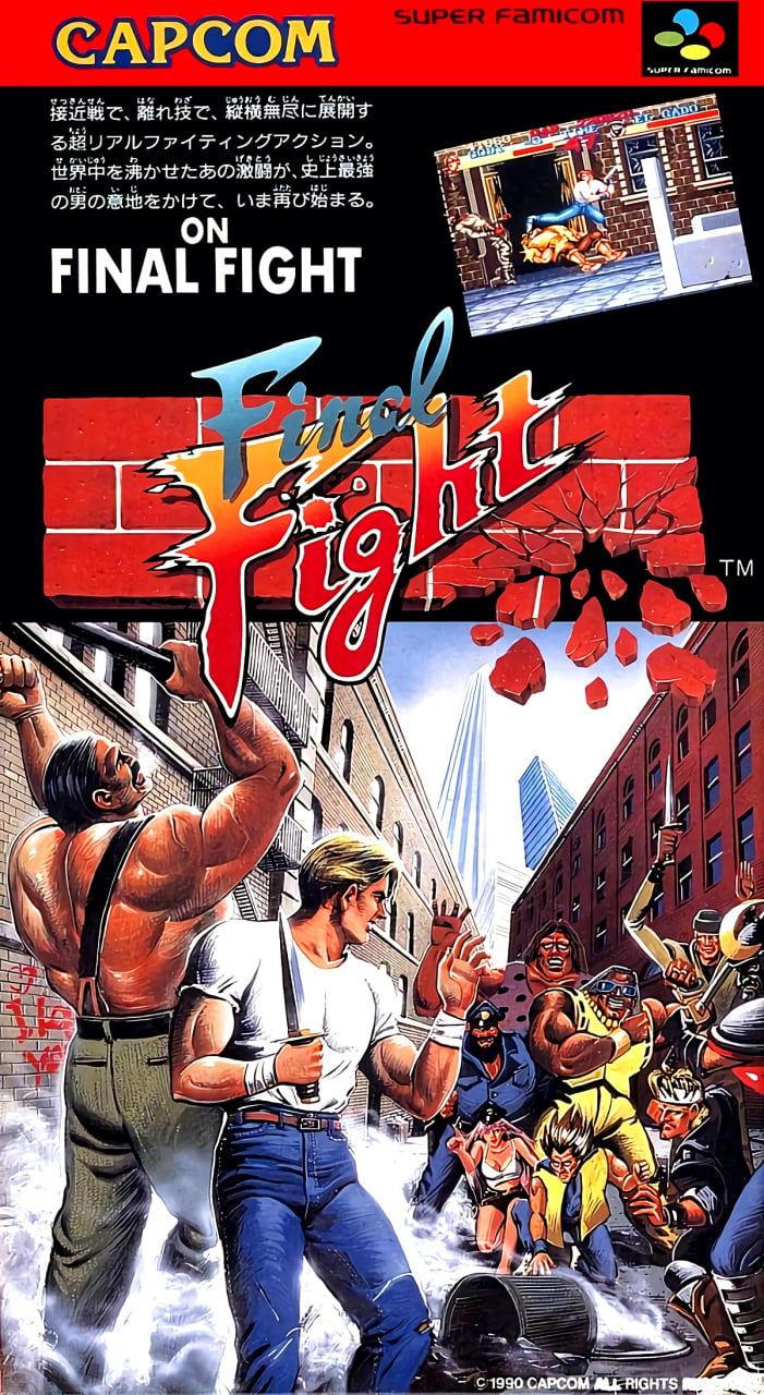
The eastern variant features a dynamic logo over a smashed brick wall and a piece of art in the bottom half showing Cody and Haggar about to brawl with a bunch of goons. Haggar prepares by screaming skyward while brandishing a metal pipe and Cody relishes the moment with a devilish grin; alternatively, he's grimacing in discomfort and wondering if today was really the best time to wear the tightest jeans he owns.
A screenshot appears above the title at a jaunty angle and the title is repeated in the blurb, but this cover certainly has impact.
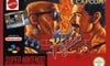
North America
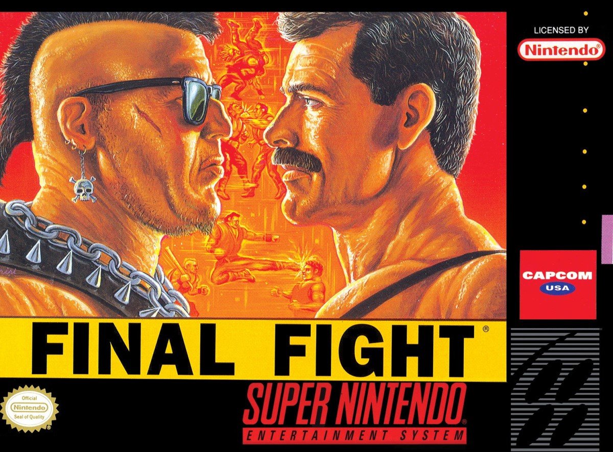
A classic face-off image, Haggar gets uncomfortably close up with a double-chinned adversary on the North American cover. The two figures are so well-drawn and striking that it's easy to miss the dudes throwing down in the background. That's probably for the best because those background figures don't stand up to much scrutiny - what's going on with the guy delivering the flying kick?
The title might not have the style of the Japanese version, but there's certainly no missing it against the bright yellow bar. Top it all off with the standard black border and accoutrements of the NA Super NES boxes (although the Capcom logo is switched for a generic alternative here) and you've got something that's going to grab attention on store shelves.
Europe

The European version adds a colour border as usual and shrinks the main image of the American box, but also incorporates the logo and screenshot from the Japanese box. There are variants of this - the Capcom logo moves to the bottom, the Mattel logo switches to a Nintendo one and the screenshot is substituted with the text 'Take Metro City back from the Mad Gears gang!', but they're all much of a muchness.
Does this blend offer the best of both worlds? That's for you to decide...
That's your Guy-less lot this week. Peruse the options below, click on your favourite and punch that 'Vote' button to register your approval and find out which Final Fighter brings home the bacon:
Ironically, we may return for another Final Fight in the future. For now, feel free to debate the virtues of each brawler below and we'll catch you next time for another bout.


Comments 58
Nostalgia bias wins on this, Final Fight is one of the first games I ever got. NA for me.
I'm surprised most people like the Japanese one better. The art on the North American one is absolutely amazing!
Praise that Haggar moustache. Praise it!
I like the NA one best. The romantic tension between Pornstache and Mohawk Man is palpable.
I am abstaining from voting because they’re all so, so bad. Like, real bad.
Easily the jap one
Is it just me, or does the one guy look like Freddie Mercury of Queen fame? Anyways, the Japan one looks the best in my opinion.
I much prefer the Japanese cover artwork (though the text at the top is a bit odd) and it seems to represent the game better than the NA and EU ones do, which to me is just a really ugly, unappealing image (though at least the EU one uses the cool logo and not just a plain font like NA).
NA should have won by a landslide. The Japan artwork is absolutely awful and lacks the detail of the others - it simply looks like it was quickly drawn and rushed out the door. The European cover has too much stuff slapped all over the place and looks gaudy. The NA version, however is detailed, clean, and perfect.
Japan by a mile away! The western art is memorable for the 90's typical macho cheesyness present in almost all sorts of media from that era. The US cover is the worst of the bunch, they didn't even attempt to use the original logo opting for some common font.
That moustache wins it for me.
The NA cover has convinced me that A slightly older and much more buff looking Freddy Mercury is the epitome of what a macho man should be.
The Japan art looks a complete mess.
European version could be a poster for a gay club, so gets my vote.
@Sakisa Doesn’t mean it’s the best cover though.
Europe. All the way
Japanese has the best artwork. America is the cleanest. And Europe is the most cluttered.
"alternatively, he's a grimacing in discomfort and wondering if today was really the best time to wear the tightest jeans he owns"
Oh man, that made my day.
Also, I'm kind of disappointed to see that the Japanese version is winning. Not so much for the artwork, but because after a million or so years living in this country, I've discovered for the Japanese philosophy of graphic design for absolutely anything (video game boxes, foodstuffs packaging, magazines, textbooks, clothing, electronic devices, live television, wild animals, inert gases - the list goes on and on!) is "let's fill any available space with as much text as possible! But wait, if we shrink that text and those graphics down we can fit in even MORE text!!!" Without that totally unecessary white filler text in the upper-left corner, the Japanese box would be pretty awesome.
Voted jap because it looks they have a great party and everybody waving
That mustache! Those neck muscles! How can anyone resist?
I prefer the Mega/Sega CD covers.
Not even fair. The western covers are absolutely terrible
Voted JP, but NA is also respectable. If you voted EU, I question your life choices.
I’m going with Japan because it looks much more chaotic. The NA one looks pretty cool too. Haggar looks like Tom Selleck a little bit.
@JLPick I thought the same!
I prefer the NA version.
However, the Japanese version we can see 3 characters of the future street fighter series.
I'm all for homoerotic subtexts so I chose the NA one.
I picked the Japanese one even though the characters are a little goofy looking, it still represents what the game is like pretty good. The other ones look gay, and I don't really have an issue with that, but, it's not that kind of game. I think they should have given Haggar a scowl to make it look like a fight.
Go Japs! I could hang that on my wall.
That's not Mike Haggar in the US and Euro versions, that's Dan Severn
Box Art Brawls Current Total:
Europe: 3
Japan: 5
North America: 3
Haggard on the NA box art always reminded me of UFC Fighter Dan "The Beast" Sevren.
Western art takes itself far too seriously (and the comic style art in the middle is just naff. The bottom one in particular, so it's nice to see that get cut from the EU box; there at least is some signs of decision making there lol) So despite some Inception levels of perspective going on in the background lol, Japan wins again.
@OorWullie Too right mate. Capcom artwork really hit a high around that period.
Is Cody waving to someone on the Japanese version?
@gaga64 Lol! It certainly looks like there is some awkward exchange between him and Andore going on
That same Capcom USA logo was used on their other two launch-window games as well: UN Squadron and Super Ghouls 'n Ghosts.
Though Capcom USA used a box with their name as their logo seemingly from 1988-1993, checking box art on GameFAQs. Looks like their standard logo was used on boxart in the US until 1994. Was definitely used in-game though, can remember the 16-bit Capcom logo jingle.
I have never played this game, but how is it that North America isn’t winning by a mile? It’s so gloriously absurd! I guess if you’ve played and enjoy the game, then having it sheathed in a laughably hyper-macho case that could have been a poster for a C-List Stallone movie (“Rambo: Mustache Blood”) is maybe not a plus. But from a comedic / time capsule perspective, the NA cover is priceless.
The NA cover is nostalgic for me, but I'm going Japan here.
I'm surprised by some of the defense of the NA box. Even if the actual art is fine, the concept and composition are questionable and communicate practically nothing about the game. This is another case of which one is least bad. Japan's artwork isn't the best, but the overall concept actually communicates something about the game. I voted Japan. On the other covers, Hagar doesn't even look like Hagar. It looks like post-1990 Rick Rude.
North America looks like a proper action film.
Oof, none of these is great. Awkward art all around, and annoying screen shots and flavor text clutter the European/Japanese ones.
I'm just happy to have the proper arcade version via Capcom Beat Em Up Bundle on the Switch. The Super NES version was good for being one of the first games released for the system, but it was quite watered down compared to the arcade version.
I saw the Japanese cover first and thought, “well, this will probably be the worst of the bunch.”
I ended up voting for the Japanese cover.
Japanese one for me, as I prefer Freddy Mercury in a pinny doing the housework
Japanese one... not that the artwork on that is good (it really isn't) but the other two make me feel like I've wandered into the wrong chatroom
@OorWullie Yep, these.
Honestly, why is Japan winning? Is it homophobia? It looks so goofy. We have midget woman, parallel to discount Vegeta, whilst behind them we have a big pimp who's put on the guy behind HIM's shades. Next we have a guy who appears to be surrendering as well as holding a knife... He may be Mr. Fantastic's evil counterpart. Then we have a burlier version of the cop from the Village People's YMCA video. What on earth is happening?
I honestly voted for Europe, the darker filter makes the dude on the left look more Native and Haggar less like Freddy.
Surprised that so many voted for the Japanese version. I find that one to look a little juvenile and cartoony. The American version looks clean and of course, features Haggar so that's a big win right there.
All three covers are ugly! I voted for the Japanese one since it's the more decent one for me.
I love that they're smiling on the Japanese cover. Like they're thinking "it's gonna be so much fun stabbing each other".
The NA box is some top tier video game art
Home computer versions of Final Fight by U.S. Gold had its own artwork.
https://gamefaqs.gamespot.com/cpc/940393-final-fight/images/190252
Good God, that Japanese art is DIRE. Perspective is complete trash, anatomy is straight out of a junior high school student's notebook of superhero doodles, the bad guys are throwing up so many awful stereotypes, I have no idea what Haggar is supposed to be doing, and the other dude's legs are facing almost exactly the wrong way for his upper body and the logic of the scene. This should have been featured in last week's box art shame article.
That Japanese version is far superior in opinion as the votes seem to attest to. There is just so much cool stuff going on in the imagery.
Voting for Japan because it looks like a game cover. Both NA and Europe both look like the covers for adult films...
At first I laughed at the poorly drawn muscles on the japanese but then I noticed the neck wrinkles on the other ones and its really freaking me out. Now I cant even look at the NA and Europe one!!! And the short little leg on the guy kicking behind the wrinkly muscle people is making me wonder if hes kicking or does he simply always have the long leg extended and uses the little leg as a spring just to get about?
30 years later and it's still the greatest beat-em-up of all time.
I vote Japan because two dudes staring at each other is as boring as hell.
The Japanese cover art is the one which best conveys that the game is a scrolling beat-'em-up, with the two heroes in the foreground squaring off against a multitude of baddies in the background.
The North American and European covers, on the other hand, mainly feature two dudes staring at eachother, which might mislead consumers into believing that the game is a one-on-one fighter.
Show Comments
Leave A Comment
Hold on there, you need to login to post a comment...