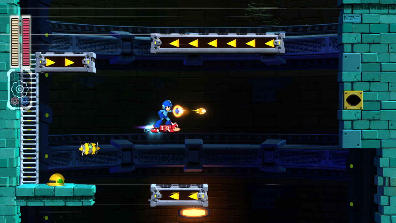
Capcom took the industry by surprise with its announcement of Mega Man 11, the continuation of the classic run ‘n’ gun series. Though it appears that it will adhere quite closely to the beloved template that all its predecessors used, the new art style has divided opinion with its 2.5D style. It’ll still be quite a while yet before the game releases, so there’s plenty of time left to polish it up.
As part of a lengthy video series, Game Informer talked with Yuji Ishihara—the game’s lead art director—who walked through his experience with the franchise thus far and explained his hopes for the new style in the new game. Check it out below:
 Watch on YouTube
Subscribe to Nintendo Life on YouTube847k
What do you think? How do you like the new art style? Which Mega Man game is your favorite? Share your thoughts in the comments below.
[source youtube.com]


Comments 33
Love it. It looks like what I think most people were hoping Mighty no. 9 would end up looking like.
8-Bit was cool with 9 and 10, but IMO it would have gotten kinda stale if they did it again. Plus it's been years since Mega Man has gotten a new game, so I think something a bit more grand than another 8-bit title (especially in an era where games like Shovel Knight and Mighty Gunvolt exist) is needed for his triumphant return.
I like the new style. When you hit 11 in a series and 8 or so of them have nearly identical sprite work for the main character, new is good. The New Super Mario Bros. series got stale for me because every entry looks exactly the same with minor bumps in resolution. The cartoon-y WayForward style is something I really appreciate, it works well for Shantae. It could work very well for the Blue Bomber.
8-bit will always look better to me but by then I'll have enough 8-bit Mega Man games on Switch so I'm more than happy to have a new style. Perhaps they could have it switch between the two similar to Wonder Boy? As long as it plays well that's all that really matters anyway and if it gets near the quality of 2 or 9 then we're in for a treat
I'm not gaga over the new style, but at least it looks like it had some effort put into it. I'm just excited that we're getting another modern entry in the series. So glad it's not another weird GX, Battle Network thing.
The fact that he’s managed to skate that fine line between nostalgic and new is a testament to this designer.
I really dig the new look.
I'm just glad they didn't go 8-bit again.
I like the new and old look! I prefer this new look to Mighty no.9 too.
The new look is growing on me. I gotta say, that art posted by the Owlboy art guy is my favorite though, I'd love a full game like that.
I think the new art style is not that bad. Better than the mega-man chiba style remake we got for the psp. Ofcours a few better shades with thicker outlines could do wonders
I'm really digging the new artstyle and 2.5D levels.
I love everything about it, its just a shame it took them so long to finally do this.
much much much better
I like the 2.5D stylings of this outing. There is, however a little person in me that's secretly hoping that the team behind this game slides an option to let you switch between 2.5D and 8-bit styles. It sure worked for Wonder Boy....
This is much better, the 8-bit look turned me off Mega Man 9 and 10.
This looks more like a new game rather then just a hack.
I hope they improve in-game apparence because he looks like a Mii...
It reminds me of the SNES Mega Man 7 or the CD based MM8 in style so it's fine and looks good.
8-bit spritework has been done to death. Glad to see them try something new.
I was a little disappointed to see the sprite work go, but I love 2D platformers in this style.
I thought this was about the old 2D pixel sprites Vs. the new 3D models, but it was about the design of Mega Man's character art instead. Which is fine.
His look is fine, it's his voice that shocks me.
It's definitely better than most of the other 2.5D/3D Mega Man games but it's still not quite perfect. It's all a bit too zoomed out imo, with Mega Man and the other characters appearing too small, and there's still a kinda rendered look to it that doesn't quite capture the more "toon" look that I think would have been perfect for this game. Like the drawing of Mega Man in the thumbnail looks great, but he doesn't quite come across like that in the actual game to me.
It looks perfect. Pixel sprite could have been great as well but not 8bit sprites. A job like Inticreate does with Azure Striker Gunvolt would have been nice. I liked the fact that a lots of things have eyes like past games. For example, the huge pyramid in the baground at the start of the trailer has eyes.
I think it looks good. The retro 8-bit look has kind of been done to death now. It's not really very appealing imo.
The new direction is fine...but I do love me some good Sprite work. From what I hear it's expensive to do if done well. I just wish the new look had a better animation when he runs. Looks stiff.
The art is fine, ppl moan for anything.
In really happy with the way things are looking. I look at the footage and it feels like mega man so I'm happy with the art style. My favorite mainline mega man is mega man 3. The first mega man x gotta everything right from sound to stages. Im happy my favorite heroes from when I was a kid is coming back.
I love the art direction. Rich, colorful pallet, soft shading. Its hard to tell the modeling is 3D. This type of 2.5D has come a long way. And, to me, the top graphical layer actually looks to blend in better with the background becaise of all the intermediary layers of parallax than even the typical 2D game. I don't see the disconnect.
I'm getting tired of retro 8Bit and especially the lazy 8.5Bit art direction passing as "retro" coming from so many Indies. Which is why whenever artistic efforts like Wonderboy and Shantae come around, I snap them up!
The art here looks great to me. Very refreshing and happy Capcom didn't cop out with another 8Bit cookie cutter release.
It's so nice to see the original blue bomber continue. Here's hoping the game goes well.
I'm not fan of the new art style. Something just feels missing from it. The mix of the new "comic" style art and the 3D models with cell shading kind of kill it for me.
They didn't have to do 8-bit like the NES games, but pixel art just with higher detail.
Gameplay will matter most, but my opinion is the new art style is a dud.
Wish they would do a HD style aesthetic of a Mega Man Zero look, with the lighter washes and pastels. But if they continue to polish this in the next year, this game could look great. Right now, the enemy models and their animations look stellar though. I understand the necessity of dark simple backgrounds in a 2.5d environment, but they just look so bland right now. The actual art direction for the character designs look really great though. Interested to see how it all shakes out - will buy regardless.
I'm not against 2.5D on principle. There's no reason that can't be done well. The key is for developers to know what not to do, despite the ability to do anything. So far, Mega Man 11 looks to be doing 2.5D right. The environments are clear and easy to understand. The art direction looks to be a pleasing and appropriate in style. Characters look like someone drew them. I like it so far.
Though it would be a titanic task, I’d like to see all 10 Mega Man games remastered to be consistent with this new one.
Nice video.
Show Comments
Leave A Comment
Hold on there, you need to login to post a comment...