Perfect Dark is perhaps one of the most accomplished games in the N64 library. It built on the solid work seen in the sublime GoldenEye 007, pushing the host hardware to its limits and making excellent use of the N64 Expansion Pak to deliver the kind of visuals that rival systems could only dream of. It remains one of Rare's best Nintendo efforts, and is fondly remembered by fans even today.
However, there's one mystery surrounding this game that has bugged us for years: why did such a high-profile release have three different cover designs for its regional releases?
Subscribe to Nintendo Life on YouTube848k
Now, swapping cover artwork isn't anything new; companies have been doing it for decades. Back in the 16-bit era, it was common to see perfectly good Japanese artwork get replaced by horrendous western efforts, the vast majority of which were almost always inferior to the original.
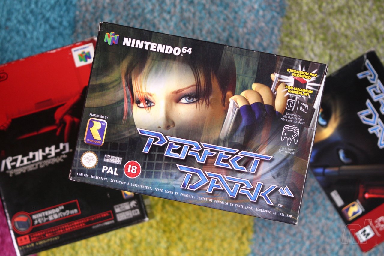
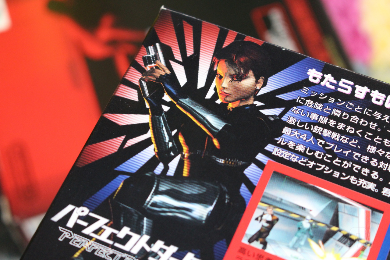
However, Perfect Dark is unusual in that the North American and European boxes have different (but thematically similar) designs, whereas the Japanese box opts for a totally unique red-and-black image which is perhaps the best of the lot; it shows Joanna Dark reclining on a sofa, gun in hand and sniper rifle nearby. It's one of the most understated covers you'll see for any home console AAA action title, and it works brilliantly – but why was it used for the Japanese version, and why did the western releases use two different takes on the same design?
We needed the US one ultra quick and there was no model at all to use for the artwork
Keen to get to the bottom of all of this (because we're sad like that), we got in touch with former Rare Art Director Kev Bayliss. It turns out that Bayliss – who now works at Yooka-Laylee studio Playtonic Games, along with many other Rare alumni – was involved with the creation of the two western covers.
"We needed the US one ultra quick and there was no model at all to use for the artwork," he explains. "So I had to quickly make some eyes and create a box art in about a day. That’s what we ended up with and as a consequence of that, I was given the task of creating a proper Joanna Dark model – so that’s when I got involved in the series. I made the model that was then used for the European box art and all promo material at the time."
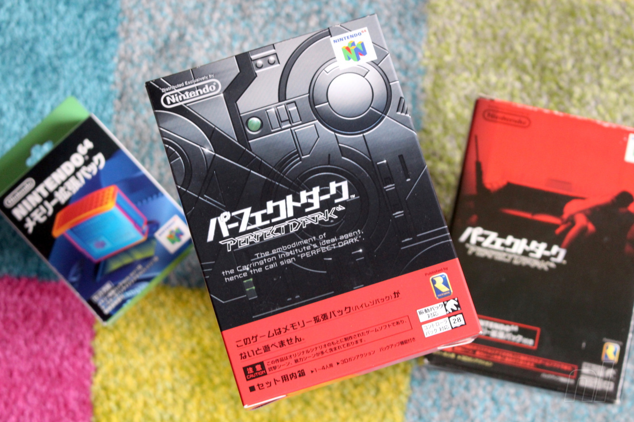
Sadly, Bayliss is at a loss when it comes to explaining why the Japanese version of the game doesn't use the same cover art. He asserts that the decision to use a completely different image was entirely Nintendo's, not Rare's. Still, Bayliss approves of the choice.
I love that there are three different pieces of artwork for the game
"I'd never seen the Japanese box art until I saw it on fellow Rare staffer Simon Farmer's shelf one day, and I loved the artwork style," he says. "In fact, I was really close to buying a mint condition boxed Japanese copy a few months ago for about £60 but I got wrapped up in moving house so I put it on hold. I love that there are three different pieces of artwork for the game, but I kind of like the European one I did. It was a bit more realistic than the Killer Instinct models I’d made Previously."
So there you have it; the North American box has a different main image because there wasn't a 'cover-worthy' version of Joanna Dark available until Bayliss quickly put one together, and the reason the European cover has different eyes is because it's based on Bayliss' more detailed character model – which, ironically, appears on the back of the Japanese packaging. We still don't know who at NCL is responsible for that amazing Japanese cover, but perhaps one day we'll find out.


Comments 39
Sadly this is one of the few classics i never got to play.
Wow. A game spends years in development knowing very well it’ll eventually need a cover—a huge influence for the casual buyer—then there’s a time pinch and the poor guy has to design it in a day!
This makes me wish Rare Replay would come to Switch. Not just for Rare, but the Ultimate games too.
The Japanese cover looks like the poster for an early 90's Luc Besson film.
Wow, 20 years later this finally clears up why the American cover looked less defined than the European cover. Compared to other Rareware boxart on the N64 I always thought the American version of Joanna Dark was rsuhed. And it apparently was.
I don't remember, was it released earlier in America?
It was a very common practice for games to have different covers in different regions back in those days.
@RobotReptile: The "time pinch" is responsible for the (usually criticized) North American boxart for Mega Man (the first).
I like the American one the best even though it was created in a day. The use of shadow to obscure her face and the laser on the gun looks badass and totally evokes the covert operations you'll be embarking on in the game. Plus it looks like the more primitive early CGI which has an aesthetic I'm fond of.
Well, I'm glad we got the best looking version, then. From the artist involved with the game, no less, so I'm happy.
As for the article itself: besides the question about the most intriguing cover remaining unanswered, it's also not all that special in general, to see vastly different covers for game cases, in various regions. To this day, it still happens, so that in and of itself really isn't all that special.
Japan probably had the best boxart here. North America would be second, and that PAL release is definitely the least appealing. But none of them are terrible.
Yea @SKTTR it was released one month earlier than in the UK and European release and three months earlier than The Japanese release.
@JayJ Thanks for repeating what was said in the feature
@ThanosReXXX Has there been any other really notable example of all three regions having different art, though? Sure, Japan often does its own thing, but most of the time the NA and EU versions use the same artwork. I think it's interesting that in this case we have three pretty unique approaches for the exact same game - and a AAA one at that.
Ocarina of Time and Majora's mask both had different artwork in three different regions
@Damo Yeah, there's that, true. But like you also mentioned in the article, different art work was already always a thing, although mainly between Western and Asian releases.
Would have really liked an answer as to the why of that Japanese cover, though...
@Damo
Does Pikmin 2's box art count? US focuses on action, PAL focuses on nature, JP focuses on the Pikmin themselves.
@Damo Zelda covers were different (gold and black) that's all I can think of and even then, I'm not confident saying it's classed as different artwork lol.
@Damo Tell a lie, there was an American cover that had a women half on the cover (I always thought she looked like Kate Winslet lol). She wasn't on the UK version. (Annoyingly, can't remember the game's name.)
@BacklogBlues it’s available on Xbox Live on 360 and Xbox One and worth hunting down a cheap 2nd hand console to play (My local cash converters is selling the OG X1 for £60
I’d still call it the greatest FPS ever made. It has so many ideas that other games have never pilfered, like extra mission objectives on harder difficulties and unlocking the cheats is a real challenge. The real meat is the never-bettered multiplayer mode. Every lunchtime at college my mates would come around to mine and we’d play 4-player. But the sheer level of customisation is infinite. We used to team up and fight off an army of boys as well as have teams of 6v6.
Good times.
I love that Japanese cover, wow! I'd seriously hang a poster of that, and I'm an adult.
On the topic of US vs European covers, though, there seems to be a long tradition of the US getting cheesy versions sapped of all class. The first things which spring to mind are Ico and Final Fantasy 7...
I think the European version is the best looking one in my opinion, looks really great!
@BulkSlash That's a really good example!
@ThanosReXXX I really hoped Kev would know who did the Japanese cover
@Mycroft Loved playing the parking garage with Farsight and cloaks! It was like the PD version of Goldeneye’s Temple with Rockets
I still have an unopened copy of PD. Historically it has been my favorite game. Multiplayer is still fun. Co-op is unplayable due to frame rate. Perhaps if there was a 16mb RAM expansion.
I still think the NA cover is the best, but the Japanese one is cool too. IIRC it was based on some advertisements.
5/23/2000 is one of the few dates I remember.
@able_to_think which is hilarious if you stop and think about it. First level you kill everyone from the roof to the ground floor. Get in an elevator and somehow loose your suppressor, kill everyone in the basement. THEN the guy who you knocked out at the elevator shouts "sound the alarm, she's here". And they shut off the lights up stairs and have barricades.
What?
But I guess when you're 10-13 you don't think of these things.
@N64-ROX Final Fantasy 6/3 was really bad in NA.
@Damo Forsaken!
Normally I like Japanese covers more but I dunno, that doesn't really fit the game that well : / Does that even really look like Joanna on the front?
The model used for the EU release obviously look better but the cover itself looks so messy with the logo covering her mouth and all that information everywhere, I actually prefer the US one I think.
Why does this article matters much?
I never knew there were three different covers, and honestly? I like the european one the most
I stopped collecting games like I used to, but that Japanese cover made me itch for getting a copy of it, so I totally get the guy. I won't actually do it though, but it IS amazing.
I always admired the way Jo looks in the PAL version. The Japanese one has way too much red for me. I'd always prefer the North American version for the pitch "dark" background and the Maian that can be identified as Elvis from the reflection of Joanna's eye.
@BacklogBlues I recommend finding a decent N64 emulator for a smoother experience. I would also direct you to the XBLA remaster, but it gave the game a much uglier makeover and the soundtrack is a bit botched on certain notes.
@BacklogBlues ive never seen a more fitting username comment combo
I love the Japanese version as art, but I think the others fit the game better.
It could be four covers because the Australian one is the American one despite it being a PAL region. The only difference I can see on these images is the local classification label. On the back it could mention PAL and for AU/NZ only. I'll sell mine in mint condition for one hundred million, gazillion dollars. Muahahahaha!
I probably prefer the US/AU one best. I don't like it when videogame characters are made to look too human.
"it was common to see perfectly good Japanese artwork get replaced by horrendous western efforts"
This is gold
The European box art is easily the best of the bunch.
The Japanese slip case is beautiful as are pretty much all Japanese N64 boxes.
Loved this game, especially the multiplayer as you could have CPU bots. Remember playing with 12 CPU set as pacifists (if you had a gun or weapon they would disarm you) an trying to rack up score as they run towards you.
The Japanese artwork is so evocative. It could easily pass for film noire poster
Show Comments
Leave A Comment
Hold on there, you need to login to post a comment...