Happy Sunday, everyone; welcome to another edition of 'Box Art Brawl'!
We've got another great one for you this week, but first let's take a look at the previous results. Last time, we featured the GameCube classic from Rare Ltd, Star Fox Adventures. Criminally underrated at the time of its release, the action-adventure title has nevertheless gained significant respect from Nintendo fans in the years since.
For Box Art Brawl, it was another duel in which North America and Europe teamed up to take on Japan. It wasn't a close one either; the western design clearly struck a chord with readers, taking in a hefty 79% of the vote.
Subscribe to Nintendo Life on YouTube845k
This week, we're moving forward in time to look at another underrated title on the Nintendo 3DS: Resident Evil: The Mercenaries 3D. Taking the Mercenaries mini-games from Resident Evil 4 and Resident Evil 5, The Mercenaries 3D was a solid action title, but failed to impress fans who were hoping for a proper Resident Evil game on the 3DS. That wouldn't follow until a year later, when Resident Evil: Revelations launched in 2012.
This time, the western designs are similar, but different enough for us to have a proper three-way battle, so without further ado, let's get started!
Be sure to cast your votes in the poll below; but first, let's check out the box art designs themselves.
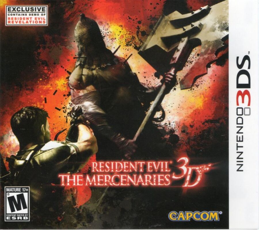
North America

The North American design for The Mercenaries 3D features RE veteran Chris Redfield coming face-to-face against Resident Evil 5's take on the chainsaw-wielding Dr. Salvador: the Executioner. It's a striking image, to be sure, with the background adding more impact with explosive textures and effects.
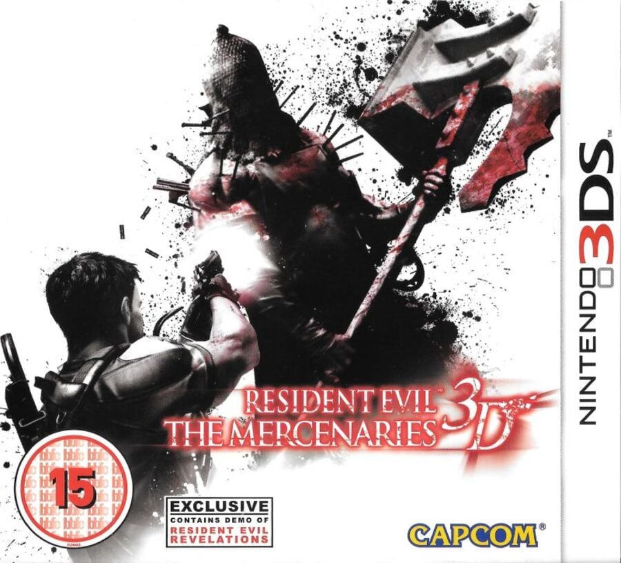
Europe

Europe's design, on the other hand, features the same image, but against a pure white background. It actually works quite well as a more abstract take on North America's design, arguably making Chris Redfield and the Executioner pop out even more.
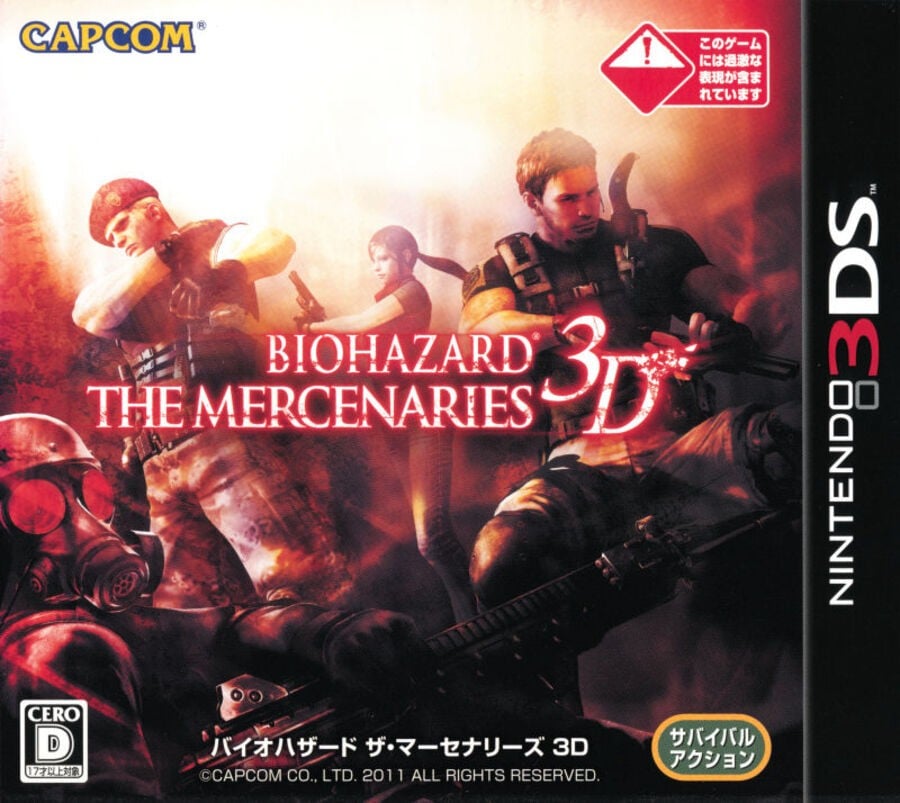
Japan

Japan's design is a little bit different, choosing instead to focus on some of the characters you'll be playing as in The Mercenaries 3D. You've got Chris Redfield, his sister Claire, Jack "Witness the Power" Krauser, and HUNK. Honestly, why Capcom chose to omit Albert Wesker here is a bit of a baffling choice, but we'll let it slide. Overall though, it's a pretty cool image!
Thanks for voting! We'll see you next time for another round of the Box Art Brawl.


Comments 33
i mean you cant say no to that stark white background
All I can say about this game is that I hated it so much that it made me sell my entire 3DS library at that point (which to be fair was only 3 games), one of the worst games I've ever played and an insult to the classic Resident Evil 4 merc mode.
Europe. Always liked that box
@Expa0 Why did you sell your other games just because you didn’t like this one? 😕
None of these look particularly good, but if I had to narrow it down to one I'd probably go with EU for reminding me of those classic Metal Gear boxarts.
Honestly all are quite bad for once. Though the whole project was clearly a low effort thing from Capcom.
Doesn't matter which one, this game is a joke.
For me, this was between the European and North American boxart, in the end I went with the one using the pure white background.
I opted for the Japanese one simply because it looked more like the game, the US/EU one could easily have been used for a "Resident Evil 5 3D".
I chose Japan because the other two look too much like an actual resident evil game. Japan one has loads going on, which might give a clue that this isn't a survival horror game, and it's a naff arena shooter which reuses some assets from better games.
Great little game. Spent countless hours this with my best friend after we'd exhausted Raid Mode on Revelations.
I like Europe's box art, but Japan's probably represents the game better.
I voted for Japan, but between the U.S. and European art (the latter of which was also used for the Australian release), I'll go with the European.
Perhaps it's just the warm and fuzzy memory of having bought the game upon launch back in the day, but the simplicity of the background also implies a certain minimalism to the game itself, which is fitting given its scope. And I must have played that Revelations demo half a million times like I did with the Metroid Prime Hunters demo for the original DS.
But the difficulty ramped up so quickly that I was never able to complete Mercenaries 3D. Sometimes I'd just jump into a harder level just to see the brutally chilling death scenes.
North America hands down. I don't like the white background of the European cover. It's as if they exist in a void, whereas the splattered colour gradient at least suggests a sense of place in the NA version.
Japan, easily. The others are so boring.
@Moistnado The text in the bottom right corner says it is a "survival action" game.
Uh-oh. I think the boxart to both western versions made an error. They misspelled text saying it has a demo for "Resident Evil Revelaitons".
This was a hard one, but I went with Japanese. I liked how it shows all the "mercenaries" on the cover. Europe was a pretty close second though.
For I think maybe the first time ever (outside of instances where they share art with US or JP), I think I'm going to give the vote to the EU cover.
Usually when all 3 regions have unique art, they tend to be the weakest IMO, but not in this case. I could see the EU art working as a poster.
Easily Europe for this one I'm surprised it is currently so close. It's unusual because the Japanese Biohazard covers usually knock it out of the park yet I'd say that's the worst of the 3.
Box Art Brawls Current Total:
Europe: 40
Japan: 45
North America: 48
Australia and New Zealand: 1
If they combined the black border from the Japanese version with the US version's box art, it'd be hard between US and EU, but now I prefer the EU version somewhat. Played this game for over a hunderd hours, solo and online, and I still boot it up from time to time. I bought it digitally when it was at a deep sale, but still have it physically as well, and I must have played that Revelations pilot level hundreds of times, followed by the real demo hundreds of times, and finally the full game many many times through, a ton or Raid Mode,... RE on 3ds was amazing.
Well, the Japanese one does actually show The Mercenaries, meanwhile the Western ones shows just A Mercenary.
So, the Japanese one is in tune with the title.
Gotta go with Japan on this one. It doesn’t exactly scream “horror” (which I’m assuming is the point of the game), but at least I can tell what I’m looking at instead of a blob.
Voted for Japan for showing more characters, it gives you a better idea of what the game offers in terms of choices. I also think the art is better.
I think the European one just shades it with the North American one. I think the white background makes it try and convey a "psychological horror" in terms of imagery and not just a standard "visual horror"
Why would anyone vote for the European one is beyond me … it’s horrible.
NA for me. I strongly prefer the red/orange background.
I really enjoyed this game, played so much of this back in the day. But yeah, it doesn't exactly age well when proper Mercs modes from 4/5/6 on Switch now exist.
Japan gets my vote
I love the idea, the thing is 5 bucks... The fact I've never bought the European one shows it's a bad cover!
In color I do like it though! ❤️😁
This is the tightest race I've seen on a box art brawl.
North America for me. The white background for the Euro cover hold it back for me. The Japanese one is pretty boring. It has no action or movement, but also no strong posing either. It's not good for a cover.
@somebread
Well, you can.
Pretty weak across the board but I'd choose Japan if I had to
I wish there was an option in these polls when you like 2 equally. I can't count how times I can't choose one as a favorite. If there's 3 covers, maybe additional options to like 2 of them together or all 3!
Show Comments
Leave A Comment
Hold on there, you need to login to post a comment...