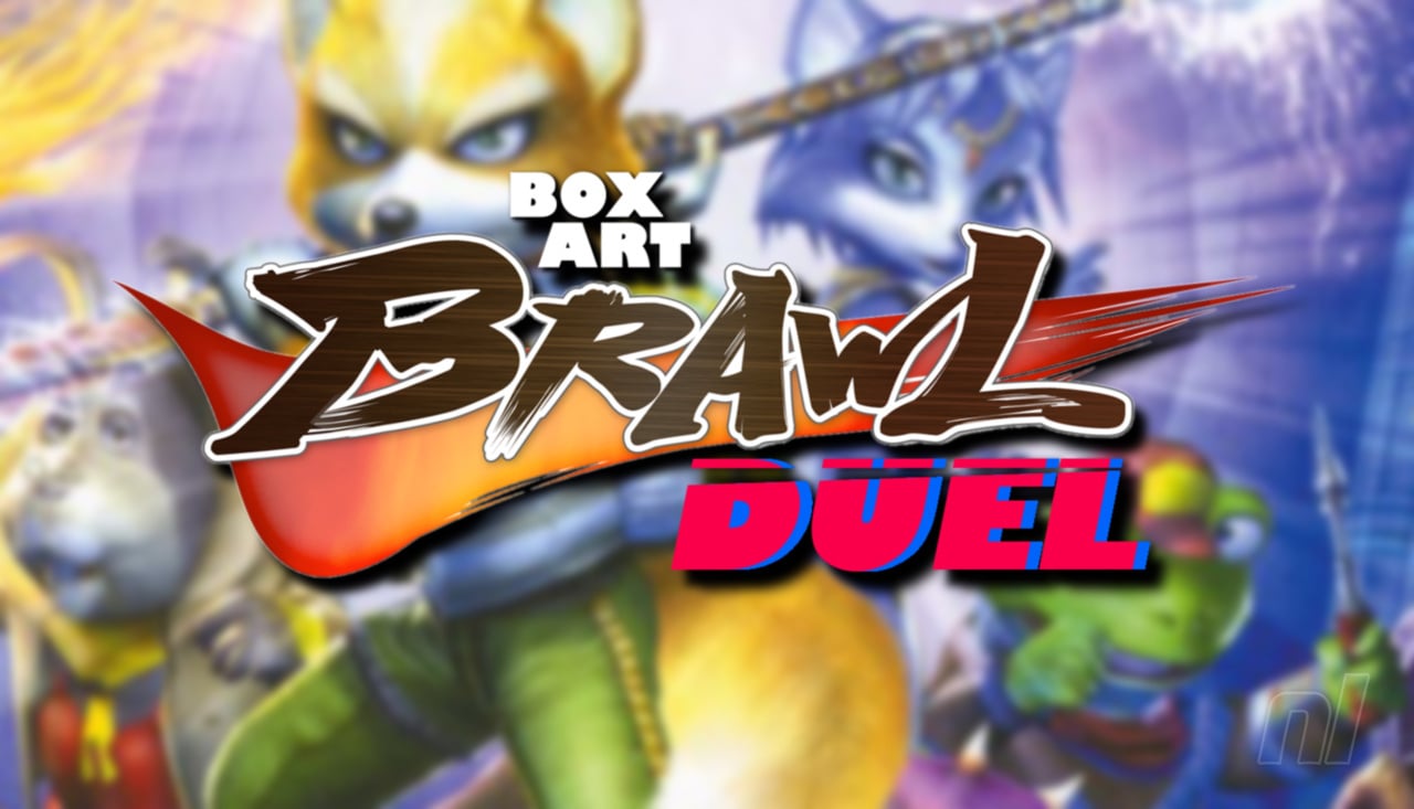
Hi everyone; welcome to another edition of 'Box Art Brawl'!
We hope you've all had a fun and productive week since our last battle. Last time, we took a look at a GameCube classic with Harvest Moon: A Wonderful Life to celebrate the recent announcement of its remake, Story of Seasons: A Wonderful Life.
It was another resounding victory for North America and Europe, with the duo taking in 62% of the vote. We have to say, we firmly agree with the result on this one. The Japanese design was excellent - not to mention super cute - but we reckon the more serene composition of the western design does a better job at communicating the overall tone of the game.
Subscribe to Nintendo Life on YouTube847k
This week, we're looking at a GameCube exclusive title that has, rather surprisingly, yet to see any kind of re-release (though perhaps not entirely surprising given its sketchy reputation with gamers): Star Fox Adventures. The title celebrated its 20th anniversary this week and even got a little nod from ex-Nintendo veteran Takaya Imamura on Twitter.
Starting out as Dinosaur Planet on N64, Star Fox Adventures is a huge departure from previous Star Fox games, showcasing 3D adventure gameplay that would have been more at home in the Zelda or Banjo-Kazooie franchises. Nevertheless, its gained a dedicated following in the years since and still, arguably, holds up pretty well today.
North America and Europe is teaming up once again as there are no discernable differences between their respective box arts. Japan, on the other hand..? Yeah, it's different!
So let's get cracking!
Be sure to cast your votes in the poll below; but first, let's check out the box art designs themselves.
North America / Europe
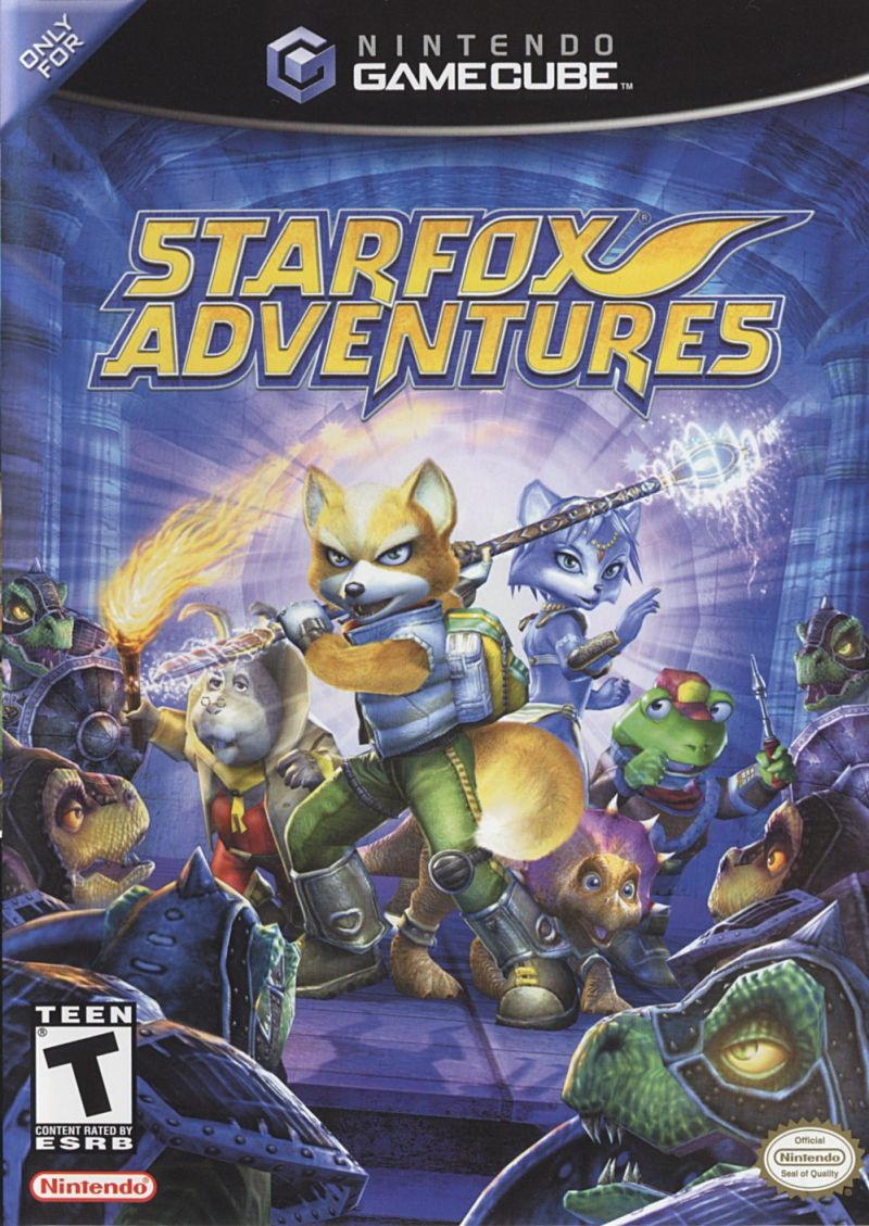
Like a lot of box art from the GameCube and GBA era, Star Fox Adventures' western design is more of a realistic composition when compared to Japan's more abstract design. It depicts Star Fox himself, alongside Krystal, Prince Tricky, Peppy Hare, and Slippy Toad. You could argue that the design is perhaps slightly misleading, since the latter two characters provide remote support from afar, rather than joining Fox on the field, but alas.
It's a cool design overall, and we particularly like the imposing nature of the Sharpclaw pirates surrounding our heroes!
Japan

Japan's design ditches the traditional background for a sharper focus on the characters themselves, with our heroes facing upwards above the game's logo and the Sharpclaw army facing downwards. It's a nice design, though perhaps the grey background itself leaves a lot to be desired. The logo does a lot of the heavy lifting here, but is it enough to clinch victory..? Let's see!
Thanks for voting! We'll see you next time for another round of the Box Art Brawl.


Comments 38
I voted the USA version.

I have the game since March 2021. 😎
Japanese. It looks more stylish and the characters facial expressions look better.
Definitely Europe this time. This really takes me back. This game was amazing and a let down at the same time. The gameplay in foot was great and the graphics amazing. But back then I hoped for a sequel like star fox 64.
For once i have to say US/EU. While i feel the japanese counterpart is visually more clear and graphic as usual, i feel the "blue+action" suits more the title.
Honestly, unless the art is just garbage, box arts that set a good scene will typically always win for me versus box arts that just slap some artwork on the cover. So yeah, NA/EU for me.
Now is as good a time as any to lay down my hot take on this game.
It was okay.
They're both good, but the NA/EU one looks positively epic. That said, I haven't played the game so I don't know which cover gives a better feel of the actual gameplay.
Definitely NA/Europe this time around. The background gives it a slight edge in my book. I like both though.
I loved this game back in the day. Would love to play it again.
My vote went to the European box art.
I LOVE this game. I wish we would get a remake.
I went for NA/EU as that’s the box that sits on my shelf and gives me all the feels.
I actually think the Japanese one looks awful. What was that artist thinking?
Both look good IMO, however, I have to give the slight edge to the Japanese version, so I voted for that.
I like that the western one shows Fox's legs and feet to make it clear that you'll be doing a lot of walking/running and not a lot of flying.
While the US art is more action packed, I went with JPN because the background looks like it might not be "grey" (like the article states), but instead holographic, which would make it an instant win.
I could only find one (short) video on YouTube about the region's box art, but the guy only focused on the back art before removing it from the sleeve, so I couldn't get a good look at the front (which did look shiny, but I'm not sure if it was a genuine holographic effect or just glare). Can anyone shed some light on this?
Anything with Krystal on is an automatic win for me.. 😅
@Olliemar28 It's quite a shame Dinosaur Planet didn't get released on the old Nintendo Fourty-Six. They needed more bits I guess.
NA wins this time. But, this game is really bad. Once I played it two years ago on my modded Wii U, I understood all the criticism the game received: it's a poor copy of a Zelda game. The only good thing about it is the Arwing section, that lasts 30 seconds.
Tough call love em both!! Just for me personally the JAP version wins slightly.
I won't just outright dis the Japanese image, but the western image tells me all I need to know.
It's a close one, but I'll go NA/EU on this one.
Game was really cool. It's a shame Nintendo never does more than one game in a certain style for Starfox =P
Somehow the western cover gives me the impression that Slippy, Peppy and Krystal are playable, and as far as I remember they're not except maybe Krystal but only at the beginning before it focuses on Fox messing around.
I like both covers, though. I cannot decide this time.
EDIT: I decided to vote for the Japanese one just for showing the Rareware logo.
In this case, both versions aren't bad to me. Both are well composed for what they're meant to be and succeed as game covers in my opinion. I prefer the western cover. I appreciate that it's depicting a moment of action and tension. I also like that it looks more like it was drawn compared to the Japanese cover which looks more obviously computer rendered. In this case, the overall look of the western art appeals to me more.
The NA one is better. Although the scene it depicts is a complete lie.
It was a bit tough to decide but overall i gotta go with the US version, is more dynamic imo.
This game is such an anomaly in the grand scheme of Nintendo: the only real Gamecube game made by Rare for Nintendo and it ends up as the glued-together remains of a completely original game. I'm not going to say I like it necessarily, but I do find it incredibly interesting as a piece of gaming history.
Oh and as for the box-arts, NA wins out for me. I'm not the biggest fan of either of them but the NA one is extremely iconic to the game and is so much more visually interesting than JP.
“ARE YEH RETTY TO GO TO KR̃R̃AZOA PAHLACE?”
-Shrek Statue
Box Art Brawls Current Total:
Europe: 39
Japan: 45
North America: 48
Australia and New Zealand: 1
North America/Europe it shows you what the game is about and the artwork is quite nice.
North America and Europe comfortably here.
The design is superior. Has a sense of environment and a good featuring of the characters there. The Japanese one allows the lettering to dominate way too much.
@Anti-Matter WAIT ANTI NO IT'S T-RATED
Yuck, they both look pretty bad, IMO.
If I saw both at a store, I would buy the Japan version.
Until I noticed the script, I presumed the NA one was the JP one. It looks more artistic, as is often the case with JP games. Naturally selected NA as the best, and no surprise it's 80/20 in its favour after almost 2000 votes.
Back when it was new, Star Fox Adventures was the first GameCube game I ever owned, so I spent a lot of time admiring the box. I have a very deep nostalgic connection to that NA box art.
The facial expressions look derpier on the English version so I went with the Japanese.
You're all nuts,
the Japanese one is far better.
Grey background loses it
Hesitated for a minute because the NA/EU version was so washed out and lo contrast, but @anti-matter posted a photo and that looks like I remember. Nice and high-contrast. Both are good, but I prefer the action poses from NA/EU to the "just plain poses" from the Japan cover.
Show Comments
Leave A Comment
Hold on there, you need to login to post a comment...