With the launch of Splatoon 3 (that's today, by the way!) and Pokémon Scarlet and Violet on November 18th, Nintendo is celebrating both games with their very own Nintendo Switch: OLED Model designs. While we love both designs in their own way, we at Nintendo Life most definitely have our preferences, and we want to know yours too!
So let's take a look at both OLED models and see what we like and dislike about each. Afterwards, be sure to vote in the poll and let us know in the comments which one takes your fancy!
Subscribe to Nintendo Life on YouTube848k
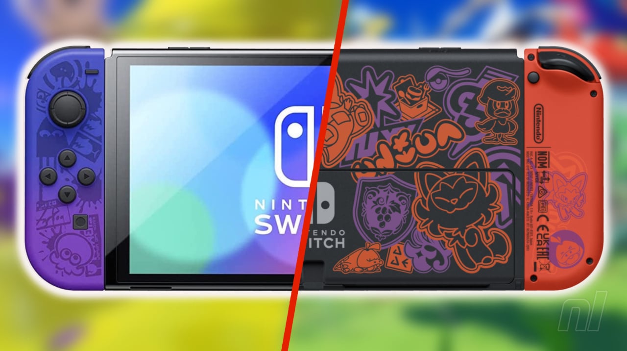
Splatoon 3 Switch OLED
The biggest draw of the Splatoon 3 OLED console is undoubtedly its beautiful Joy-Con designs. It's the first instance we've seen colour gradients used for an official Joy-Con design, with the left going from yellow to green, and the right from blue to purple. Not only that, but each Joy-Con features an intricate pattern displaying brand icons from the game to compliment the colours on display. Similarly, the back of the Switch console itself features the same design, albeit against the standard black background.
Moving onto the dock, we've got the basic white design that we're all familair with, but again it utilises a lot of the iconography from the game to give it some pizzazz. Finally, for an extra flourish of colour, a blob of yello ink is displayed prominently in the bottom left corner, which will no doubt cause concern for any visiting relatives unfamiliar with the game!
Pokémon Scarlet and Violet Switch OLED
Perhaps the most striking aspect of the Pokémon Scarlet and Violet OLED model is the back of the Switch console itself. Taking a similar approach to the Splatoon model, we can see a whole bunch of iconography from the new entries alongside depictions of the starter Pokémon Sprigatito, Fuecoco, and Quaxly. The difference here, however, is the use of colour makes for an immediately more alluring design, and it's one that will surely stand out in the crowd. On the flip side, however, the Joy-Con designs are, well... kind of boring. Nintendo has reverted back to block colours to depict Scarlet and Violet respectively, with the in-game school emblems displayed on the bottom of each.
Looking at the dock, this one is again a bit more bold in its design than Splatoon 3's; the overall base colour is once again white, but we've got really prominent images of the two legendary Pokémon, Koraidon and Miraidon, front and centre. In addition, the subtle yet elegant border that surrounds the two Pokémon gives the overall design a very appealing final touch.
So there you have it! No doubt many of you have already made up your minds as to which design you prefer well before clicking on this article, but hopefully those of you on the fence might have a better idea of which one to go for. Be sure to vote in the below poll and give us some extra context in the comments below. And heck, if you're just waiting out for the inevitable The Legend of Zelda: Breath of the Wild 2 console, then let us know!
Further Reading:
- Splatoon 3 Review (Switch)
- Feature: Pokémon Scarlet And Violet Trailer Breakdown - Everything You Missed


Comments 53
Both are utterly beautiful and both come from my two favourite Nintendo series so having to choose is agonising. I think I'll Pokemon for the cute design on the back and the warm colour scheme at play but that gradient on the Splatoon one is so good it makes me want the Joy-Cons on their own without having to get a brand new Switch. Nintendo's been killing it with console variants as of late with the Switch though. It's amazing how we went from the blandness of the Let's Go/Smash Ultimate ones to the sheer vibrancy of the ACNH, Splatoon and SV ones now, crazy stuff.
I love the Splatoon themed OLED, but personally speaking, I find the Pokemon one rather ugly. Please don’t shoot me!
I love both but picked Pokemon. Good thing ai didn’t have to choose when buying. Got my Splatoon OLED and just preordered the Pokemon OLED off Amazon UK
Splatoon theme looks nice even if I don't particularly care for the style the series has, Pokemon is a bit too busy and I don't think red & purple make for a nice color combination either.
Splatoon joy con are far superior, Pokemon dock is a little superior.
Splatoon wins.
I love Pokemon and I'm apathetic about Splatoon, but I voted Splatoon over Pokemon. I like the red and purple on Pokemon, but the Splatoon design just seems cleaner and less busy (like the back of the Pokemon design)
I just want both joycons. Someone on etsy will make them.
I came to close to buying the Splatoon OLED, but made myself really inspect the design and I came to the conclusion that the Splatoon iconography does little for me and the joy-cons are the only particularly good thing about it.
I prefer White Joy Cons + ACNH White dock combo.
#whiteforever ⚪🤟
Both look good, I wish nintendo would release dope variants like these closer to the system's actual launch. My regular switch works just fine and I have no intention on upgrading until the next gen model, but they wait so long to put out actually good variants that I always just end up getting the basic color scheme
I would have bought an OLED Xenoblade 3 Switch, damnit.
The "Metroid Dread" oled is my favorite switch.
I still prefer regular white OLED to both but Splatoon if I had to pick. I'd like to see them make more special standalone Joy-Con like the Skyward Sword ones rather than just limited edition consoles because even if they do release a really nice one, I'm not buying a whole new Switch just for some pretty Joy-Con that'll be drifting within months anyway.
Splatoon. I think the one thing Pokemon has over Splatoon is some color of the system’s backside, which the Splatoon version could have benefitted incredibly from.
I like the gradient colors of Splatoon 3's Joycons, but I also like the mystical look of Pokemon Scarlet/Violet's OLED Deck. So, they're both good in their own ways.
@Fizza I would really love to see Nintendo do more joycons on their own. I'm not sure I want an entire console based off one game, but joycons? Absolutely.
@gcunit Totally agree, I like the gradated colors the best out of the whole design. Wish they would just come out with cooler controller colors or whatever. But they want to sell you the whole system instead.
The ones without drift
Black Hori Split Pad Pros do solve the ugly joycons on the Pokémon one, because that is the only ugly thing with it, the system itself and the dock look nice.
Most of the Switch's special editions are way too busy for my taste. I'd say the Animal Crossing one still looks the best, followed by the LABO one and the two Pokemon Switch Lite models.
Not sure if anyone had the chance to do this with the Splatoon 3 OLED but I kinda found out last night by accident, if you have a blacklight or a dark blue light near the dock and joycons, the neons really pop, especially the right joycon and the splotch on the dock.
I just bought a used OLED standard white, but I'll be using my animal crossing coloured Binbok Joycons with it. Even if they launch a Zelda themed one that is ALMOST worth the price just for looking at the system itself, this package deal I just got was more worth it, and my launch day Switch needed replacement because the battery fails and it is therefore no longer really portable... I do have an electricity socket in my forest, mounted on one of the trees, but I rather be able to go sit wherever I want to, not within cable length of that socket... And I was looking to replace it anyway, with a used Switch not a new one, just for better off the grid capability. It would be a waste to pay full price on a collector's model. A handful of years back, I would have probably bought the Splatoon one (after having bought a Lite and an OLED upon release, and then think about how I wasted way too much again, that's how I ended up with so many Zelda themed and other 3ds's, and had so much less money in those days).
@Anachronism The LABO one? I don't remember that.
love both but am getting the Pokemon because it's my fav game series
@Anti-Matter The ACNH dock isn't white though. At least, the one I have isn't, it's a light beige/sandy colour.
Was hoping for a 'Neither' option to be honest!!
Pokeman dock, but I don't like the Pokeman Switch-Housing. These Splatoon JoyCons are crazy sick!
Wish they sold the Joy-Con separately.
Splatoon 3 Edition, which I already bought. But the Pokemon edition also looks not bad.
Splatoon oled wins 100 - 0
Not a huge fan of how the design cuts off on the Splatoon Joy-Con, but I like the gradient. I think both are really nice consoles, though I don't care much for Splatoon and thus favor the Pokemon one, especially with its awesome looking dock.
The Splatoon 3 version is cooler, no doubt!
Kinda prefer the all white, but splatoon wins because of its joycons
Largely prefer the Splatoon one (which is good since I just bought one) but I like the Pokemon dock more.
the Pokemon could of been worlds better.. looks like duck doo graffiti
I prefer the Splatoon Switch, but I’d much rather play Pokémon.
Splatoon 3. Because of the joy-cons and the slick backside of the console.The Pokémon does have a cooler dock.
@kurtasbestos Me too. I'd've even bought a special edition controller like the one released to accompany XC2. Maybe for XCX/XCX's sequel if we ever get one, or for XC4 on the Switch 2.
I like the Splatoon one better but that's more because I like Splatoon more than Pokémon
Pokémon is one of my favourite games and I'm largely indifferent to Splatoon, but that Splatoon OLED does look so much cooler to me.
The final factor was the gradient Joy Cons. We never have those anywhere else.
I prefer the switch itself in the Splatoon one but the Pokemon dock is cooler so I voted for the that. But they’re both very cool, if I hadn’t bought a ps5 at the end of last year and I knew for certain a switch successor was at least 2-3 years off I may have caved and got one of these.
@gcunit It was only available as a prize for a LABO-related competition Nintendo ran, but the pictures of it were cool. It's painted to look like it's made out of cardboard. Only flaw was the kickstand was still pure black for some reason.
Wow. They both actually have good designs. But I think the Splatoon one is better, the colours and designs blend in well with the switch, whereas the Pokémon one looks too bold.
I voted Splatoon. Neon is one of my aesthetics, it reminds me of childhood and summertime.
The Pokemon one still looks nice
I picked the Splatoon 3 Nintendo switch but the one thing I like about the Pokemon SV switch is that the artwork on the back of the system is in color while the Splatoon 3 one just has an ingrained grey back. But you don't normally see the back of the system when your playing it so it really doesn't matter.
I honestly like the Splatoon one, the colored mixed on the joy cons are well done.
@Anachronism Aw man I hate how they do that with the kickstand. The red Mario anniversary Switch... beautiful red all over... apart from the ****ing kickstand 😫🤯🙄
Edit: This has finally given me the sense to search for a replacement red kickstand. Of course they're all over eBay 🎉
🤞it's a good colour match...
I prefer the Splatoon one, the joy cons especially look great. I've been meaning to by an OLED but at this point I think I'm going to wait to see if there will be a Zelda one when BotW2 releases and get that.
Didn’t mention how the back of the Splatoon 3 joycons are white with octopus and squid suckers on them to represent the tentacles on a squid/octopus
Also Splatoon 3 is my fav fo’sho
Are there any pictures of the back of the Splatoon switch? I'd like to see that before making a decision.
Only wished they have more designs on the White Dock to show off more of it's tech. Also be nice if they give more outlines to better display the consoles and even lights to illuminate the designs to make it visual treats. They could've also give the Poke Joy-Con version more treatment like the Splatoon 3 Joy-Cons. I hate the solid colors of the Pokémon, now I wonder before release will they redo it to make it more pleasing??? Only problem I have is they won't give us a Charging Joy-Con Grip or did I miss it not saying it has one? They make one pay that much and don't include this simple but useful hardware. And it's not check by a long shot either. I think just giving Switch buyer just one Charging Grip would do more for the cost where buying Switch consoles for.
Splatoon is better but the rear of the Pokemon one is what they should have done for the Splatoon one to make it perfect.
@The_Pixel_King I agree
Show Comments
Leave A Comment
Hold on there, you need to login to post a comment...