Greetings fellow Earthlings, and welcome to another edition of Box Art Brawl!
In last week's epic battle to commemorate our 100th Box Art Brawl post, we took a look at the phenomenal GameCube brawler, Super Smash Bros. Melee. It's one of the most iconic Nintendo games of all time, without question, so naturally such a beloved title was the perfect fit for our Box Art Brawl milestone.
The results were honestly much closer than we'd anticipated, but nevertheless you lovely people decided that the box art for North America and Europe should take the crown, pulling in a respectable 61% of the vote. Having said that, many of you demonstrated a keen fondness for the Japanese box art, with its sepia tones and killer logo design winning over many fans.
Subscribe to Nintendo Life on YouTube845k
This week, we're on a bit of a Final Fantasy high, so we'll going to be pitting the Japanese box art for Final Fantasy VI against its US equivalent. Now, those among you who are "in the know" will be aware of course that Final Fantasy VI released in the US as Final Fantasy III, owing to the fact that Final Fantasy II, III, and V had not previously been released in the region.
As a bonus, we'll also take a peek at the box art for Final Fantasy VI Advance for the GBA and see how it stacks up, but keep in mind that this release won't form part of the poll at the bottom; that's reserved for the SNES games only!
So with that all said, let's get cracking!
Be sure to cast your votes in the poll below; but first, let's check out the box art designs themselves.
North America

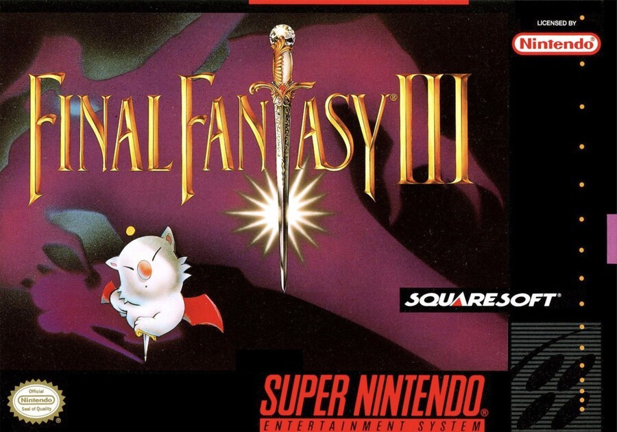
Okay, so... Final Fantasy III. Or Final Fantasy VI. Man, this is confusing! Actually, it's not, ignore us. The box art here actually reminds us a bit of The Legend of Zelda, with the sword forming part of the game's logo in place of the letter 'T'. You see the comparison, right?
It's a pretty nice, understated composition overall, and of course we can't not mention the adorable Moogle just chilling out there near the bottom corner - too cute! It's wildly different to the Japanese box art and doesn't quite fit in with the general visual theme that the series has gone for over the years, but we like it regardless!
Japan

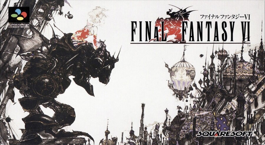
Right, so the Japanese box art for Final Fantasy VI is very Final Fantasy, if you get what we mean. The series has maintained the same logo style to this very day for a good reason; it's simply iconic. Similarly, the artwork by Yoshitaka Amano is beautiful - as it's always been and always will be. It just screams Final Fantasy, right?
We've got a strong feeling the Japanese box art will come away with the win this week, but who knows, a great deal of people seem to love the Moogles, so there's every chance that North America could sneak in with the win!
Bonus - Final Fantasy VI Advance

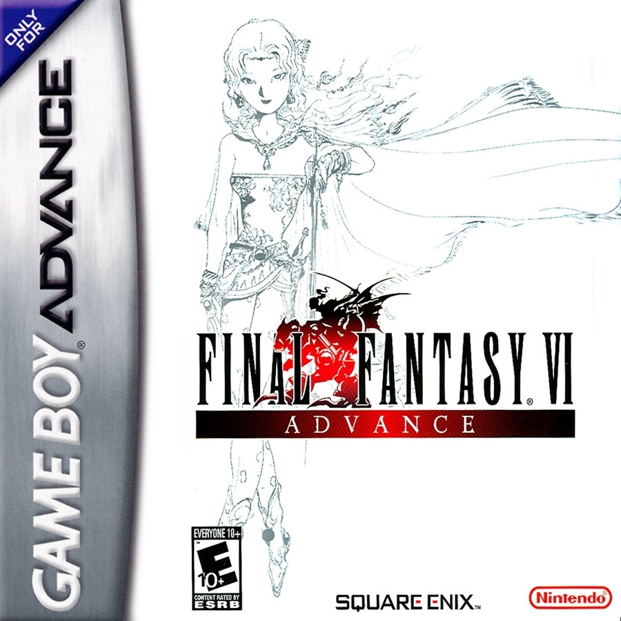
Yes, we said we'd take a look at the box art for Final Fantasy VI Advance, and here it is! It's got a lot more in common with Japan's SNES box art and maintains the series' consistent visual theme with both its logo and cover design. We love how understated this design is; you probably wouldn't see anything like it in this day and age. Indeed, Square Enix itself is moving further into more "traditional" cover designs with the likes of Final Fantasy VII Remake and Final Fantasy XV.
So there you have it! We had fun with this one simple due to the drastic differences between the NA and Japanese box arts. Now, if someone at Square Enix or Nintendo sees this... Please bring Final Fantasy VI to the Switch. M'kay, thanks.
Make sure you tune in next week to find out the results of this epic bout!
Thanks for voting! We'll see you next time for another round of the Box Art Brawl.


Comments 78
There's something to be said for NA's simplicity, but that JP box art is absolutely stunning.
Imagine creating the Japanese cover and someone voting the US one. You know who you are.
(lol)
I mean, come on. This is Muhammad Ali vs. me pretending to be Ali when I was five.
Japan without question. The US release looks like a cheap and nasty bootleg (not helped by the misleading title).
Big fan of the FF6 official Amano art, it's so clean and nice. The US cover has little to do with anything it's very weird.
Amano's beautiful art wins, no contest, but Mog's smug look on the North American box never fails to give me a chuckle so it's got that going for it.
Japan by a landslide. That scene is beautiful, iconic, and conveys a little about the game. All landmarks of decent box art. I've always found this game's NA box art to be sorta bland, though brownie points for the cute Moogle; it's a nice change from many covers at the time.
A much loved game this. I remember the GBA boxart fondly. The Japanese one here wins hands down. Unusual art for its time in a way and quite good at that. Looks like a cool rock band album art of that era. Ha.
Hahaha this one’s a no brainer!
This one is no contest
Japan's looks epic.
Japan easy. Now that's a cover that puts the "art" in box art.
It's easily the Japanese box art this week, that's a thing of beauty.
Japan rocked it this week. No contest.
Also appreciate the bonus. The GBA had some great box art.
We're talking the artwork of Yoshitaka Amano... same guy who has been doing Vampire Hunter D since forever. Anime meets traditional Japanese art. The NA cover didn't stand an icecube's chance in hell.
Japanese art easy……I only wish Nintendo had employed Bob Wakelin to do all the cover art for the European releases.
Amano every time. The Super Famicom version is the one I own.
The NA version is really boring, but I can't stand Amano art and never could. So, the simplicity of NA coupled with the adorable Moogle wins for me!!
Easy choice this time … the Japan version is gorgeous!
Stunning Yoshitaka Amano art versus a generic logo next to a Moogle. Difficult choice.
Japanese version without a shadow of a doubt for me.
I haven't played this game (Switch remaster when??) but Japan definitely wins for the box art; it's beautiful and really gives what I think of as a final fantasy vibe.
The Mog-centred ad campaign in North America was so weird. It was deceptive too. Why did they feel the need to go in that direction?
The colour composition on the NA one is great, but there's simply no beating JP on this one. Yoshitaka Amano absolutely killed it with the art on that one, it's BEAUTIFUL I tell you.
@Ara I think you accidentally posted your comment under the wrong article.
There is something special and magical about the North American version that I just can't describe.
the Japanese box art actually depicts the fantasy part of the title. it depicts a sense of atmosphere that gives someone a preview of what the game will be like.
the U.S. box art is like "hey, here's a cute character who's only there for like 33% of the game. marketing! "
the Japanese box art is light years better.
Easy win for Japan.
Amano’s art style is gorgeous. Seeing his illustrations was actually how I gained appreciation for hand-drawn art when I was younger.
NINJA APPROVED (I voted Japan!)
No, the Japanese one isn't very Final Fantasy at ALL. It's very Amano, but I never felt the games took any inspiration from his artwork at all. Only in later releases would they feature his art as character portraits, so I do not feel it screaming Final Fantasy.
That's not saying it isn't gorgeous, because it is. But the US box art holds a very special place in my heart and I cannot ignore the pulling at the heartstrings that is happening right now.
Usually I can seperate the nostalgia, but FF6 (I do call it 6, yes) is such an important game to me...
No contest, Japan. Can’t beat Yoshitake Amano
Japan by far. That artwork is amongst my favorite video game art period.
The last great Final Fantasy game.
As much as I like the Japanese one, Nostalgia played a huge factory for me on this one. I remember asking my mom to take me several stores when this came out till I was lucky enough to find a copy at a Target a few towns over. One of the very best games on the SNES.
I have a lot of nostalgia for the North American box, but come on. The Japanese version is obviously objectively better.
Still want to play this game on switch whenever it makes it over. I know it's on the snes mini right? Just need that portability factor and I'll play it all the way through.
God as much as I love Mog (and Moogles in general), the Japanese cover easily wins.
I mean, even putting aside the fact that Amano’s artwork on the JP version is incredible, it also features (one of) the main character(s) in Terra, as well as the iconic Magitek armor, while the NA version features….Mog. Now, I love slam-dancing moogles as much as the next fella, but c’mon. He’s an optional party member for crying out loud.
The North American is way too plain.
The NA box art was my introduction to Final Fantasy, so there's definitely some amount of nostalgia. But at the same time, when I actually look at it, I don't really get what's happening. What is the purple shadow supposed to represent?
Um, der already.
I know that the Japanese cover is objectively better. But there’s a level of nostalgia that I feel for the NA cover that I just can’t get around. It transports me back to fifth grade. And for that, it wins.
Amano's art has and will be always my favorite when talking about a unique style and the delicate. The characters he draws look so translucent that it sends my brain to think its faded due to aging.
Japanese one is better, hands down. Not just for the art but also for having the appropriate title and none of this "Chronologically Confusing" bs.
Voted for Yoshitaka Amano's beautiful style
It’s sad that Final Fantasy VI was overshadowed by Final Fantasy VII. Sure FFVII is a great game but so was FFVI. No remakes or spin-offs for Locke, Terra and the others.
US one isn't horrible or anything, I actually like it... but the Japanese one is so evocative! Excites the imagination just looking at it!
I have to vote Japan just because it's so great I think they should turn it into a figurine as expensive as my car!
Awesome battle! Amazing art for Japan.
Bonus was great. I hope the bonus section becomes a regular thing.
@GrailUK Actually I kind of like and have nostalgia for the US box, but I have to meme as above.
@Silly_G Might I remind you they were still considering releasing FF5 later, as Final Fantasy Xtreme. Chrono Trigger could've been bumped off the release schedule for it.
@KingMike I owned the original US cart. But man, the cover has always been...um functional to be polite.
The NA art has some nostalgia value (even though I didn't play it back in the day, it's still the first one I came to associate the game with), but it's really hard to beat that Japanese art. The only problem I can raise with is that Terra's hair could use more green (Yes, I know Amano always drew her with blonde hair and that's her "official" depiction these days, but come on, the green hair is way cooler and more fitting for her character)
Can't beat Yoshitaka Amano.
This was a pretty easy choice. Too bad NA got the cover art we did.
The Japanese art all day... the way the logo was supposed to be.
@ReaperMelia I like blondes as much as anyone, but does Amano ONLY draw females in blonde?
I can only imagine the pixel artists had to ask for a little more visual diversity.
If only the box art had been this epic in NA. I ended up passing over this game initially (I played it a few years later and it’s my favorite FF) because it looked so bland and I didn’t know what a moogle was at the time (so I thought the shadows on the NA box meant the Moogle was the big bad in disguise and I had been recently scarred by a watch of gremlins) .
@KingMike Amano really likes to draw blonde characters. Some of his concept art for Squall looks almost blonde as well honestly.
That being said, I haven't seen anything to confirm it, but I've heard the pixel art for Terra actually came before Amano's concept art. That would mean green hair was the original design. I wish they stuck with it for her appearances beyond the original game, it makes her stand out a lot more and it also just fits really well given her heritage.
Japan!!! Not only is the art better, but it has the correct number....but the cover is better.
@sdelfin Well technically 3 was correct as it was the third FF game to be released in NA at the time.
The Japanese box art is absolutely beautiful. One of many pieces I'd gladly hang on my wall.
I never liked the US cover. Almost made me pass the game over if I hadn't read about it in Nintendo Power when it first came out. I didn't know what the heck I was looking at, at first.
To think that game would become my favorite game of all time.
Easiest choice so far, though the gba is top actually
Now THAT was an easy decision!
Box Art Brawls Current Total:
Europe: 33
Japan: 39
North America: 43
Australia and New Zealand: 1
With this one, I actually prefer the american one.
I'm not much for boxes that smother me with artwork.
Is there even any contest here? Japan 100%.
Has there ever been a so-lopsided poll here before?
I just don't understand what's going on with the NA version. Very childish images, weird shadows, purple (?)
Japanese ff6 box art is one of the best I've seen.
Japanese LOOKS SO FREAKING GOOD AAAAA... Seriously though, it really gets you pumped up for a pretty amazing game.
@FantasiaWHT Super Castlevania IV. Though in the opposite direction, it was the western artwork that is such a masterpiece.
The western boxart was almost certainly inspired by Zelda's boxart.
It was released around the same time that Nintendo had launched Illusion of Gaia in North America (also marketing it to the Zelda audience by changing the logo from the Japanese and European style to a Zelda-style logo).
Actually the boxart for FF4 (2), as well as the later three of the four Game Boy "Final Fantasy" games also had released with the logo in front of a solid background.
I forgot if the original Link's Awakening NA boxart had the owl on the front, or if that was in the Player's Choice version. That could've been another source of inspiration.
@BloodNinja You mentioning Amano reminded me of how Square would mix up box art aesthetics for regions.
The NES/SNES releases have the same text logo with a mostly simple background, while Japan got a mix of Amano (1,2,3,6) and stylized 3D (4,5).
Then for the PS and PS2, NA gets some form of 3D while JP and EU get logos with solid backgrounds.
Then on the GBA, everyone got logo-on-blank for 1/2 and Amano for 4,5,6, albeit different artwork.
Couldn't make up their minds.
America, purely for the nostalgia value. My did picked me up a second hand copy of this back in the day on a work trip to the states (I was after ff legend 3) and after I managed to borrow a pal converter I was hooked.
But looking at it with fresh eyes I would probably go Japan as I do love that image (I even have a notebook with it from Redbubble)
Removed - disrespecting others
@Pod You don't like art?
@Lanmanna
I do, but this isn't a particularly good composition, even if the art is nice.
As someone who was there when the SNES version came out, the U.S. box art was actually a huge win for us, as it retained a distinctive Japanese anime art style at a time when it was common to Westernize everything. (The instruction manual is also notable for including a plethora of Amano's art, including the original cover.)
It's never fun having the unpopular opinion. But here I am. There is something about the Western version that I admire (and not just nostalgia). Not only is it elegant in its simplicity, but it's also unapologetically "kawaii" in an era when game developers were very insecure and went way out of their way to hide aspects of Japanese culture. Many game developers seemed to assume Western gamers had fragile egos and anything remotely "cute," "childish," or "girly" would somehow make them run away in abject terror (although to be fair some people really were this insecure). And from what I understand, Final Fantasy 3 wasn't even released in Europe at the time so those in NA were very lucky to get a version.
Show Comments
Leave A Comment
Hold on there, you need to login to post a comment...