Hello, and welcome to the 100th edition of Box Art Brawl!!
This is a pretty momentous occasion for us at Nintendo Life and all of you Box Art Brawl enthusiasts, so thank you for participating over the years! We have a big one to kick off the celebrations, but first, we need to look back at last week.
For the past two weeks, we've been looking at the box art for the Mario Strikers series, and last week it was the turn of 2007's Mario Strikers Charged to take to the pitch. And this time, Europe & Japan's box art came out on top with a pretty healthy 76% of the vote! Both are pretty electrifying, but you made your voices heard here.
Subscribe to Nintendo Life on YouTube845k
So what could be a worthy battle to commemorate our 100th edition of Box Art Brawl? It has to be Super Smash Bros. Melee. We've already done the original N64 game, and Melee celebrated its 20th anniversary in Europe and Oceania in May, so this is perfect. is easily one of Nintendo's most iconic video games. While the N64 game rang in the series, Melee is easily the game that defined it and made it the smash hit it is today. It's still played competitively today, and it also helped cement the GameCube controller's status as one of the very best. Yes, we said it.
For this 100th round, we'll be pitting the Japanese box art against the America & European. Both are pretty iconic in different ways, but we want to hear what you think. Let's make it a Brawl to remember!
Be sure to cast your votes in the poll below; but first, let's check out the box art designs themselves.
North America & Europe

Ah, yes, this is the box art of many people's childhood, their teenage years, etc. Iconic is an understatement. Mario, Link, Bowser, and Pikachu are all getting ready to battle. Link's Master Sword is plunging into Bowser's flame. Many of the game's characters (new and old) are in little boxes on the left and right of the cover. This was a signal that Smash would be getting a bit more real, as much as we love the cartoony box art of the N64 game.
Japan

But come on, you can't deny this isn't very cool, either. Melee was called Dairantō Smash Brothers DX in Japan, and on this cover, it looks like Mario and co. are facing off against Link & co. One thing we prefer about Japan's cover is that a lot of the cast get a bit more space rather than just being popped in cute little icons at the sides. Zelda, Ice Climbers, Samus, Ness, Peach, etc. — everyone is here! Sort of. The sepia tone also gives it a classic feel, like this will be a clash of Nintendo's classic titans.
We couldn't think of a better game to celebrate our 100th edition than the game that literally puts Nintendo characters up against each other. And this is the series that helped give this feature a name, after all.
Make sure you tune in next week to find out the results of this epic bout!
Thanks for voting! We'll see you next time for another round of the Box Art Brawl.


Comments 49
This makes me really want to buy a Japanese copy of Melee. It’s so strikingly different. When I take off the nostalgia goggles the US cover has a very clip art vibe.
I can understand most would find the Japanese cover too minimalist, but the Western one is a little awkward imho. The characters don't even look like they're fighting each other, more like they're piling on another character hidden under Bowser's flames. ^^
Not only is the international version more iconic, but it clearly shows newcomers to the series what it's about. The Japanese one focuses more on the fact that various characters from Nintendo are in the same game, rather than the (excuse the pun) melee that it is.
Not really fond of the sepia tones from the Japanese version. And the game title takes up almost half of the cover compared to the North American/European version.
@RootsGenoa In all fairness, there is a rule mode in the game where you can have teams, so three people can be on one team, and one person on another. So everyone can gang up on you.
Plus, there seems to be more action going on in the North American/European version versus the stare contest in the Japanese version. It's Super Smash Bros., not Super Stare Bros., after all.
Two mediocre boxarts. I dislike the little boxes with characters on the Western one but the sepia filter completely ruins the Japanese one, so I’ll go with West on this one.
The western box art is iconic.
But the Japan box art is just better. It's like a movie poster — clean design, title well-centered, and a memorable visual motif.
Neither of these are actually all that great I don’t think, though the European one definitely has a place in my heart.
Went with US/Europe. The action does a better job at selling it in my opinion. That’s not to say though that the Japanese version is bad.
There’s a piece of artwork that I will always remember where the entire cast of Melee are all facing the left and look like they’re staring into the distance together. It was such a cool piece and the Japanese box art reminds me of that.
I don't like the sepia, but the Japanese box art has a better design other than that
Europe because that’s the one I have
Neither one is very good, but the Japanese one is so boring that I went with the NA cover
As Iconic as the North American box art is, I gotta go with the Japanese cover.
North America wins it. More colourful and good layout in comparison. The Japan one is less colourful and the writing and borders too large relative to the artwork of the characters IMO. Interesting design lining all of them up like that.
NA was really good boxart for its time as well.
The jap version looks like they used soul calibur as it’s inspiration with its sepia tones but I prefer the US/EUR version it’s definitely more eye catching
The western one is iconic, but it’s also looking very dated. The Japanese one is more timeless
Are you people insane? Japan should win by a randusuraidu!!
Always liked the Japanese one more and ""Nintendo's Best in 4 Player Action" is just an awkward sounding sentence!
@RootsGenoa
"I can understand most would find the Japanese cover too minimalist, but the Western one is a little awkward imho. The characters don't even look like they're fighting each other, more like they're piling on another character hidden under Bowser's flames. ^^"
"character"?
The Japanese one would've been better if it wasn't for the sepia filter, it makes the art look a bit boring.
every week the same artsy people defending the bland box art.
The Japanese one looks perhaps a bit too understated, but I had to go with it.
While the NA version is iconic (and I'm sure it'll win), looking back it looks surprisingly cheap & slapdash.
Not a fan of either but NA is clearly better.
Come to think of it, only the Western covers of Smash 64 and Melee show a fight, the Japanese covers and the rest of the series is literally just the characters.
I went with the Japanese one. As iconic as the Western one is, I like that lineup in the Japanese version, Mario vs. Link, Zelda vs. Peach, Pikachu vs. Bowser, Donkey Kong vs. Kirby, Samus vs. Fox, Ness, vs. Captain Falcon and Yoshi vs. Ice Climbers.
It should be mentioned, there's also a Korean version, whose box art is the Japanese illustration with the Western logo. For the first-party Gamecube games released in Korea, that was the standard for their covers.
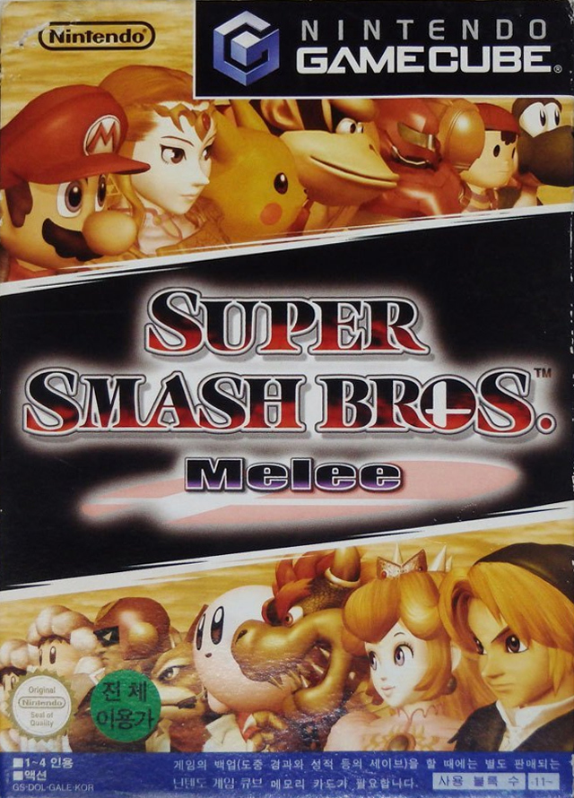
The only exception I've seen is the Korean Metroid Prime, it uses the Western illustration rather than the Japanese one.
As much as I like the dynamic feeling of the Western one, the JP one is cleaner, uses all of its space better, and has a much better designed logo.
I like the Japanese one just a bit more because it gives more characters the spotlight than just four of them. And it looks more ''Get ready for battle!'', rather than ''We're already in battle, join us!'' or something.
I think both are fine but I went with the North American & European one.
Can't bring myself to vote for the "add some gradient"... "now add drop shadow!"... look of the font in the US/EU version - looks like something from a middle school newspaper
I may have liked Japan better if it didn't have that ugly brown filter over the characters. So yeah the American boxart wins this one for me.
Not sure what Link's trying to achieve with that attack.
Gone Japan this time, think there is some sort of reference to an old Samurai movie.
I have zero nostalgia for this one but I do think the american/european boxart just shows what the series is about better. The japanese one looks clean but a tad bland.
Went with the western one, probably mostly for nostalgia. I think the Japanese cover is a better design, but as a kid who played the heck out of the N64 version, that western box art perfectly matched the hype I felt for this game
Honestly both covers look pretty bad, in my opinion.
I personally prefer Japan, it shows off more characters then NA/PAL, ie the NA/PAL one shows off 4 characters that are all OG’s, and the other fighters in boring little cubes.
The worst part about this game is that i cant make a “Its Not Melee” joke. And i havent even played this game, i just needed to mention Its Not Melee.
The western one is all I've known, but that Captain America: Civil War style Japanese version has a good look.
The western one is just more up my alley, it's more dynamic even if people argue it's just a bunch of awkward PNGs and I'm not sure about the brown filter on the Japanese art.
If it was the JP one with colour, I'd choose it
❗️This USED to be my favourite GC Game.
I never played the N64 version so seeing all of Nintendo's characters IN ONE GAME BLEW. MY. MIND back in 2003.
I never liked 'Brawl' so lost interest in 'Ultimate'.
Looking back, I now think 'P.N.03' is my favourite GC Game, despite the repetition and sameyness. I absolutely LOVED its original soundtrack.
NA wins this time, The cover is so good, it sells the gameplay of the game and the wackiness of the fights. JP is also great, but not as good and iconic.
Wow, I think the western cover is fugly lol that logo is just terrible! It looks like WordArt on Windows XP!
Even for early 2000s that was really bad.
They're both a bit off tbh. I voted NA/EU because I like the colors, but it doesn't particularly look like they are fighting, just kind of posing individually. The Japan version on the other hand is grim; all those characters are about to go on a death march and they're not coming back from it.
Neither are great, but I went with NA/Europe. Not loving Japan's sepia tone.
Neither's great but I think I prefer the Japanese one.
I had to think about it for a bit as both of them are lacking in my eyes. What the Japanese cover does well is showing the fighters, but the overall design is too minimal to me. On top of that, the Gamecube logo in the upper right hurts it further. The western cover shows the cast of fighters in an inferior was with those little boxes. But I like that it shows more than just the cast. Not great, but I voted NA and Europe.
I like japans box art, but I think the other one better gets across the feel of the game and smash as a whole. That said I do hate the “Nintendos best in 4 player action” because I don’t feel like it adds anything.
Box Art Brawls Current Total:
Europe: 33
Japan: 38
North America: 43
Australia and New Zealand: 1
Is this the only Nintendo game to show Bowser breathing fire on the cover? I can’t think of another offhand.
i like the japanese one. it looks more outstanding and has style.
I think they're both kind of ugly.
Both are excellent!
@OnlyItsMeReid I remember that during the GameCube era, a handful of titles did this on the boxart. The North American Paper Mario: The Thousand-Year Door, and Mario Power Tennis both have tan-ish sunburst-like logos that read, "Best Seller".
Show Comments
Leave A Comment
Hold on there, you need to login to post a comment...