Hello hello, and welcome to another edition of Box Art Brawl!
In last week's fierce battle, we pitted the brutal, calculating, unsympathetic pink blob that is Kirby against... well, Kirby. The EU and Japanese box arts for Kirby's Dream Land went head-to-head, and although the abstract nature of Japan's box art gained a few fans, it was the EU's more traditional approach that won the day, taking in 61% of the vote.
This week, we're taking a look at another all-time classic with Super Castlevania IV. It's the 35th anniversary of the original Castlevania on the NES in North America, and while we could have gone with that one for this week's Box Art Brawl, we determined that the different regions' box arts were simply too similar to one another. So what's the next thing? Why, the re-imagining on SNES with Super Castlevania IV, of course!
Subscribe to Nintendo Life on YouTube847k
It's North America against Japan this week, and boy, are these box arts different. Take a good look at each one and make your voice heard. Don't be a miserable little pile of secrets!
Be sure to cast your votes in the poll below; but first, let's check out the box art designs themselves.
North America (& Europe)
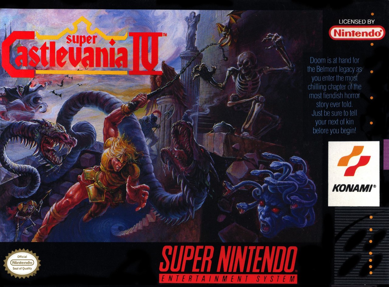
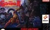
The North American box art for Super Castlevania IV is quite simply iconic. Featuring Simon Belmont surrounded by creatures of the night, it's said that Konami wanted the odds to be against the protagonist in the key art in order to represent the advancements made by the game itself. We have to admit though, as with all SNES box arts in NA, we don't like how the key art is shrunk down to make way for logos and other marketing bits and bobs. Not nice. Still, this is a beautiful piece of artwork, and we absolutely love the classic logo!
Japan

♫ I'mmmm gonna swing from the chandelierrrrrr, from the chandeliERRRRRRRR ♫
Ahem... sorry.
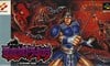
Japan's box art is wild. Here, you've got a bunch of seemingly disparate elements of the game mashed up into one composition, including Simon in the foreground, Dracula himself at the far left, a bunch of bats flip-flopping around, and an image of Simon using his whip to swing across distances, a key gameplay element in the game. It's a very busy piece of artwork, and if we're being honest, the image of Simon in the foreground kinda reminds us of the disastrous North American box art for Mega Man... Not quite as ghastly, but still. Aside from this though, it's a proper gothic piece that really demonstrates what Super Castlevania IV is all about.
Thanks for voting! We'll see you next time for another round of the Box Art Brawl.


Comments 69
NA box ofc! No question about it!
That Japan one is… messy. The NA art is way nicer
Japan's box art will haunt my dreams.
NA/EU no doubt. The JP box art is beyond weird.
Is there any question about this? NA has dynamic composition and looks like it was drawn by an artist. Japan... well. Dracula does look good, I'll give it that.
I do prefer the bloody logo & wild eyed looking Dracula on the JPN cover, but the artwork is overall better & more dynamic on the NA box, so that's what I voted for.
This is a rare case of usa box art better than japanese box art, I choose north america version 😃
I think we know which will win.
I wonder why they stopped using different box art for each region now?
I'm just going to assume any votes for the Japanese boxart are out of pity.
NA significantly better in quality of artwork and having a more interesting piece on there.
Japan usually has great box-art! What the hell is wrong here?!
The Japanese box art looks like a poster for a bad 1990s action film.
Japanese Simon looks like he belongs to the old He-Man and the Masters of the Universe cartoon or something.
I think that this will be the biggest winning margin ever in a Box Art Brawl. NA is gonna romp it.
As weird (i.e. awful) as that Japanese box art is, it earned bonus points from me for the Brent Spiner cameo. Not enough for my vote, mind you.
That Japanese box art is simply too funny. I gave it a vote out of pity.
Mega Man was the first thing that came to mind for me as well. Truly horrific in all the wrong ways. NA wins hands down. Even the text blurb is awesome.
NA wins this one easy.
@Don Probably because they cost money to make, and usually they now don't reflect each country's supposed difference of taste in art styles, but just the actual graphics and aesthetics of the game itself.
We need an option for both. I enjoy both of them!
the american box art of Super Castlevania 4, have a better composition compared to the japanese one(it a mess).
Yeah NA without question. It captures the gothic, horror atmosphere and intense platforming/combat to a tee whilst being one of the most gorgeous looking box-arts ever made.
The faces on the Japanese box-arts meanwhile are just plain weird (what the hell did they do to Simon and especially Dracula?).
@Krisi
I do miss the earlier decades where games don’t just have unique regional artwork but manuals and maps (And guide books sold separately) as well. The only major great thing about modern game releases is the simultaneous launch for most major titles. I remember having to wait months for Paper Mario, Pokémon Gold and Silver and Zelda Majora’s Mask to come out after the original Japanese release.
The NA version is a bit dark but definitely better. In the Japan version, Simon looks completely doofy.
Dracula on the Japanese box art looks like Adam Sandler. Ironically, he plays Dracula in three of the Hotel Transylvania movies.
The North American box art is a thing of beauty.
My favorite childhood game! NA for sure, and not just for nostalgia reasons. As others have mentioned, it's surprising how bad Japan's is this time around, as they usually have good artists. And this was an established franchise, too!
NA by a mile, it's fantastic, and I love the dynamic poses of Simon with the snakes.
Oh man, I never looked closely enough at the NA box art until now; look, Simon is trying to whip the monsters but his whip got caught in that ring that lets him swing instead. Just like what happens in the game!
NA, The japanese one is...weird
NA hands down, pretty sure it’s by Tom DuBois who also did The Legend of the Mystical Ninja, Contra III and other iconic box art for Konami in the US/EU.
My life in gaming did a very good piece about him a couple of years ago, worth checking out on YouTube.
I voted for the Japane-hahahaha, of course I didn't.
The NA art is just spectacular. Understandable why it was downsized for logos etc, but one of the best gritty style artwork for a video game ever.
Eh, what's this? It seems the overall popularity of Japanese box art has been going down in recent brawls. Color me intrigued.
Not…even…close
Anybody’s box art against Tom Dubois’ work doesn’t stand a chance.
The NA box art is so iconic to me. I remember seeing it in a local video store when I was a kid and the art alone made me want to play the game.
Box Art Brawls Current Total:
Europe: 31
Japan: 34
North America: 40
Australia and New Zealand: 1
For Japan's box art they surprised Dracula with a camera when he least expected it.
They're both ugly in my opinion, but I like the Skelton pose so NA it is.
NA's box art just looks so much more dynamic and iconic imo. Japan is just too cluttered and it has the same stupid "Castlevania character looks at you" pose.
Night and day. Classic piece vs GCSE graphic design project rushed together at the last minute
@Edd-O I just watched that because of you. Thank you for that. I was checking the comments for Contra 3 parallels since the art here has a similar composition, and now I know why.
How strange that the Japanese art looks like something you'd expect to see from a North American release. I also thought of the NES Mega Man cover looking at the way Simon was drawn there, though Mega Man is much worse, of course. The NA cover has a lot of movement communicated through the artwork, and also does a nice job of incorporating different enemies from the game in a way that looks pretty accurate, with the medusa head being a good example.
The Japanese one looks like an alternative cover made by a fan with a major thick thigh fetish.
Seriously. It looks like under that blue miniskirt thing there's another skirt only made of thigh.
Chain whip on NA box art way more badass!
The Japanese box art can still come back! 😭 Come on everybody! 😫
Jk, NA all the way.
It came to Episode too, right? Did it have the same box art as North America?
I have a really nice story about this game. When I was a child (about 10 I guess), I had the game cartridge of Castlevania IV and the contacts somehow got "pushed" inside the cartridge. So I wrote a letter, I remember, to Mattel, a firm that distributed Nintendo games and systems in Italy and I sent the defect cartridge to them. After some time they sent it back, repaired, with a handwritten letter with thanks to me for being a loyal fan!
The Japanese one looks a bit silly
It's not even close this poll
Dracula in the Japanese version looks like his shower abruptly turned cold while he was having a relaxing rinse after a day of terrorizing the local Roma population.
Not playing anymore, don't see why we don't have the PAL and US versions, similar or not tou should get to vote for what you grew up with. Shame, I always used to like these articles.
The North American box art wins this hands down.
It's one of those rare cases where NA got the better of the two, gotta say. NA and Europe got a censored version of the game though, so the JP version is the one I chose to keep in my collection.
Blowout. Simon's face alone makes NA better
What is a box art? A miserable pile of paints.
You gotta admit, dull a game as it is, SCIV sure looks cool--both in-game and on the box (at least outside Japan).
@Morph I looked it up. PAL regions have the some art as the US version
@Dr_Corndog dull? dang, i love castlevania iv
@Ricube aww that's cute
@Dr_Corndog Dull? Mother quacker we're gonna need to have a word.
=) I love that game. Carry on.
@NintendomPower Right? Super CV is absolutely amazing, at least from an aesthetic perspective. The versatility of the 8-directional whip also makes it the only "classicvania" I enjoy at all.
The Japanese art could be great if they used only the left half of the box. Dracula, the castle and the bats, with the nice title logo.
The other half and the foreground Simon are obviously 2 different and unrelated art collaged together.
@NintendomPower that's fine but why not post both and list it as US/Pal then
I said the same thing-- That Japanese Simon is the same as the Mega Man NA character lmao!
NA gets my vote.
Looking forward to box art brawl #95!
This is the easiest vote on one of these box art brawls I've seen. That Japanese one is a mess.
Show Comments
Leave A Comment
Hold on there, you need to login to post a comment...