Hello everyone, welcome to another edition of Box Art Brawl *cue stadium-sized cheer*!
Last week, we looked at the classic, the incomparable, the ruddy good video game that is The Legend of Zelda: A Link to the Past. Pitting the US box art against the Japanese box art, you fine folks were quite clear in your preference for the more classy, understated design of the US version. With its gold background and iconic logo design, it pulled in 65% of the vote - well done, golden boy!
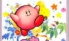
This week, we're taking a peek at Kirby's Dream Land for the Game Boy. The franchise is currently celebrating its 30th anniversary, so it's now officially old enough to wrinkle its nose at modern culture and long for the "good ol' days". We'll be pitting the European box art against Japan this week, so strap yourselves in for the fight of the century week!
Subscribe to Nintendo Life on YouTube845k
Be sure to cast your votes in the poll below; but first, let's check out the box art designs themselves.
North America & Europe
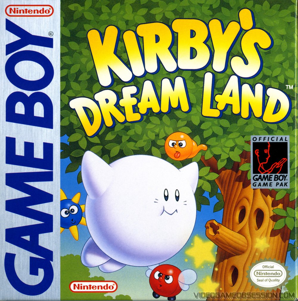
The North American and European box art for Kirby's Dream Land features our main guy doing his floaty thing, with Whispy Woods in the background. There's a lot of colour going on here, but you might notice that Kirby himself is looking a bit pale. As the story goes, Kirby's final colouration couldn't be determined by the time localisation started in the west. In the end, Kirby's colour on the box art matches up with what the character looks like on-screen, because that's really all they had to go on! He's looking more like Kirby the Friendly Ghost to us.
Japan
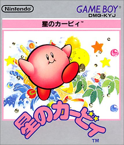
Japan's box art depicts Kirby as we know and love him: round, pink, and squishy. Like many of Japan's box art designs from the '90s, the artwork here is a lot more understated and abstract than the western design, with watercolours bursting from the image. In terms of what it actually depicts, there's not a lot to go on here; after 30 years, we know what Kirby is and what the games are all about, but if we saw this back in '92, we'd probably just think "eh??".
For us, we're honestly a bit torn as to which box art to go for, here. The Western design is a lot clearer and marketable, but Japan's just looks cool, man. Yeah, we can't choose... You do it for us. Vote!
Thanks for voting! We'll see you next time for another round of the Box Art Brawl.


Comments 53
While it's a shame Kirby wasn't coloured pink in the European box art, I think it still looks way more dynamic and interesting. I'd have definitely been more drawn to that one as a kid as well.
I'm so split on this. I feel like the European one is far more interesting visually but I've never really liked pure white Kirby. The Japanese one has a much nicer looking Kirby, complete with the iconic classic design, but a much less interesting background (there's just a lot of negative space and it irks me immensely).
I'll go with the European one but I wouldn't say either are my favourites, there's just one major thing wrong with both of them.
Easy choice this week, gotta go with that European box art.
That bad quality image you've sourced for the Japanese box art really doesn't do it justice.
But I do think the European box art just edges it out.
The EU one is super cute.. even if Kirby seems to have died and become a ghost.
Kirby should be pink, that's all I have to say 😂
They are both so equally cute tho. I guess I prefer the western bow art for having more going on in the background but can’t go wrong with how cute they both are.
Europe is an interesting curio with its white Kirby, but the Japanese design looks like something exploding, so that's an easy win.
Japan. I'm not keen on the Western whitewashing ;p
japanese box art of Kirby Dreamland is only box art that show Kirby actual/correct color.
Western wins for poster design, Eastern wins for mural design. I won't vote on either though, my voice is and will always be mine and mine alone, to speak for myself, and change my opinions without having the old ones keeping me down.
I was expecting some angry Kirby american box art. I am disappointed
Japan, because Kirby is pink guys.
I really wanted to vote for JP because Kirby is actually pink on that one, but I couldn't. The background is way more interesting in the EU version. I like how the logo pops and sits infront of the tree leaves for contrast.
While the EU version is definitely better, I just can’t approve of a non-pink Kirby.
Fight! These articles are a great way to celebrate these old art works!
I don't like the white kirby. He looks like an adapted boo or just quite unwell. So I will have to go with the japanese one. Even though the European one is more interesting with thr background.
The Japanese one is unusually poor for coming from the land of impeccable design. It’s just random and imbalanced.
And seriously—look how good the rendering of Whispy Woods is on the cover of the Western box, c’mon. So nice!
Is their any reason why the western box isn't labelled as NA/Europe instead of just Europe (same with the Zelda box being NA only last week)?
When you used to do these, when the western boxes were near identical you'd count them as one (giving them both a win if it won) instead of arbitrarily picking one or the other to represent.
It was thirty years ago today then that some poor Japanese child drew Kirby, only for Kirby to respond by giving them a free trip to space, to never see their friends and family again.
How tragic.
Well, Kirby, here is to 30 years of being one of the cutest jerks in all of video games!
@RR529 I've seen suggestion that Europe also got the same (somewhat hypocritical, considering its time) TV commercial as the USA where Kirby eats some muscular dude and then spits his bleeding head out? (something more violent than NoA would infamously have allowed in actual game content back in the day)
In my mind I know it’s nostalgia but I’d pick EU. That cover art is iconic in my brain. Every kid who had a Gameboy at the time had Tetris and Kirby. The Kirby cart always drew me in and I always asked to borrow their Gameboy to play it. Even the music and SFX are nostalgia inducing alone. I’ve since gotten my own GB and it was one of the first carts I bought for it.
I’ve actually never seen the JP cover until this article!
The Japan ones background stuff looks like the mash of nonsense neuralblender would come up with.
White Kirby is just weird looking though.
@jump That has got to be the best comment yet.
Sort of relevant: https://www.youtube.com/watch?v=BP5pb7hGelM
I think the european cover is better, it's cute.
My vote goes to the western one this time, it implies Kirby will kill that darn tree. However, I'm not a fan of white Kirby, is there an edit that colors him in his proper colors?
@KingMike, it wasn't bloody. It was sort of melty looking (in a very cartoon way).
Just look up US Kirby commercials on YouTube. It'll be the one with the white Kirby (if it's a collection of all the commercials it'll be the very first video since it's the oldest one).
Problem, that’s not the European box art. You can tell via the oval Nintendo Official Seal of Quality, compared to the circular Nintendo Original Seal of Quality. Even though the art for the US & Europe release is the same, I just wanted to point that out.
Gotta go with Europe on this one. Just a more interesting cover, and it's cool seeing a different era when Kirby was white.
I would definitely get a t-shirt of the Japanese cover. 😊
I like the tree but i agree they should copy and paste the Japanese Kirby
@HammerGalladeBro Here's a quick and dirty edit:

Box Art Brawls Current Total:
Europe: 31
Japan: 34
North America: 39
Australia and New Zealand: 1
I chose the western cover without hesitation. Kirby being white is understandable under the circumstances. While that's not ideal, the background for the box art really goes a long way, making much more interesting and dynamic to me.
@Monkeido
Great job!
I don't know what game the bottom one is since I can't read Japanese. Europe wins by default.
@Monkeido Thanks a lot. Your edit looks better than I had imagined.
The EU version is much better for giving us an actual overview of the game, and some of the enemies and world themes that will be in it. The Japan cover looks like Kirby just blew up a craft factory. Also, I have a soft spot for the original NA/EU Kirby- he’s just so puffy!
I’d say Japan because Kirby is coloured in.
Kirby looks a bit off in the European one, but the Japanese one is kind of random to me, I prefer Europe’s.
@RupeeClock Thank you for this! If the NL post had this pic, I would have went with Japan. I thought the Japan one was cool but looked too blurred. I feel kind of dumb for not realizing it was just a bad scan.
Part of the reason I like JP. Versions is because they are unfamiliar and new to my eyes.
I actually like this jp version more in general, but for box art purposes I have to go with the eu/USA. It at least gives a sense of the game and what to look forward to. Definitely more appealing to young kids.
@Dr_Corndog the Japanese says "hoshi no ka-bii" which is kind of like his full name in Japan.
Hoshi means star, or maybe even dot. So it's like, Kirby of the stars!
One of my favourite games ever. A perfect little platformer.
I went with the Japanese version. Nice composition with an explosion of colour and fun behind Kirby. There is nothing wrong with the EU cover. Maybe a little staid and by the numbers but fine. But the artist didn't even do the most basic research on the central character lol.
While Japan features pink, squishy Kirby as is only right and proper, the background on the European box shows more and looks charming and whimsical.
I like that the soft colors of the Japanese art capture the art-style of the Kirby series but the Western art is probably better composition-wise and better shows what the game's world looks like.
The EU is also the NA art for what it’s worth.
I’m finding that I prefer western boxart about 2/3 of the time.
I pick up the European/American boxart as it is more nostalgic and well composed. Also, that particular boxart is the American one, just take a look at the seals.
@tyranny_life But this is Kirby's Dream Land. No wonder Japan lost; they got the name wrong!
The Japan one is much more appealing to me. I dislike all the inaccuracies in the Europe one. Plus the Japan one isn’t all that abstract, there are more game elements in it than in the Europe one. Also it feels more dream-like and if you can read the Japanese wording the image makes much more sense.
@acNewUpdates Thank you! ^^
@HammerGalladeBro You're welcome!
@RR529 I can remember seeing the Kirby ad live. Even the tiny bits of cartoon blood was strong material for NoA's standards at that time.
Though that same year they also ran a Dr. Mario for Game Boy ad which would probably be considered racially insensitive by today's standards.
Show Comments
Leave A Comment
Hold on there, you need to login to post a comment...