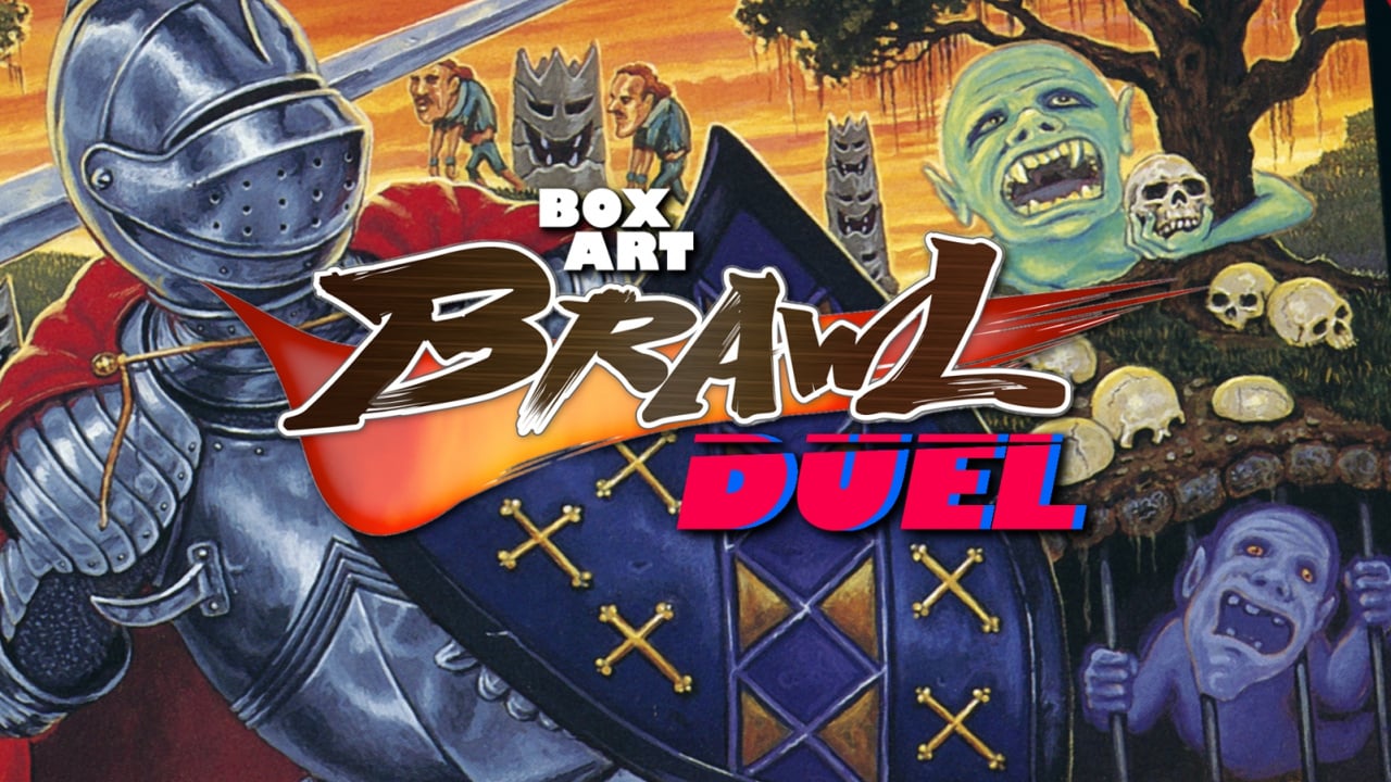
Welcome back to Box Art Brawl, our regular vote to see which box art variant from around the globe wins your approval.
Last time, we went all modern and looked at the two covers The Legend of Zelda: Breath of the Wild received. We thought it would be a much closer contest than it was, but the result is crystal clear: North American and Japan won by an absolute landslide with Europe getting less than 20% of your votes. Eye contact obviously isn't all it's cracked up to be. Congratulations to the East-meets-West pan-Pacific superpower!
Subscribe to Nintendo Life on YouTube849k
This week we're revisiting Capcom's gruelling Ghosts 'n Goblins series with the 16-bit entry Super Ghouls 'n Ghosts. It's available for all Nintendo Switch Online subscribers to play right now (it also features on the SNES Classic Mini) and the rewind feature will come in very handy with this rock-hard action platformer. North America triumphed in the three-way Box Art Brawl #31 when the NES game went into battle against itself, but this time that territory is lumped in with Europe, too.
Armoured up? Let's get slashin'.
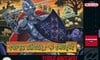
North America and Europe
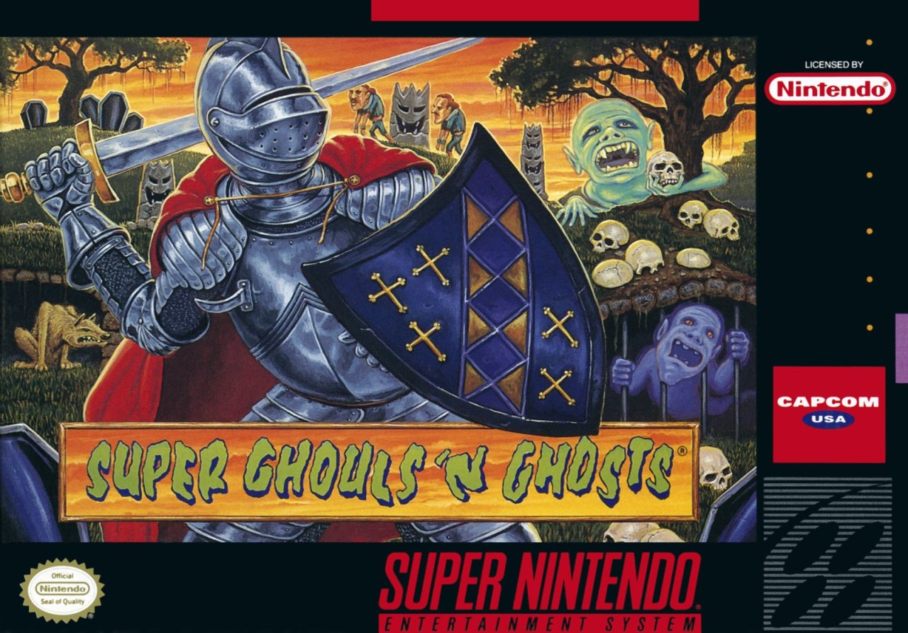
While it sported a natty purple border in certain PAL countries, both regions featured the same key art and basic layout. The spooky landscape is littered — appropriately — with ghouls, ghosts and other unattractive nasties, and the gallant knight Arthur (presumably) stands front-and-centre with the logo running along the bottom.
It's an odd mixture of styles. Arthur is realistically proportioned (relatively) while the background beasties appear with cartoon-y oversized heads. The gravestones are comically chunky. The font treatment of the title looks like it's come straight from a '90s TV commercial for farting goo in a tub. And the least said about perspective of poor Arthur's right arm, the better. Looks painful.
Yes, it's a weird hodgepodge. But for some reason... we kinda like it.
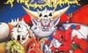
Japan
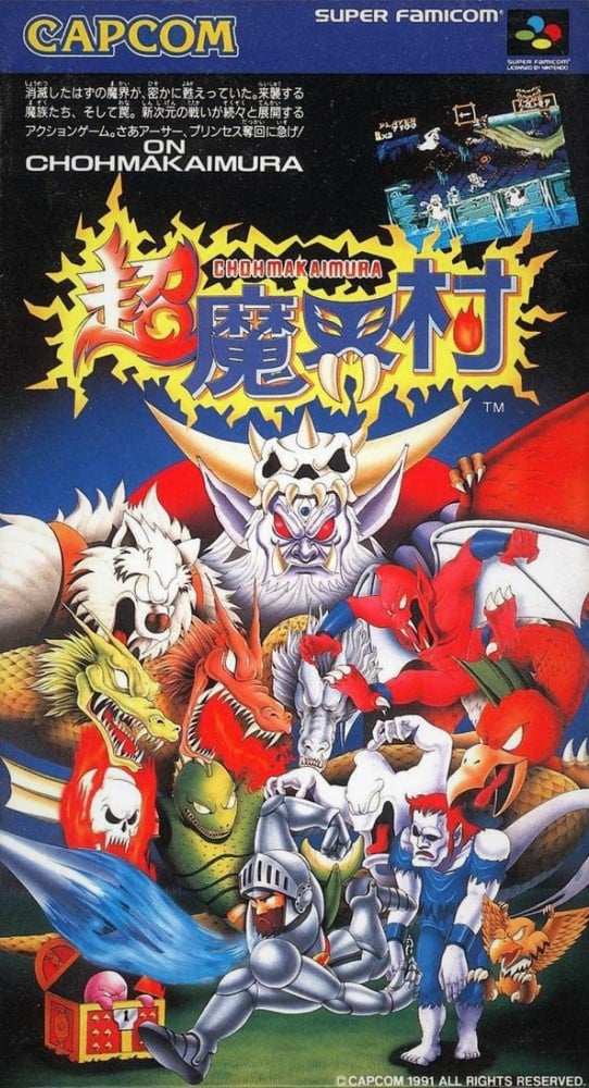
The cover of Chomakaimura, as the game is known in Japan, features a more familiar-looking Arthur at the very bottom with a host of enemies bearing down from above.
Compared to the western variant, the art style here feels more consistent across the box, and the colours certainly pop. It's a little tough to parse that crowd of monsters and it's easy to miss the screenshot occupying the upper righthand corner. We like the idea of showcasing the game's graphics on the cover and the fact that the screen is at an angle — almost as if it's another enemy looking down on Arthur — but it makes a busy cover even busier.
Killer logo, though. Puts the western version to shame.
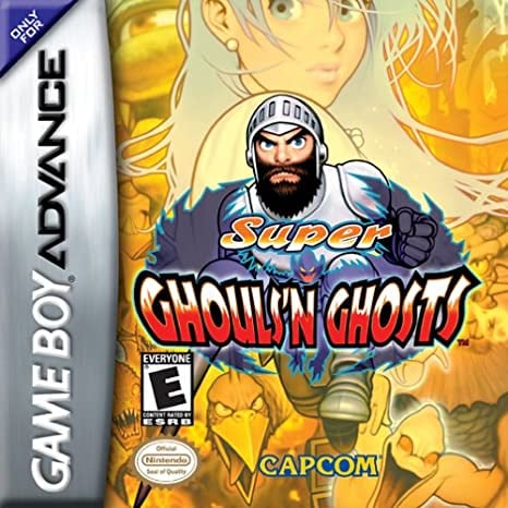
Bonus!
And just for funsies (it won't be featured in the poll), here's the more straightforward cover of the GBA remake:
So, you've seen both covers, but which is best? Pick your favourite and hit 'Vote' to let us know below:
Take care beautiful people, and we'll see you next time for another round.


Comments 45
Tbh they’re all terrible!
Yeah not great but America n eu win xx
I thought the Japan one looks more interesting
Easily Japan for me! Though as people have said, neither are amazing.
Cho-Makaimura for me, by a long shot. I think it’s closer to the spirit of the game.
But either way, Arthur deserves better!
Definitely Japan. I like the art style better (though neither cover is amazing), plus I like the enemy variety.
Japan, the western cover is just bad.
I really wish the GBA version had been allowed, as it was the clear winner but I held my nose and picked the Japanese version.
How can you look at the US/EU version and not cringe at the impossible anatomy of the knight with the elbow that bends the wrong way? Ouch! On a positive note, the zombies in the background remind me of the ape in the classic arcade game, Toki...
NA/EU isn’t exactly great, but at least Arthur stands out on it at a glance, unlike Japan, where he’s part of a crowd. The GBA one is awful.
I voted for the Japanese cover.
Japan deserves the win like 90% of the time.
The GBA one is the winner.
Now if it was the manuals, Japan would be a clear winner.
The Japanese version is of course filled with colorful art throughout.
Whereas the US manual is very boring and business-like. Just text and a few doodles of like the items or such when needed.
The GBA cover beats both, and in second place comes the Japanese cover.
They're both ugly, but but the Japanese one is at least a bit more interesting.
Clearly japan for me. Looks like so much fun.
Neither is really good or outstanding, but the japanese one is better because it matches the ingame Style better.
On the GBA is a pretty Girl, that sells
Japanese cover because Susumu Matsushita (of Hudson Soft's Takahashi Meijin/Adventure Island fame), I like the way all the ghouls and ghosts you fight in the game are outnumbering Arthur like that, and it more closely reflects the spirit and look of the game proper
To each their own
Neither are that good but I prefer the North America & Europe one here. The GBA cover is great.
This one's rather obvious, isn't it? Japan.
Going with the Japanese one simply because the character art represents what the characters are supposed to look like.
The western variant is just another example from the era of localizers erasing Japanese art stylings to give them a more western vibe (not that the westernized art can't be good, but it never represents what the in game universe is supposed to look like, and it's resulted in fans of old time games such as this decrying modern entries for becoming "more anime", when a lot of them were supposed to be like that in the first place).
Box Art Brawls Current Total:
Europe: 25
Japan: 27
North America: 27
Japan, but just barely.
What I don't like about the Western artwork is that the titular foes are merely in the periphery. From a distance, all you're seeing is a knight, though I do prefer how creepy how the ghouls look.
The GBA art is bloody awful though. I'm even kind of tempted to hunt down a copy for the game itself, but they weren't even trying with that one...
Japan
The enemies actually look like enemies you fight in the game.
Will never forget when I first had a Super Famicom this game was and still is amazing. This franchise needs bringing back to life. And yes that boxart is the icing on the cake.
@BulkSlash yeah picked the Japanese version for the same reason. The NA version looks nothing like the game.
Not a fan of either, but the Japanese one at least matches the look of the game. I HATE 90s Capcom box art. The breath of fire and mega man legends series take the cake, but super ghouls and ghosts is channeling a similarly awful vibe.
Is it just me or does Arthur's arm look broken in the western boxarts?
I voted for Japan, it's art more closely resembles how the game looks.
When I first saw the western box art, my reaction was that I couldn't imagine much worse. It's really bad, from the design of the knight, plus his messed up arm, and bad enemy designs in the background. On top of that, even the game logo and non-standard Capcom logo are ugly. The Japanese box isn't perfect, but it's competent. Western box is just bad. GBA box is okay at best. Not very interesting.
Wow, Capcon really was awful withv their box art... And manuals! Those where really bad!
poor arthur doesn't even get to show his face on the NA/EU version, pretty clear winner IMO
the GBA title looks like the capcom vs SNK 2 character art which is...bizarre
Feels like we're voting on travelling fairground rides rather than games this week
So woulda voted for the GBA version. Its the best one. I voted for NA/Europe version instead. I like the carny spookhouse feel.
Eugh. At least the Japanese version shows the lance being thrown, so it's going to get my vote for accuracy.
The faces of the ghouls makes the NA/EU a clear winner, besides the japanese one looks generic and too busy for my taste. I concur with the writer that japanese logo is superior to the western one in every way.
I’ve read before that the US artwork was done by the same artist as the one who did the hastily illustrated Mega Man 1 box art. They were given more time to do this one, or so I’ve heard.
Anyway the Japanese cover is better but I have much more nostalgia for the US art.
Really dislike it when they don't bother with background scenery, but everything else is better in JP cover, so went with that one.
From a design perspective, the NA one stands out. Its pleasant on the eyes, the colors balance nicely, and theres just enough to look at after the cover draws you in. It is a bit boring in comparison to the Japanese art, which uses the actual character style... but that clashes and is a bit frustrating to look at. They could learn from one another.
Easy Japan for me
While the JP one is obviously closer to the source material in looks, the US/EU one is so bad it becomes awesome again!
Sidenote: Capcom's art department was ON POINT during the GBA era. Their Breath of Fire artwork had a similar awesome vibe for the GBA version.
The bigheaded zombies in the background of the EU cover remind me of the children eaters in Little Nightmares.
With boxart as bad as Mega Man and Super Ghouls 'n Ghosts it's no wonder I skipped them back in the day.
I vote Japan, because it's actually artwork representing the game, plus no fractured arm.
Back then games almost always had the Japanese anime style stripped away and were westernized. I most cases for the worse.
I would have voted for GBA
The GBA one looks really nice.
Japan for me. Though I have to say, the box art here is giving me strong Mega Man vibes
Show Comments
Leave A Comment
Hold on there, you need to login to post a comment...