Welcome back to Box Art Brawl, our weekly(ish) contest between box art variants from around the world.
Last time, to coincide with the 30th anniversary of both that game and its host system, we looked at SNES launch title Super Mario World. Thirty years! Time has its own Magic Cape, it seems. In the end it was the Japanese cover which brought home the bacon with over half of the overall vote. North America picked up nearly a third while poor old Europe (or the few countries that used the red variant as opposed to repurposing the NA cover) came in third place.
Subscribe to Nintendo Life on YouTube845k
This week we're looking at the most modern game yet to feature in the Brawl. These days games usually get the same cover internationally, but this one is an example which had a different version either side of the Atlantic for both its Wii U and Switch releases. It's also a relatively unusual case where Japan and North America are the covers in sync, too, so they'll be teaming up to take on Europe this week.
Yes, the release of Hyrule Warriors: Age of Calamity (which has some regional box art issues of its own) has got us thinking back to Breath of the Wild and all those Koroks we still haven't found. Let's return to Hyrule and see if we can't find a few more, shall we?
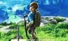
North America and Japan
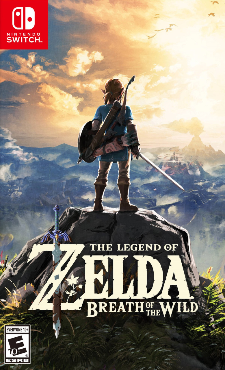
As the sun begins descending in the western sky, the hero looks out across the kingdom, the danger of Hyrule Castle beckoning as Death Mountain spews into a cloud-filled afternoon sky; ominous, but also inviting. The foliage in the foreground highlights Hyrule's wilderness and Link himself looks childlike in stature standing atop the huge boulder, framed against the massive world before him...
A great logo sits over an evocative image that captures and communicates the spirit of the game beautifully. We can't get enough of this painterly style — it makes us go all verbose.
Top marks all round. It can't get better than this, surely?
Europe
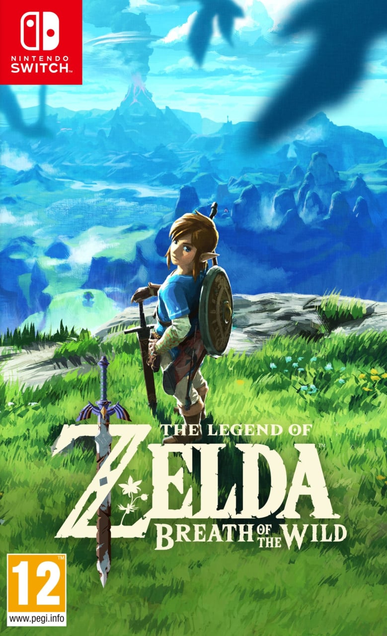
Oh, 'ello cheeky. In the European version we're looking down once again over Hyrule, and Death Mountain is still erupting in the background, but it's much earlier in the day and the blue of the sky infuses the entire top half of the image. The bottom half is filled with the bright greens of the long grass and flora, and Link himself turns around to look at us. What's he saying? "Ready?" perhaps. Or maybe "Who the bloody hell are you and what are you doing in that tree?".
It's a different look and feel, but no less evocative. The placement of the birds here — out of focus in the foreground — gives this cover a less 'epic' feel and conveys more of the sense of being 'in' it. You're part of this adventure already. Grab your things and let's get back to it.
Add in the same great logo and we don't envy the choice you've got to make this week.
So, you've seen two top-class, painterly covers this week, but which is best? Pick your favourite and hit 'Vote' to let us know below:
Have a brilliant start to December and we'll see you next time for Box Art Brawl #70.


Comments 74
Somehow I've never even realised that the game has two different versions of the boxart despite definitely seeing both versions many times over the last few years. Not too sure which one I prefer, they both look really good.
The PAL version looks great in Blue color scheme.
But alas, i still neglected my BOTW for more than 3 years.
I have no desire to continue the game.
US/Japan
Call back to the first game, https://www.zeldadungeon.net/Zelda01/Legend-of-Zelda-Walkthrough.jpg, and Link having his back turned to the player and staring out at the world let’s you know that the focus is on the world itself. Plus I prefer the colour palette.
Never really enjoyed the European cover art. Link looks like he's posing for the snapshot.
@Munchlax I agree about the color palette 100%
I would also add that the NA/Japan version feels more appropriate for the game. It instills a sense of challenge and foreboding while the EU version feels more friendly and inviting.
I prefer US/Japan as it shows Link determined to facing the dangers of Hyrule (monsters) and the Calamity.
The European art has a childish look to it while the NA/JP art looks refined and heroic. No offense Europe lol
This is easy.north america and japan.
I gotta go with the North American/Japanese cover as well.
Both look great. Certainly the European one is dear to me as that is the art on the physical version I have of one of my fav all time games. However, I would say the Japan and NA one is the better one
Thankfully, the European cover is somewhat reversible, if you don't mind (or prefer) the absence of the usual logos etc.
The front nicely frames Link climbing an inverted cliff wall, showing off his liberating new ability.
Yeah, the NA one is cooler. But I like the cover we got over here as well. None of them are bad.
I like the beautiful painterly art style on both, but I prefer the US/JPN cover as I believe it has a richer color palette, a sense of foreboding with Hyrule Castle in the distance, & an overall more epic feel.
The Europe one is nice and vibrant. You can actually see Link and the background.
Love the colours of the European one but Links pose is a bit strange. A combination of the two would have worked best.
I imported the US version for the cover art. Haha. The EU cover has an innocence about it whereas the US/Jap cover is rather monumental and epic with a sense of determination. Also, EU cover looks like he's taking a selfie lol.
I wish Europe had got the NA/Japan variant - it's so much better!
Too easy. US/Japan. Perfectly embodies the sense of exploration and the world of the game.
Love the us/japan cover.
Neither are great, but the EU one is less "generic shot from behind at backdrop"
I'm very sad to have the Italian one, as it was bought with my Switch during a trip (Nintendo wasnt officially in Brazil yet in 2018!)
It's not a bad cover by any means but the Japanese/North American is MILES better. Alas, the game is great in any way
I don't like the European box art. I feel like I'm a Peeping Tom who just got spotted.
I didn't even realise we had a different cover in Europe. It's fine but I prefer the NA/Japan version.
So Link is doing some Selfies on that Spot and sharing the both best ones.
You can see that it is not from the same Corner since the Volcano is a bit more to the left.
I voted for the North America/Japan one. I just love the idea of Link having his sword in hand, looking off into the distance for his next big discovery. It really nails the scope of the game.
As a European this is the first ever game that I actually considered importing the game from the U.S just because I dislike that European cover art so much. Sadly I couldn't justify the import charges so I'm stuck with the inferior cover art forever lol
As a European, I prefer the Us/Japan one. Link's pose is definitely more natural.
Yeah, the US/Japan one. No contest. It conveys the open-world nature of BotW much better than the European one.
To be honest, the European cover looks like something that came out of me, Birdo.
Whew, this was a tough one. I love both covers, but I gotta give it to NA/JP for just looking cleaner. The EU cover comes across a bit more awkward with Link's pose and the foreground birds.
Plus, the logo being on the rock in the NA/JP one makes it look out of the way, and lets the scenery shine more, while the EU one looks more traditional. Probably because your eye isn't drawn to the background as much.
The box art for Europe has been used in promotional materials in Japan, btw. I've seen it in large format posters in train stations and such.
in fact, here's a pic of one https://i.imgur.com/FmJKWHF.jpg
US easily takes the cake. It makes the game seem a lot more epic than Europe’s.
Both are very good but Link's European pose is a bit awkward and I prefer the colour scheme of the NA/Japan one.
@EdScissorshands I dislike the European cover as well, the other one has so much more focus on the world to discover, less on the character through which you discover it. Which is what most fans love about LoZ I suppose. Luckily, the collector's edition box in Europe (the big outer box at least) has the other art as well, almost as if they knew perfectly well that it was the better of the two.
Maybe I'm just more used to the European one but I much prefer it's beautiful blue/green colour scheme.
@Anti-Matter i have beaten the game 3 times already. You should look back to it at some point
After laying my eyes on the US/Japanese cover art, I've hated the European cover with a passion, and I am so very glad that Australia got the original cover art (as we are usually get whatever Europe gets).
European box art is really bad for a so big game like this
The European cover looks better on the starting menu of the game than box artwork imo
Both are great covers. I love the sunset in the NA / Japanese one and it feels more epic, but I don't think it's a great look to have the hero with his back turned on the box art. Link's pose is a bit weird in the European version, but it's almost like he's beckoning you in to come and join him in discovering the bright and vibrant world before him. Honours even for me this week.
Much prefer the US/ Japan one, not sure why they changed it for Europe. Especially as it references the famous painting by Caspar David Friedrich.
Naw, I don't want Link looking at me.
@Slowdive Agree! Good nick btw
@peachflavored Considering there is a camera module in the game and you can make selfies in which Links poses in different ways... I guess this box art still makes sense.
I like the american/japanese one much more as well.
The european one is fine, but the other looks epic.
I votd Europe because he looks funny that he is staring at you
US is nice too
The NA/Jp version is my favorite video game cover of all time, so that was an easy pick.
So, whats the reasoning behind this? I understand they are trying to generate a more localized appealing towards the game by it’s cover but what is the justification in this case. That would be a great article.
I wanted to vote japan, but clicked on europe.
The japanese version realy shows (courage) links triforce. Ready to face the evil ganon, no one will stop him.
Don't think I can choose. For what it's worth, I have the wallpaper art featured in the E release on my Nook at the moment.
NL: Don't envy your choice
The People: What Choice?? votes NA/Japan
Link looking back at you kills the box art
Okay, honestly, I strongly dislike the European cover art. The first time I saw it I'm sure I said "gross" out loud. Night and day difference in terms of likability in my mind. Link's pose is extremely awkward, and his body just looks out of proportion with itself. And what's with the out of focus bird blob at the top right? The oversaturated colors are just ugly. It's really, really bad in my opinion. I never comment on these Box Art Brawl articles, but I couldn't just stand by and say nothing this time, hahaha..
I'm going to be completely biased and go with the NA/JP cover for this one. Everyone has pretty much highlighted why I prefer it over the EU cover, though the latter is pretty decent too.
@Munchlax The irony is I've just started thumbing through Art & Artifacts and never noticed how much the scene on BotW's NA/JP cover reflects that classic art piece from the first game. (I own BotW, but haven't played the game yet). Thanks for pointing that out!
I'm quite surprised how much of a difference the NA/Japan one is leading over the European. Especially since I taught the European was better even though both are good.
I think the North American/Japanese boxart is one of the best boxarts ever for any game. The European one is pretty weak by comparison.
Also, nice 😏
I’d trade back the American box art for that Zelda cartridge chest Nintendo Euro gave out on club Nintendo!
No contest! The European box art is pretty awful, and I say that as someone with thst copy on his shelf. Why wouldn't they just keep the same cover for all regions??
Box Art Brawls Current Total:
Europe: 25
Japan: 26
North America: 27
*now collated with Duels results
heh, 69
(insert comment that contributes to the conversation here.)
Australia also got the US box art, but I ended up with a European copy of the game. Wish I didn't because the the US/ Australia box art is better.
@Anti-Matter Just start it all over at this point.
I am in the minority again! I never liked the japanese NA cover of BOTW, its so dark, void of color and depressing, the European one seems to capture the feel of the game better.
Had a hard time with this one, as both looked great imo, but I ultimately ended up going for the EU one, as it captures the more peaceful, relaxing side to BotW, which was always my favourite part of the game (in contrast to the NA cover, which, as others have pointed out, gives more of an 'epic adventure' vibe).
I'm later than usual voting and commenting on this as I literally forgot what day it was and that I hadn't yet visited the site today. I vote for NA/JP. Usually, seeing the back of the character is weak for a cover, but here it adds to the expansive feel that was intended. Frankly, the world in the background is the star of the show, and having Link in the foreground adds to the sense of scale. While the European cover uses a similar smile, I don't like the way Link is posed. The overall quality of the art is similar though, which is good, but the composition makes the difference for me.
I dont think link's pose looks awkward in the european like others have said. The proportions look just right considerig the angle. He's giving a longing look, as if to invite you into the world of the game. I think the color scheme is more appropriate too as nature is such a big theme of the game regardless of it being a post apocolyptic world. I think it looks great!
I've only ever seen the European one before, and the US one is FAR better! Link's over-the-shoulder pose just seems so out of place in the euro one.
The NA/JP easily beats the EU box art. It definitely contrasts traditional box art from previous Zelda games, where Link usually looks towards you.
@benchan
Nice
Dang. I keep picking the European covers and they keep losing.
They're both great! But since I can only vote for one, I think it'll beeeee....Europe.
The Na/Japan one, because the european box looks like link is about to take a wizz off the cliff.
I like how it's boxart brawl number 69 and the tagline is just "Nice"
I prefer the art and pose on the NA/Japan version, but the colour & vibrancy on the EU box. All-in-all NA/JAP wins for me, but I too somehow didn't even realize there were alternate covers for this game despite seeing boxes and art everywhere for years lol smh.
Hears to to the upcoming Tears! One of the few Switch games I plan to own a physical box copy of.
... Wun can only hope.
I just discovered this little series, so even though this is late I had to point out my thoughts.
The NTSC cover clears because it's very clearly inspired by Der Wanderer über dem Nebelmeer, completely using the same composition. I'm honestly surprised that Europe didn't appreciate it.
Show Comments
Leave A Comment
Hold on there, you need to login to post a comment...