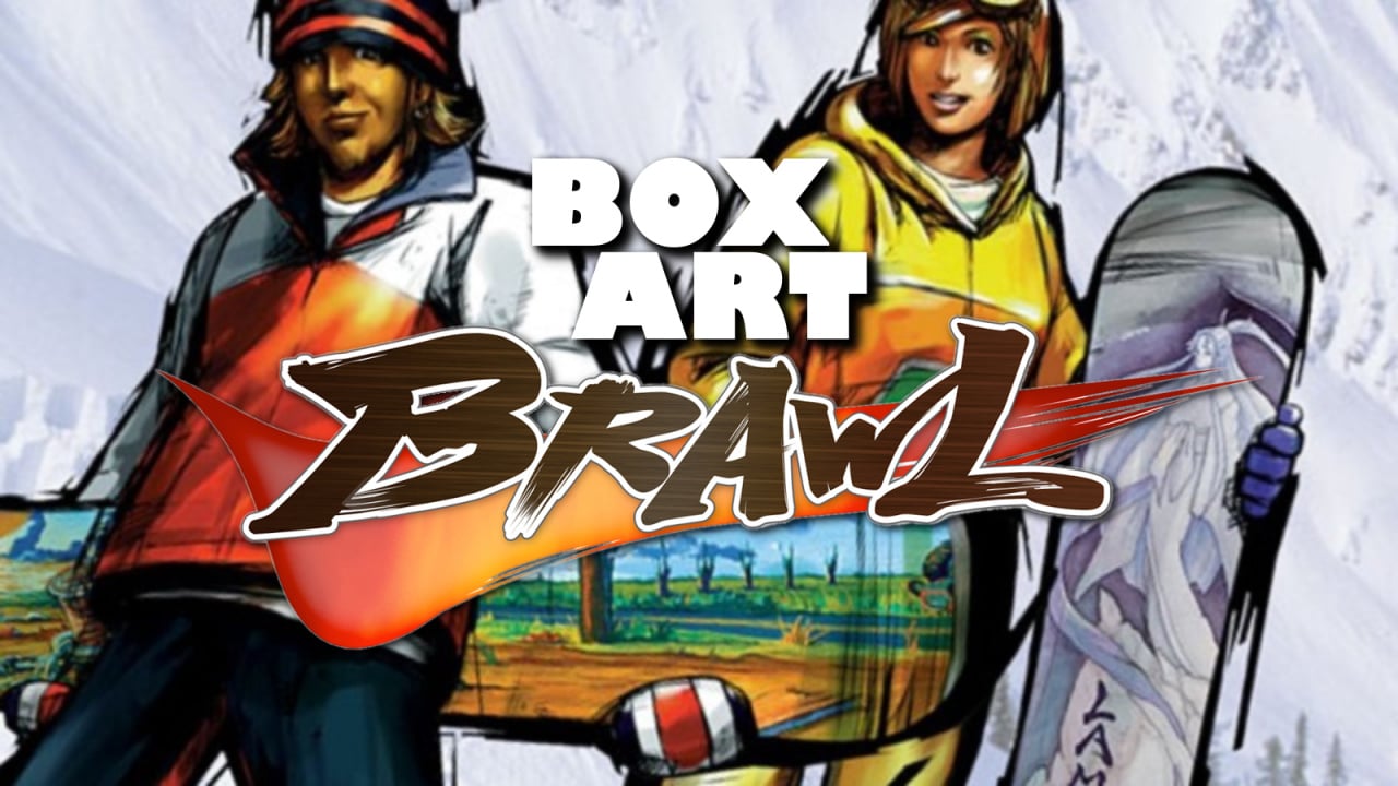
Welcome to the Box Art Brawl, our weekly (well, most of the time) vote to decide which of two or more regional retro box art variants is the best.
Last time, we sized up Tuff E Nuff, one of the latest additions to the Nintendo Switch Online SNES catalogue. The Japanese version — known as Dead Dance in those parts — was the clear victor. The infamous North American version came in second with a third of the vote, and poor Europe limped home in third place. Clearly not tough enough, then.
In an effort to get into the festive holiday spirit, this week we're looking at the gloriously snow-filled 1080° Snowboarding for N64. C'mon, it's got 'snow' in the title — what more do you want? We looked at the N64's other premier snowboarding series this time last year, so Nintendo's cracking first-party effort is the obvious choice this holiday season.
So, pick your 'boarder of choice (Ricky Winterborn! Akari Hayami! Dion Blaster!) and let's get out on them slopes.
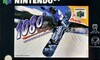
North America
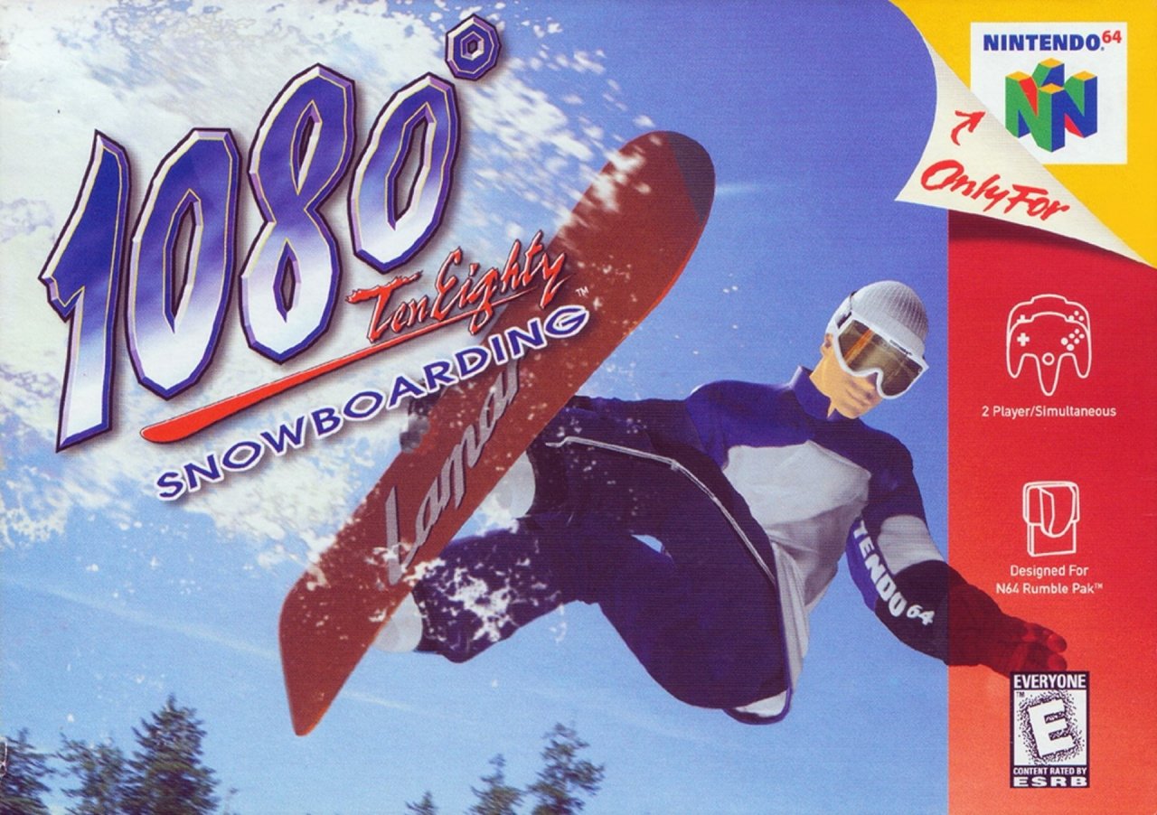
The NA version presents a dynamic low-angle shot of a snowboarding CG mannequin spinning over you, presumably mid-1080. The logo itself stands out in the top right corner against the background of white powder kicked up by Señor CG, with a crisp blue sky providing a serene backdrop for the rest of the image.
A handful of fir treetops break the frame along the bottom, in a relatively uncluttered cover. Not bad.
Europe
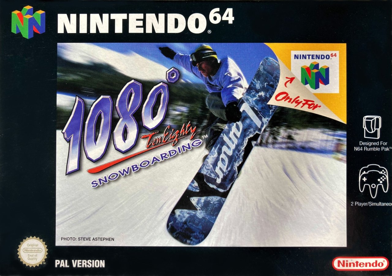
The EU version gets the customary first-party black border around its 'boarder and uses a completely different image, courtesy of Steve Astephen. The Lamar board branding is once again visible and the logo stands out thanks to the blur effect applied to the background.
The black border is admittedly an acquired taste (we're quite partial to the way it makes the console logo stand out along the top edge), but overall we probably prefer this to its NA counterpart.
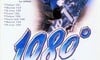
Japan

The Japanese version uses the same image as the EU variant, splashed in the middle of a while box in 'portrait' orientation. Lamar gets a more explicit shout-out with its range of boards listed on the left, and the logo is blown up to occupy the bottom half of the cover.
We like the added detail of the little board in the bottom left corner, although the white-out effect feels a bit cheap. Some snow-covered terrain would have looked better, no?
So, you've seen the boarders, but which one actually pulls off the fabled 1080? Pick your favourite and hit 'Vote' to let us know below:
We hope you're enjoying the holidays. Join us next time for a less-festive but just-as-wonderful box art-based bout. Until then!


Comments 36
Once again, I got to go with the Japanese cover. The full portrait view, once again helps sell the box art cover for me, at least in my opinion anyways.
Europe cover, has black borders, makes it look sleek and ambiguous.
No matter the cover, Nintendo please give us another 1080 and Wave Race.
Another franchise Nintendo let die. Every time I play Mount Wario in Mario Kart 8 Deluxe it reminds me of what could be... The original 1080 was actually built with the Mario Kart 64 engine.
I'll go for America for this one. It looks more fun and vibrant than the others and suits the arcadey gameplay.
I actually prefer the NA one here.
More professionally put together and looks neater - especially without a black border (Europe) or big lettering that obscures a fair amount of the snowboarder image (Jap). Also NA shows some of the background scenery (albeit mainly blue sky and a spray of snow) where the Japanese one strangely doesn't
"The black boarder is admittedly an acquired taste"
One accidental letter a completely changes the meaning of the sentence. Oops.
@OrangeSoda Shocking. Nintendo Life is cancelled.
I miss the days of extreme sports video games.
I clicked on this article fully expecting to vote for the North America version. As soon as I saw the Europe and Japan covers I immediately realized us in the US were short changed some. I voted for the Europe cover. Something about it makes it more edgy and cool to me.
Now the next 1080 article should be a "Can You Guess the Lyrics" to that intro song. Let's be honest all of us sang along with our own lyrics every time we turned on the game
Europe for me. Love this game great memories , so peaceful and soothing sliding on that snow xxxx
@OrangeSoda Ha, too many borders/boarders. Zapped it, thanks. 👍
Box Art Brawls Current Total:
Europe: 25
Japan: 29
North America: 28
I grew up with the European cover, but I actually picked the North American as it feels fresher for this type of cover.
Almost voted for NA, but I really do like the Japanese cover. All three are great this time--well, aside from Europe's awful black border.
Japan is clearly the best, the Europe one has too thick a border and the NA one looks like a shop mannequin that's been dressed up and tossed through the air for an action shot. Looks plastic AF!
This one was hard for me. I think I like the NA one better, but that red side completely ruins the look. I went with Europe this time.
An outstanding game on my favourite ever console.
NA wins this time. Don't even know why, it just looks the most pleasant.
For me the first 1080 is still an absolute delight to play. Tight controls, real sense of speed and it’s challenging. Avalanche is good fun but it’s not got that special feeling like the first. Plus with slick mode on my Super64 and mClassic upscaling to 1080p (see what I did there) it looks pretty good!
Europe for the win
The boot grab on the European and Japanese cover is inexcusable. Plus it almost looks like the ‘mannequin’ is doing a toe-deo (rodeo off the toes), or at least a really dumped frontside spin grabbing Indy properly between the bindings. NA for me. (Also biased as that’s the version I played and own). Don’t grab boot or tindy (halfway between tail and Indy grab) kids!!
First one I can remember europe didn’t win with ease.
North America is nice!!!!!
Hold alt and type 0176 on the number pad. You're welcome
Voted for North America, it has the best action shot in my opinion.
EU the CGI on US cover is horrible!
I prefer the European box because the athlete doesn't look like a mannequin. The Japanese version is okay, but there's no background.
The only thing I really don't like about the European one is the "Only for Nintendo 64" tag obstructing part of the board. I also not crazy about the black borders, but they don't really bother me and the extra information goes there. Since the black borders are there anyway, it seems like the exclusivity logo could have been put there without covering any of the artwork.
NA gets my vote here, I like that action shot the best. I'm not a fan of the thick borders on Europe's N64 box art. The JP one is good but would be better without the '99 New Boards bullet points"
I love this game. It definitely has a learning curve, but it's incredibly satisfying once you learn how to land well. I still like 1080 Avalanche on GCN too, but it feels a bit "off" compared to this one. I feel the same with the Wave Races too. I adore Wave Race 64, and still like Wave Race Blue Storm, but WR: BS just feels a bit "off" compared to 64.
Why do all of these hurt my eyes? Gotta go with Japan, the best of the worst
I gotta go with NA on this one. The EU version looks so blurry is hard to stare at and the JP version is so plain and boring...
I voted for Japan. I didn't like the mannequin on the NA cover. For Europe, the black borders are excessive and not very useful. Why not just have a black strip on one side, or maybe back in an L shape on two sides to allow the art to be a bit bigger? Having black all around is such a waste of space.
The European one would easily have been the best if not for that stupid border.
Japan for watashi.
Europe for me. The borders are annoying, but the actual image is the most interesting of the three.
I always wondered... If they make a new entry in this series, should they call it something else? If anyone has watched the Winter X Games in the recent years like I have, 1080 is basically considered as small potatoes compared to the rotations being pulled off now(triple cork 1620, 1800).
Work ya body, we’ll work ya body
Work ya body, we’ll work ya body
The NA cover is a classic, just a totally 90's thing that really captures the look of a snowboarder tricking on a mountain. Easily one of my all time favorite games, I still get strong nostalgia feels just looking at it.
There's actually another NA box version out there. It has the 3D "N(64) Sports" logo, with a black background only on the upper right corner. Probably the coolest box of them all tbh. It has the clean authentic look of the NA box, with a touch of the Pal's black boarder which really makes it pop. That would be my vote!
Show Comments
Leave A Comment
Hold on there, you need to login to post a comment...