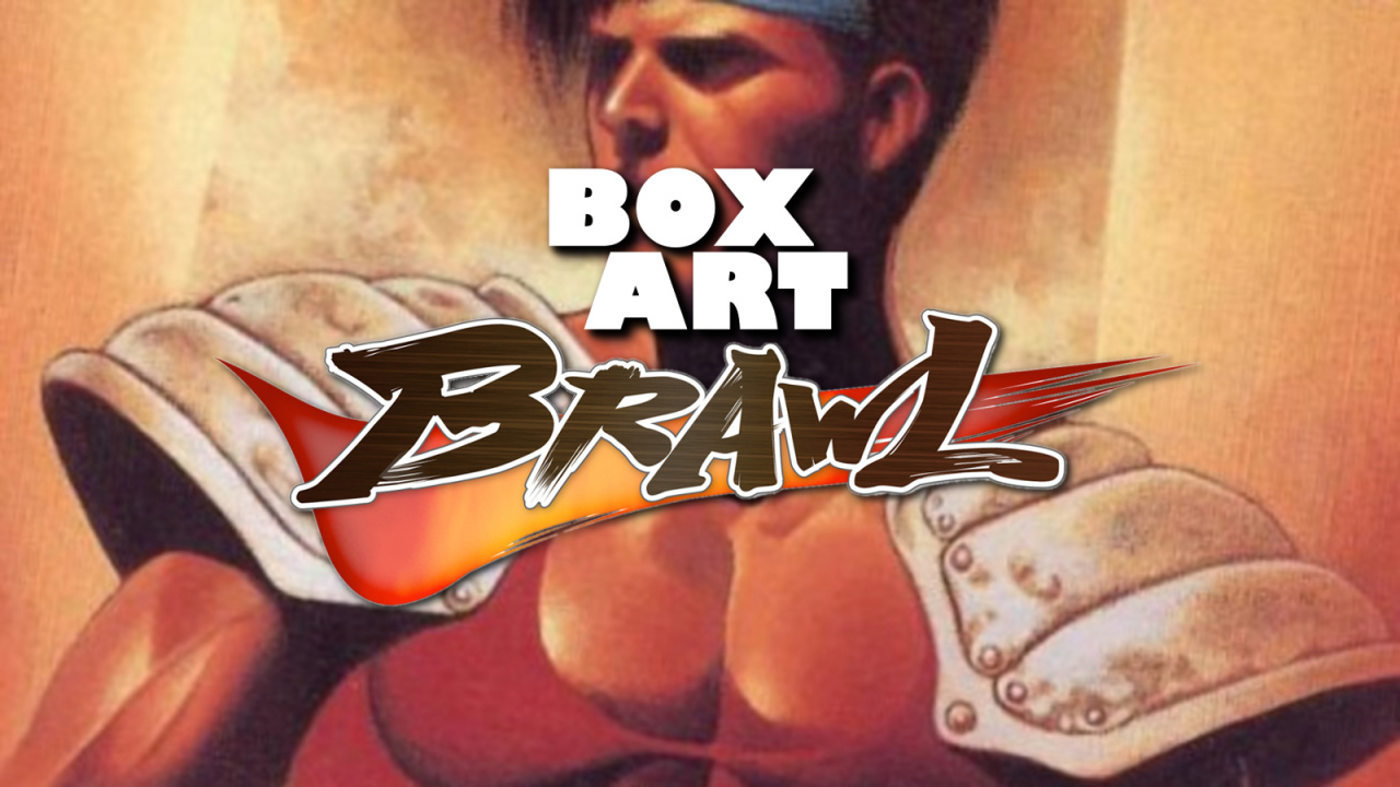
Welcome all to the Box Art Brawl, our regular contest where we vote on regional cover art variants from the dim and distant past when you could only buy games in physical form.
Last time, we observed an old-fashioned Pokémon battle with Pokémon Stadium 2 for the N64 in honour of its 20th anniversary. Both covers featured the same key art, but ultimately the portrait-orientated Japanese version emerged victorious with an approval rating of just under 60% while the North American/European version had to be revived by Nurse Joy at a Pokemon Center.
Subscribe to Nintendo Life on YouTube848k
This week we're back to a three-way bout with Tuff E Nuff, a SNES fighter in the Street Fighter II mould that was added recently to the SNES catalogue available to Nintendo Switch Online subscribers. Awful name aside, it's a solid game with notorious box art in the West, so we're happy to shine a little light on it in the brawl.
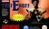
Europe
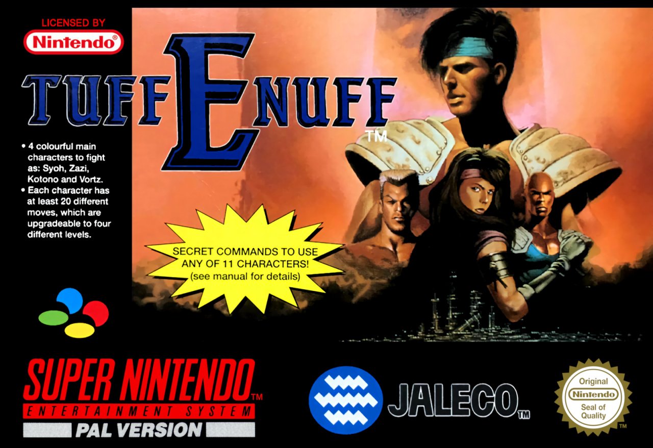
Rumour has it that the key art for both this and the Japanese cover originally came from British magazine CVG which produced its own material to accompany preview coverage of the game. The makers were apparently so impressed that they decided to use it for the covers everywhere outside North America.
In some EU countries this carried the name Fighting Spirit: Tuff E Nuff and had a fiery Street Fighter-style logo, but the olde-style serif-ed logo here is super dull, and despite having a decent piece of art, there's too much black and empty space on this cover for our liking. What is this? An RPG? A Golden Axe clone? You'd be forgiven for thinking so.
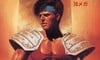
Japan
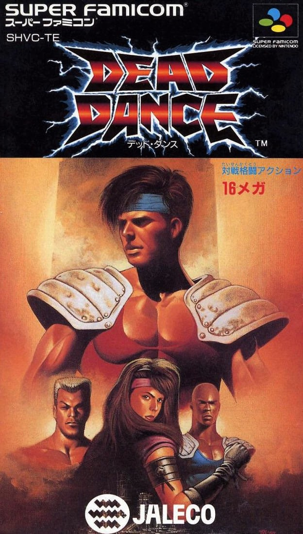
Known as Dead Dance in Japan (so much better!), the Japanese art reformats the key art and exposes a pair of impressive pectorals worthy of the great Ricardo "Khan Noonian Soong" Montalbán himself. Regardless of the name change, the logo itself is much more eye-catching and dynamic and gives you an idea of the type of game it is. Strong.
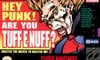
North America
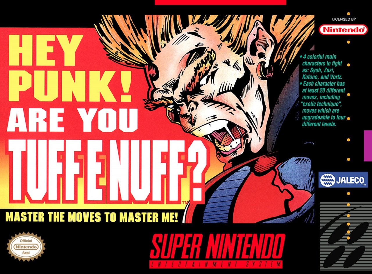
"MASTER THE MOVES TO MASTER ME!" Nah, you're all right, son.
What is there to say? It's bold and punchy, that's for sure. The green text on the right clarifies that it's a fighting game, and there's something of Blanka about the character in the front cover, although he bears little resemblance to his in-game counterpart.
Arguably the biggest problem here is that the title of the game is unclear. It's just a bit of a brightly coloured mess.
So, you've seen the candidates, but which one gets your vote? Pick your favourite and hit 'Vote' to let us know below:
As 2020 hurtles to a close, we'll see you next time for a post-Christmas Box Art Brawl. Take care everyone!


Comments 44
This has to go to Japan. Perfectly aligned unlike the EU version, and no ugly drawing with messy text like the NA version.
I choose Japan just because I dig the title. Other than that, everything on these 3 covers is abysmal.
Japan of course. Gotta free those pecks.
But what is with the eyes on the guys? The woman’s face looks perfectly normal. The men all look dopey. Lol
The horrible saliva, the not-so-passive-but-very-aggressive slogan, the ugly gradient, the blocky font, the pun - the US cover is all the worst things about 90s gaming and advertising, and I love it.
Edit: just found out there isn't a character in this game who's actually called Tuff E. Nuff. I feel betrayed.
@Kienda Play this game if you like your male characters to appear eyeless. It's what I look for in my fighting games.
Go Japan! Never hide the hottie!
Didn’t the artwork come from the cover of an issue of Nintendo Magazine System?
This one is a good one! Surprised NA was released as shown.
Japan. I like the title font on the European version but that Microsoft Word looking yellow star is hideous! The American version just looks dorky.
It's an awful fighting game though, especially on a console that had the likes of Mortal Kombat, Street Fighter and Killer Instinct. Solid, really? 🤔
I do wish European Switch owners got the European box arts on the SNES Switch app and not the American ones. It's Star Wing, not Star Fox! 😉
Japan not only wins the cover, it wins the whole game. So much stuff got cut from Jaleco's Western versions of the game and Dead Dance is one of the worse. We got no dialogues between dules and we got no blood as fights went on on character's faces. A real shame, among Jaleco's kusoges this take on Hokuto no Ken was always a guilty pleasure.
The North American box art is horrendous. This is an easy decision, I gotta go with the Japanese cover.
North America because it is so stupid. I have memories of seeing it at the video store as a kid and thinking the same.
I am so glad I used to buy gaming magazines 30 years ago. At the time I probably would have thought about buying this to get another 1v1 fighting fix but having played it for the first time this week it is pretty much what I expected, a bland, generic inferior take on SF2.
I actually love the character on the NA version. It's everything else I hate: the title, the dorky "Hey, punk," the font... Nevertheless, NA got my vote this time.
Japan on title alone lol. None of them are particularly great in my opinion.
U.S.: It's bad. But it's the funniest kind of bad.
Europe is my favorite here.
The US box is positively rancid, but it's so goofy and funny that it has my vote. I can find you numerous box arts that look like the JP one, but I don't think there are any box arts like the US one. A one of a kind disaster.
Japan. Good centralisation of the character art models and interesting lettering.
The EU one is decent but almost too formal, lop-sided & has some poor choices on lettering design.
Not sure what is happening in the NA one, lol
Box Art Brawls Current Total:
Europe: 25
Japan: 29
North America: 27
Voted for North America. The Japanese one looks the best but it's generic, the North American one is unique and very reminiscent of the 90s.
Edit: The guy in the middle group of the Japanese and European box covers looks like Ben from Parks and Recreation.
I think while all of the are awfull... At least the NA version captures the spirit of the 90's and the game itself. And it looks the most professional designed too (for its time, 90's aesthetics)
The lettering on the NA cover is terrible - is the game called Hey Punk!? But I like the art much more than the painterly “wannabe-a-Star-Wars-poster” image on the EU and Japan boxes. Going with America this time. (But Dead Dance is a far better name, even if it sounds like a zombie shooter.)
First time I wished there was a 4th box so I could vote "no"
The North American box art is some of the worst box art I’ve ever seen. You know you have crappy box art when it’s unclear what the actual name of the game.
It's weird. The Japan / EU art looks like the kind of thing they'd draw for a NA audience in place of the original Japanese anime art.
All of them are horrible and awesome at the same time. I like the "hey punk!" so I voted that one, but I absolutely love the absolutely HORRIBLE artwork on the other versions. Nothing here makes sense. But unlike with politics, where when nothing makes sense and every choice is horrible, I simply refuse voting and refuse submitting to the "democratic" outcome, here I could have voted any of them despite not wanting to see any of them ever again, let alone allow any of the portrayed characters to have a say in my life.
There is no best option here. But Japan is the least terrible.
I remember seeing this game in the rental stores when I was a kid. Due to the NA box art I never rented it cause I wasn't sure what type of game it was.
Seriously, there were people who voted for the terrible American art ??? There are gamer who don't know how to differentiate between bad and art ... that's why the metacritic of users is so strange
Well they are all terrible.
That "Secret Commands" star on the European one is awful. And whats "secret" about it? They've declared it on the front and in the manual!
As corny as it is, I voted for the European box art because I find it more visually appealing despite that annoying yellow spiky splat obscuring some of the art. The American art has its own appeal with the in-your-face angry thug whose teeth blend in with his spit, but it just doesn't really do it for me.
I'm with those who say they're all bad. I think Japan's is the best of the lot. The vertical layout certainly works best for that art. The Euro version has an inferior layout. The US box is awful. I've seen better inking work for US-style comic art than what we see here. And the title and extra text just don't look good to me. It's like they went the same route as Phalanx, making a cover to stand out, whether or not it looked good.
Three equally bad box arts for a horrible game. Fitting!
Licensing Jaleco games must be dirt cheap for there to be so many on the SNES Online service. Not that there's many good fighting games on SNES which don't belong to Capcom or SNK... Namco could/should release WeaponLord on it, though.
The game makes this play in my head... and I can’t escape.
https://youtu.be/EcXT1clXc04
You telling me the American version isn't called "Hey Punk Are You Tuff E Nuff?: Master the Moves to Master Me"?
All ugly. But the US one wears it with a sort of grotesque grace. It's memorable. The other ones are just, bland.
I don't like any of these, though 'Dead Dance' is a neat name. Voted for the terrible US one because something about it cracks me up.
Eek! Is the middle “punk” stretching out his sisters swim suit on dead dance?
Thanks for these NL/ @dartmonkey !
Death Dance!? Japan wins again
I'd agree the proper title of the game is hard to pick out from the North American boxart. I guess I only knew it because I had read magazines back in the day.
I know some people on the Internet called the game by the entire question.
I unironically voted for North America. It's peak campy SNES marketing at its finest. The art itself is actually pretty good! I totally get what they were trying to do, and make it stand out on store shelves — obviously it failed, but I applaud the effort. It's memorable!
The American version is so 'American'. in a cliche way.. wow.. (voted Japan)
Man... Japan seems to win every time these days. I feel like the Japanese cover is the best, but I voted for 'Merica for its "so bad it's good" sort of vibe. Also out of spite because the Japanese cover that won last week was awful (if you read Japanese).
Show Comments
Leave A Comment
Hold on there, you need to login to post a comment...