Welcome to a festive edition of Box Art Brawl, where regional box art variants battle each other for the honour of your vote. Christmas is over, New Year is approaching, so it's time to hit the slopes as the snow settles in the interim.
Last week Star Wars Episode I: Racer raced itself to the podium and t'was decreed by you lovely people that the Japanese variant was worthy of first place, with the subtler European version picking up the silver medal and North America nabbing bronze.
Sticking with the Nintendo 64 this week, we're racing once again with the rather excellent Snowboard Kids. We can honestly say that this rivals Mario Kart when it comes to comical racing, and that's not some underhanded snipe at Mario Kart 64, either - Atlus' downhill racer is really good enough to rival the plumber when it comes to multiplayer mayhem. It also gains extra respect for not succumbing to the tired convention of turning the 'S' on that Kids plural into a 'Z'.
Subscribe to Nintendo Life on YouTube845k
So, without further prevarication, let's join Slash, Nancy, Jam, Tommy, Linda and Shinobin on the slopes...
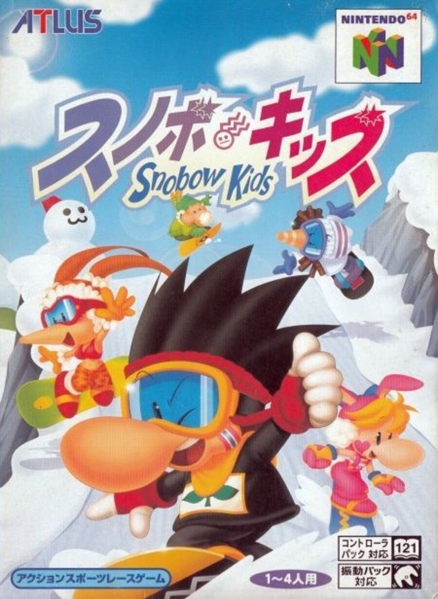
Japan

Starting in the east, the cover of Snobow Kids as it was known in Japan features Slash front-and-centre with the rest of the gang positioned around him as they shoot down the slope. The portrait orientation works well here and the cover gives you a good idea of the sort of colourful racing contained within.
Not much else to note here, really. Colourful, energetic - we like it.
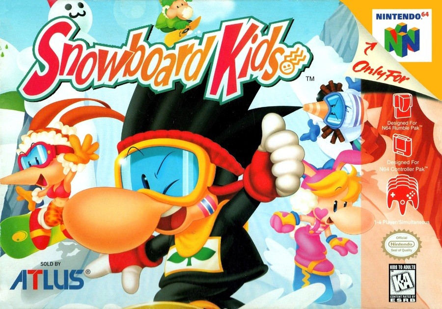
North America

The North American variant takes the exact same elements and moves them around to work in the landscape frame. The standard red strip comes in on the right side and the logo moves down while gaining a hot new colour scheme and a little Fido Dido-style smiley.
The same elements reframed, then. We also like this.
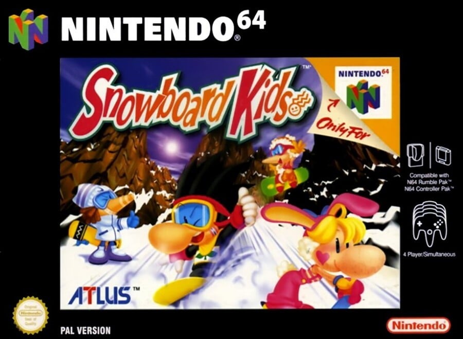
Europe

The European version features the black border - elegant or intrusive depending on your point of view - but also has some alternative art for Jam and Nancy, along with a totally different background. The sun appears over the mountain tops and Slash sprays up some powder as he winks at you.
Similar colourful elements, different configuration; it's another 'like' from us. But which one's a hit with you?
So, there we are! Click the 'Kids that you think are most deserving and hit the 'Vote' button below:
That's it for this seasonal edition of the brawl. We hope you're enjoying the holidays - we'll catch you in 2020 for another round!


Comments 37
Now this is a game I’d love to see ported. Had so much fun with the original when it came out.
Those mountains in the background of the European cover really elevated this for me.
This definitely was a game/series that was/is underrated. A fun Mario Kart clone, mixed in with some 1080 Snowboarding. I wish Atlus would give this series another chance. Maybe if we start a petition to ask for HD remakes on the switch then maybe they’ll listen. What do you all think?
America for me the first time Europe hasn’t won
Don't like any of them ( or the game really )
But I prefer the European juxtaposition of the black border with the colorful graphics
I don't play the game, but i prefer USA version.
Rayman, is that you?
Went with North America because it's more vibrant than Japan's cover, which looked washed out in its color scheme.
This could totally be nostalgia, but there’s just something so iconic to me about American N64 boxes. That red strip on the side makes for a great aesthetic; classically cool without being too 90s or XTREME.
If only they weren’t made from the flimsiest cardboard imaginable
I just wanted to mention that I enjoy these features. They make for a nice Sunday changeup!
I want to like the EU one but the border always kills it for me. Japan got my vote for the cleanest cover.
I love the Japanese composition. Much more fun than the others.
Voting for Japan for 2 reasons.
1. It's the same as the others, but the artwork is less obstructed.
2. Snobow Kids.
@Nanaki Yes, please bring this to the eventual N64 collection on Switch online. And hopefully, it also supports online like the NES/SNES collection.
JP has better artistic framing, and you can see the main character's snowboard.
I went for the backdrop of European version, sets the mood.
I always vote USA because I'm a patriot.
I like the idea for box art brawl a lot, but so often the regional differences are so little. This makes me wonder if there aren't any better candidate games for this series(?) Meanwhile, I'll keep enjoying the ones we get
With the two main characters acting toward the outside of the frame, the European cover provides a matte to contain the action and not let it visually run out of the center. And the darker colors hold the image together better, making it appear more cohesive. U.S. is close, though.
Man. The choice reminds me of something.... Oh yeah,
http://www.quickmeme.com/img/9e/9ea87c6c6fa24821d81f903353ab9e943dc3987874b89e4a2b638b58c247bce4.jpg
US version feels cramped, EU is too dark. Japan for the win
Has anyone else noticed that in the European art, Linda (the girl with orange hair) has her twintails hair cut off?
Is the same Linda used in the Japan and NA box art but for some strange reason the Europe box art cut off her twintails hair...
I don't understand that logic... WHY?!
At first I was going to go with NA for the sharper colors, but then I realized that the Japan cover only looks washed out because of how the two covers were scanned...there a clear difference in method and quality on that front, which has nothing to do with the actual cover itself. So Japan for me.
@Chibi_Manny I'm going to say it's probably because they moved her and changed the background - in the original art her hair is slightly covered by another character, and they certainly weren't going to draw that in after moving her so it was easier to crop them out and pretend that they never existed in the art.
That's just a guess based on what I can see though; I don't know what the release people were thinking for sure.
Japan because you get a nice bit of sky and I guess its vertical orientation helps with the Snowboarding vibe.
Honestly I would say the European box art has the best look. To me it's the more clearly defined mountains.
Another brawl and yet another batch of, in my opinion, terrible N64 box art. Bad boxes seems to have been a trend for the system. Yet again, I don't like any of these. The Japan box seems the least bad.
Japanese all the way. I own 1&2 on NTSC-J and the boxart is lovely.
Who turned out the lights on the Europe cover? I like the 80s colouring going on on the Japanese cover, so went with that.
This is one of the damn reasons we need a N64 Classic!!!! Loved this game!
I like both Japan and NA, but I think Japan is best because of the portrait orientation. It brings out the snowboarding appeal more.
@Aronin I really see no reason to call it a "Mario Kart Clone."
Never played the first, but Snowboard Kids 2 was the bomb. I would love another sequel in this day and age.
Man this game was a blast. Would love a new entry. Dunno which box art I prefer though.. they all have things going for them.
Box Art Brawls Current Total:
Europe: 4
Japan: 10
North America: 9
Was Snowboard Kids 2 any good?
(Was not released in the PAL region, so I did not play it.)
Legendary game. Still have my copy
Show Comments
Leave A Comment
Hold on there, you need to login to post a comment...