Welcome back, you beautiful bunch, to Box Art Brawl — our regular poll to find out which of two or more vintage video game cover variants from around the globe is the best, better than all the rest (diew, diew, diew-diew, diew), better than anyone we ever met.
Last time we watched F-Zero take itself to the races. It was a close call, but in the end it was the North American and European variant that took the chequered flag on race day, winning 57% of your vote and getting a faceful of champagne on the podium.
We're sticking with the Super Famicom/Nintendo this week (it just turned 30, dontchyaknow) and looking at another classic launch game — perhaps the classic launch game. Super Mario World isn't just one of the highlights of the 16-bit era, it's one of the highlights of the medium, full stop.
Not much else to say really. Grab your cape and let's get down to it.
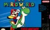
North America
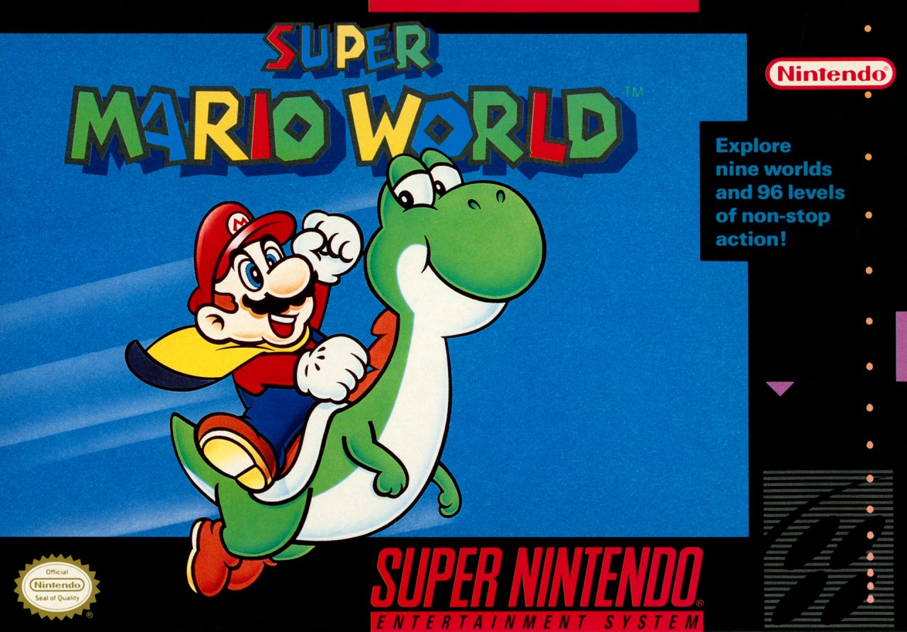
The simplicity of this one is unusual and eye-catching. It's Mazza and... err, Yozza shooting across an optimistic blue sky in classic 16-bit style. Mario's yellow cape flaps in the breeze but there's precious little else to distract from the fun of "nine worlds and 96 levels of non-stop action" ahead.
Mario is as vacuously happy and as enthusiastic as ever, but it's Yoshi's look at his plumber pal which really gets us. Mario might be the one notionally calling the shots on his dino mount (and socking his poor steed on the back of the head, apparently), but the dinosaur's grin and endearing look show that he's clearly humouring his little Italian compadre. "Yes, yes, okay Mario — get your cape and let's go on an adventure..."
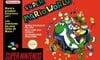
Europe
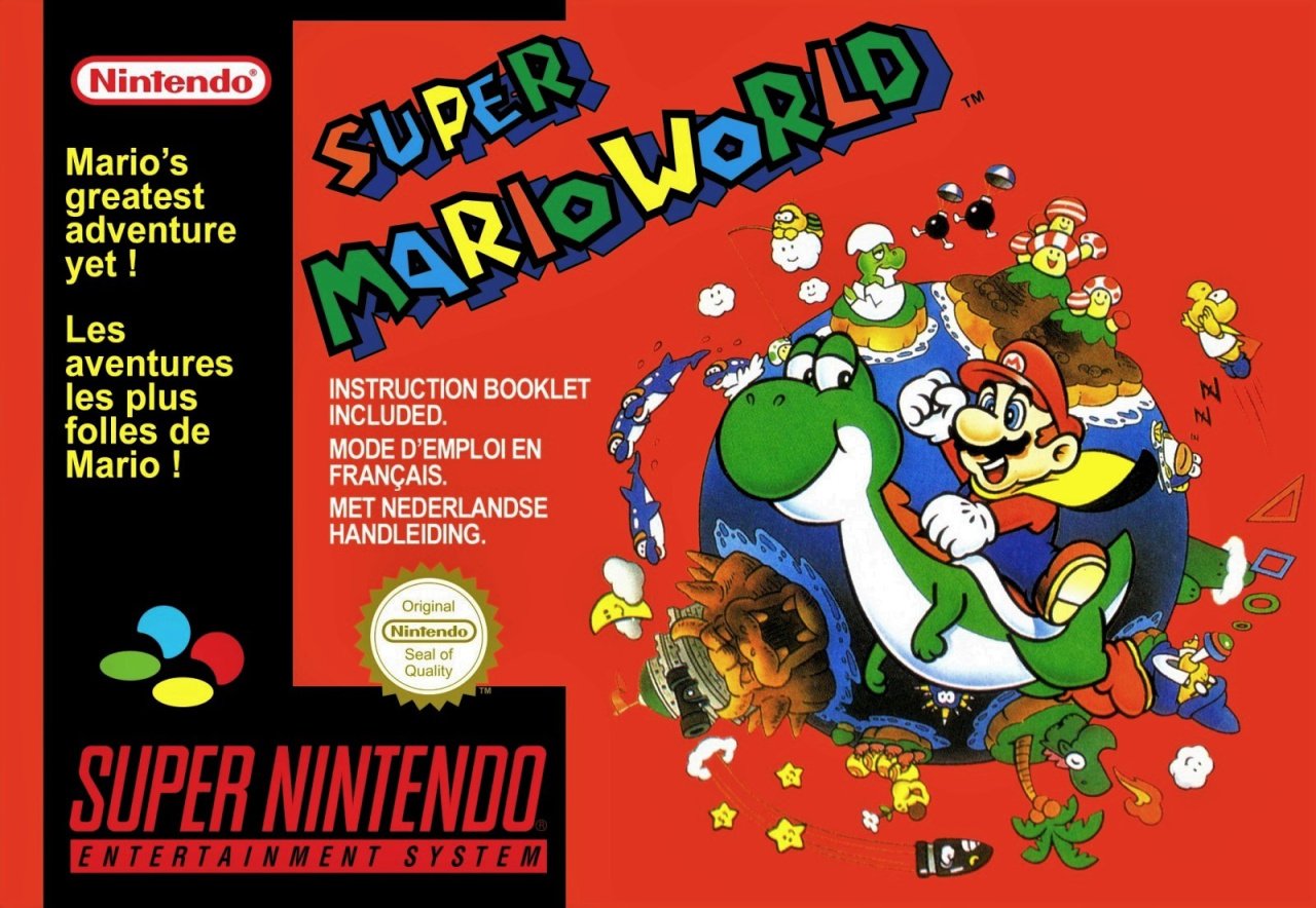
Much of Europe got a very similar cover to the North American variant, but several countries including France, Luxembourg and The Netherlands got this mash-up of the covers above and below. The same key art is flipped and sits on a background which shows the titular Super Mario world you explore and the enemies you encounter in the game.
There's an awful lot of red, though. We like red. Red's great! The other cover had loads of blue, so why not red here, eh?
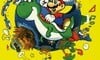
Japan
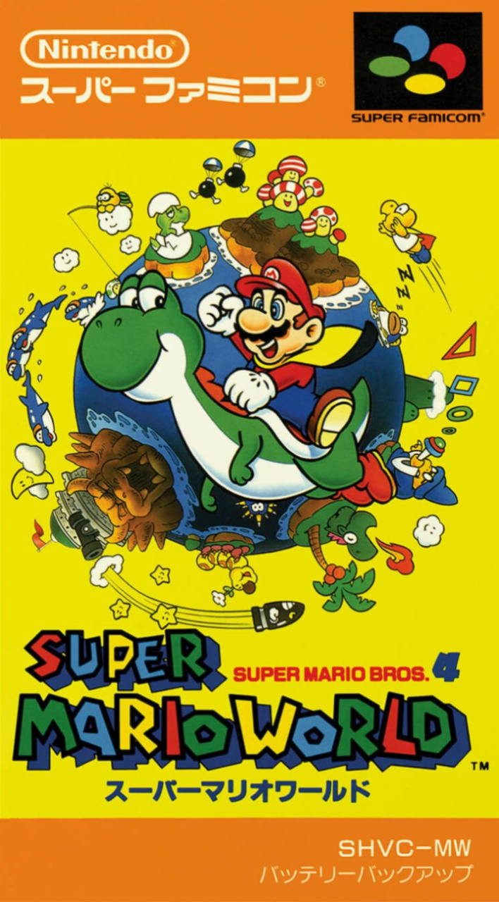
Super Mario Bros. 4, as the game is subtitled in Japan, features the same key art of Mario and Yoshi. The yellow background certainly pops—you're not going to miss this when you glance at your shelf—and it's framed top and bottom by a fetching pair of orange strips.
Definitely more going on in the Japanese version compared to the NA box, but does more equals better? That's for you to decide!
So, you've seen the three options, but which is best? Pick your favourite and hit 'Vote' to let us know:
Have a wonderful week, one and all, and we'll see you next time for another Box Art Brawl.


Comments 71
I voted Japan version.
I fear the Japanese cover is going to table the other two this week,
Jap, euro the the NA for me. I love the art work but i like the fact it closer up in the Jap version. Lets you see all those iconic characters a little bit closer. Also the yellow background i find more pleasing to the eye than the red. The EU version is still a pretty box art but that bland NA version. Where is all those popping artworks? 🎨
Something about the striking red and green of the European version just does it for me.
Much to be said for the simplicity of the NA box - but Japan’s shows the whole world! I like the European box - it’s still a fine design - but it’s caught between two stools, and probably isn’t as good as either of the alternatives.
USA. Straight and to the point. The clutter on the other two is unnecessary.
I'm from the Netherlands and we didn't get that version. We actually got a NA variant with yellow borders instead of black. Never saw this one. Maybe Belgian?
The NA version is my fave.
30 years later and now i'm confused. I have the EU console but apparently the NA box. Is this correct?
North America's boring and Europe's too cluttered. Japan ftw.
European. It's red. I like red.
USA wins for me, the yellow and red backgrounds clash a bit too much with those extra details
The North American one is very dear to me because it was my first video game ever (that's the cover we got in Portugal). But I voted for the Japanese one because that makes more sense. It conveys the idea of "World" better than the NA one.
The French one is just ugly, too much text, strange composition.
Japan here. I actually had the NA boxed version as well. I am from Europe. Hmmmm ...
Funny how, despite being from Europe, it's actually the least familiar of the three for me. Probably due to me getting this game back then on the All-Stars + Mario World version where the US box-art was used.
Anyway, Japan wins this time.
NA cover was also in Europe, I remember it like yesterday
Gorgeous Japanese super famicom bot art, that's what made the 16bit era even more special.
I have no recollection of the European art, probably because the game was bundled in the system’s box. I do remember that the art on the cartridge was the same as the NA one above, while the booklet was... yellow like the Japanese one shown here. Circle = full
I live in Italy and I have never seen the red cover. The “US” version is the one sold here. Don’t know about other european countries
I’m from the uk and my copy is like the North American but yellow box
I missed not having a box art brawl last week. >,<
Also, I voted for the Japanese one. I definitely love seeing the little globe with the worlds depicted on there.
Too bad the European one ditched the yellow for an awful red.
Why is this called a duel when it's between 3?
Box Art Brawls Current Total:
Europe: 17
Japan: 22
North America: 18
In the UK, we had the NA box and I always liked it. But now I've seen the alternatives...
I've gone with Europe. I prefer the red. The yellow is too bright on the Japanese one.
America for me xx
I am from the UK, I had never seen the European box! We did indeed have the NA one. For the best I think, I like that one most.
Gotta go with Japan. As nostalgic as I am for the NA cover, I love the background art on the Japanese cover. Sorry Europe, but that red background just isn't doing it for me, and the art is a bit tiny.
From the US and I went Japan. It’s rare nostalgia doesn’t win out for me, and I was very surprised it didn’t with this super nostalgic game (especially as the sticker on the cart was the same as the box essentially).
But I liked the japanese design enough they won my vote.
My favourite game of all-time, an absolute classic. I was tempted to vote for the North American cover, mostly due to nostalgia, but man I really love the Japanese box art.
PAL: Too much red.
Japan: Too much yellow.
NA it is, then!
Europe's is awful. Bad color, way too busy. Also, "Instruction Booklet Included"??? Wasn't that the default then? It would be a selling point now...
Japan's makes much better use of the same image from Europe, and I like it, but the simplicity of NA's is great, I think.
If Japan doesn't win this one then people have gone mad. Lovely cartoon artwork.
(disagrees with this part of the article):
"(and socking his poor steed on the back of the head, apparently),"
UK got the blue box version.
I think Japan is the best, easily. The Euro version shown here is also nice, as it uses the same art, but the better BG color and size increase for Japan make it superior. The art itself is great, with a lot more going on in a good way. To me the NA box is too simple and not very interesting.
I’m in the UK and had that red box variant. It’s what I own now as it’s what I have nostalgia for. I never had the yellow one with the USA artwork, although it seems that was the main one.
I voted for Japanese box though. Easily the best with the yellow and that ‘World’ artwork.
North America gets my vote. Its nostalgic, simple, clean and doesn't have a koopa statue popping out from the "planet" like a giant zit.
The globe is cool but the yellow background in the Japanese one is such a bad choice of colour. The red in the European one ain't a good choice either but it's better than yellow.
I had to go with NA. I remember getting a SNES one Christmas morning and after opening it up seeing that picture on the cartridge just made my imagination go wild. What kind of levels where there? What enemies were we facing. Up to that point I was able to avoid magazines from seeing spoilers so everything would be a surprise to me.
Good ol' Super Mario Bros. 4 lol. Little known trivia there. On a similar but separate note, I remember back in the day on a Saturday morning, the cartoon Captain N/Super Mario World. I remember hearing the announcer say once "Stay tuned for Captain N and Super Mario Bros. 4" though Super Mario World was how it was known in the States lol. Good times.
Japan by a country mile.
@echoplex was thinking the same thing. The cartridge only ever had the plastic bag it came in unfortunately.
Look, people are of course allowed to have personal tastes and opinions--no one is denying that--but the Japanese box is superior to the other two from an actual technical artistic and graphic design point of view.
There are many best-practice rules and techniques and methods that define what makes good art [and packaging] and indeed go into creating it (colour theory, composition, balance, clarity and readability, etc), even though, once again, what each person thinks of a particular piece of art is of course totally subjective, and the Japanese box just gets far, far more of the important things right, which ends up in an objectively better design in all the ways such things are measured in any kind of professional capacity.
For me, the American and European boxes look like your average USA/EU SNES game boxes, not terrible and not particularly strong either, whereas the Japanese box actually looks like a piece of art that you could almost frame and put on a wall as is. It could literally be released straight up as a poster and no one would even question it wasn't always meant to be as such imo.
But--AGAIN--you are free to have your own personal taste and choice based on nostalgia or whatever you think it is that makes one of the other designs better for you personally.
That’s weird I thought the American one was used in Europe lol
Japan is my choice for this
@impurekind I really like your well-reasoned comment. It's funny, I went with the NA cover based on nostalgia, but also just the fact that blue is personally more pleasing to my eyes. But I do like the picture and layout of the Japanese one better. You mention a poster and I mostly agree with you; I'd love a poster of the Japanese art but with blue replacing the yellow background.
On that very topic: I have a poster of the original SNES Mario Kart artwork, however it has the yellow-sky background of the Japanese box. I always thought it'd look better with the more blue background of the North American (and European) boxart. Kind of a pattern with me I guess. Lol.
Peoples memorys often get confused in Europe as we tended to get different box art but 9/10 we got the USA art on the cartridge itself. Smash bros 64 is a great example of people miss remembering the PAL box due to the cart art
@Cosmo_Joe Really it isn’t, atleast it wasn’t in the Netherlands. I can’t proof it, but look at 1UP_MARIO2:39pm Comment
In France there wasn’t a red splashed background, but I can’t remember how it was looking
Blue backdrop with good framing >>> yellow backdrop with noisy foreground, but that's it as far as advantages go. (Enough to get my vote.) The island full of striped mushrooms would be my only other nitpick of the JP boxart. Still, just like SMB3, something iconic about that solid color.
You know, I usually vote european as i genuinely think they have some strong covers. But I have NO nostalgia for the european cover of this one, NoA all the way
If the Japanese art had the blue background it would be absolutely perfect.
I'm actually impressed by Europe's cover here. Nice background and the red background echoes Mario's color scheme. Japan's is much too....yellow.
@SenseiDje @datamonkey @reaktor @cosmo_joe
Thats what i always wonder when i see these polls
The art labelled as North American is the one i always knew, i never knew there was a red box
And that goes for almost every SNES game art i see in these polls
I do like the Japanese version, but I'm just feeling the chillness of the NA version right now. (That, and LOT of nostalgia influenced my choice.)
I have never seen this European Version before
The NA cover art is a lie! There aren’t 96 levels in SMW, but 96 exits. SMB3 actually had more levels than SMW.
That European cover was about 17 years ahead of the curve telling us an instruction book was included.
Still makes me think of the classic Tiny Toons skit "Super Plucky-o Bros. for the Nonmindo system". I recall the disclaimer was like "game, console, instructions, cord not included" or something. A console with no cord included? What a silly thought to us in those days!
@MeloMan I believe the commercial bumpers for the show even called it "Captain N and Super Mario Bros. World".
Though I think the official title was "The New Adventures of Captain N and Super Mario World".
"New" because from reading the old Mario Mania Player's Guide (Nintendo's official SNES SMW guide for NA) it said Captain N and Super Mario Bros. 3 were originally an hour programming block with both shows a half-hour long, but I know for that last season, they got shrunk into a single program.
Instruction booklet included! Don't think i have ever seen that on a box before
@KingMike Ha nice you are right! I hated when they reduced it to a single half hour program. I was worried the series was about to end for Captain N and Mario and I was right for the following season. Sad day.
Gotta go with the Japanese box this time.
Don’t think I have ever seen the Europe version as everyone I know got the game with the console
@Franklin Someone used the wrong logo, innit.
they didnt show the yellow european box. pretty sure this came out in the uk as well as the red one
Japan as always
Also does anyone finds the Yoshi expression on this covers mildly disturbing? Its like he knows something Mario does not that would eventually lead to his demise and he is enjoying it.
I have the yellow UK variant. Much nicer than the red.
I went with the USA cover. It may be just me, but the other two could be slightly spoiler-y. I mean, having the entrance to Bowser's Castle come up out of the water was kind of a wow moment for me when I first played through the game, so having Bowser's castle on the cover might've slightly ruined that for me.
Best game 100% beat it so fun
@Reaktor in the UK we had the red variant and the blue variant of the boxes(plus allstars & world) all released at different times. But the cartridge art was always the USA art regardless of the box art version.
Japan pulls it off for once!
Show Comments
Leave A Comment
Hold on there, you need to login to post a comment...