Welcome back to Box Art Brawl, our weekly poll to find out which of three regional box art variants whips the behinds of the other two.
This week is a rather special edition because we've reached Round #52, which means it's been one year since we began this fun little exercise. We hope you've enjoyed it so far; from next week we're planning on switching things up a little to bring in some new candidates to this weekly contest.
More on that later. First, let's revisit last week. It was a strong round with two versions of Super Aleste taking on the North American Space Megaforce. In the end Japan won out, with North America coming second and Europe bringing up the rear. That may have been how your voting went, but in our eyes there were no losers last week. All those covers deserved to win.
Subscribe to Nintendo Life on YouTube844k
For this birthday edition of the Brawl we thought it fitting to bring back a character closely associated with his retro box art, for better or worse. Yes, today we're looking at the infamous Capcom classic Mega Man 2. The blue bomber has featured twice before in Brawl #6 and Brawl #40, but you can never have enough questionable Western interpretations of Rockman.
So, grab an E Tank, and let's go.
North America

For the North American cover we've got another infamously poor cover, although in a step up from the original Mega Man cover, the Blue Bomber is indeed blue here.
Several years ago the story behind this cover and the pistol came to light, as told by the original artist. In all honesty, people tend to focus on the pistol but its the least of this cover's troubles. Mega Man and the robot masters look like wrestlers squeezed into costumes for a straight-to-video movie tie-in, and the hero's right leg looks to be crumpling like it's made of jelly, reminding us of that Thai kickboxing clip we saw on the internet years ago which haunts us to this day.
Often overlooked is good old Dr. Wily hiding in the background on the left. We assume it's Dr. Wily, although he looks more like Santa.
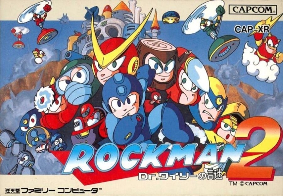
Japan

The meat in our Rockman sandwich, the cover for the Famicom sequel sees Rockman flanked by a cluster of robot masters, with enemies in the skies above Wily's Castle. It uses practically the entire colour palette and is undeniably in keeping with the version of the character we know and love today. There's nothing particularly exciting going on, and perhaps our nostalgia for the others is clouding our judgement, but this is nothing if not a pleasant, competently-composed cover.
Europe

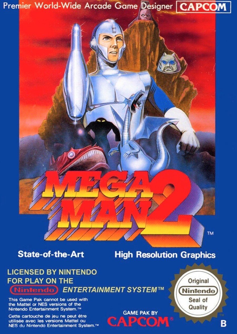
The European version gets yet another realistic reinterpretation of the hero and various enemies, this time with a '70s Dr. Who aesthetic (that's a Sontaran's head on the right, no?). The hero does indeed have an arm cannon here, although in true budget-strapped BBC fashion, it appears to be a bowling pin covered in tin foil.
In keeping with the previous game, the 'State-of-the-Art' and 'High Resolution Graphics' tags remain, as does the blue border. And much like the first, we actually quite like this image. It's nothing like how we interpreted the game's graphics personally, but the artist really went for something and we respect that.
Bonus Stage!
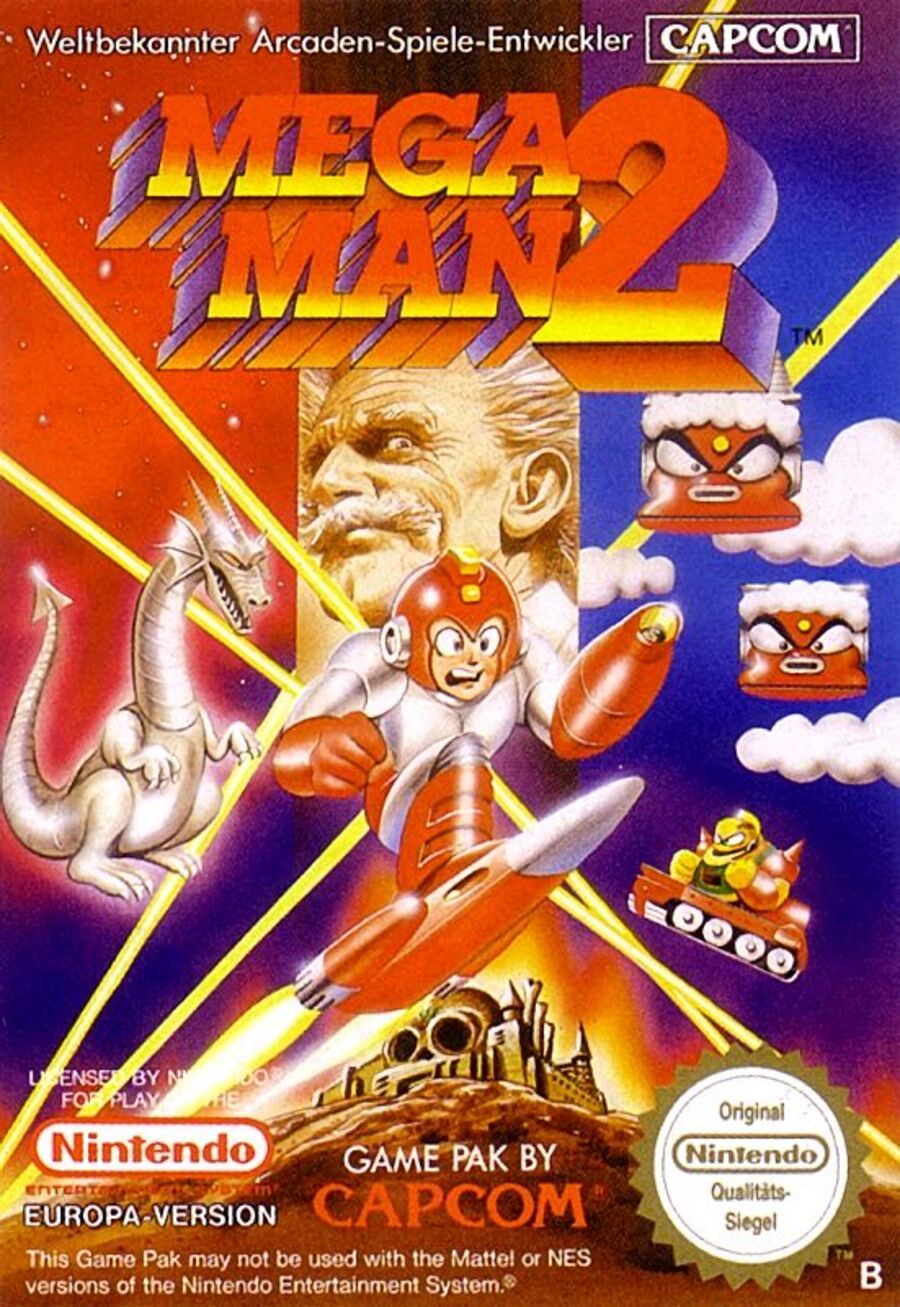
While most of Europe got the cover above, Germany received its own variant which depicts Mega Man using the jet board he gets after defeating Air Man, plus the dragon and a Dr. Wily who looks more on model. We won't include this cover in the poll (although feel free to voice your approval in the comments). We think it's a rather fine cover, though, especially given the other efforts:

Three covers, one vote. Pick your fave below and click the 'Vote' button:
And that's a wrap on one year of Box Art Brawlin'. We hope you've enjoyed perusing these lovely (and occasionally not so lovely) images every weekend.
Next week we'll be introducing a new format to run alongside the standard Brawl which will open up a whole new world of opportunities. Until then, make it your mission to have a particularly fabulous week.


Comments 71
Europe is SO GLORIOUS, the Queen is pleased.
Japan - actually mega man
Europe - A knight in shining armor
USA - Uhm A gun? At least it’s better than the first mega man’s box art
Japan obviously gets my vote
@TG16_IS_BAE I'd have to agree, despite being from North America. It looks like the artist for the NA version at least got to glance at the game for a second, whereas the artist for the EU version was given a vague description scrawled on a bathroom wall. Maybe.
Hail to the European cover! Japan’s is great, NA is legitimately atrocious... but Europe is just something else. The cheap tinfoil, the Mount Rushmore of Evil, the deformed monsters barely visible at the bottom. It’s stupendously bad. Comfortable winner for me.
the japanese box art for Rockman 2(Mega Men 2) really fit the cartoony aspect of the Mega Men franchise.
Europe is so bad it's good.
So much wrong with the North America cover. Top left is clearly a building from Bomb Man's stage in MM1. Why is Dr. Light hiding behind Crash Man and pointing at Mega Man? And what's the deal with that ladder in the lava pool? If one falls into a lava pool, are they going to live long enough to swim to the ladder and climb out? Also if Quickman's design was cannon I'd have to find a new avatar. Japan is the winner BTW. Europe for hilarity, North America for personal nostalgia.
Dear lord that Europe one is.. interesting.
Wily looks epic in that German one.
They all certainly offer something unique, but it's Japan for me, easily (and I don't think it's even that great)
So Europe got a Silverhawks video game?
The German cover is by far my favorite. I remember the US one growing up, and I thought it was so awesome compared to the first one.... yikes.
The Japanese cover looks great the others atrocious.
Japan without a doubt. Europe and NA look like that one 2003 movie by a shady company in the dark pits of Netflix.
Box Art Brawls Current Total:
Europe: 15
Japan: 21
North America: 16
It's sad, because I would have totally voted for the German cover. Looks like Japan gets the vote.
So it's easy to see that the NA cover is bad, in comparison to the other covers, but I still picked it due to nostalgia and just generally bias.
I actually like the German cover the best but since that not in the poll I went with Japan.
I like the cartoony more than the real life(ish) ones so Japan get's my vote! I also love Germany's Megaman box!
EDIT: I'm gonna make Japan's version my wallpaper
2 is a great game. I still like 3 the best tho. I know most people love 2 better, and for good reason, as it's good too. But I still think 3 is the best one, and like 3 better.
Japan's the obvious winner (the anime touch is more appealing) and it blows the American cover (an improvement over the first game's American cover, yes, but that wasn't hard) out of the water
To each their own
Wow the poor Europeans
IMO Japan >>>> North America > Europe
>:] Nice
Mm he dash
I've never seen the European one until now; it's a step above the North America box art, but still terrible. Germany's variation is sick, but Japan obviously wins
I always preferred the European megaman box, they always looked like cool movie posters
I went with the NA cover. The Japanese art is just too jumbled but I will say if it would’ve been an option the German variant is the best. It’s got everything right up to and including his color change when using items.
That German one is my favourite. Everything looks more or less like it does in the game, and it has a more epic and less cluttered feel than the Japanese one.
I'm picturing Mega Man going to the doctor in Europe and the doctor is asking him "what wrong?" to which he replies "my arm is a bowling pin!".
From best to worst: Japanese > German > European > U.S.
So yes, the Japanese one is a better representation, but I like the American one. I don't want to like it but I do.
Hey, they forgot to draw Quick Man’s visor on the NA box art!
Wish I could've voted for the German cover
Since I can't vote for the German cover, I chose the Japanese one.
Face it, most of you clicked in to see THOSE covers. XD
Definitely Japan for me, though that bonus German cover isn't bad either. The other two fall in the "So bad they're good" category.
German cover is goofy since Mega Man looks terrified and like he'd rather be anywhere but where he is. US cover is an upgrade over the prior game. Europe isn't a terrible cover, but it's not Mega Man. Japan's layout is pretty basic, but it has a pleasing style overall. Japan got my vote this week.
I mean... the Japanese version is clearly best, but I have a real soft spot for the European version, as I grew up with it, so went for that. Too bad the Legacy Collection uses the Japanese box art!
There's something about that Europe cover that's...strangely alluring.
I voted Japan only because it's so traditional, but I liked the attempts at visualizing the game as if it were live action/real. All the covers offer a different way of stimulating the imagination.
It’s one of my favorites games of all time. Back then, I stuck in that stage, with a small ladder on the left corner and another in the upside right corner. I wrote to a magazine to get the solution. And they published my question. Back then, I don’t get that I can use the elevator weapon, multiple times.
The germany box is very good. Dr. Willy look great!
Are you sure that isn't Dr. Light instead of Dr. Wily on the NA cover?
Keiji Inafune’s art style is awesome. Japan easily wins imo
Also this made me feel like playing Mega Man 2 for the 50th time lol
I like the German cover the best, but since I cannot vote for it, I vote for the Japanese cover.
Europe's gives me a David Bowie vibe, if he was stuffed into a excessively low budget sci-fi movie.
Europe Megaman's arm is literally a steel douche. I love imagining the twisted kids who actually pictured megaman looking like this and thinking he was some kind of cyborg. Could easily be a horror game because it is scary looking all around.
Say what you will about North America’s cover, but the European cover was truly bad.
Wow i never imagined there would be a worst art than the NA art and since the EU art is artistically better but accurately worst that means NA art is still the worst one, but atleast is accurate. The German art is pretty good too, but the Japan art is obviously the superior art above all of them.
Japan! North America and Europe are insanely bad!
Japan's is logically the best but I had to go with North America's just on the iconic absurdity of it.
Australia also got the European box art. I saw the cartridge in a second hand shop for $20 around 1990 and persuaded my Mum to buy it, sparking a 30 year love for the Blue Bomber.
Still voted for the Japanese cover, but the European cover is a close second.
I'm sticking with the first description I heard on the Internet of the European MM2 cover: it's Patrick Stewart holding a bowling pin.
The last of the NES Mega Man boxart comparisons, I think.
4 and 5 boxart I recall are only different between NA and EU in Mega Man's facial expression (angry vs. anime). Then again, NL has done polls before between such similar boxart.
It's just not even a contest when accuracy is involved.
Japan obviously.
Germany's is second.
Both the U.S. and Europe's are hilariously bad.
Germany. That Dr Wily looks awesome.
The European one is the worst one this time around. Woof.
The North American one is still awful, but it's a huge step up from the original Mega Man box art.
Great game - ugly cover art.
@Purgatorium i love your avatar! Thats the weird thing that wont let you past in chrono trigger. I played on ds port and it was such a cool game. One of my faves!
🤣🤣🤣🤣🤣🤣🤣🤣🤣🤣🤣🤣😩. How did the usa cover even get passed quality control. Did they say heres the megadude cover art you wanted!capcom............yes?
The funny thing is, every time I see the North American box art, I immediately think of, not the game, but the children's novella that was adapted from it. I remember reading that in, third grade? Something like that.
Edit: "Worlds of Power."
I really needed a laugh. This is so, so good. I want to live in whatever universe the European artist was trying to conjure up.
@ryobi85 That is a Nu. All things begin with Nu and end with Nu.
Poor American Mega man has to fight with a broken ankle
I love how perfectly terrible our US box art is for this series. Cheese factor alone makes it endearing. But Japan wins, hands down
At least the Japanese box art's art was somewhat representative of the character designs, the European and American representations of Megaman, looks like out of something from bad 80s sci-fi.
Compared to the original Megaman, NA's MM2 is much much better than the original NA MM coverart, Europe's MM2 is actually a little worse (and weirder) than the original European MM, and Japan is pretty even between the original and MM2.
@Wavey84 Agree, NA hands down. NA Mega Man 2 cover is an all-timer of bodacious proportions. I am immediately taken back to summer of 1989 and the 15" CRT TV that I used to play it on.
I honestly love all three.
The German version deserves the win! Best depiction of Dr. Wily ever. Lame it wasn't included, I had to vote for the 2nd best, Japan.
This is a first time I see German MM2 Cover and it's absolutely gets my vote. Don't get me wrong, these are all a classic, and I would give the prize to Japanese or US, if I could. But that incredibly well-drawn Wily's face along with Mega Man probably shouting "oh man oh man oh s***" to himself while he's escaping from the dragon are absolute gold.
@Wavey84
OK?
Japan's is for sure the most appealing to my eyes. The only thing missing is Dr. Wiley.
The German one is obviously the best.
Show Comments
Leave A Comment
Hold on there, you need to login to post a comment...