Welcome to Box Art Brawl, our weekly contest that pits three box art variants from around the world against each other in a fight for your vote.
Last week observed three versions of ActRaiser 2 locked in combat. While Japan trailed from the very beginning, it was an exceptionally close fight between North America and Europe. At the time of writing, though, there is a clear winner with only the slimmest of margins - the slimmest possible, in fact.
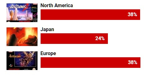
As we write this on a Friday evening, the results are as follows:
- North America: 335 votes
- Japan: 289 votes
- Europe: 336 votes
Subscribe to Nintendo Life on YouTube844k
Therefore, Europe wins by a whisper! Congratulations and commiserations as appropriate.
This week we're sticking once again with the SNES (hey, it's a great console!) and taking a look at Compile's 1992 vertical scrolling shmup Super Aleste, or Space Megaforce as it's known in North America. With a name like that, how could we resist?
Let's barrel roll right in.
Japan
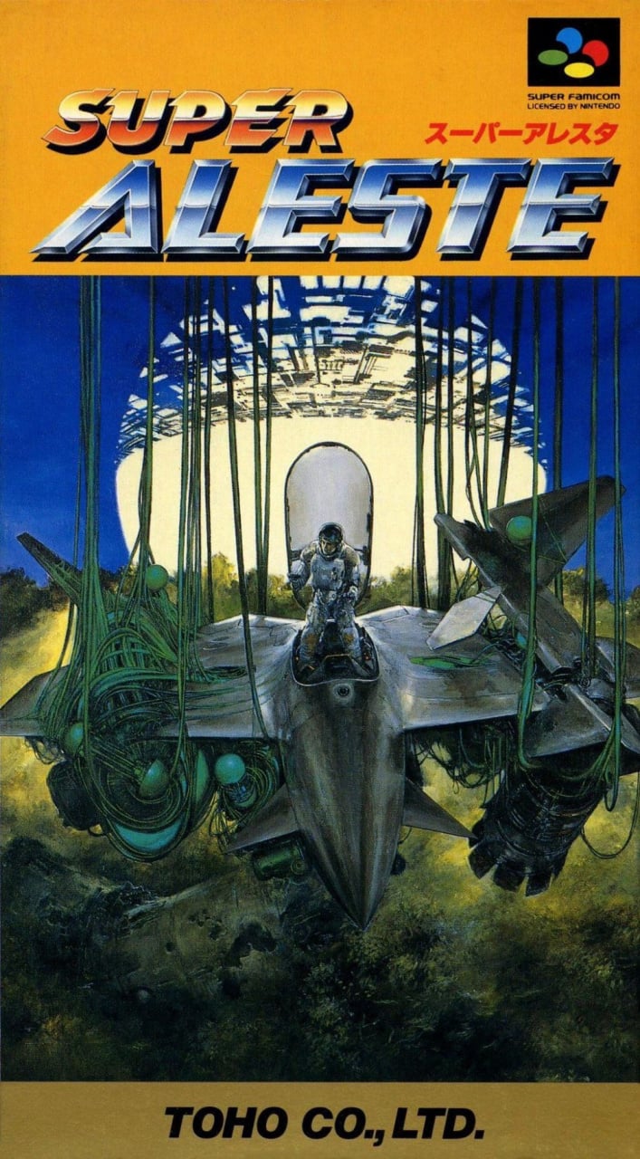
It's not a bad start, is it? The Super Famicom cover kicks things off in style with a rich yellow strip at the top acting as the background to a beautifully shiny and embossed logo that couldn't be more late-'80s/early-'90s if it tried.
Below that is an intriguing image of the titular craft hanging by green tendrils above the jungle. If you're not familiar with the story, you'll have no idea what's going on... but it really doesn't matter. The image of the pilot in the open cockpit against the bright sphere in the background grabs your attention and makes you want to know more.
Europe
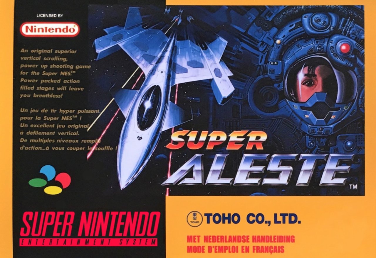
The European version retains the title and the exact same logo treatment along with a cracking piece of art which blends '80s sci-fi with '80s fighter jet porn.
There's an awful lot to like. The rich yellow is back in the border this time. There's a needlessly long tagline that explains the game quite precisely. There's even a little bit of French on the box to give it an air of sophistication. What more could you possibly want?
North America
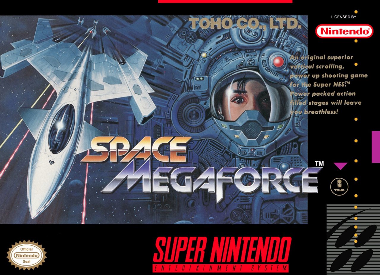
The North American cover uses the same great art as the EU version but shifts it over to the left. The tagline remains the same but the mustard-coloured border is switched out for the standard black.
The biggest change is the different title and logo for the NA release. It resembles the original in shininess and impact but goes for a slightly more 'sci-fi' font. Again, very '80s, very cool. The actual name itself couldn't be more generic, yet there's something pleasing in its banal fusion of cool word + cool word + cool word = very cool words.
Three covers, one vote. Pick your favourite, give it a click, and click on the 'Vote' button:
And that's all for this week. Next time on Box Art Brawl, it'll be round #52. That's right - we've had one whole year of box art battling! We'll see you then.


Comments 43
Japan hands down!
North America style is for me!
The Japanese art is just that, a nice piece of art. The EU and NA covers look like gaudy promotional pieces.
I'm not sure why folks like the Japanese art so much. It's extremely poor. The perspectives are wrong and the color blending and application is awful. I've seen art students, let alone professionals, turn out better work. At least the European and U.S. artists had a modicum of talent. Yeesh.
At least the artist was smart enough to hide the pilot's hands and feet, notoriously difficult to draw properly, because they probably couldn't. That's something, I suppose.
Japanese one is nice and kinda moody but there's just something I've always loved about the NA one. edit: and the ridiculous title also helps.
North American version for me.
North America for me this week. I like the color and contrast more than the European version, as it's easier to see the details. The Japanese cover is interesting conceptually, but it doesn't represent the game properly, to me. It's a space shooter, yet the cover shows a wrecked ship and the pilot out of the cockpit. If it was a Metroid-style game where you crash landed on an alien world and had to find a way off the planet, then the cover might work better in concept. I also want to say that I love that last line under the North America description. It's a cool-word word salad!
I don't like any of them. Always worst thing about this game the box art, game itself was quality, add was the soundtrack.
While the coloring on the US version is much better... why the silly name change? I shall therefore withhold my vote.
Japanese one looks nice but doesn't make enough sense.
Congrats Europe on last week's awesome victory! Too bad you're not doing so well this week. I do prefer the darker colors on the European box art compared to North America.
Japan by a landslide for me. That one really ropes you in and makes you wonder. The other two seem more generic IMO.
When the European and NA box art are similar, EU often wins out with me because of the added splash of color that the background/border has as opposed to US's standard black.
Japan has a lot of detail going for it so I chose that one. The others are pretty cool as well, Europe pretty accurately described the game, and NA did the same.
I like both japanese and american. the EU never liked the thick black borders
@AirElephant I don't see anything wrong with the perspective or the color blending. In fact the lightning of the piece is amazing, the detail of the sun behind how it reflects on the surface of the ship is pretty well done as well as the textures and the brushstrokes on the jungle below. The details on the ropes on the left and the shadows on all the piece are great. It's quite a detailed piece of art, both the ship and the pilot's armor. (Dont know what's the top thing on the sun though)
I think you should go back to art critics school.
@AirElephant I respect your opinion mate! But for me, the art style just really pops. The blending doesn’t work in some parts i agree. And no this isn’t my favorite box art, but compared to the other dare I say “mediocre” ones it’s really good. But I respect your opinion. Which one do you like best?
I like all of these! Feels like it’s been a while since I could say that. The Japanese one is great, with the jungle creepers giving off Predator vibes. But I prefer the other two, with the transfixed eye in a a cyborg-style background bShame that the NA and EU covers will split the vote, because they’re so similar. Going with the EU, because Super Aleste is the correct name. Great game too, IIRC.
The NA one is a mess. It's ramshackle in its spacing and the text is partially obscured by the background.
There's plenty of art of space ships in space. But it's the first time I see a space ship stranded in a jungle.
Japan wins for originality.
It is always this way: 1. Japan. .2. Europe. 3. NA
Japanese cover on account of being unique
I'm starting to wonder if people automatically vote Japan because it looks different from what we're used to or something....
European one has the best colour so it edges out the NA one (though I don't like the squared off orange bit for the company name at the bottom). It looks like it's a shooter.
Japan one....doesn't even imply it's a shooter and it's not that great. Buddy looks like he crashed and his ship is entrenched in vines and this is going to be an adventure/action game where you control the guy.
All pretty good but easily Japan for me
I. LOVE. THIS. GAME. !!!!
Space Megaforce is probably one of my favorite games of all time, and I just discovered it about 2 years ago.
@sdelfin "If it was a Metroid-style game where you crash landed on an alien world and had to find a way off the planet, then the cover might work better in concept."
Yes! Exactly what I thought too.
I'm not fond of the Japan art because it doesn't seem to have much to do with the game. The NA region takes it for me.
@Axlroselm I think Japan always wins because of its vivid art style compared to Europe’s and NA’s basic styling. But sometimes, the simpler ones work better than the crowded ones.
@Eel i agree! It reminds me of a crash landing from an aerial plane stranded in the jungle. It looks cool!
I just like that cool looking sliced up white ball thing on the Japanese cover. What the hell is it?
US version makes me want to see the game in action (and is the best "box art" therefore), but the Japanese version has the best art...
Hotel Dusk (Korean, Japanese, and US / EU), Ghost Trick, Contact, Resident Evil DS, all on DS, have very interesting different box art. And Minish Cap, although I'm sure Japan will win that one with over 90% of the votes.
But the NA version adds a cheesy memory-wasting voice to the copyright notice "SPACE! MEGAFORCE! Presented by Toho."
EU only gets half the voice.
Though I remember for how broken it was it one of the first emulators I used when I had a PC fast enough to run them with sound "Spaaaaaaace MegaFORRRRRRCE!"
Being passionate about art is great, folks, but I don't think it's necessary to snipe one another. We can like what we like, and others can feel differently about what they like - it's not a zero sum game.
"a cracking piece of art which blends '80s sci-fi with '80s fighter jet porn."
Excuse me, I'm sorry but... what??!
Box Art Brawls Current Total:
Europe: 15
Japan: 20
North America: 16
Not sure how anyone could pick the EU one, far too busy and a wall of text on a cover is never a good look.
Japan all the way for me.
@Franklin thank you for your sacrifice! 🙏
No comparison whatsoever. Japan got some brilliant art. The rest of the world, it works, but it's nothing special. With Japan's art, it's mysterious and evocative. I actually want to know what's happening.
Can we talk about how amazing this game is ! I would give it a 9/10 lol. The soundtrack is amazing i would spend hours playing the music while floating in space in the demo mode.
Japan is the coolest, but it looks like the ship's wrecked and you'll be exploring a jungle planet. Doesn't really sell the game for what it is AT ALL ;-D
Japan is the best artwork, but Europe is the one I grew up with and love. I traded Super Soccer in for this, back when nobody really knew too much about too many games.
80s fighter jet porn is the best kind of porn
Japan's box is great; getting a fun Akira vibe through it. Though I like the yellow box work on the European one also.
They're all pretty awful, but the North American one looks the least bad.
Show Comments
Leave A Comment
Hold on there, you need to login to post a comment...