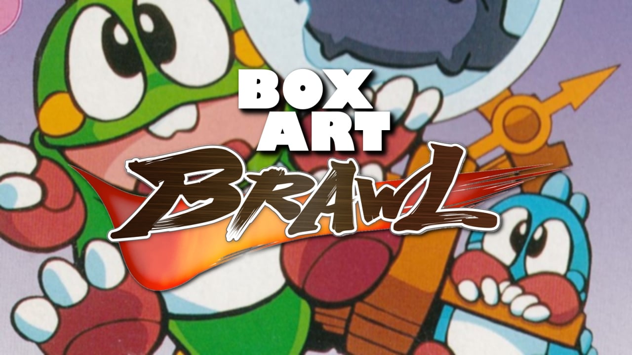
Welcome once again to Box Art Brawl, our weekly poll to discover which of three regional box art variants sits at the top of the tree.
Last week we scrutinised Natsume's Wild Guns on Super NES. Following a classic Western-style gunfight, North America emerged from the smoke victorious, growling at second place Japan and third place Europe to leave town and never return.
This week we're sticking with 16-bits and taking a look at Taito's tile-matching puzzle game Puzzle Bobble, or Bust-a-Move as it's known in North America. Most recently, we've seen dragons Bub and Bob on Switch in Bubble Bobble 4 Friends, a game North America is still waiting for, although the Neo Geo version of Puzzle Bobble is available as part of Hamster's ACA Neo Geo range on Switch.
Subscribe to Nintendo Life on YouTube845k
Right, let's bust some bubbles.
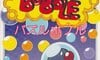
Japan
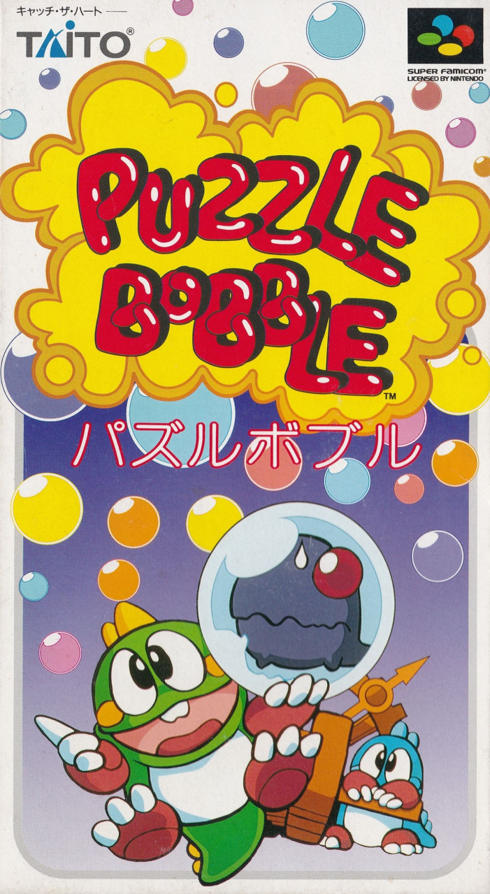
The Super Famicom version is relatively clean and quiet, with Bub and Bob at the bottom, a bunch of multicoloured bubbles rising through the middle and the bulbous title bursting out of a yellow foam at the top. The lower half's gradiated blue-purple background stops the white border looking stale and you end up with a cheery, colourful cover.
Top it off with the sweet Taito and Super Famicom logos at the top and it's a strong start from the Japanese.
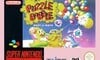
Europe
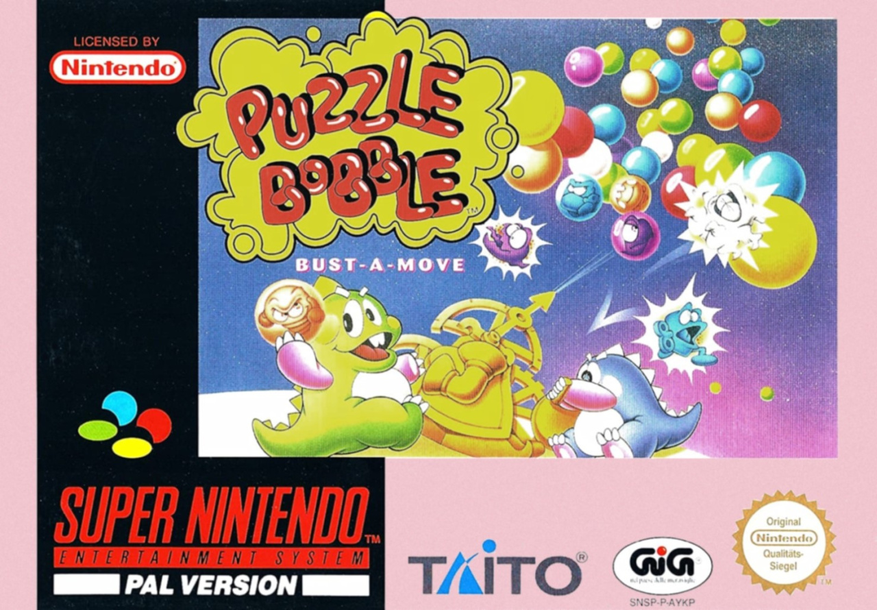
Europeans got a pale pink border around a bubbly piece of art featuring the dragons. This one gives you more of an idea of the gameplay, with the pointer firing at the bubbles and popping several of them. It uses the same title as the Japanese version, with the Bust-a-Move subtitle added just beneath.
The pink is a little insipid, but there's more than enough colour elsewhere and we like that it communicates something about the game, too. Not bad.
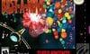
North America
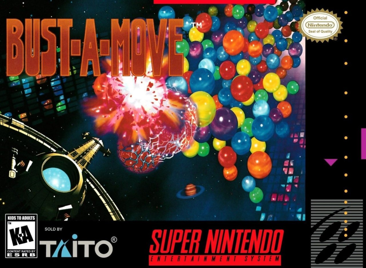
We must remember that this game released in the mid-'90s, and kids in the '90s hated cute things. If it wasn't rude, lacked 'tude, or seemed in any way 'kiddy', Western gamers apparently wouldn't touch it. Consequently, Bub and Bob got ousted in North America in favour of a grittier, more serious cover. The pointer looks like the Eiffel Tower transformed into a laser cannon and the planetoid 'bubbles' don't pop here, they explode! The background suggests we're in some sort of digital cyberspace here, with celestial bodies going nova as you shoot them. Far out!
The new title gets a hard-edged font treatment and the only thing missing is a tagline to let us know this ain't for kids.
It's sure different. It's not bad per se, but we've taken against it for the way it treats gamers like idiots who refuse to look past the surface to the gameplay beneath. Then again, we've seen time and again covers in the West reworked to give them an 'edge' (hello angry-eyed Kirby!), so maybe the marketing people knew what they were doing. Maybe we were all idiots in the '90s.
Time to bust-a-groove and click your favourite below. Hit the 'Vote' button after that and you'll have voted - jolly good show!
Thanks for joining us this week. Let us know how you picked below, and we'll see you next time.


Comments 30
Japan for sure. The US one makes NO sense and the EU one looks like it was drawn by me.
Sorry EU. I'm afraid it looks like Bub n Bob have been eating those bubbles instead of trying to match them up!
U.S is just devoid of any fun isn't it.
Another win for Japan. ^^
Don’t really like any this time round to be honest. Japan by a very slight margin.
Japan's the clear winner this time. NA's is awful.
Japan : Well done
Europe : Eh...
USA : Blah...!
"We must remember that this game released in the mid-'90s, and kids in the '90s hated cute things"
Really, Nintendolife ??
I was 90's kid and really like cute things and still like cute things even already grow up.
America, what was the problem? That’s like advertising for Sesame Street by only having a picture of Oscar the Grouch’s garbage can.
Box Art Brawls Current Total:
Europe: 14
Japan: 19
North America: 16
I like the European one. The characters are cute and pudgy, and the art gives the player an impression as to what the gameplay is like (which the Japanese artwork does less effectively).
The U.S. one plainly sucks and looks generic as hell. I am indifferent to the Japanese cover.
@Realness Love this comment so much lmao!
Yeah, the NA art completely kills the mood of the game, makes it look like Arkanoid, kinda? Maybe? Ugh!
I voted Japan, but I don’t like any of them, honestly.
@Anti-Matter I thought you said you’re from a country other than the US, so maybe it’s a cultural difference lol
I was alive in the 90’s too, and in the US that was when everything was XTREME in almost all advertising directed at younger markets.
Gave me and my friends a lot of ammo to laugh about, heh. Good times.
Uk pal cover for me. Did really enjoy this game. The music was hypnotising.
I liked japans the most, but I think Europe does the better job representing gameplay, so that’s what I voted
None of them are that great. I would have picked the European version if it wasn't for that border. But at least it shows what kind of game it it. I can imagine that some people bought the game in Japan thinking that it was like Bubble Bobble. The only reason the NA cover is bad is because they took out Bob and Bub. I chose the Japanese version just because it has decent art even though it could be confusing.
The NA one just screams 'Buy me Bonestorm or go to hell'
They are leagues better than Super Bust A Move on the PS2.
Going with Japan, since while Europe was a good try, it has fat Bub and Bob (more famous
While it works enough for art demonstration purposes, I spot a repro sign or two on that NA box art.
I picked the version from Japan! The design just pops for me, and at the same time, sends my imagination to Japan, as if I was walking through one of their classic game stores tucked away in an alley.
None of you appreciate America’s sci-fi /horror reimagining of the game. The canceled movie tie-in was going to be aN epic space opera with Lovecraftian ancient beings attacking Earth with psychedelic balls, but the rest of the world just couldn’t handle it. No respect for art.
NA is technically fine(it's not the original Mega Man or anything like that), but it is hilariously inappropriate. Europe's art is mostly well done and nicely composed. The giant, two-tone border hurts(Europe's borders are usually terrible), and the dino designs are inferior, in my opinion. I think Japan is the best by quite a bit.
Well this was an easy one.
I didn't play this game until about a decade ago when I learned Bub and Bob were in it. I played the heck out of Bubble Bobble on the NES when I was young. If I saw the SNES cover when I was young, and maybe I did, who knows, I forget, I probably would have or did pass it over because of the odd cover. Why am I shooting what looks like marbles in space?
Went with EU regardless of the border. That is totally a poster I’d hang on my wall.
Europe: The dinosaurs are too childish, add angry eyebrows!
America: The dinosaurs are too childish, add GUNS
Lest we forget, the 90s were the decade that Nintendo of America advertised a Kirby game by having a man eat until he literally exploded. A Kirby game.
@Dr_Corndog
That's why playing Kirby for the first time was so disappointing
Japan, 100% Japan
@Daniel36 Hahahah! I’m sure you can draw better than that! 😁👍🏻
@TimboSlice Maybe a long time ago. But I could never get past the "pretty good, I guess" phase so I quit.
Japan.
The other two are a tad strange for different reasons
Show Comments
Leave A Comment
Hold on there, you need to login to post a comment...