Welcome to Box Art Brawl, our weekly dust-up to find out which of three regional box art variants is the best.
Last week it was Shadowrun's turn to battle itself. Japanese Shadowrun obliterated the competition with over 70% of your approval, leaving second-place North America and third-place Europe to mop up the remainder.
This week we're looking at Natsume's classic 16-bit shooting gallery game Wild Guns. This steampunky Western from 1994 is available on Switch in Reloaded form, and also as part of the SNES library for Nintendo Switch Online subscribers, so there's no shortage of opportunities to catch up with this great game if you missed it back in the day.
Enough waffle. Draw!
Europe

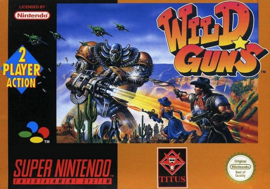
We begin (alphabetically this week) in Europe. We can see an epic Western shootout on the edge of a grand canyon. However, towering over the cowboys, cowgirls, wagons and cacti is a wicked-ass giant armoured Terminator with a massive gun instead of a right arm. Note, also, its elegant, gentlemanly ruff and exhaust horn things framing the polished cranium. If McG had put one of these into the irredeemably awful Ternimator Salvation, the movie might have been elevated to 'almost watchable' (or at the very least 'meme-able').
Throw in a nice chunky logo, a '2 PLAYER ACTION' diamond and some green drones and bullet casings breaking the border and it's a mighty fine opener from the European PALs. It arguably gets enough right to make the odd perspective of the town against the huge misty canyon just feel like a non-issue. Nice shootin', Tex.
Japan

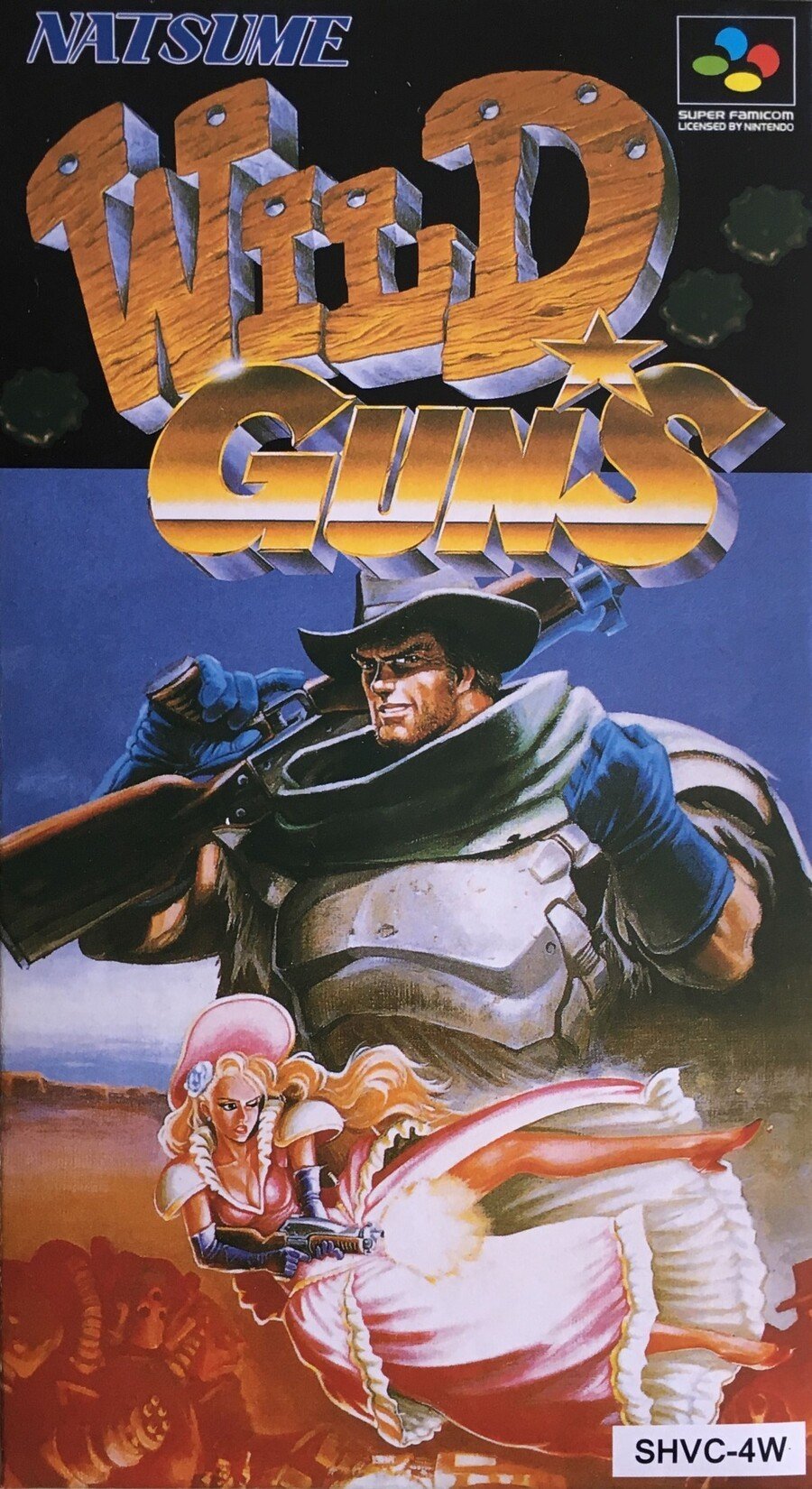
The Super Famicom box features a similar logo embellished with more detail and shows protagonists Clint and Annie. It's less immediately obvious but it also includes one of the mech-dude Terminators in the bottom left corner, although here it looks more like the Iron Giant.
We're not really sure what's going on in the background here, but like the European cover, the main images are strong enough to overpower other issues. Another strong entry.
North America

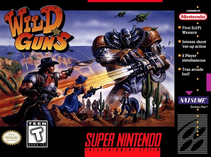
Essentially, the North American cover uses the same image as the European one (or vice versa) flipped horizontally and reframed slightly. We can see more of the bottom of the image, which helps make more sense of the perspective, and we lose a bit of the sky at the top. It also adds a bunch of tags in the column on the right. Gotta have that "True arcade feel!".
Again, there's a lot to like. We're not sure the white dusting on the top of the logo, settling there like snow, was really necessary, but it's another fine cover. Tough week, that's for sure.
Three covers (well, two-and-a-half?), but just one vote. Click your favourite below and hit the 'Vote' button to cast your ballot:
And that's it for another week of the BAB! Join us again next time and stay safe until then, lovely people.


Comments 31
Yeah, that Japanese cover with Annie’s dubious gunfire and Clint’s abusive hand gestures... Very not 2020...
North America. I've always loved the design of the big mech boss and it isn't tainted by the Titus logo.
I don’t like NA Super Nintendo covers, so I voted for Europe.
@gaga64 I get what you're saying about Annie but when did a fist become offensive?
The NA and Japanese ones are great but the European cover is just a slightly worse version of the NA cover. After some deliberation I went for the NA cover as I like the badguy image.
Got to have that Serious Fun.
Annie's pose on the Japanese cover is certainly a pose on a Japanese cover. THEY KNEW who they were targeting with that! (though Super Strike Eagle is the most gratuitous cover I know of, so much I don't know if it's quite appropriate for a NL comparison though. )
To be honest love em all, but the American cover wins out.
Am I the only one getting a Jojo's vibe from the japanese artwork?
I went the unpopular route (as of this writing) and picked Europe. It's very similar to the North American cover, but at the end of the day I like my box art borders to be less busy. Both capture the action well.
The Japanese cover is my least fav this time. Clint's just a poser. While I like that Annie is more action-oriented, that pose is also....suggestive, even with the censoring gunfire.
@gaga64 What abusive gesture are you talking about? that hand gesture is very common even today. have you play any Mario party game? thats a victory gesture.
I don't love Japan's cover. It's not a character-focused game, so that type of cover doesn't fit so well for me. Europe's border is too large, as usual, for my taste. While NA's border is busy, it allows the art to be bigger which is a good thing. NA gets my vote. The image is a pretty good bit of game art too.
@jikflet or that decade old meme with the triumphant baby.
Japan's vagina bullets win it for me.
Box Art Brawls Current Total:
Europe: 14
Japan: 18
North America: 16
@gaga64 So we’re at the point we’re just gonna find offense over everything, huh?
I love wild guns but I have never actually seen the box art it’s just as well cos I wouldn’t have ever played it I used to avoid any game with Titus on they published some proper stinkers back in the day
@gaga64 bore off! It’s video game art
The Japanese art is just not good here. I don't understand why they needed such an extreme close-up on these characters, and there's no sense of the sci/fi angle at all. The other two are more or less tied. I picked NA because I'm nostalgic for the SNES boxes.
Ugh, another NintendoLife comment section is devolving into sniping. Hooray for 2020!
@Rodan2000 @Julien @jikflet @Katon it’s probably just my filthy mind, but I’m imagining the fist going left-to-right in a manner suggestive of a certain stroking action. Might be a British cultural thing, might be I’m just dirty minded, but after the explosive shotgun positioning I wouldn’t put anything past the artist.
And for the record, I’m not actually offended, just highly amused.
I'm surprised that Europe isn't higher on the list at the time of my writing, I think it's top!
The colored border really pushes it over the edge for me compared to America
This was hard.... really like that Japanese image, just not as box art.
Dear Nintendolife,
These box art brawls rock! Please keep them coming.
Europe has a bad layout, it's tacky ... these splash "2 player action", all very ugly ... it looks like bootleg game.
NA and Europe's covers feel like a Fallout New Vegas expansion.
The Euro cover has faded S-video-like color hue while the NA one has a deeper, component cable-like one.
I voted Japan as I like the quality of the artwork more, but the other artwork represents the game better. I think I prefer the European to the American art though, as the American artwork seems to be in shadow. I like seeing the artwork clearly.
All great, but I give it to Japan.
@Franklin cool cool, thanks for the totals.
All three are really good this week! I arbitrarily voted for Japan, but honestly it's a toss-up for me.
@luxoricious Yeah, the guy looks like old Joseph in that box art.
Show Comments
Leave A Comment
Hold on there, you need to login to post a comment...