Bienvenido a Box Art Brawl, our weekly look back at the same game's retro box art from around the world with a cheeky vote attached.
To coincide with the release of Animal Crossing: New Horizons we took a look at the first game in the series last week. Despite the North American and European variants being very similar, the minor differences elevated the North American version way above the rest with a comfortable 59% of the vote. Japan mopped up just 7% leaving Europe in the middle with the remainder.
After the lovely and contemplative relaxation of Animal Crossing, we're taking to the streets (digital ones, we hasten to add) with Streets of Rage 3 this week. Yes, we broke the mould with a non-Nintendo system game back in Box Art Brawl #32 with Sonic the Hedgehog, with the proviso that the game has appeared on a Nintendo platform. This week's game is available on Switch as part of the rather excellent Sega Mega Drive Classics collection (which, crucially, includes the Japanese version, AKA the one you should play).
To be honest we're just whetting our appetites for the upcoming Streets of Rage 4 with this selection, and with many people across the globe currently under a lockdown of some sort thanks to COVID-19, what better way to release some of that pent up tension with an underappreciated beat 'em up, eh?
Let's get down to it, then. Round 1...
North America

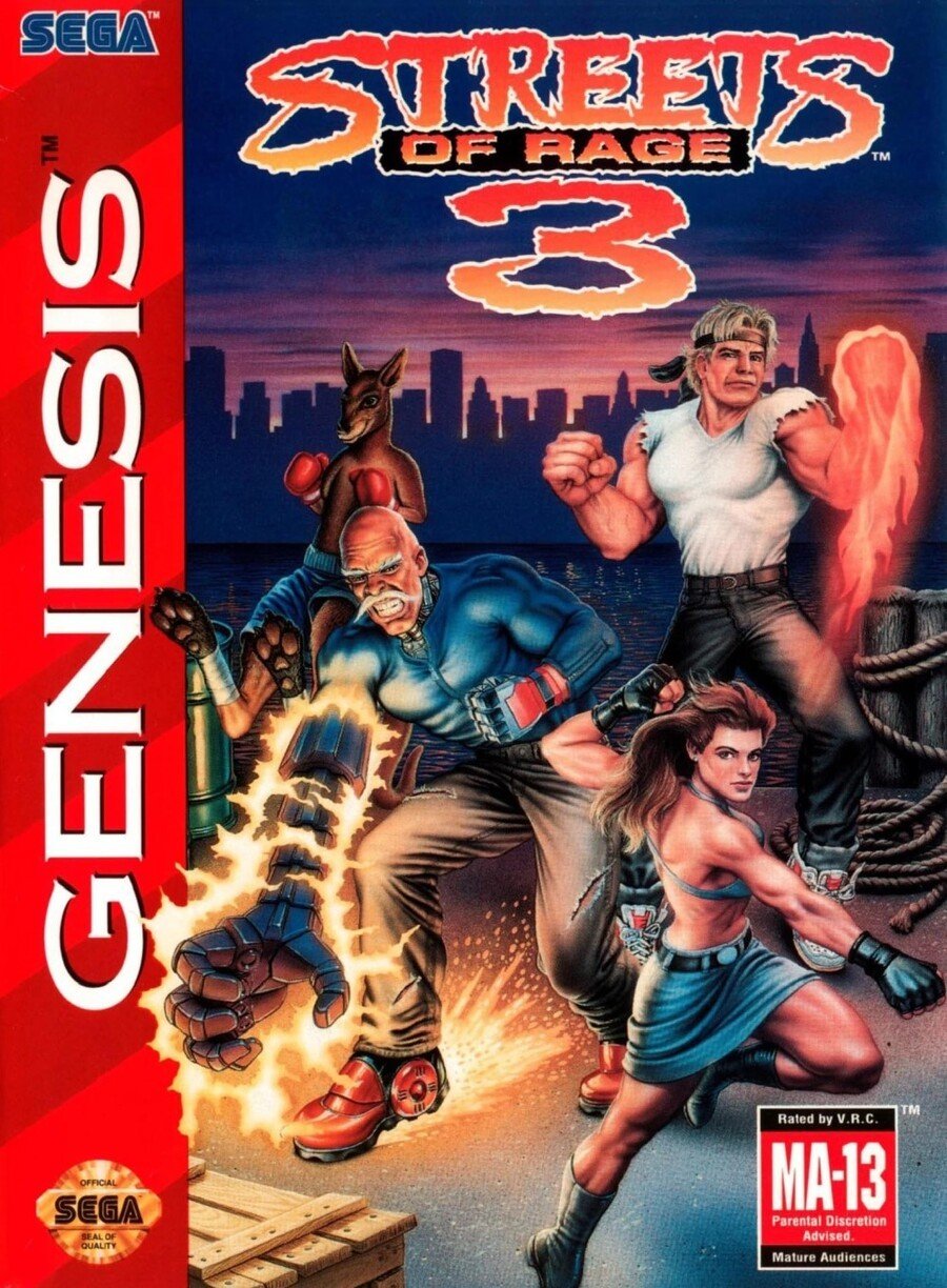
We begin in North America with Axel, Blaze, Dr. Zan and unlockable character Roo practising their moves on a dock as the sun sets (or rises?) behind the city in the background. Skate, or Sammy if you prefer, is entirely absent for some reason and the positioning of the four characters is a little odd. Your eye is drawn to Zan's electrified cyborg arm, and while he and Blaze are rendered pretty well, poor Axel has seen much better days.
Midway through his patented Grand Upper punch, the veteran brawler’s mug is enough to distract you from the odd proportions of his body. His hands and feet are enormous and the poor chap has taken some heavy blows to the face. This is the third game, we suppose.
We like how Zan's hand breaks over the red Genesis strip down the left side, although we're less enthused with Roo's foot doing the same. There are some strange perspective issues here that become more evident the longer you look, but it's got plenty of energy.
Japan

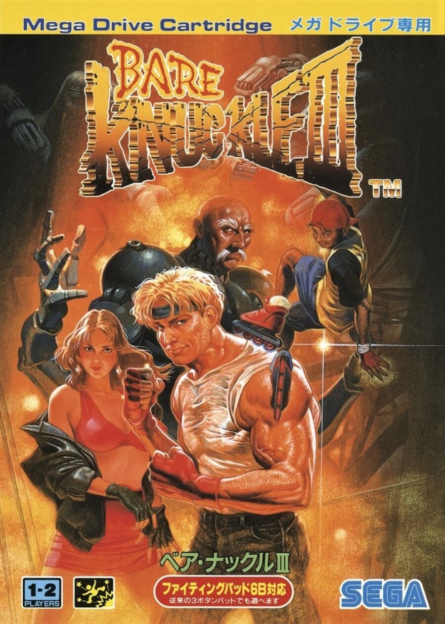
All the characters look more or less as you'd imagine them from the in-game sprites on the Japanese cover, with Axel looking suitably ripped and Blaze reminding us of her, er, formative influence on us as a young gamer. Ahem.
Sammy is present and correct and Zan's massive cyborg body presents the cast as they all stand in front of a blazing... something. We see robotic hands reaching out behind the kick-ass Japanese title. It's evocative, dynamic, colourful and beautifully painted. In fact, the only fault we can find with it is Axel's shirt. What's going on with that? Is it cling film? Is his white t-shirt just soaking wet with sweat after giving dozens of goons a sound beating? It almost looks like he has smeared lard over his chest in the form of a vest.
Europe

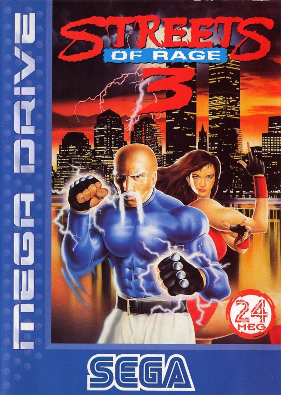
Taking a leaf from the North American book when it comes to omitting characters, Dr. Gilbert Zan takes centre stage on the European blue box, although with less obviously cyborg appendages. Killer 'stache, though. We assume Blaze has just had her head crushed and twisted by an unseen enemy thanks to its unnatural angle and curiously small size compared to the rest of her body.
The city with the ominous lightning storm looks nice, the water looks nice, the logo is cool and we don't mind the big blue strip with prominent placement of the Mega Drive and SEGA logos, either. It is still lacking something, though, and despite any good points it may have, we can't stop scrutinising Blaze's head.
Them's your picks this week. Click your favourite below and hit the 'Vote' button to register your choice:
We hope you're all keeping safe and sound wherever you are. Happy gaming and we'll see you next week for another round.


Comments 45
Wow, the European one is terrible.
The Japanese one is the least terrible.
The only thing missing from the Japanese cover is the boxing kangaroo. Still the best by far though.
EU had a good streak going but at last that ended. Japan has really nice detail.
Japan for sure. European one is quite hilarious, though. What a huge miss.
North America because kangaroo.
I'm easy to please.
North America despite the fact Axel looks like my aunty Tracey.
They are all awful... Japan wins this one, but not by much...
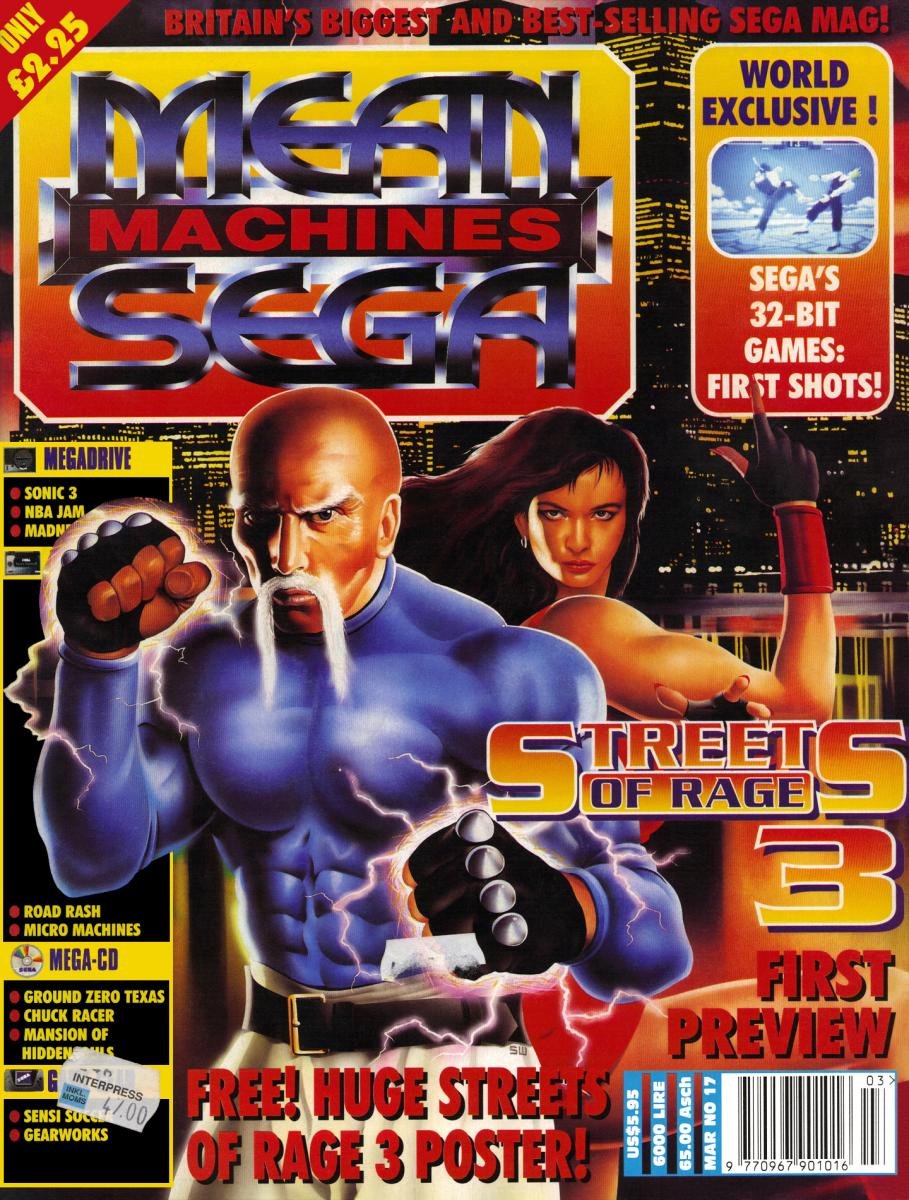
Fun Fact: The EU version cover is actually used by Mean Machines Sega magazine issue #17 as you see here:

Sega of Europe loved the cover art so much, they purchased the rights to use it for the EU version's packaging.
One glance was all that was needed for this one. JP easy winner for me
None are standout but I will go for the European because I liked the blue spine in those later mega drive releases. It made them feel special. Take care everyone x x x x x
@bluemage1989 Axel in the North American cover art looks more like more the actor Richard D. Anderson with the exception of the blond hair.
My god, that bloke’s face in the NA cover. I still see him looking at me when I close my eyes.
No vote from me this time. They're all terrible! xD
Oh boy, that North American cover. "And so Dr. Beckett finds himself leaping from life to life, striving to put right what once went wrong and hoping each time that his next leap will be the leap home."
I knew EU was out of contention as soon as I as the image at the top of the page.
Looked like usual bad '90s CGI art.
I remember owning this game, but sold it when I sold my Mega Drive. This was by far the most valuable game I owned for that system and it fetched me around £70 or £80 online. Not as much as my additional copies of Suikoden 1 and 2 though...
The most one-sided bout we've seen in this feature. NA and Europe both have zero redeeming features, and Japan is pretty slick indeed.
Tits.
@LaytonPuzzle27
What an amazing magazine!!!
Japanese boxart easy win.
Unlike two Brawls ago, which was supposed to be massively lopsided for some reason, this one was a foregone conclusion. This is about as obvious as it gets. Japan is the best by far. Europe's is just not good. NA's cover could have been okay with some tweaks, but, as it is, Axel was mangled and his giant fist is laughable.
They all look pretty bad. The Japanese art almost gets a pass, but Axel's depiction ruins it.
Woah that European art is terrible! Japan is the best of a bad bunch for me, so gets my vote.
Europe's background with Japan's foreground is the perfect cover.
I noticed it only has 99% counted.
Had to go with NA as it is the only one that features my favorite character Roo. That image actually was a huge hint for me when I was young that he could be a playable character.
None of the above. But if I had to pick one, Japan - and by a huge margin. I agree with all the criticisms of the EU one, because it’s pretty terrible, but NA has by far the worst art. It’s like an eight-year-old’s fan drawing.
Take the main art of the NA version and replace the horrible Genesis Red with the lovey Megadrive European blue spine part and you've got a winner. As it stands the Japan version is the best.
Japan, it looks the best by a wide margin
The USA art is the worst Axel looks like he got hit a few times by the ugly stick.
He got breast implants and his entire pose is stiff, like he got some metal rods up there, to keep his skeleton together.
Zan looks so 90's it hurts. Down to the EXTREEEEEEEEEEME teeth clenching and cyborg arm.
And that roo is all kinds of wrong.
The only character that looks haflway decent is Blaze.
North America for the win (but only because of that awesome Kangaroo).
I'm going with NA, it gets minus 1 point for Axel's weird face, but plus a hundred for kangaroo, it makes me want to play it more because it looks ridiculous
Japan with the easy win here. The NA and EU covers are so ugly.
@LaytonPuzzle27 I remember that issue and remember thinking it was still not quite as good as the other versions for a game cover as it looked so empty in comparison.
For me personally I have nostalgia for the EU cover as I remember a huge poster at my local game store.
And the background is really cool with the skyline looking all manacing.
It lacks characters but the characters look better.
Blaze with a blue outfit and constipated looking axel? nah!
The artwork on the Japanese version looks solid but axel looks like a young Vince mcMahon with blonde hair.
Easily Japan and it isn't even close. The NA cover isn't too bad, but that European cover... just lol.
The descriptions are hilarious. The European Box Art is so unappealing. I like the Japanese art because it looks like a painting, but the North American one wins for me. There's a kangaroo with boxing gloves on the cover. C'mon!
The japanese one looks great. It gets my vote!
Box Art Brawls Current Total:
Europe: 11
Japan: 13
North America: 12
And the winner is... the Japanese box art.
If you put the top of the background from the EU cover with the bottom of the background of the NA version, with sprites like the Japan version, the cover would actually be really good. Japan gets an easy win, though.
Oof! Both the US and EU boxes are embarrassingly badly done!
I voted for the European by accident, but I want to change my vote to Japan as usual!
Blaze actually looks like she can fight in the NA cover, so works for me. The only issue I have is the lack of Skate on it.
Japan for me. NA and Europe are the derpyest things I've ever seen! 😄
Show Comments
Leave A Comment
Hold on there, you need to login to post a comment...