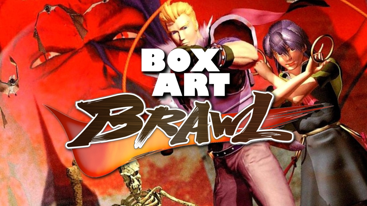
Welcome back to Box Art Brawl, the weekly contest where retro video game box art variants duke it out for your approval.
Last week we broke the 'rules' and featured a non-Nintendo platform example in the spiky blue form of Sonic the Hedgehog for the SEGA Mega Drive / Genesis. The hedgehog's first game cover is an iconic one all regions and it was a close run contest, but (and this one surprised us a bit) Europe turned out to be the fastest thing alive, winning the race with 42% of the vote. North American came in close behind with 37% while the Japanese cover came home at the back of the pack. Who'da-thunk-it? Congratulations to Sonic, commiserations to Sonic and Sonic.
Subscribe to Nintendo Life on YouTube847k
This week Castlevania returns not only to our TV screens with the third series of the (rather good) animated Netflix show, but also to this poll-based crucible of public opinion with Castlevania - the 3D one on N64. This is the series' third appearance following #12 Castlevania III: Dracula's Curse and #26 Castlevania: Dracula X. Earlier this week we ranked all the Castlevania games available on Nintendo platforms, and despite earning our respect, the first N64 entry certainly doesn't stand alongside the greats in Konami's hallowed, hammy horror franchise. Still, a game doesn't need to be great to have great box art.
Contrary to popular opinion, it feels like a lovely night to have a curse, so why not take a stroll back to 1999, hmm?
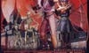
Japan
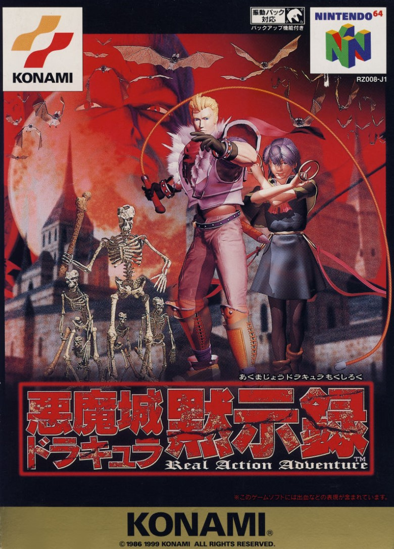
"Real Action Adventure". None of that 'pretend action adventure' here, you understand! The Japanese cover gives an excellent first impression with Reinhardt and Carrie flanked by skeletons and a blood red, bat-filled sky providing the backdrop as the big bad's ugly mug peers into the middle distance. It's got all the elements you need for a great Castlevania cover, including a whip and a pointy-towered castle.
There’s an effective use of 3D renders to achieve a look similar to the painterly covers of old, although each element becomes more disparate the longer you look. Given the standard of the time when it came to pre-rendered game covers, the compositing job on this one is utterly commendable. It's hardly a vintage Tom duBois job, but it does a good job of emulating one.
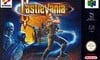
Europe
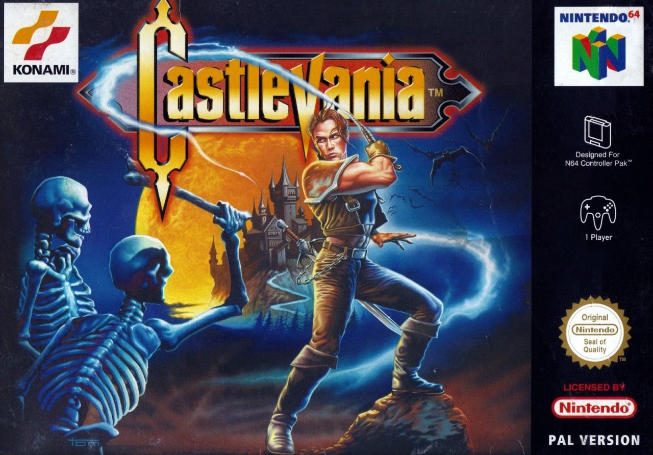
The European version takes all the expected elements (minus a pair of ominous vampiric eyes) and turns Reinhardt into a Heath Ledger look-a-like. The fact that it doesn't reflect the look of the game at all may be a minus for some, although that wasn't an issue when it came to beautiful Castlevania covers in the past.
We especially like the way the whip needlessly flits around the logo and off towards the spires of the castle in the background. Say what you like about the game - this is top shelf stuff. No Dracula, though. Bin it.
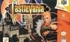
North America
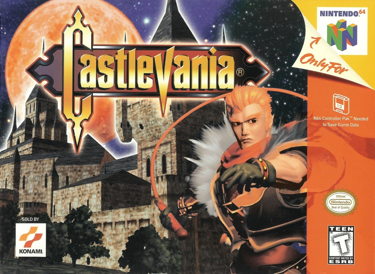
The North American variant takes a leaf from the Japanese version, using renders to illustrate the cover. It employs the same fetching logo as the European version and we quite like the render of Reinhardt (similar, though not identical to the Japanese version), although the fact that so much of the cover's real estate is devoted to a blocky, low-poly castle is beyond us. The alcoves in the background to the left of Reinhardt's whip hand, for example, are obviously part of the texture. In-game, from a distance, with a squint, on a cloudy day, it would be passable. Something you'd want taking up a good chunk of your game's cover while sitting on a store shelf in 1999, though?
It makes you wonder that Konami was hoping to accomplish with this. On one hand it could be viewed as a valiant, honest attempt to give players a taste of the visuals they can expect when they fire up the cart in their Nintendo 64 entertainment system. On the other hand, crummy textures from the 32/64-bit era don't make for beautiful images. It's also missing the vital elements of bats and a vampire staring at you through the dark night sky. Minus points for that.
Despite all those stated faults, we still like this cover! Kinda like the game itself. Maybe it's the luscious red moon against the starry night sky. Maybe it's the needless-yet-classic white drop highlight around the castle. We suspect it's actually the protagonists magnificently bushy orange eyebrows. Whatever it is, we don't envy the decision you lot have to make this round.
Them's your choices this week, but which one whips you into a frenzy of enthusiasm? Give your favourite a click below and then whipcrack that 'Vote' button.
So, which did you go for? Share your opinions and defences of this brave game below, and we'll see you next time for round 34 of this most box art-iest of brawls.


Comments 41
Well none of them are bad this time at least.
Japan let me down this round
One of the only times I have voted Japanese. Clear winner for me this week.
I give a slight edge to the Japanese version. But the NA box isn’t bad at all for the time.
This game actually has a cool setting despite faults with the controls and some goofy enemies. It has a cool title sequence too, with that violin really setting the mood.
I guess the European box art, but, honestly, they all suck.
Yeah, I went Japan too this week, though I'm not really enamoured by any of them.
I like how the Japanese cover has a gold border at the bottom so that it sort of matches the Super Famicom box art of Dracula XX. It should have had a gold border at the top too, tho.
Really wanted to pick the US one since that’s what I grew up with and all I knew, but wow that JAPAN cover is just so cool. Even the EU one, wow. I’ve actually been playing this game again and am having a blast! Really hoping they rerelease it in some capacity as the atmosphere alone is jut so darn good. Actually, I’d prefer the second game for 64 where you play as Cornell and can transform into a werewolf. I saw that sitting on a shelf recently for like $65 and I should’ve bought it when I had the chance! Now it’s gone!
Anyone who didn't go with the European boxart... Why? The 3D on all the others look very dated and kind of goofy, while the PAL version still looks great. The Japanese art looks okay at least, but the US one is just horrible.
I hope this doesn’t mean we won’t be seeing the sequel, Legacy of Darkness, in Box Art Brawl in the future. That has suitably different covers for each region, perfect for this feature, but more importantly it has the hilarious looking wolf on the NA cover!
I love the European box art!
Can't say I really like any of them. But at least I find the low-poly castle cute enough to vote for that one.
If you look closely, it's actually the same one in the background of the Japanese one.
A lot of European bias. It's very bland
I HATE this game. It has definitely not stood the test of time. This year I started to play almost all of the Castlevania games and this one was so bad I just couldn't beat it. It has aged as well as moldy bread in a pee jar
Europe because all the rendered art for the game looks incredibly dated and goofy.
I don't really like any of them, but I guess the one from Japan is the least ugly one.
I prefer the European one based on its colors, how the black balances out the electric blue of the whip/lightning, and goes well with the orange moon.
Japan >> US > Europe IMO
Japan all the way. Absolutely love the background on the art.
@Krisi Your thinking is the same as mine. Hand drawn art wins almost every time.
For me, Europe easily wins. The 3D rendered characters look like plastic and look quite ugly to me. The US fares even worse as it has the rendered character, and its framing is quite poor in my view as well.
Japan all the way.
I voted European purely on the fact I’m not a fan of the 90s style 3D used for the characters on the box art, makes it look kinda goofy
This is a toss-up between the Japanese and European covers for me, but I think I'll give the slight edge to Europe this week.
Awesome game! I love it so much! The european boxart stood the test of time preferably.
@Menardi Loved your comment, especially the 2nd paragraph about not judging art by modern standards. I make this (similar) point often when showing my kids retro video games.
However now I'm afraid to watch season 3 of Castlevania on Netflix!
Japan wins this round. The NA cover takes the same basic idea, but executes it worse. That EU cover is godawful, though. Why so many like it I'll never understand.
I like both the Japanese and European cover, but I think I like the colouring a bit more in the japanese one.
Speaking of the game itself though, both N64 Castlevanias are definitely on my bucket list, I know they're not exactly the most acclaimed games out there but I wish they got a more convenient way to be played. Still waiting for that 2nd Switch Castlevania collection in hopes that they might bring some of the missing Castlevania titles on the system.
I can honestly say that my favourite this week is ... none of them. Don’t like any of these covers! Generally speaking, hand-drawn art is always better than 3D renders, but the EU one is, as stated by others, so Eighties! It’s somewhere between He-man and Rastan (but also definitely Heath Ledger). Picked Japan because it has Dracula in it, but through gritted teeth.
Japan for me by some distance, the NA one has not stood the test of time and the Euro one is just okay
They are all ugly.
Voted Japan cause at least that one shows both playable characters, and some of the enemies
The usa cover is just a crop of the Japanese cover, and loses everything that makes that one half way decent
While the European one is just stiff and not particularly memorable.
Europe for sure. The other two both use that horribly dated and ugly CG.
I consider Castlevania 64 specially the Castlevania: Legacy of Darkness is most underrated 3D Castlevania game ever made.
Europe, easy. No bland pre-renders.
Europe’s looks amazing!
How is this one close? Japan is by far and away the best.
The Japanese one because it has both of the playable characters.
Box Art Brawls Current Total:
Europe: 11
Japan: 11
North America: 11
They all look terrible in my opinion but having to select one my vote goes for the Japanese version since it's more elaborated overall.
To me, they are all good.
Europe, but they all look bad. The CGI art doesn't feel epic, just anticlimactic.
Show Comments
Leave A Comment
Hold on there, you need to login to post a comment...