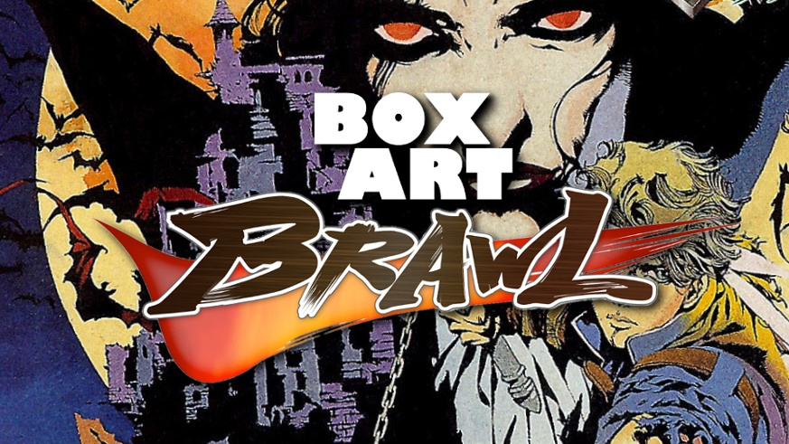
Welcome back for another edition of Box Art Brawl, the weekly vote to see who triumphs over the first and second losers in a box art beauty pageant. Three regional versions of the same game cover battle it out to see who is the sharpest looker.
Last week we had a returning series in the form of Resident Evil 2. We looked at the N64 version, although the GameCube covers of the same game were practically identical in every region. Following a bloody bout with multiple returns from the dead, Europe edged it with 46% of the vote ahead of North America by just 5%, while Japan was left mopping up the zombie juice with a shambling 13%.
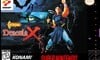
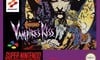
This week's combatants are part of a series with a long history of very fine box art. Yes, the Belmonts are back with another Castlevania game, and this time it goes by a different name in each territory. US readers know it as Castlevania: Dracula X, those in PAL territories will recognise it as Castlevania: Vampire's Kiss, and in Japan it's called Akumajō Dracula XX. The game was a Super NES remake of the PC Engine game Castlevania: Rondo of Blood and another fine entry into this hallowed franchise.
That's enough banter - we've got Dracula's horde of evil minions to whip. Come!
Japan

Brooding vampire with blood red eyes against the backdrop of a full moon? Check.
Young musclebound hero with a chain whip ready to battle foul hellspawn? Check.
A crapload of bats swarming out of a creepy Gothic castle? Check.
Okay, everything appears to be in order. Enjoy your game.
North America
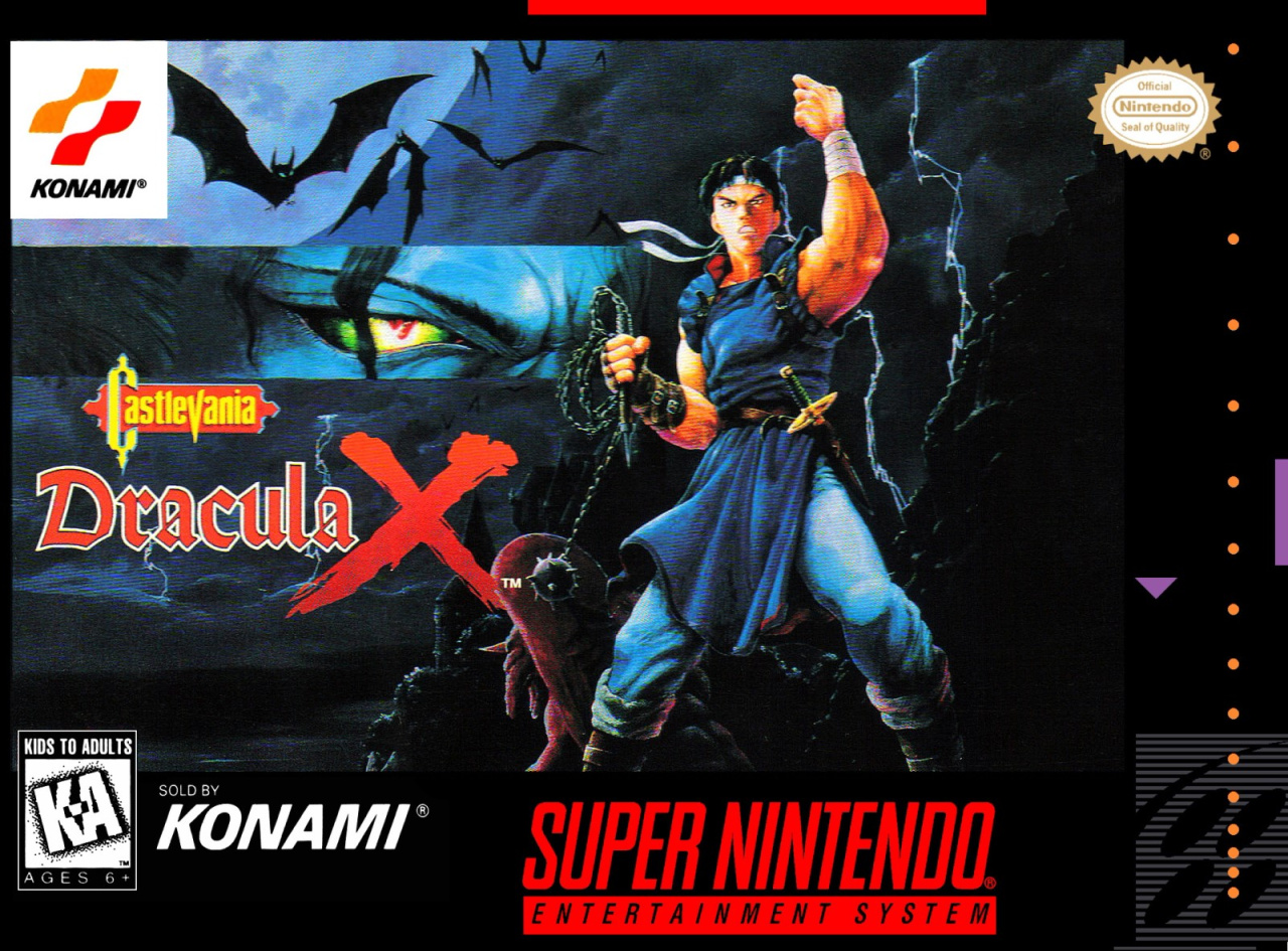
Again, we've got all the requisite elements of a Castlevania cover, although this one is rather subdued for the region. Fewer bats, a close up on a yellow and red eye, a big bloody X... It's very different, but spend some time with it and this cover really grows on you. It also has lightning, so extra points for that.
Europe
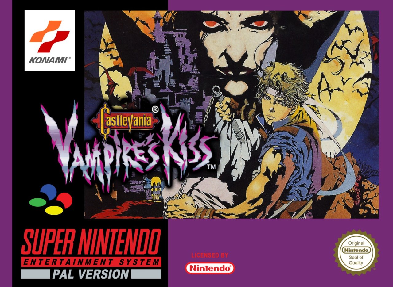
The European version uses the impeccable Japanese art but throws in a juicy purple border. We can't lie, the Vampire's Kiss logo treatment feels a bit crass after the previous covers - as if it's the name of a try-hard '90s band on a flyer for a gig. Wooohooohooo, vampires!!
You know what, though? We still like it. Tough choices to be made this week! We're glad it’s not up to us.
So, three games with different names, but which one gets your vote? Click your favourite and whip the vote button below:
That's all folks! We'll see you next time for another round of savage bloodletting.


Comments 49
I like the NA art, but the arrangement is kind of slapdash.
PAL says "Vampire's Kiss."
Japan it is.
@Dr_Corndog Perfect description.
Interesting that it's an even split between NA and Japan right now.
The JP art, due to being downright sinister.
Japanese cover is pretty slick, I love the funky coloring.
North America for me.
Japan it is.
The American cover looks too generic and the European one is purple for some reason, with a ridiculous name change.
No brainer this one
NA one for me. The Japanese art is beautiful but I don’t like how Richter looks and also he kind of blurs into the piece. The NA cover represents his look in game much better and every visual element is better separated.
NA wins this round for me. Uses the same artwork as Rondo of Blood on PCE and that's fine. The JP/EU artwork is too anime'ish for my liking.
Fun Fact: The cover art for the North American is technically the original cover art used in the PC-Engine CD version of the game.
One of the easiest choices yet, Japan all the way.
I think the Japanese one is the best artistically.
However, I chose North America because I love the retro “Generic Karate Expert” style of the man on the front rather than the blonde hero on the other two.
As usual, the Japanese box is gorgeous.
I don't really care either way about the box art. I will say this about the game though. Just because it's not the Turbo CD version doesn't make it a bad game. The snes version was limited yes but they did the best with what they had to work with. It's no super castlevania IV but Dracula X on Snes was still alot of fun!
No contest, Japan all the way
Japan by a landslide. It looks like the cover for a Gothic manga novel. 🤩
Wooohooohooo, vampires indeed!
I really wish Rondo of Blood was on the Switch. For me, it's the best Castlevania and the one that really nailed the Gothic Horror theme. I loved Hammer Horror growing up and Rondo of Blood is like Hammer Horror - The Game.
Oh cool. This is the first time I looked at the box art articles. I always wondered what the articles were about but never looked at one.
I almost voted for the American box art because it almost looked like he was flipping you off. Japan wins though because it's so much more detailed.
One of the most obvious in awhile.
I have to say, the Japan box art is the best. Too bad North America's wasn't as cool
Box Art Brawls Current Total:
Europe: 6
Japan: 11
North America: 9
Europe is just a zoomed in part of Japanese art with a different name. Japanese for me with US a close 2nd.
I went for jap Konami's artists used to have such a distinct style you knew it was by them without even seeing the company logo
Japan by a mile. That art is gorgeous. Reminds me of an Bernie Wrightson comic book cover.
Usually prefer Japanese box art most times, but for me personally I prefer the US cover for this one.
That Japanese art is some of the best to ever grace the box of any video game! It could even be the poster to a badass anime, love it!
Another Fun Fact: The JP/EU cover is the inspiration for the cover art for the issue 35 of the popular UK gaming magazine Super Play. The cover art is made by Wil Overton:
.jpg.581d7ab699a312aef5788e5b74f44481.jpg)
Can't vote on this one, myself. NA's placements on the cliff and Dracula cutaway are just so strange (which stinks, because both are great elements). JP is solid all-around, but the colors are just too funky (bright-red ground in a not-clay terrain?) and not terribly representative of the character designs.
I went with Japan, but none of them really appeal to me, to be honest.
I love the tune from the first level of this game (and the PCE version). One of the best Castlevania tunes out there.
That same tune also plays in the opening of the Castlevania 64 title screen, violin solo. Amazing.
Speaking of N64 Castlevania games, Legacy of Darkness would be a good choice for Box Art Brawl. All regions are different, albeit none are great and the NA version is particularly bad. Unless you like a man in a werewolf gimp suit, of course.
This is my favorite Castlevania, pre-vanias. It’s a real tough call for me between Japan and PAL, but I chose Japan. Great cover art!
I voted for Japan. The inking style is interesting, though a bit flat as it limits detail, especially on the castle. But it's more dynamic than the NA cover, which isn't bad.
Am I the only one who gets a JoJo's Bizarre adventure, vibe from the Jap/EU artwork?
It's amazing how many people misspell "lightning." I get that spell check won't catch that particular misspelling, but come on, the word only has 2 syllables, not 3!
Love that Japanese artwork! I would love to have a print of that to put in a frame!
Since the NA version is just the PC Engine cover art, aren’t they all the Japanese cover art?
He looks like a JoJo’s character in the Japan & PAL version.
The JP art is good, but something about it just doesn't look "official" to me. I'm going with NA on this one, I think it looks great.
@BulbasaurusRex And like a bolt of lightning I’ve lightened the letter count by 1 😉
@dartmonkey if you're a Sega fan at all, then you can consider yourself in good company. They released Thunder Force 4 as Lightening Force, at least here in NA.
The Japanese title for Castlevania is something I always found weird. Literally, it's "Devil's Castle Dracula" so yeah.
i love the art of the Japanese version which is condensed for the European version, but i went for the much better title of the EU version. "Castlevania : Vampire's Kiss" sounds so much cooler than (wha wha) "Castlevania : Dracula X" (wha wha).
Mmmh well the North American version uses art from the PC-Engine version's cover, and that rendition of Richter is more faithful to both what he looks like in the game AND what he looks like now. Artistically speaking the Japanese cover is better, but in terms of representing the game and the character's styles, my vote goes to the North American cover.
Love the artwork on the Japanese and EU covers. Went with Japan for it being just a hair more visually appealing.
That Japanese cover is one of the best I’ve seen yet. It’s a landslide.
Other than the strange name change (it doesn't really matter to "art"), Europe is best for me.
They're all good and the Japanese and European ones have a carny spookhouse charm to them. But I find the North American one to be the most aesthetically pleasing.
The JPN cover looks like it came from someone's long-dormant DeviantArt portfolio. It's close to good, but doesn't quite get there: Richter's waaaaay too prominent, and drowns out the cool background. And everything looks a bit rough around the edges; it falls apart the longer you look at it.
I love the Japanese cover, I wish I had that version. They should have kept it for all regions. At least Europe got it, although cropped.
I just notice the sold by Konami on the US cover.
Never seen that before, is that normal for US covers ?
Show Comments
Leave A Comment
Hold on there, you need to login to post a comment...