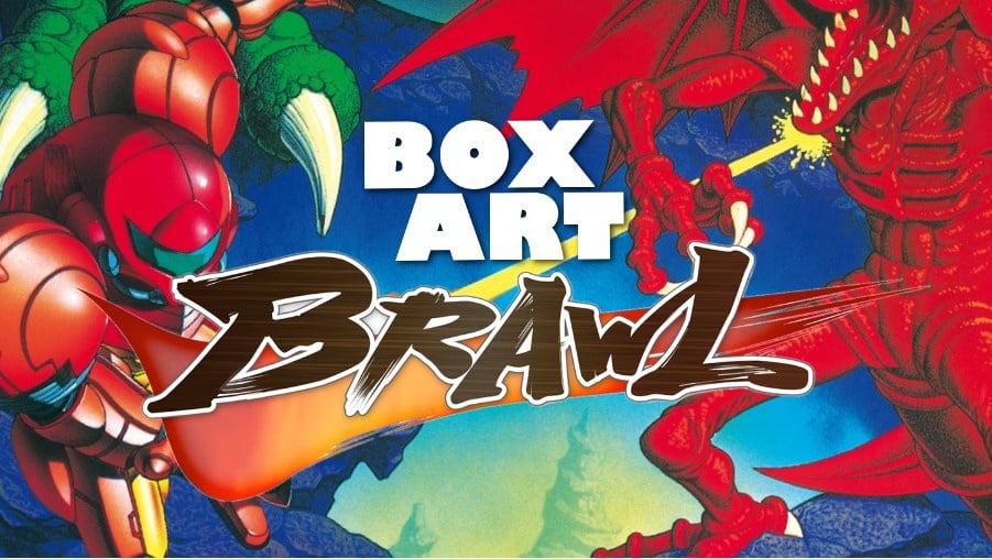
Welcome one and all to the first in a series where we pit regional retro releases against each other to decide once and for all which territory got the very best box art! And no, it's not always Japan.
Over the years, the art on your video game box has increasingly taken a backseat as digital purchases have become more popular. Of course, this means that the arguments these days are more often about menu icons, but there's still nothing quite like a lovely physical box emblazoned with a beautiful bit of art. Some of our strongest gaming memories aren't from actually playing the games, but rather devouring the box and every last page of the manual in the car because our parents decided we needed to visit granny on the way home from the town centre.
Subscribe to Nintendo Life on YouTube848k
Obviously, back in the day we only knew the specific boxes we saw on the walls of our local Electronics Boutique or Blockbusters, so when we glimpsed in gaming mags or import shops the oftentimes totally different art on foreign boxes, they sparked a fascination with the unknown world of video games that existed beyond our local shop shelves.
That was back when it might take years for a Japanese game to see the light of day in the west. The worldwide launches we (usually) enjoy nowadays mean there tends to be unified box art across all regions. We suppose that’s a fair trade if we get to play the games day-and-date with the rest of the world, but it does mean we miss out on discovering how different games look on the other side of the planet.
Within each region there were often minor variations related to alternate languages, reprints and the like (and let's not even talk about the ghastly Player's Choice variants), but for the most part we'll be presenting the North American, European and Japanese boxes unless there's a particularly interesting alternative from elsewhere.
At the bottom of the page you'll find a poll where - after much deliberation and consideration - you can cast your vote with a simple click.
So, let's take a quick look at the three options...
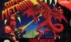
North America
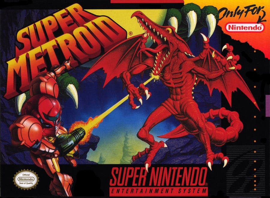
The North American version pits Samus against Ridley as she blasts the fiend in the chin. The reds and oranges really pop, although there's not a lot of context - who or what exactly do those green claws belong to? Is that a full moon to the right behind the logo? However, it's very clear that Super Metroid is only for Nintendo, so don't even think about putting it in your Sega or your Walkman.
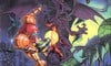
Japan
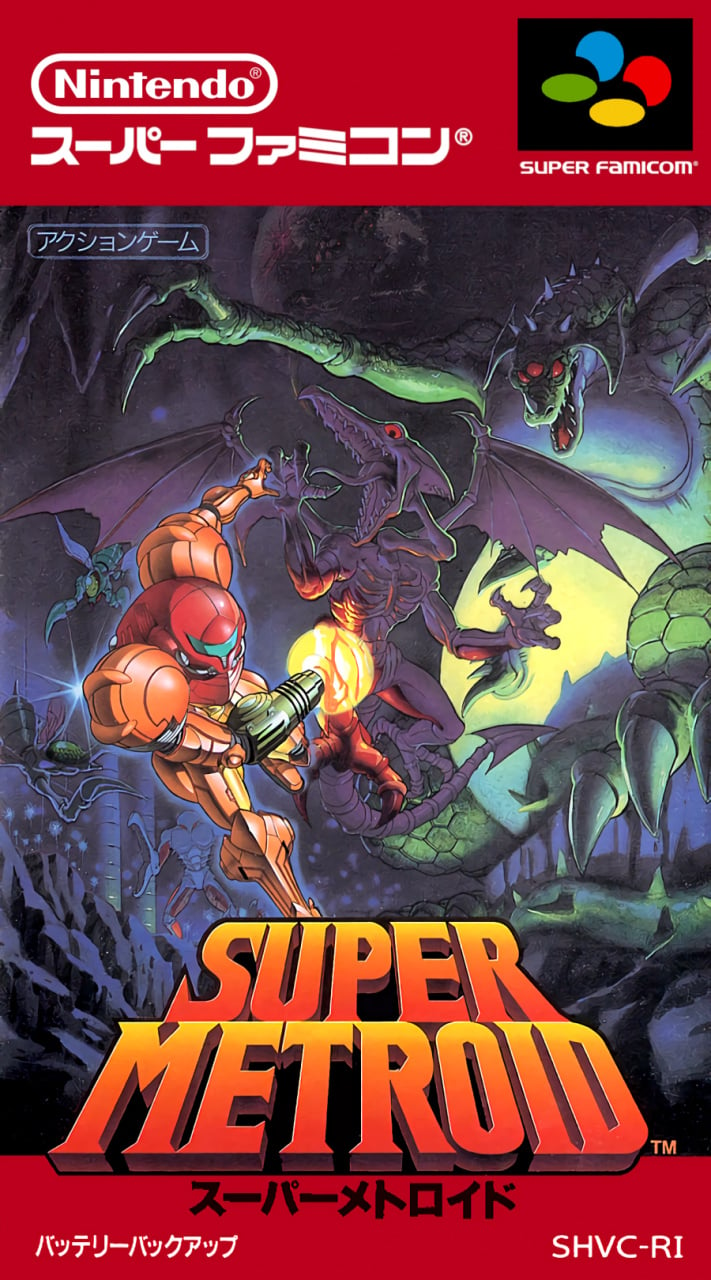
The Japanese version, which presumably served as the basis for the others, gives players a better idea of Samus' surroundings and the planet Zebes, as well as a decent look at Kraid, the owner of those green claws and the moon-esque belly. Ridley is also an on-model colour.
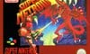
Europe
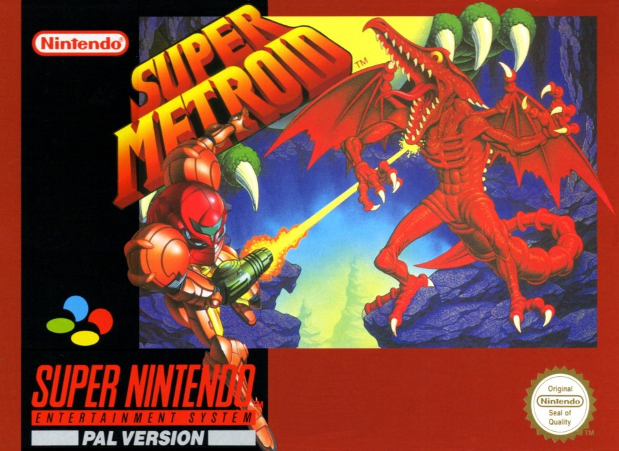
PAL regions got a very similar box to the US version, although slightly reframed with a punchy red border in place of the black and the circular Nintendo Seal of Quality. Gotta love the colourful SNES logo on the left, too, although without the little corner tab of the US version we're unsure if this game will work on our car stereo. Should be fine, no?
Those are your choices! Whether you take into account each version's aesthetic as it stands in 2019 or let yourself be guided by nostalgia is not for us to dictate - just have a think and click your favourite below followed by the 'Vote' button:
Which region got the best Super Metroid box art? (909 votes)
- North America
- Japan
- Europe
Please login to vote in this poll.
That's it for this week! Feel free to share your impressions and feelings about the various Super Metroid boxes below (and, indeed, other versions that we haven’t included) and we'll see you next time for Box Art Brawl #2...


Comments 93
Oh, I love this idea for a series!
I was surprised to see that when i voted, 100% of people agreed with the Japan art being the best....and hten i was saddened that I was the only one who voted so far. Lets see how this turns out.
No real comparison here outside of nostalgia. At least the European and American ones still look decent
I picked the Japanese one because it looks the best, but the EU and NA ones have the least spoilers on the cover haha.
Seriously though... who picked Europe?!
(Just poking fun)
Japan looks great, in my opinion. Wish the NA version looked so good.
Japan's looks best by a long shot: More details, more enemies pursuing Samus, Ridley's color matches.
America's is pretty good, just not as good as Japan's. Europe's looks like a blurry messy.
A pretty one sided selection this go round. The Japanese box art is leaps and bounds better. Not only with adding Kraid and background details but with general depth and color pallet as well. Ridley and Samus don’t just look like they are superimposed over the background. It’s just a really awesome piece of box art all around.
I've always loved the American boxart, didn't realise the Japanese one was even better.
Japan easily, in the other two it looks like Samus is trying to leave the game.
Japans just has more detail and matches the intended colors of the original. Its no contest unless nostalgia is included. American looks too dark and Europe looks too blurry.
Really cool idea for a series. Can’t wait for horrible Megaman box art!
I LOVE THIS IDEA GUYS! Hope it's weekly. Japan's has to win here surely. The EU and US versions feature a very similar composition and dramatic scene using the same art for Samus and Ridley's head (huh!) but they reduced the bold outline for some reason. Samus also looks faded a tad. Anyhoo, I can see why they tried to take a lot out of the piccy so Samus and Ridley are the main focal point of the artwork, but they removed the atmosphere. Also...what the heck is that random claw doing behind the Sun in a cave??? (Not sure what's going on there.)
@dartmonkey Great idea dude
This is a good idea, but I don't think this one will even be close lol. Do some Kirby games, please!
Japan clearly got the best box art with this game, just look at that detail in comparison!
This is an awesome idea, NL. This'll be entertaining for a long time. For Super Metroid, the Japanese art is without parallel to me, nostalgia aside, so it gets my vote.
I am going to go out on a limb and say you’ll notice a pattern to these results.
Dang, the Japanese Box Art looks epic. Definitely the best.
Great idea Nintendolife. Definitely keeping an eye on this.
https://m.youtube.com/watch?v=bY_QHS2ckoo&t=967s
The north american one. Not even nostalgia, I just love that image, it screams gaming to me, and more often then not it is the background I use on a desktop.
It's also my favourite image for one of my favourite games, so has a lot going for it for me.
I had never noticed Kraid was also on the other two.
Botw is kinda the same, ie. Japan has the best one the biggest difference is that US got one that is only slightly worse and EU got something that should have been in the trash.. and a fugly icon that matches..
Japan. While the North American one has more of a graphic design punch, the unedited artwork of the Japanese one is beautiful. I love the menacing Kraid in the background, all the extra detail, and less saturated colors.
The Japanese one by a mile
Oh and great idea for a series!
Love this.
Japan's Box Art is usually better.
Great idea, guys! Looking forward to this series!
No contest. Japan should win most of these matchups.
People are actually complimenting NL for something they published and not just criticizing them for clickbait, a slow news day, or some other third thing? Pinch me.
Also yes, Japan is the clear winner. And that's coming from someone who often doesn't care for Japanese box art that much.
Had to pick Japan due to Ridley's right arm.
the 8/16/32 bit artwork from Japan always superior. The Megadrive, Snes, PC Engine, Famicom. Box art for these systems is God like, I remember the very first megadrive game I bought was Thunder Force 3. I fell in love with that game and the Art work on sleeve.
I like Japanese box for being more accurate, in that it doesn't have Redley on the cover, and you can see Kraid here, too.
@Wesbert I can imagine in the board room;
"Ooooh, it would look much better if Metroid was firing his gun."
"Ok, we'll have to put his right arm in an unnatural position."
"Whatever it takes."
"Oh...and it's Samus...and he is a she."
"Sorry, that's just noise to me."
@Robzilla Japan wins. 😒
Japanese > EU > US.
The US one just looks like the EU one got damp.
1. Japan
2. Europe
3. USA
I'd never seen the Japanese box art before. I had no idea it was so much better than the Western art!
You have to continue this Nintendolife great article the European version came in a massive box too or at least it did in the Uk
I'm going with Japan for this one. There's definitely more context there.
Do you not understand the fact that "only for Nintendo" means that it was exclusively for Super NES? You do know that there were other game systems at the time, don't you?
Honestly a tough choice. The U.S. and Europe got red Ridley with that amazing expression on his face while Japan got the one that presented a lot more of the detail and dynamic action.
I'll have to choose Japan's by a small margin.
European cover is so nostalgic to me I could simply not vote for it. As a kid before I even knew how to read I used to call it the "red game" for a reason.
@GrailUK I just realized after so many years that those random claws next to what I thought for 25 years was the moon is actually Kraid's feet and belly!
Which is another point in the favor of the Japanese box art. Why have less than 50 percent of Kraid, and the least important parts of him at that? Might as well have taken him out completely.
Europe - love that red border!
@burninmylight I know right. Just so you don't think I was being dumb, I was making the point of it being just a ridiculous unrecognisable mess o.<
Gotta give this to Japan.
Even though it's a slightly skewed comparison, due to both the EU and US box art images being of a lower quality, I still say that the absolute winner is the Japanese box art, by a MASSIVE landslide.
Far better color tones, both Samus and Ridley actually being the right color, and it's the complete picture, instead of the over-saturated cutouts that Europe and the USA got. And last but not least, it is the original image, that the others are only derivatives from, so that already gives it a decent head start.
I also found it weird that it's basically the same picture, but for some weird reason, the Western departments thought that it would be better to give Ridley another color, and twist his neck around...
If we really try to vote as objectively as possible, then there simply can be no other choice than the superior image of the Japanese box art. Any other vote is just rosy tinted sentiment.
That American and European box art looks goofy and childish, while the Japanese art looks epic. I don't understand why they changed it so much.
@ConanLives The beauty of this is there are no wrongs or rights. It's purely personal preference and I applaud you can go against the tide
Come on NLife community, don't thumbs down someone's differing opinion on artwork. It makes the thread much more interesting and engaging.
This is gonna be a fun weekly thing!!
@GrailUK Thanks, the US version just pops more for me. I find the Japanese one a bit flat. But, as you point out its decidedly a personal aesthetic choice. I think this is going to be a great series though, looking forward to Zelda.
Japan, simply due to seeing more of the artwork
Well the PAL version is definitely the worst of the three.
For the record, I think the JAP version will win the majority of the time in these votes, but I'm swinging back and forth between the JAP and USA versions for various reasons, although the JAP version probably is the better overall. If the imaged had a little more contrast then I think it would win without and doubt.
I like both the US and Japanese art, but nostalgia aside, I have to go with the original Japanese box for this poll. Ridley's pose is much stronger and more natural, and Kraid's feet and belly aren't floating above the horizon like in the US one. That said, I do wish Ridley stood out slightly more from the background in the Japanese one, but it's still a lovely piece of art.
Bonus points for the near-imperceptible giant Metroid near the top of the JPN box.
@TriforceBun Good Lord! I never noticed that before! Good eyes mate.
Bit of a no brainier
I’ve voted Japan, though it does kinda look like Samus is shining a torch at the monsters she is running away from, instead of shooting as runs away like the others.
Going to have to go with the Japanese artwork. Kraid is a very important and often overlooked part of the Metroid Legacy.
Japan's is the best since it has Kraid as well as Ridley. However it kind of spoils the surprise of how big Kraid is in the game. Remember the first time you realize Kraid is 2 (TWO!) screens tall!?
One of the best games ever created and the japanese box art is amazing.
@mauhlin12 Seeing how big Kraid is was a very cool moment!
U.S. gets my pick.
Japanese cover art is a close second, but I feel like that works better as a poster rather than cover art, I like the more simple Samus/Ridley fight.
Japan has the best box art, which doesn't come as a revelation to anyone because Japan usually has a better understanding of how to draw gamers in with just the art, alone.
That said, Samus takes a clear shot of Ridley in the Western box arts of the game; I take it as a clear indicator that he's being shot, because Samus just fired at him, and it connects. Ridley's skin eventually gets reddened when he's low on health when you actually fight him in the game. It could explain why he's red in the US and PAL covers - he's about to be to get destroyed.
The Japanese one is beautiful and easy wins.
Then Usa in second and pal third for this one.
Wow, japans is so much prettier! Love the art style!
The colours are just so much nicer on the Japanese, from the colour choices right down to the level of saturation. Hits me way more as that kind of classic Sci-Fi anime level of saturation, like the Akira movie or something. Also, I think the second you flip that logo at a 45 degree angle, you’ve already lost the fight. The centre bottom alignment gives it that 80s/90s Heavy Metal Magazine OOMPH that’s way more in line with the way I feel when I’m playing this game. IMHO.
This is such a cool idea for a series!
I think Japan takes this one, despite my nostalgia for the North American cover. That art on the Japanese version is just gorgeous.
@PcTV 100%
Europe for pure nostalgia, also we had the massive box with the jumbo instruction Manuel for no apparent reason. Made the game feel massively epic to my child hands coming in such a big box lol
@bluemujika I do too... but Japan is going to win 99,9% of the time
That's easy Japan.
@Sir_funkington
Pretty much word for word what I was thinking.
For this game I choose Japan, most of the time there cover art is better.
Ooooohhhh I am going to LOVE this series of articles! What a great idea!
Japan cover all the way for me. I think it just captures the mood of the game better.
And I like the idea for this series, too!
I predict I will vote Japan every time, possibly excluding a few 洋ゲー (you-gee: games developed in the West).
@Nintendolife Great idea for a series folks. I love retro game box art, and will be looking forward to seeing more of these in the future.
Having said that, I voted for the Japanese one. Like most people I prefer the more detailed hand drawn look.
more of this, please. Great job.
@GrailUK I'm sorry if I gave you the impression that I thought you were being dumb! I was just saying that it just now occurred to me that those random objects in the box are are actually Kraid's lower half!
Japan, easy.
If Nintendo was a parent playing favorites with the world, Japan would get all the love.
Nice idea ! Thanks.
@burninmylight Oh no not at all. No need to apologise mate
such a great game ! There is a lot more going on on the japanese cover in my opinion.
um, please do this series for a long time for a lot of games. this is an awesome idea, and can great cool discussion below. killer idea!
For the next cover: Use Harvest Moon
normally I always like the JPN version better, but for some reason the USA box just seems so much more fun to me!
@Wavey84
Definitly, the only real problem with it is kraids awkward position. It sort of looks like he's floating Kirby style overhead. Still they all have a great mix between horror and action.
Despite having once the USA version, I have to admit that the Japan version is better and in fact, I like it more despite just seen it now for the first time.
Please do a Donkey Kong Country 1 next.
Japan for the win!
Japan here. Seems to have had more affort into it compared to the other two as well. The could have emphasised Ridley moreso though.
(An all tim great video game)
Japan by far. feels so much more expansive, like there's a world of horrors and challenges beyond just Ridley.
I've literally gone back through all the box art brawls and cast a vote. I didn't realise how long this had been going on for!! Amazing stuff. Credit to all Nintendolife staff for keeping it alive!!
Show Comments
Leave A Comment
Hold on there, you need to login to post a comment...