With all the struggles we face as we go about our daily lives, not to mention the larger challenges facing the world right now, it’s easy to look at an ugly icon on your Switch’s home screen and brush it off as totally inconsequential. After all, it’s the game itself that’s important, no? Would an ugly icon trivialise the brilliance of a game like The Legend of Zelda: Breath of the Wild or Celeste? Of course not. We can all sit here and rationally say it has precisely zero impact on our enjoyment of the game. Super Mario Odyssey could have the poo emoji for an icon and the game would still be an absolute belter.
Many of us gamers have compulsive tendencies, though. For every person who couldn't care less about the accoutrement surrounding the core game experience, there’s another who rigorously catalogues and arranges their collection with pride and meticulous precision. A pile of loose carts on the floor collecting dust and grime? Perish the thought! While there are many subtle levels between these mindsets, any collector will probably recognise some version of compulsive behaviour.
Subscribe to Nintendo Life on YouTube848k
So, while we can smile at the ferocity of online feeling when an ‘awful’ icon appears on menu screens, a great many of us have had a similar feeling at one time or another. ResetEra has a long and ongoing thread dedicated to the subject of Switch icons and we sympathise with the passion behind it. One part of us completely understands – the part which makes us consider going on eBay to hunt down a non-Player’s Choice version 007: Everything or Nothing simply to eradicate the erroneous silver spine on our treasured GameCube shelf. It's that same obsessive-compulsive part of us which bought all the James Bond movies on DVD and lined them up so the spines showed the ‘007’ gun logo. And yes, the same part which cursed the Daniel Craig films and Blu-Rays for coming along and ruining the display.
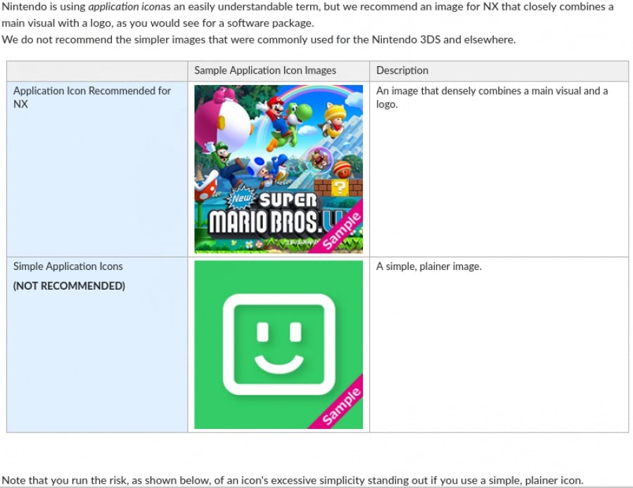
Guidelines from back when Switch was still codenamed NX popped up online and show Nintendo’s advice to developers when creating icons. While a great many conform to these guidelines (or have been subsequently altered following a backlash from players), there are still games released every week which don’t follow the 'rules'. A cynic might surmise it’s a calculated marketing ploy to get the game trending on social media, and it certainly triggers powerful reactions in some people. Take, for example, these tweets in response to Snake Pass' initial icon change:
https://twitter.com/TerrorCats/status/882467483512299523
How does a tiny square menu icon fire up such fervent emotions, though? Well, we suppose it's for the same reason we got so antsy and envious of overseas box art back in the day. Who would want to look at a botched, rubbish Mega Man every time they fire up their console? This is essentially the digital equivalent of an age-old video gaming debate around box art, except this time you’re stuck with just one digital variant, and unfortunately it's not the super sexy one they got in Japan.
It seems to us that there are a variety of reasons why some gamers get hot under the collar for menu icons. Pure aesthetics play their part. Does the icon look good in terms of colour palette, composition, font (if it has one), etc? Many developers might argue that the minimalism of a classy, logo-less icon is far more attractive than some key art with the game title pasted in.
More importantly, is the icon easy to pick out in the swathe of games on the menu screen? This is a user interface issue and something we’ve encountered a lot, especially as time has worn on and our library has grown. With all the games sitting on our Switch menu after two years, scrolling through to find the precise game we're after can be challenging at the best of times. With the release of the firmware update Nintendo finally enabled us to order the icons by title, but some of them still don’t stand out well enough.
Of course, some gamers simply want uniformity in the way the icons line up on screen. If we’re honest, we’re a little torn here. Yes, Nintendo’s guidelines make sense, and many of the icons which follow them to the letter are beautiful. But does that mean that every developer should adhere to the rules?
That would be a little bland, no? There's beauty in variety and the homogenisation of the Switch menu isn’t necessarily a good thing. Sure, those guidelines might combat usability issues, but making all icons fully compliant won’t necessarily make the menu screen less ‘ugly’ and there are plenty of games which follow the rules with uninspiring results.
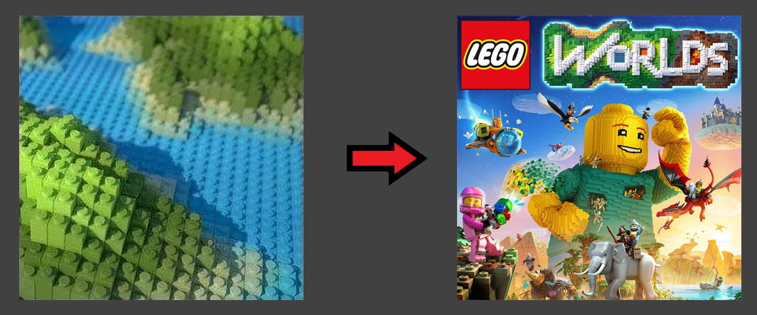
Some games simply don’t need a logo to show what they are, either. The first LEGO Worlds icon was infinitely classier than its generic replacement, and was anybody in doubt as to what the game was? Short of having a LEGO globe in the pic, it was pretty on-the-nose for a game called ‘LEGO Worlds’, no? We’ve got a soft spot for the simplicity and elegance of the original icon, especially compared to the generic one the game ended up with.
Likewise, it would be very difficult to confuse the Sonic Mania logo for any other game, and it certainly stands out in the crowd. Is it ‘good’? That’s a matter of opinion, of course, but there are plenty of people on the internet who would prefer a change, and some even provide alternatives:
Enforcing rigid 'rules' seems a bit over-the-top to us, but perhaps there’s another solution. Giving Switch owners the option to display alternate icons would essentially bring ‘reversible sleeves’ to your digital shelf. You can go with the minimalist or pixel art one if you like, or switch to the orderly, guideline-conforming version if you prefer to have everything looking ship-shape and Bristol fashion.
We’ve collected below a handful of some of the most notable icon changes, in no particular order. Changes happen quite a lot and there are far too many to include them all here, but the sample selection we've pulled demonstrates why the subject continues to push some people's buttons. If you'd like to see more, we recommend checking out the comprehensive list available at Switch Icon Showdown, a site which proved most helpful while putting together this article.
Snake Pass
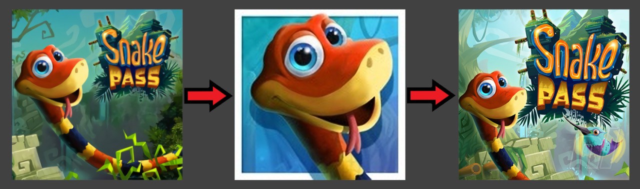
One of the first recipients of Switch icon internet ire, Snake Pass launched with an image which seemed to stick to Nintendo’s guidelines, but Sumo Digital went and changed it for a headshot of Noodle the snake and arguably initiated the whole #icongate movement. The update not only jettisoned the logo, but also added a border; something of a design no-no which makes things visually messy on the menu. It got compared to a generic mobile app and Sumo, despite standing its ground for a time, changed it to something very similar to the original. Peace was restored to the internet once more. That is until the next outrage. Pitchforks at the ready!
Kingdom Two Crowns
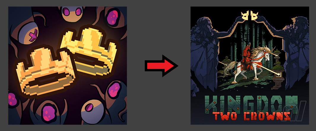
Similar to the Lego Worlds example, Kingdom Two Crowns started out with a quite literal icon sans title. That lack of title is a big deal in some circles and eventually Two Crowns (and its predecessor New Lands) received a lovely-looking, though less literal update. There are many games on the eShop that don't bother with a logo – Sonic Mania is arguably the biggest ‘offender’.
SteamWorld Dig 2
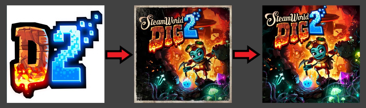
Another game which went on an iconic journey, SteamWorld Dig 2 started out with simple stylised ‘D2’ against a white background. While it contained the title of the game – albeit, abbreviated – this ‘all-title’ approach rubbed people the wrong way, as did the bland background, and Image & Form switched it out for something much nicer. Oddly, Diablo III took a similar route before Blizzard pulled a switcheroo of its own.
SteamWorld Dig 2 would get a further alteration that removed the scroll-style border from the icon because, as we all know, borders don’t work well.
Death Squared
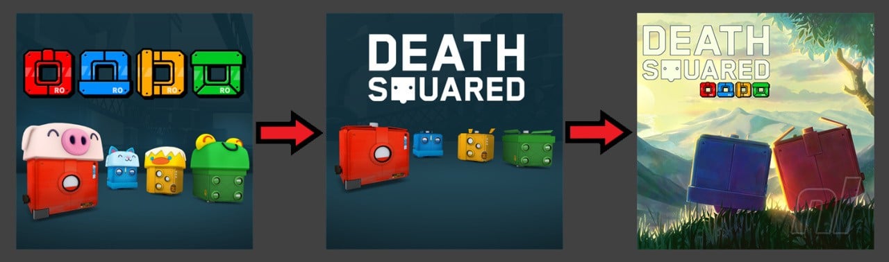
Another one that’s gone through an evolution, SMG Studio recently updated Death Squared a second time. While promoting its newest game OTTTD, it announced the intention to change all its Switch game icons to ‘align’ as one linked image on the menu screen (assuming you play them in the right order to ‘queue them up’ correctly). The resulting 'landscape' is a cute way to have fun with the icons and we’re all for it.

Owlboy
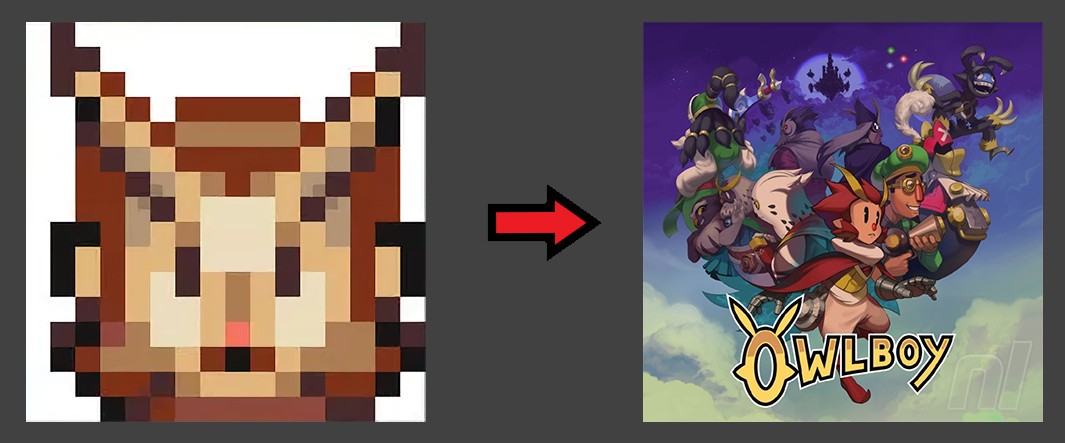
Not much to say here. We like pixel art as much as the next website, but we can probably all agree that the one on the right was a vast improvement over D-Pad Studios’ original offering for Owlboy on Switch. Down with white backgrounds!
DOOM
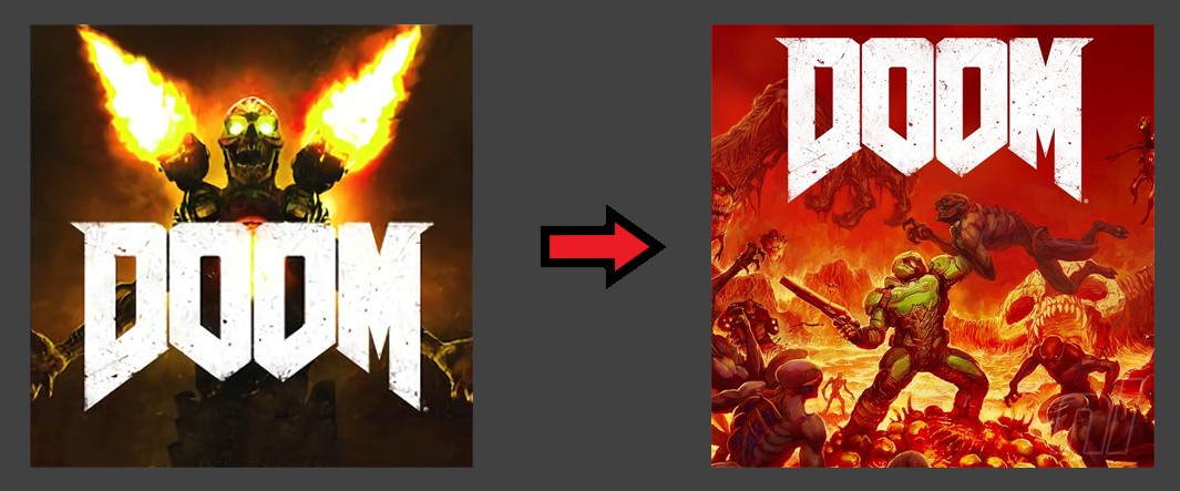
You’ll find no arguments that the newer DOOM icon looks great and recalls the classic box art of the original game, but the initial icon already seemed pretty good. Each to their own.
Thimbleweed Park
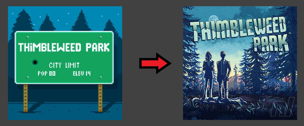
The move from the in-game Thimbleweed Park town sign of the original icon to the more polished image is a typical one, and although a little of the adventure game’s personality is lost in the transition, this was still probably the right choice.
And icons that some people want to see changed...
There’s a fair old list of icons which fall outside Nintendo’s guidelines and which many people would like to see get an overhaul. Sonic Mania continues to be a bone of contention, although as we said above, we quite like it - Sonic's all about non-conformity and there's very little doubt as to what game it represents!
Hellblade: Senua's Sacrifice is a recent entry in the Switch library which is winding people up, and it’s tough to argue that the icon above in the centre isn't boring and doing a poor job of 'selling' the excellent game. Not that that is a massive issue - if it's on your menu screen, you've already bought it.
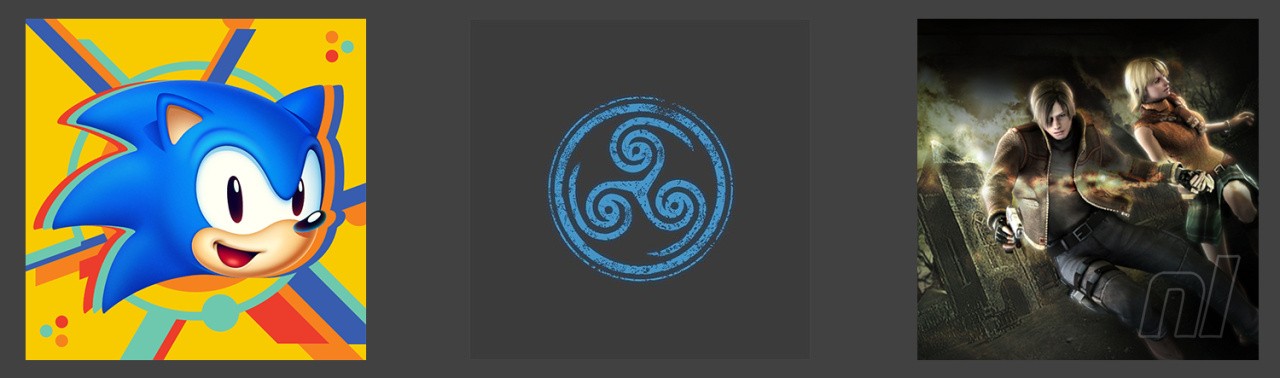
That's not the case for upcoming games, though, and it seems the icon for yet-to-be-released Resident Evil 4 on the right is already grinding some gears. The icon itself looks all right to us, but it lacks the all-important title. We can see the argument, especially considering that the icons for Resident Evil and Resident Evil Zero do carry the title. Conversely, as one of the most popular games of all time, is it really necessary to include it? I bought RE4, I can see it's RE4 - do I need to read the title on the icon? Maybe. Maybe.
So, are there any icons sitting on your menu screen that wind you up? Do you think any have changed for the worse? Are you confused by the whole debacle? Don't forget to check out Switch Icon Showdown for a more thorough list of altered icons and feel free to share your thoughts and suggestions for alternate Resident Evil 4 icons below.


Comments 87
so many changes I nvr notice
Deleting a game, in protest of.. an icon? I find that quite trivial to get so mad over.
I don’t understand this meme at all, big giant icons have been a thing for years and the Switch’s use of them are nearly identical to the PS4’s yet I never heard anyone going on and on about icons on the latter.
I'd like the ability to customize my Switch file folders. Oh wait....
Gotta do a feature on menu icons because lord knows Nintendo isn't adding any additional value to the OS anytime soon. Folders? Wallpapers? Netflix? pffft.
I think most of the newer icons are better but when it come to the DOOM icons i like the original DOOM icon better.
I hear ya @hihelloitsme on the Wallpapers. Come on Nintendo it's been over two years now. I loved my Vita Wallpapers and it's web browser for that matter.
I do not agree with the article about the Lego Worlds icon, old one was bland.
Personally an icon isn’t gonna make me change my mind about buying / keeping a game... but I do understand how people would want better icons. I’m glad SWD2 was changed from just D2 icon. Thimbleweed id rather have the pixel art original, and the original Doom. But hey I’d rather have folders and more sort options than anything when it comes to my dashboard. I’d really like the ability to sort by genre and publisher / developer.
Themes for me are a “maybe”..... I love themes on my 3DS.... however, if it’s gonna effect the performance of my games by changing the dashboard to something “active”, then no thanks. Rather have speedier loading and navigation....
Addendum - Even more than full themes, I’d just like some game music on my dashboard. Would be nice to listen to classic themes/scores while browsing my titles, or just the ability to leave my Switch open and listen to some of the games I own soundtracks
I just had the craziest idea ever. What if we could choose between maybe 3 icons? Nah, that`s too crazy!
In pretty much every single case I think the complaints about the original logos are totally legit.
No sane person want's crappy smartphone-app-looking icons littering the Switch's game menu if they can avoid it--those kinds of "app" logos just scream of ten-a-penny shovelware garbage most of the time.
It's not that hard to get it right.
Octopath Traveler deserves to be on the naughty list. It was like they couldn’t be bothered.
Personally, that original Lego Worlds one was just bland to me. Yeah it looks classier like you say but the updated version looks far more dynamic.
I had no idea Steamworld Dig 2 had such an ugly icon initially, that surprises me from such a well crafted game.
As for Owlboy, not only is it gross but the fact it’s off centre, in what looks like an accidental way, just feels cheap. The game itself is gorgeous so why not carry that over to the logo? Looks good now.
I like the Sonic one but it does kind of stand out against ones with logos.
I try not to be judgemental over something so small but my day job is improving pictures, it’s a force of habit.
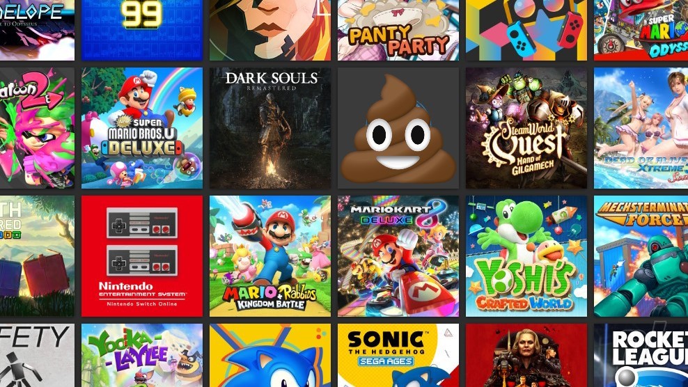
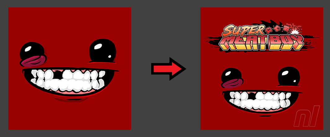
I love that game icon on the header with the poop emoji
Old Lego Worlds icon was bad.
Icons don't matter. Enjoy your games.
Icons are more important on Switch than other systems because, with the minimalist home menu screen, they are front and centre.
More, I as a gamer am a little compulsive and icons represent my Switch games collection. S****y icon=no buy. With dozens of good games on the system I can well select them also by their icon
If it had zero importance, why would Nintendo release those guidelines? In fact, all Nintendo icons respect them and are gorgeous as a result.
No title? S****y icon, no buy
But what really annoys the most, as the lovely guys on Resetera point out, is the fact all games have a RIGHT icon on the website, a correct one in line with the guidelines, but frustratingly end up with a generic, bad one with no title
"Many of us gamers have compulsive tendencies, though"
Yes, we do.
Does it excuse wishing for changes?
Yes, it does.
Does it excuse imposing any changes on the studios in an arrogant tone (not to mention tragicomical threats to "delete and not redownload the game" you already paid money for)?
No, it doesn't.
I salute every game that resists this fanship-reeking crap and mourn the ones that didn't. Snake Pass proverbially went through both phases, and I, personally more fond of the current icon's looks, still stuck with the maligned one for quite a while (even eschewing the later content which admittedly wasn't of my interest anyway) until Switch sneakily autoupdated it on Wi-Fi. Hallelujah, now the game doesn't look like a "mobile store" one - a bitterly hilarious notion in hindsight with how many mobile games have actually migrated to console space thanks to Switch now. Perhaps, them being bashed and dismissed as a whole has its upside as a result? Neverout, for one - a game of Steam origin but of the kind that fanmouths write off as "mobile" - seems to have the mother of all minimalist icons and doesn't seem to be caving in or even causing Snake Pass amounts of drama.
As for the more hyped victims of fan attention... consider my fingers crossed for Sonic Mania and Hellblade - at least when the vocal opposition isn't making those fingers itchy to form a birdflip. I have my own tastes in Switch icons (for instance, I'm partial towards present and readable titles - especially when browsing the whole library screen since I "archive" everything), and I stick to my right to wish for stuff in this regard - but I can't sanely claim any semblance of right to DEMAND it.
I love the icon wars. It cracks me up even as I do agree almost always with changing the icons. Someday there will be videogame art books with just icons and logos.
How do people who only buy digital keep track of all their games? After a about 10 games or so they are moved to a larger library where theyre harder to find
I know the official Nintendo rules to what an icon should look like say they need a logo, but I love the ones with no logo. The Sonic Mania icon is one of my favorites.
I also don’t get why Switch users are so adamantly for and against some icons. I never heard a peep about game icons on any previous console.
@ummyeahnintendo Fortunately you can quick sort those games now. I’m still hoping for folders or a search option at some point. Or both.
I have a lot of Switch games, and I’m all digital, so I reeeeally want folders, haha.
I am mainly annoyed that Zelda, which I have digital, keeps ending up as the most recent game played, even if I don't ever play it. Why does it end up at the first spot almost every week?
I wish they would change the icon of ARMS to Punch-out. Heck why not just change the game entirely.
Personally I prefer it when the icon resembles box art.
@ummyeahnintendo Switch library screen has more sorting options now (including the alphabetical one), but personally I also use 'My Game Collection' phone app for all my platforms. Used to keep a multipaged Excel file as well (largely for romsets), but I haven't got around to updating it in forever, and I keep MGC strictly for stuff I have legal access to (bought/giveaway/freemium).
I would change the icon for RE4. But that's just me.
Am I the only person that spends less than 2 seconds on the library screen and gets on with the game? I mean Nintendo designed the whole Switch O/S so you concentrate on the sweet and not the wrapper. Play the games.
I love rearranging icons on my main screen. I like to have my favorite games all there, kind of like an ad for the most fun Switch games. Also, regardless of how good or bad the icon looks I like to have really good games on my recently played list (the one friends can see).
Some icons I think are very well designed: captain Toad Treasure Tracker, horizon Chase Turbo, west of Loathing, Castlevania Collection, minit, bad north, super Mario Bros U deluxe, the end is nigh, stellar interface (I wish this game ran at a perfect 60 fps!!), Donut County, party golf, Celeste, mechstermination force, Wargroove, Neko Navy, Gunbird 2, Kingdom New Lands (better than two crown's icon), Ghoulboy, child of light, world of goo, pool panic, Cuphead, Taiko Tatsujin, Octahedron, out run Sega ages, Sonic the hedgehog Sega Ages, Iconoclasts, stardew valley, vvvvv, Gris, swim out, toki Tori, hook, Slime-san, 1 2 Switch, limbo, inversus, lovers in a Dangerous Spacetime, and Dandara.
Bad icons are Energy Invasion, Bloodstained curse of the moon (the moon is the only sort of clear thing, can't read the words), tinboy, jydge (such a unique and short title. Should be integrated into the icon), kitten squad, odallus, Tower of Babel (illegible), n verlore verstand, qbik (come on, that name begs to be in the icon!), Swamp defence 2, Monkey King, and last and least conga master party (what the hell?!).
I like the one for RE4, what's wrong with it??
@imgrowinglegs the ability to alphabetize has functioned as a search for me. It really helps. One time I lost a game. I simply couldn't find it while at a friend's house and we just played something else. The icons without letters or words really don't help.
I'm firmly in the "who cares" camp. I understand that people can be pernickety over tiny things (I'm very guilty of it myself), but getting so bent out of shape over one picture that has no bearing on the game itself seems way over the top to me.
Personally I prefer them to have the icon resemble the box art but it don’t really affect me as I only have 4 switch games that are all 1st party games so have box art as the icon,
However one thing that I have a slight issue with is Mario Odyssey, or should I say MARIO ODYSSEY, why is it all capital letters?
A bit of a tangent but I think the logo stuff is particularly notable because of the one thing nintendo did with the logo compared to everyone else.
By this I mean that everyone else treat the game logo as just that; a very minute icon that is only there to select the game in an often sprawling and cluttered menu which means that every options need very tiny icons.
In comparison nintendo made game logo within the UI not only bigger; it made them enormous in the UI and front and center a part of it.
And I'd say it's pretty clever of them because in this age of digital UIs and libraries what nintendo basically did was resurrect the old art of video game boxes covers artwork for a digital era.
And the fact people can argue about the logo art(which might as well be called "digital box cover art") is literally the proof that it work, especially when you think about the importance that box cover art once held for purpose such as marketing that most digital-only games had little means of emulating years ago.
It's a part of the whole.
It's human nature to judge a book by it's cover, even if it's not wise. And it's human nature to judge a game by the icon to some extend. A half-arsed icon, at least in part, is likely to suggest a half-arsed game.
As an example, I don't care much for physical releases – but for those that do the box art is an all important part. To a lesser extent the digital icon is the same and will either sit proudly on your Switch for years to come making you feel warm and fuzzy towards your favourite games, or it'll be an ugly smudge on the UI of your lovely machine.
I love Blossom Tales, but it's icon consists of very badly-drawn manga and looks nothing like the wonderful games in-game style. The icon wouldn't stop me playing - but it does taint my love for the game when I have to engage that bad art before playing the game. AND it WILL stop some others for buying and experiencing the game in the first place. Which is a shame.
Sure it's not a big deal in a world of big/real issues, but we all have our likes and dislikes – and I dislike when dev's can't be arsed to do a good icon. So to an extent – yes it matters.
@RainbowGazelle good word! Pernickety. Agree with the comment too.
Article is spot on about having the option, like reversable sleeves
Let the player decide!
Stupid thing to be upset about.
@RazorThin Many people are passionate about their games - and in a community of gamers, the Switch faces backlash from people who think it’s a glorified phone. In that same world, if the icons look like mobile phone apps, then there is simply one additional thing for ‘hater’s to laugh at when they look at their friends screen while they try and show them a good Switch game. There are many other reasons, including aesthetics which I can understand, but this original reason alone is enough for people to have a good reason to delete a game once finished instead of having it ‘showcased’.
I'd like to highlight just how bad the original Diablo III icon was; it seemed to be a simple PC desktop icon against a garish white background. Horrifying!
@shaneoh To many people that front screen is a showcase to their friends and even just something they enjoy looking at as a collection... if the collection looks like a mobile phone app screen, that might be a problem for some people. No more stupid than anything else.
Did... did you just cover the hellblade icon with a poop emoji?
What about west of loathing
Hm, I didn't even once think about the icons even a little bit. Now that I've read this, I still don't care. As long as I know what game I'm about to start, it doesn't matter. It could be white text on a black background for all I care.
Some people just need to complain...
@SalvorHardin The Switch icons are larger though...
I’m surprised the article doesn’t mention Octopath Traveler. I love that game, but the icon design is horrifically bland.
While i certainly wouldn't push any devs and/or publishers to change a mere icon, i do think that a great icon can go a long way.
Especially since the Switch lists everything you own, even physical copies on its app drawer.
Insignificant? Sure, but it also doesn't hurt to have a nice, snazzy icon on top of a good game
@FTL
Actually it's stupider than many other things. It's also sad if people want their friends to sit there and admire their "showcase" home screen rather than play some games with them.
Any icon without a logo is objectively bad GUI. Sure, right now it's obvious that Sonic Mania is Sonic Mania. But is it going to be that obvious when there are TWO Sonic Mania games and a couple of other Sonic releases?
Lego Worlds' original picture was pretty, yes, but anybody with any kind of visual impairment (like me) is going to have a hard time distinguishing what it is when there several other blocky building games in their Switch library. Are those LEGO blocks, or Dragon Quest Builders blocks, or
Minecraft blocks? If it's LEGO, is it LEGO Kingdoms or LEGO World or LEGO Dimensions?
At some point in time people are going to have hundreds of icons in their Switch library. Some people here already do. When you reach that state, you want to be able to glance at them, say oh there's LEGO Worlds down in the seventh row. It should be clear. The current icon is not as pretty as the original, but it does its job a lot better.
I actually like the simplicity of the Hellblade one... though I admit I might forget which game it belonged to.
@shaneoh It’s not about sitting there and admiring.. it’s about someone turning on their Switch and saying, hey check this out... meanwhile that person they are showing sees icons that look mobile phone apps.. not a good look. If you aren’t someone who that affects, then good for you... turns out it doesn’t affect me like that either... but that doesn’t make it stupid.
@daveh30 That’s sometimes the reason... but sometimes it’s worth complaining. The rule is not universal.
This reminds me of the random icons Wii save files tended to have. Usually they tell you nothing about the game.
Like Muramasa, Sakura Wars, Arc Rise Fantasia, Fragile Dreams, the Sonic tennis game is just a sprite straight from Sonic Advance, the All-Stars Racing game is just a Sonic 1 sprite.
The Xenoblade one is also pretty weird but I guess since the game is full of nopon the player will easily identify it.
I get being upset at not liking the aesthetics of an icon, I hate it when an ebook decides to update the cover and I preferred the old one, but deleting the game because you hate the icon or it screws with the visual image you're trying to project? This screams the old argument of "who are you trying to impress with your large collection of physical games in this digital age?"
@FTL
The icons are similar to what PCs have had for decades now, and if people want to judge a book by it's cover, fine, but it's still a stupid decision to make. If their friend is saying "hey check this out," then it is obviously worth paying attention because it's obviously something their friend thinks they would enjoy.
There are certainly icons I don't think look very good. The Final Fantasy icons for 7, 9 and 10,10-2 are pretty boring. (Haven't seen 12 yet but I assume it's the same.) And there are other boring ones too.
But it's really no big deal, for me anyway.
I'm mixed. I can deal with the icon if it's not pixelated, however, I do always wish that devs work better on some of their icons. I would like to see custom folders on Switch menu, because I like to categorize my games by genre, favorite, and title.
@SalvorHardin The icons on Switch take up much more screen real estate and are not framed by as much UI elements.
@Heavyarms55 Zodiac Age's icon is actually really beautiful. It's the reverse cover art on the physical copy, show casing the entire party, hand drawn by one of the original FF illustrators.
I agree with you. It's annoying but I can deal with it as well.
While there are icons I like more than others, its really not going to be the determining factor on whether or not I play a game. And it shouldn't be for anyone else with any sense of rationality or common sense.
Skyrim could use an update as well. Frankly if your icon doesn't have the title on it, I think it needs an upgrade, as the majority do this, and the few that don't, stick out like a sore thumb. I don't think the Skyrim or Sonic Mania icons look bad on their own, but I do think they fail at doing what most other icons succeed at.
@shaneoh Each to there own... however all I’m going to say... is that no, the icons they are referring to are not really like PC icons for decades, but PC doesn’t really have the same interface so it’s kind of a pointless comparison.. Anyway, enjoy.
@FTL

They're exactly the same, an image used to represent a program. Here's my desktop icon for LEGO Worlds:
Click on that will do the same as pressing A on the Switch icon
If there are guidelines, they should be followed. I understand, though, that complaining for new icons isn't always in good taste. The best case would be for Nintendo to strictly enforce those guidelines; we get our better icons as they should be, and no one has to make annoying complaints online.
@shaneoh Umm.. I totally understand that the icon might be similar... for the same game (That’s actually still a better icon anyway) but the interface is not the same, nor is the way in which people use the device, which is the point.. but more importantly.. I kinda don’t care anymore haha
@FTL
I'm not saying the interfaces are the same, they're two different operating systems, I'm saying that the representation (icons) of the programs are the same, as is the method of getting those programs to run (click/press a to run).
I just want to see everything easily at once.
The old icon for LEGO Worlds needs more JPEG.
I've dropped off this site recently as a lot of 'articles' began to feel barely above Click Bait, with stuff like Every. Single. Announcement. for the recent Mario Maker 2 Direct getting a seperate article, rather than just putting all the information in an easily digested report on the Direct.
But fair play, this feature was pretty interesting and about an area that I hadn't really paid much attention to previously.
More of this!
I want the Mario+Rabbids one changed. Although it is the box art, Mario's nose is just wrong.
We definitely need custom folders. I'd like to put my completed games in one for example.
Nintendo Switch Menu UI is Similar to Playstation 4 Menu UI are exactly the same.
@RazorThin We’re slowly moving to all-digital era, so the Home menus are naturally becoming our own shelves. No one likes a bad cover art for a physical game (Bust-a-move, Phalanx, Mega Man, remember those?), so why would one be okay with a bad icon?
It matters.
Sonic Mania and the god awful Human Resource Machine icons are the offenders on my Switch home menu
@rushiosan @FTL But its an icon, half of the icons listed in the article are just people nit picking. I don’t see any issues with the Sonic Mania one for example. We are living in a period where more parts of media are transferring to a minimalistic approach to design. If I enjoy a game, an icon won’t make the experience unenjoyable.
@RazorThin The Sonic Mania one is definitely fine.
@Heavyarms55 FinalFantasy XII’s icon on Switch is actually different from the other installments! It actually features the artwork by Akihiko Yoshida on the front.
I'm glad that Thibleweed Park, SteamWorld Dig 2, and LEGO Worlds changed their horrible icons to something much better.
I don't have Owlboy but that old logo is a mess.
I'm all for having the title in the logo. Just looks a whole lot better imo.
I'd like to see an icon update on Skyrim, Lumo, Fallout Shelter, Color Zen, and Kitten Squad.
While an icon will never make me want/ don't want a game to buy but if the icon is terrible/bland and when I am finished with the game I will removed it from the system. While I can understand why people would think this is silly or stupid of me to do so.
I see an icon as an extension of a games box art. A box art draws your attention to a game while terrible box art makes think what were the developers/publishers think this was a good idea to get peoples attention. Think of it this way. If you have 50 games on your switch with 49 of the icons looking amazing and 1 of them is terrible that 1 is going to stick out like a sore thumb.
TBH they should be 2 icon choices.
1 should be a custom icon that the developers wants as there icon and 2 should be the games box art or digital icon on store pages that show the title of the game with something behind it. If a developer doesn't want to have a custom one then it should default to option 2.
@rushiosan That's exactly the issue: these images are no longer just icons, but Covers; If it would look bad as a CD cover, it will look bad as a Switch Icon
I couldn't care less about the icons. Its the games that matter!
Icons aren’t make or break for me, but I can understand deleting or, more appropriately (opinion), starting up 12 other games to rid oneself of its unsightliness. Speaking personally, my physical collection is semi-ruined because The Adventure Pals folks decided to center their title rather than ascend from the top (arrrrrgh, am I right?!). I also think two/three icon options, mentioned by many of you lovelies, for each game would be monumental, OCD-wise. That said, NINTENDO: give us the Wii/Wii U tiled layout option! Make each icon customizable in their layout (preset sorting options are a good start...) and folders for those inclined. I’ve had this thing for just six months, and the single, scroll-right layout is becoming depressing (in the ‘how is this the only default option?’ kind of way)...
I know Switch users want the best content, and that includes the best icons too. They don't want their icons to be misleaded with a mobile game icon, they want their icons to look the closest to the other console versions.
To my mind, these "complete" icons make games look like the full-flat experience. For example, that Hellblade icon can cause misleading for anyone else until you select it and see the title.
But sometimes the minimalistic icon can actually be attractive, I mean, what if a game like "The Orange Box" came to Switch, huh? Or if Overwatch came to Switch, would you prefer that famous logo as the only icon? or just Tracer doing a pose with the generic logo? Sometimes it can even stand out alongside other "complete" icons!
Not really sure how to feel about this debacle. I side with Nintendo that detailed icons look much better on the main Switch menu, but they start to look dense and scattered when they're ordered on the grid. I like the Switch UI, but this is one part where I wish the original design would have been a bit more featured.
I really miss the old Exit the Gungeon icon. It was so simple, it looked so good.
Originally I was kinda, "This seems kinda a silly thing to fret over.' Had my switch open and glanced down at the icon of the last game I had open, Xenoblade C1. Gorgeous, but the size of the icon itself really drew me. As a thumbnail, minimalist art can be good, esp for phone apps and the like where we kinda need one image per. On the Switch, that icon gets blown up to larger size by a lot when dealing with sprites. I imagine that Owl one was esp yikes when at full size. Like swiping over to a, "Did my Switch just glitch?" moment. So in this case I think it matters a little. But not up to the point of deleting a game you wouldn't have otherwise deleted. That's still just ridupidlous.
Funny you should mention BotW … I live in the UK and so have the European icon. I gotta say, to put it on the positive side, i would kill for the US icon instead!
Show Comments
Leave A Comment
Hold on there, you need to login to post a comment...