Hi folks, and welcome to another edition of Box Art Brawl!
Before we get cracking with this week's brawl, let's cast our minds back to last week. We looked at Sonic CD for the Sega CD and, surprising no one, the more action packed box art for North America won the vote by a decent margin, bringing in 48%. Europe came in second place with 30%, and the weird, squishy-titled Japanese box art finished with 22%.
This week, we're going to stick with Sega's console line and take a look at Castlevania: Bloodlines. Released back in 1994, the game was known in Japan as 'Vampire Killer' and in Europe as 'Castlevania: The New Generation', while North America took on what would arguably become the game's most well known title, 'Bloodlines'.
The game was well received by critics at the time of its release, praising the faster pace and more action-focused gameplay, but criticism was levelled against the visuals, which were regarded as inferior to the SNES title Super Castlevania IV.
Two of our competitiors this week share similar designs for their respective box arts, but we're going to go with a three-way brawl, if only for the stark difference in game titles.
Be sure to cast your votes in the poll below; but first, let's check out the box art designs themselves.
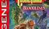
North America
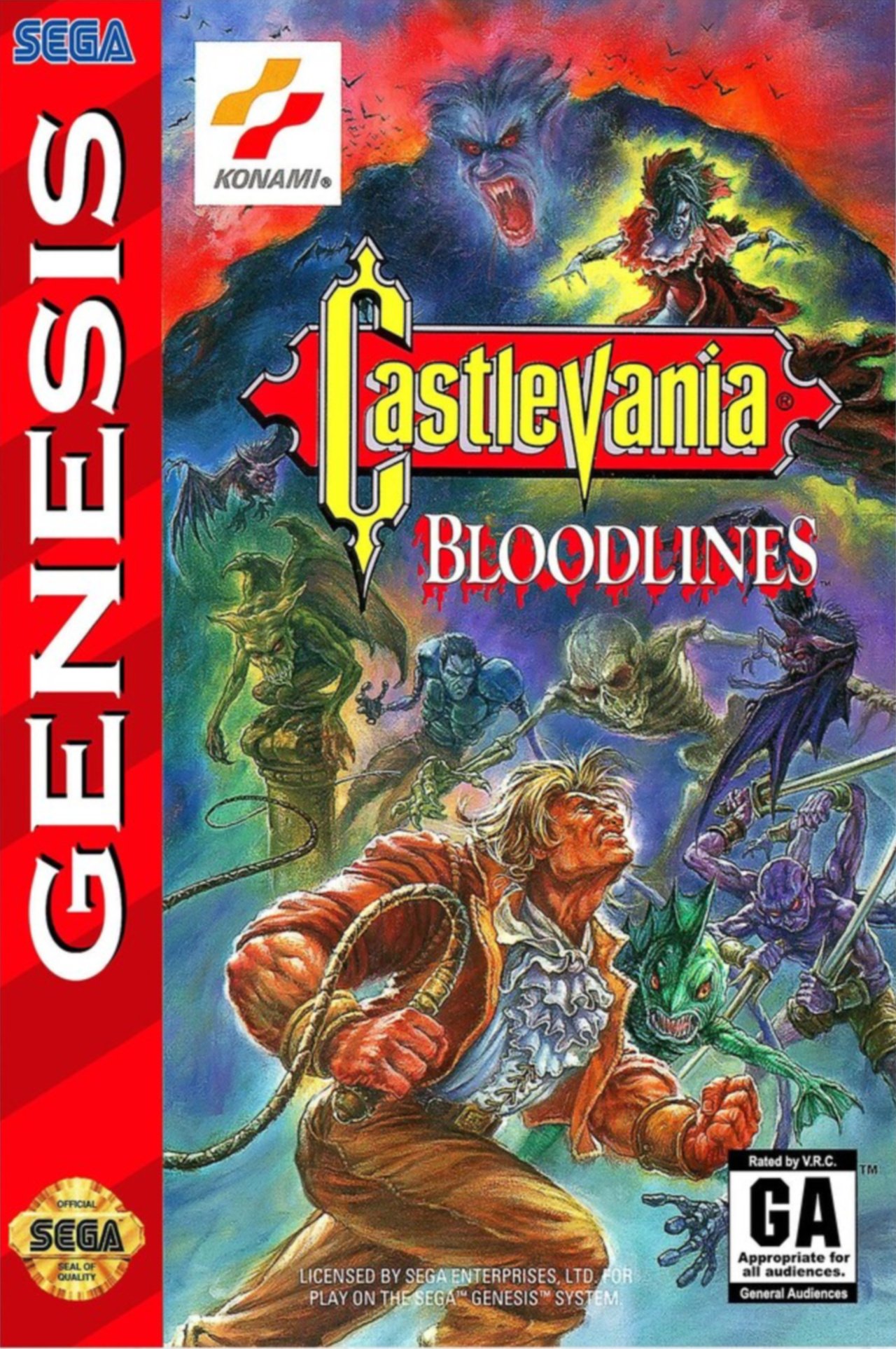
Along with its title, the North American box art design is probably the most well known among fans. We see our protagonist in the bottom half of the composition and a whole bunch of nasty creatures surrounding him. The 'Bloodlines' title itself is pretty macabre, with blood dripping from its letters to look like something straight out of R.L. Stine's Goosebumps or something! We're big fans of this one.
Europe
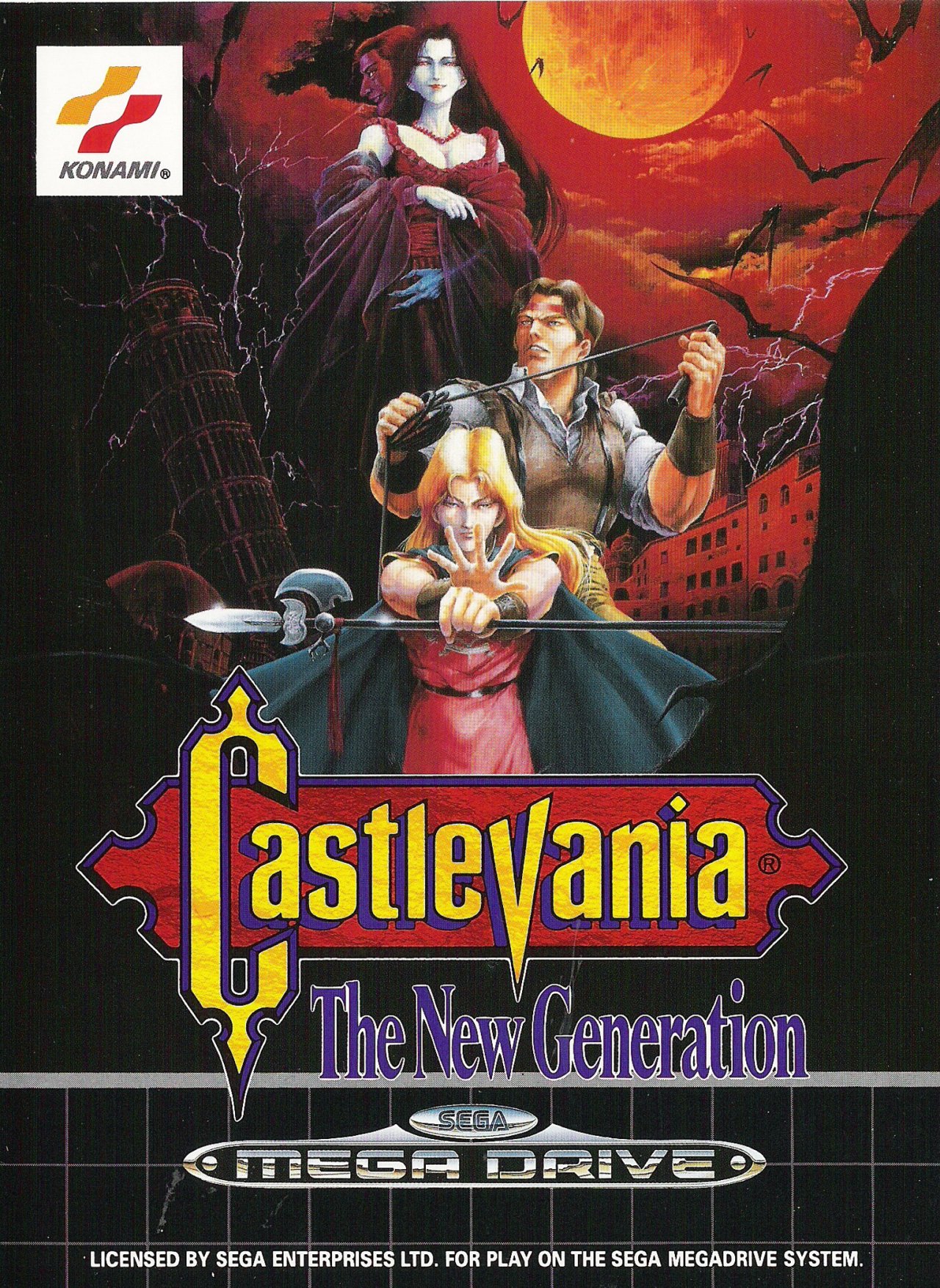
Europe's 'New Generation' design is perhaps a little more ominous, with significantly darker colours and a sinister red tone in the background, with bats flying about and a blood red moon looming in the sky. The characters here are very well designed and their positions within the composition make for a pretty impactful piece of art.
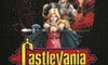
Japan
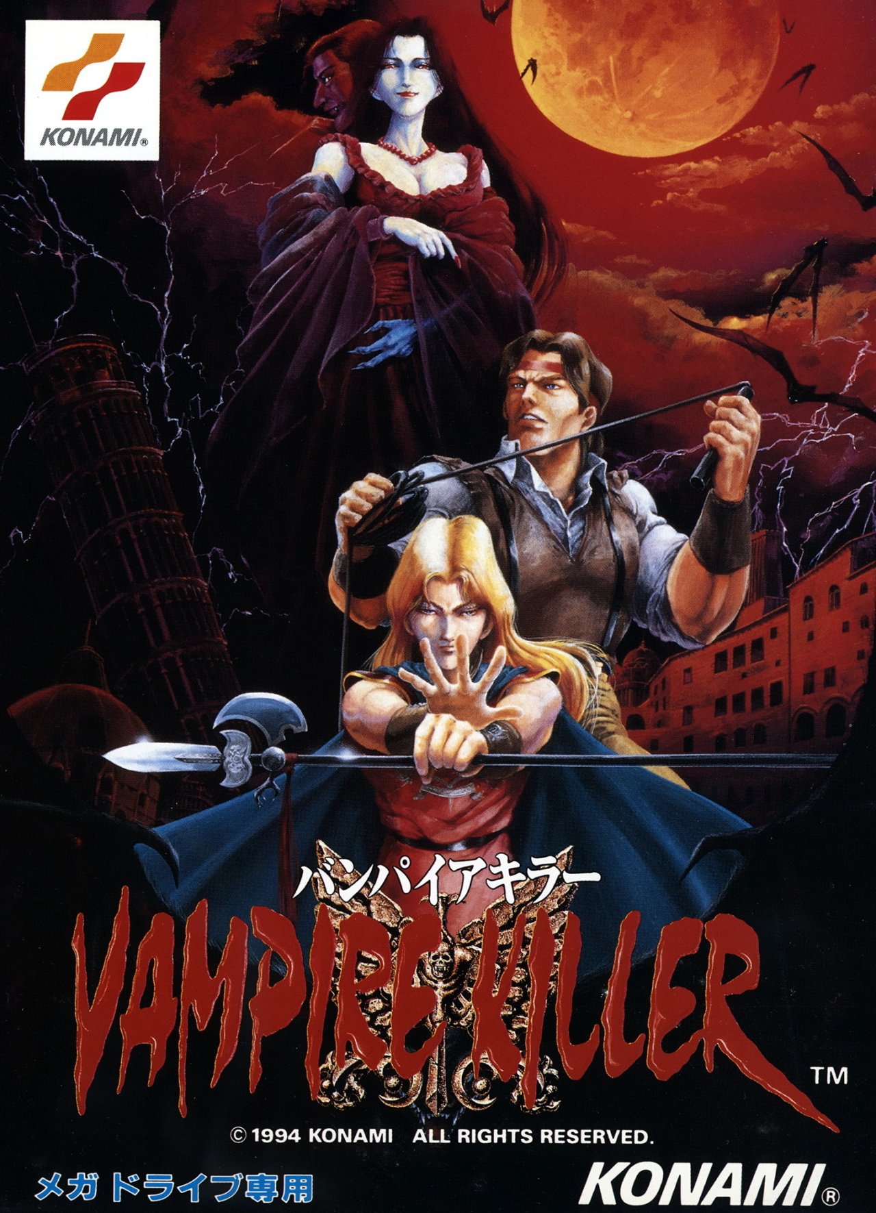
Japan's design is more or less the same as Europe's, except everything has been zoomed in significantly to remove some of the empty black space. The main difference here, of course, is the title itself. We've got 'Vampire Killer' that looks like it's been written in blood and it's a pretty striking; certainly more so than the rather dull 'New Generation' title seen on Europe's cover.

Thanks for voting! We'll see you next time for another round of the Box Art Brawl.


Comments 45
As much as I love Tom Dubois artwork, my pick goes to the Japanese/PAL cover art. Chose the Japanese one since it's less cluttered.
On one hand the Japanese art is the cleanest and has the least amount of clutter while the USA boxart gives the best depiction of the gameplay and what you're getting into. I'd say it's 50/50 between them.
Close call between Japan and America honestly. The japan one has a typical horror feeling. The American one makes the monsters look scary. Had to pick Japan because it all goes together so well, but the American one still looks impressive.
John Morris is so intense and focused on the NA cover. Great art!
There's not a great deal of difference between the Japanese and European covers. I voted Europe as I'm quite nostalgic for the Castlevania and Mega Drive logo's.
the US one looks like total crap
Those are all ugly.
Japan by a mile. It looks like a cover for an old horror movie, and I really like it!
The US art is way too busy, to the point of obnoxious.
The rare time I’m picking the European box. The artwork is cleaner and represents both protagonists and antagonist well. I’m also a sentimental fan of the Sega graph paper aesthetic. And while not the most exciting title, The Next Generation leaves the least room for confusion for me. This isn’t the usual Castlevania iteration, these are unrelated people carrying on the Belmonts’ vampire hunting mantle into the modern era.
The two main issues with these covers for me are that John Morris looks like an ogre on the North American one, while Eric Lecarde looks like a woman on the European and Japanese ones.
I think I'm going with Japan this time. Castlevania: Bloodlines is the more iconic title, but the hodgepodge of characters is "less is more" in this case IMO. I also can't get over the hilarious constipated look on the MC's face. Whereas Europe/Japan's cover has a moodier, more atmospheric background, and the character drawings seem cleaner and less raw. Vampire Killer is the better title though.
As much as I dig the North American box art, I got to vote for the Japanese cover, the Vampire Killer part is sick AF.
I've only ever seen the NA cover. I think I have to go for the Japanese version though, it's the slickest one. My apologies to John 'Stallone' Morris.
This is a tough choice
The US one is big, bold, screams THIS IS A VIDEO GAME and accurately represents the brighter color palette this game features over past games in the series. The others would better reflect the slower-pace of the Symphony of the Night style. Tell people the US one is Japanese and vice versa and they'd go with what they think is Japan.
Japan wins again! Obviously a close 2nd for Europe.
A rare instance where I think the NA one is leagues better than the other two. There's just something about the composition of all the monsters above Morris that just screams gothic horror to me that the EU/Japan ones sorely lack. It's all personal preference though I suppose.
Japan and North America are nearly tied for me, but I voted for the Japanese art.
Both look great, but I went for NA because Jonathan and Eric look terrible on JP/EU
I like the European cover the most. I don't like the depiction of John Morris on the NA cover, though the monsters are cool. The Japan "Vampire Killer" logo doesn't look right to me. It looks unfinished. I also like how the European cover is slightly zoomed out and you can see more bats in the upper-right section. I think it adds to the image as opposed to the way the Japanese version cuts them off.
I chose Japan just because it looks like a sick early 90s death metal album cover
I actually like them all this week, but I chose Japan because I like the gothic portrait-style of all the characters.
I like that the European box art looks like a classic Mega Drive game. But Eric looks like he should be 'Erica' based on this artwork....
I always preferred the Japanese cover to the NA one. Just like I always preferred Bloodlines over Super Castlevania 4.
I don't know who that dude is on the NA cover even though I'm most familiar with that cover lol. Japan for me nails the "who's who," and makes great use of the cover space. So that's where my vote goes today. I'm amazed that it's so neck and neck between NA and JP-- Guess it's a toss-up of who thinks what's the better art versus nostalgia...
Japan for me. Prefer the layout and artwork
I like the Japanese one the best but I gotta vote for that ruffled shirt.
The NA box art is definitely more iconic and shows what you will have a fight on your hands so I went with it. Although I’ll have to give a very close second to the EU cover.
Japan for me! The art and the original title have more intensity than the westernizations. And I love Eric Lecarde’s androgynous look 🥰
Either way, I wholeheartedly agree with @Diogmites - this is one of the best inclusions on the MD Mini. I never got to play it back in the Genesis days, either.
NA reflects the fact that it's a dumb game about whipping monsters until you win. I appreciate that.
I'm going with Japan this time, the fact it's not so cluttered benefits something like Castlevania. The style of the American cover makes me think of an NES game, not a Mega Drive/Genesis one.
That dude looks like a swole Pertwee in his ruffled shirt.
Box Art Brawls Current Total:
Europe: 43
Japan: 48
North America: 52
Australia and New Zealand: 1
@LikelySatan Dumb game... it's an intense journey to twart the forces of evil that try to ressurect Dracula on the brink of WW1.
@khululy I wonder what kind of name was "Elizabeth Bartley" for a demomic lady?
Until I saw on some history channel, a documentary about a supposedly real woman from the 1600s or so, that she was probably based on.
@khululy that's what I said.
Siding with the NA art this time. It’s cluttered, but clutter isn’t always a bad thing. It reflects the frantic gameplay style.
The US cover is a bit aimless, with a horde of monsters thrown onto it with little composition. But the other covers are kinda boring and make the game look like a horror B-movie. If I picked up the Japanese one at a store, I’d think I was buying a movie at first glance.
North American edges them out slightly by looking more game-y.
My all time favourite Castlevania game. Yes even over SOTN and SC4
North America.. and not because of the nostalgia factor of having played it back then. I just always really liked its artwork.
I'm also surprised the vampire dabonkers aren't bigger on the Japanese version 🤣
@peachflavored Less cluttered and more cultured? 🤣
@KingMike Elizabeth Bathory
https://en.m.wikipedia.org/wiki/Elizabeth_B%C3%A1thory
Theyre all good, but i gotta give it to Europe.
Does anyone know what happened to this week's Box Art Brawl?
Show Comments
Leave A Comment
Hold on there, you need to login to post a comment...