Welcome folks, to another edition of 'Box Art Brawl'!
Last week saw the classic N64 title Pilotwings 64 battle it out for box art supremacy. The results were honestly quite a bit closer than we were anticipating, but nevertheless, Japan's vertical design took the lion's share of the vote with 60%. Bad luck, North America and Europe - your designs weren't bad, but they weren't great.
This week, we're going to be diving back into the world of Capcom's Mega Man with its fourth NES title: Mega Man 4. Released back in 1991, it received strong critical reception, though many folks were quick to note that it did very little different to the previous entries in the series. Franchise fatigue was beginning to set in, though not before Capcom released another two follow-ups for the NES before finally moving onto the Super NES.
Subscribe to Nintendo Life on YouTube845k
It'll be a three-way brawl this week - just the way we like it - due to the key differences in art design between North America and Europe. But enough talking, let's get right to it!
Further Reading:
- Poll: Box Art Brawl #40 - Mega Man
- Poll: Box Art Brawl #52 - Mega Man 2
- Poll: Box Art Brawl #6 - Mega Man 3
Be sure to cast your votes in the poll below; but first, let's check out the box art designs themselves.
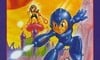
North America
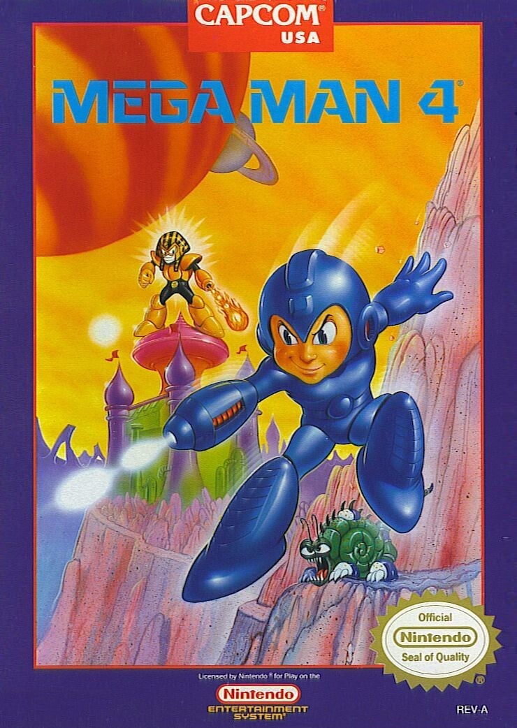
North America's design for Mega Man 4 is, um... interesting, to say the least. There are hints here that the art style is moving away from the admittedly hellish approach taken in earlier titles, but there's still something rather odd about Mega Man himself. Why are his cheeks so rosey? Why does he looks so... well, real? At least, real in comparison to the more stylistic approach taken with the other region variants.
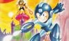
Europe
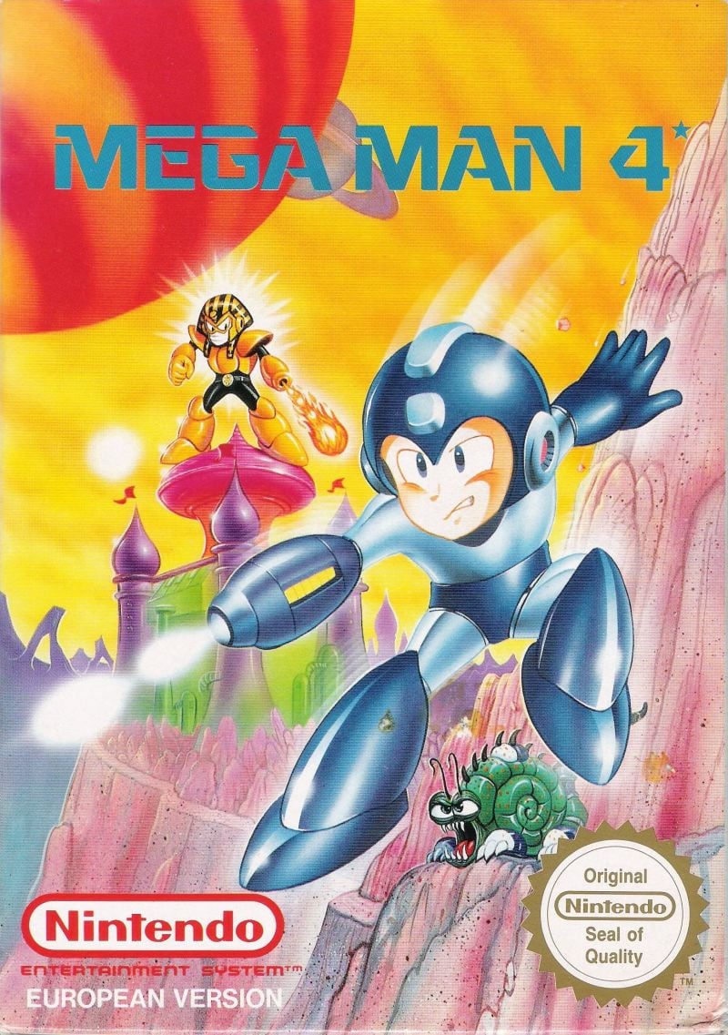
Interestingly, Europe's design for Mega Man 4 opts for the same composition as its North American counterpart, but swaps out the art style for Mega Man himself for something arguably more traditional. The background is exactly the same, but Mega Man's face looks decidedly less unsettling, matching the visual style present in Japan's box art design.
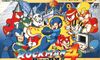
Japan
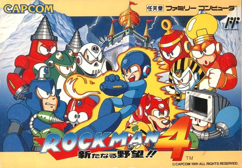
Speaking of which, Japan's box art design utilises an art style that's still used to depict Mega Man to this very day. It also makes strong use of the landscape orientation, adding in some Robot Masters for a slightly busier composition. Mega Man himself looks pretty awesome here too, covered in flames and about to let loose what we only assume to be a charged shot.
Thanks for voting! We'll see you next time for another round of the Box Art Brawl.


Comments 53
I like the Japan one much more, it’s just overall, in my opinion, just more pleasing to look out, unlike, whatever those first two are.
Man, his facial expression on the European artwork is really quite odd! He looks bored / unimpressed! Japan got my vote here. I think Japan will run away with this one.
The Japanese cover is great, but I have a soft spot for the European box art. Can’t stand the American apple cheek design.
Beauty is on the eye of the beholder and anything can be subjectively beautiful. Except for the eu/na megaman art cover. Thats an abomination and if you dont cry when you see it then you are a disgrace.
If it was between the US and Europe, I think PAL would win by a landslide as the least bad option. With Japan in the mix, neither is in the conversation.
Boah, it's often the hardest when they're all ugly. Voted for Japan.
Is there even any question? Japan all the way baby.
I do like the EU one a bit though, even if I'll never understand why they decided to keep everything the same except for Mega Man himself (even if he does look significantly better than on the NA side of things).
They spelt Megaman really wrong on the JP cover.
Japan version looks the best.
USA version is just Yikes....
No argument here and the poll clearly agrees. The Japanese one is definitely the best. Featuring the art style that we all know and love. It's not even that the wide box art makes it better, it's just that the other two doesn't really feel as well-polished.
Box Art Brawls Current Total:
Europe: 40
Japan: 47
North America: 48
Australia and New Zealand: 1
The japanese one is a bit too crowded for me, I went for the European one because it’s less crowded and Mega Man isn’t a minger like on the US box art
I gotta vote for the Japanese boxart for the second week in a row.
It's funny even at the time the European designers could see that his face looked hideous on the US box.
Cossack Castle(or Citadel/Fortress) is either REALLY small, or Pharaoh Man is an ENORMOUS Robot Master! And what’s the deal with those huge planets in view? I’m pretty sure Mega Man returned to earth by the end of Mega Man 3, so he’s still on earth during the events of Mega Man 4.
I love how crazy the NA/EU box arts could get, lol.
Japan wins by a long shot, it's just so much better than the other two.
@Linker2A03 I'm guessing the artist was told to draw a "futuristic" design, so the huge planets probably represent advancements in space travel. That or the solar system shrunk.
@Jackpaza0508
"The japanese one is a bit too crowded for me, I went for the European one because it’s less crowded and Mega Man isn’t a minger like on the US box art"
"minger"?
JPN definitely, and by a good margin.
US in a (very distant) second. It's terrible, but at least it has a style & sticks to it (as much as I don't like the "westernization" of Japanese box arts that's so endemic of the era).
EU in third because they couldn't make up their mind in terms of art direction (I also can't un-notice how they split up one of his fingers so he'd have 5 instead of 4 like on the US box).
Japan, Japan, and Japan. Wonderful character spread, a better color palette, and more familiar designs. Europe isn't too bad, but North America....What is up with the obsession with realistic Mega Man?
@Mario500 sorry, accidentally used a British word lmao (a minger is an ugly person or thing)
I like having all those robot masters on the Japanese cover. Its just better like that.
His face in the US version really disturbs me. I actually voted for Europe because I like the colors, though Japan is also very good.
@Jackpaza0508
"sorry, accidentally used a British word lmao (a minger is an ugly person or thing)"
"lmao"?
The Megaman in the American cover looks like a psychopath. The Japanese one is the best.
I had to vote Europe/NA just because of that adorable snail monster under Megaman's feet.
NA nice background, JP too much to me, EU gets the vote
Japan should always win! I am from Europe.
Japanese one for me, only because it still shows a proper Mega Man. European one also has a western Mega Man that actually looks like Mega Man. American one shows someone portraying Mega Man, but not the actual Blue Bomber.
What's up with American artists refusing to portray the actual classic Mega Man?
Japan one is too overcrowded, europe has good colors but american is kinda dark and meh but i think the American one is the best
The American box art pretty much never got Mega Man right. His head and body proportions look so strange in this and the EU version. At least the Japanese version makes him look right!
Japan.
But I find it more interesting to compare the two that are the same artwork but totally different. I think that of those two, I like the European one more. It's more like a pencil drawing, more consistent with the background as well, and just a better drawing at that. In my personal opinion, as they are weirdly similar for having different drawings of the main character in the same pose on the same background.
North America by a long shot. It’s so weird. I really think it has a lot of character, like a children’s book cover that scares you when you’re a kid.
The European one is the one I picked, mainly because I really like the "shininess" on MegaMan if you know what I mean (also in general it's really nice to look at for me). Still do like the Japan one though.
I have to go with NA on pure nostalgia alone. I remember walking the aisles in Toys R Us's video game section and seeing that box art for the first time. Being a fan of 2 and 3, I got excited to see a new Mega Man game.
These are fun
Definitely Japan. I've always really like the the Japanese Rockman cover art style. The composition isn't always the most dynamic, but the style goes a long way. I appreciate what they tried to do for the NA cover by making it so dynamic. It's not a bad layout. Mega Man's face is awful and makes me want to play against him. I like how the Euro box mostly fixed that. His face looks much better there, though he looks quite sleepy, so that's a bit odd.
Since his name isn't Rockman I'm going with America.
I really don't understand, who thought Kids in the US will like this Face more?
Europe seems to have the original Artwork
If I saw both at a store, I would buy the European version.
While I love the American box art the European box’s depiction of the blue bomber is much better so I’m going to vote for it.
It’s clearly Japan. Japan will always win with the Megaman artwork.
Japan has best artwork
Man when I was a kid I remember thinking Skull Man looked so cool. I also remember not knowing what the heck Pharaoh Man was supposed to be (I didn't know what a pharaoh was back then lol).
I love Box Art Brawl, and I love the Mega Man series, but I don't think there is a single instance of a NA or EU cover being superior to the Japanese version. The Western games never got it right, until they started using the same artwork worldwide.
Oh, man. That US art reminds me so much of game covers of budget PC games from the 90s. It's absolutely hideous, but it's inexplicably nostalgic too.
The European art is an improvement, and while the Japanese artwork arguably looks the best overall, there's a little too much going on there for my liking.
Either way, this reminds me that I really ought to get around to completing my Legacy Collection carts.
@Jackpaza0508 : British site. British rules. Apologise to no-one, unless you accidentally apologize, in which case, you should definitely apologise.
i really don't know how to describe the strange rage i feel when i see those rosy cheeks. i truly hate some of the American style cartoon art from that era
Mega Man 4 is also probably my favorite of the NES games. The level design and technical prowess is really underappreciated.
Is europes supposed to be washed out like that, or is it the scan?
I’ll just assume the 21% of people who didn’t vote Japan are either blind or have the combined brain cell count of 10
NA is a distant 3rd for this. I know I didn't know it back then, but sheesh troll Megaman is fugly. NA MM boxart didn't get good until MM5. At least his proportions are mostly right. JP boxart is stellar. EU Megaman needs sleep lol
So I'm clearly an outlier here, but I really just don't like the JP boxart. Maybe it's my preference for environments over characters, but the JP art just looks like an overbusy, crowded mass of faces that just look silly when all pushed together like that.
For me the best to worst order is actually NA, JP, EU.
The EU box art looks washed out (bad scan?) and Mega Man has a bored/awkward expression that doesn't match the action.
JP is more consistent, the art is clearly good but the layout is very crowded. It's unpleasant to look at.
The US box has a solid composition and decent art work that conveys the game play. I think the problem is that we look at it from a modern perspective where the Japanese art is established as correct. Back then people in the US probably had no idea what Mega Man should look like.
Show Comments
Leave A Comment
Hold on there, you need to login to post a comment...