Welcome, everyone, to another edition of 'Box Art Brawl'!
Last week featured one of our closest polls to date with Resident Evil: The Mercenaries 3D for the NIntendo 3DS. It's not everyone's favourite game in the series by a long stretch, but It seems Capcom at least nailed down some pretty decent box art for all three major regions.
Coming in at first place is the European variant with the blank white background, drawing in 36% of the vote. North America followed closely at 34%, with Japan lingering behind at 30%.
Subscribe to Nintendo Life on YouTube847k
Thie week, to celebrate the imminent release of Pilotwings 64 on the Nintendo Switch Online + Expansion Pack service, we'll be looking at the original release for the Nintendo 64. Europe and North America are teaming up for this one, as despite the black border surrounding the EU variant, the two are otherwise identical.
So with that all said, let's dive right into it!
Be sure to cast your votes in the poll below; but first, let's check out the box art designs themselves.
North America / Europe
The western design for Pilotwings 64 features characters Lark and Goose chilling out next to a pretty awesome Gryocopter, with Hawk barreling toward them in the foreground. It's a pretty cool design and we like how prominent the sky is in this one, with lots of fluffy clouds too.
Japan
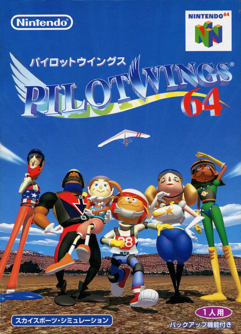
Japan's design, meanwhile, puts the focus squarely on the main cast of characters, with a hanglider visible in the sky above. This composition arguably has more impact than the western approach, with Japan able to make better use of the vertical space here. It's a nice one!

Thanks for voting! We'll see you next time for another round of the Box Art Brawl.


Comments 36
japan got that thiccness
Neither one is all that great, so I guess I'll go with the Japanese cover, for being slightly less ugly.
i think the NA art would be better with a better scan--as it is here, it looks crazy desaturated
The Samurai and Ninja Island wins for me.
Time has not been kind to either of these, let's be honest.
I definitely prefer the Japanese one though. That composition, for how dated it is today, is still quite pretty (especially with the bright blue sky with a single paraglider, that's unironically really good) and it shows off all the main characters front and centre so that'll be my pick for this week.
Both are super-fugly
The NA one and the EU one both manage to crop out that one guy with the N64 logo.
I like the composition of the NA cover more, and the use of an aircraft better fits the game.
It's a game about flying. Japan gets the point for at least having something actually flying.
Oh yeah, sure… sure… It's very fair to compare and vote when one of the images takes up an inch on the phone's screen, and the other takes up the entire screen...
NA is better for me, the composition is a lot better, the JP only has the characters in line, pretty boring.
Went with JPN on this one.
I hate how invasive the text and overlays are in the NA/Europe versions, but the Japan cover is just unimportant characters posing. The game could be about almost any sport looking at that one.
(Oh there is that glider in the air I looked right over… are the characters there just to watch?)
Neither are great and I never liked these characters tbh. I missed the flight instructors from the SNES game and more serious tone. Tony, Shirley, Lance and Big Al >>> These guys
Neither are very attractive, but at least Japan’s follows the most basic rules of picture composition.
Did Capcom provide the box arts of Pilotwings 64?
Anyway, as for which one I prefer? I think the Japanese one. I hate how the Western pnes have a character obstructed by the western box art designs (the red stripe on the NA one and the "Only for N" in the European one)
Never understand why the European ones put that black border around it.
@Purgatorium it was to mentally prepare you for the way that pal games would actually display.
Japan. Full character spreads = win
I'm not really a fan of either because the character designs just don't really look appealing to me but Japan wins because it isn't ruined by the ugly red line that or black box that plagues the other covers.
They’re both very mid-90s.
Went for the NA one (not Europe-stupid big black borders) as the Japan one doesn’t really give you much idea what the game is about
Japan is only slightly ahead in my eyes but both designs are solid 👍
Wow, these are terrible. Japan is less awful to me. The Euro version has the horrible border. The NA version has that terrible red strip. The peeling upper-right corner both have makes them even worse. I hate N64 boxes because of all that nonsense. Japan's box wins for me, in spite of itself.
"Lark" is Nester and I will not be quiet about this
Japanese box art every day of the week!!
@StuTwo They had a black border around them?
I love the large sky above on the Japanese one, but I'm bored by the box art trope of all the characters just standing there, so the NA box gets the vote from me, just for having a more interesting scene composition.
If I saw both at a store, I would buy the NA/EU version.
The US manual uses the Japanese box art. So, we get both worlds over here.
And yeah... the character designs are kind of awful, as nostalgic as this game is for me.
I voted NA/EU because it has less focus on the terrible character design, but they are both really bad.
@SoManyHaveDied I was hoping there would be a thick comment and it was the first one! Thank you much, pumps my tires up!
@Jacoby ahhh yes, a fellow connoisseur of the thicc ::tips hat::
Box Art Brawls Current Total:
Europe: 40
Japan: 46
North America: 48
Australia and New Zealand: 1
@Purgatorium In many, yes, cases pretty much.
PAL was 50 fps refresh rate (slower than NTSC at 60 fps) but with a notably higher resolution than NTSC. A lot of games were badly localised - they just slowed the speed down 15% but never bothered to increase the resolution.
So the leftover space was black borders around the action (which was of course slower and at a lower resolution than in the US and Japan). Waverace 64 had particularly big borders top and bottom.
@StuTwo Wow, I didn't know that. Must have been hard dealing with that back then.
@Purgatorium It was ok. In hindsight we had a poorer experience but, then again, the companies that were more successful in Europe were Sega and Sony and their games were much better converted to work on PAL (and of course then benefitted from the higher resolution).
It's not a coincidence that they were more successful here - the attention on the local delivery of their games was just one symptom of a bigger underlying focus. Nintendo didn't really care as much as Sega/Sony so they were always second place here.
Show Comments
Leave A Comment
Hold on there, you need to login to post a comment...