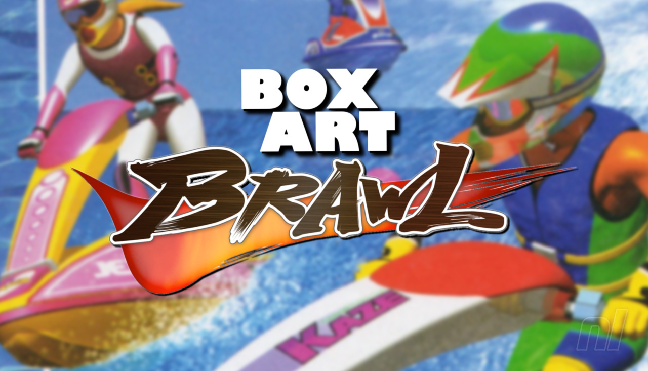
Hello folks, and welcome to another edition of Box Art Brawl!
Last week, we took a look at one of the GameCube's best and most important games: The Legend of Zelda: The Wind Waker. It was a pretty close race, too! North America and Europe teamed up to take on Japan, and although many loved the traditonal golden aesthetic of the game's western release, a few more preferred Japan's more vibrant, abstract approach.
In the end, Japan took home the trophy with 54% of the vote. This week, to celebrate the launch of Wave Race 64 on the Nintendo Switch Online + Expansion Pass service, we're going to be gunning for a traditional three-way brawl to find out which region got the best box art design for the classic N64 title.
Wave Race 64 is one of the most celebrated N64 games out there and is still greatly appreciated by racing fans to this day. Unfortunately, however, the Wave Race franchise has been very much dormant since the GameCube era, much like its cousin F-Zero. The launch of Wave Race 64 on the Switch's Online service is certainly a step in the right direction, but we reckon it's high time we got a proper sequel to 2001's Wave Race: Blue Storm!
Be sure to cast your votes in the poll below; but first, let's check out the box art designs themselves.
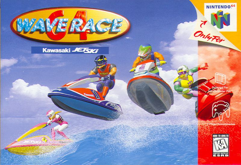
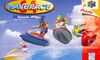
North America
North America and Europe got pretty identical designs for their respective box arts, but we reckon the overall composition is different enough to warrant separate entries this week. The image itself focuses on four racers as they effortlessly leap over a wave; it's simple, straightforward, and epitomises the term 'cool'.
However, one major complaint we have here is that it all looks a tad cluttered, with the large logo in the top left corner along with the opaque red banner going down the right hand side. Bit yucky.
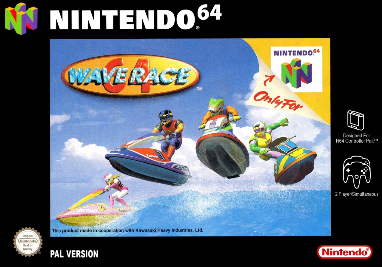
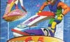
Europe
Okay, so Europe's design is identical to North America's, but the image itself has been shrunk down to allow for the black border around the edge; which would be fine, of course, if it weren't for the garish "Only for Nintendo 64" branding stuck on the actual image itself! We're not quite sure what the thinking was behind this, since there's a lot of empty black space in which such branding could have been utilised, but never mind.
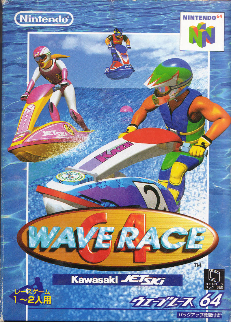
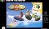
Japan
We've a feeling Japan might just run away with this one. Look at it! The composition is instantly more eye-catching, with bigger images of the racers and no overly-intrusive branding getting in the way of the action. We love how it effectively sticks one image on top of another too, with the background consisting of ocean water to make for a vividly colourful display. Nice!
Still, it's your vote that matter here folks, not what we think! Make sure to leave a comment too and let us know which one you prefer and why.
Thanks for voting! We'll see you next time for another round of the Box Art Brawl.


Comments 48
You missed out the second and final Japanese release, the white box. I personally think that one is best.
That ridiculous black border automatically disqualifies any and every EU N64 box art from winning. Anyway, Japan this week.
Japan be fat shaming here a little bit?
I quite like the USA one unfortunately it will always be spoiled by the red strip down the side, so Japan it is.
I find it interesting that the European box art is missing the subtitle for Wave Race 64: Kawasaki Jetski.
some times i have the feeling people just vote for the japanese because it is the japanese cover
Maybe just nostalgia but I like the European design on every n64 game. Maybe just because I grew up with it.
Box Art Brawls Current Total:
Europe: 35
Japan: 45
North America: 44
Australia and New Zealand: 1
@Franklin Noting that the Australian box art in this case (and some others) is the same as the US one... so make that 2
NA looks more exciting
I know you guys don’t care about feedback for this column, but these would be a lot more fun if the author didn’t voice their opinions in the body of the article itself. That sways the poll results.
This one was actually a tough choice between the US & JPN covers. I ended up going with JPN, but I like both about the same.
The NA has a more artistic framing, like it's more aesthetically pleasing, even if the JPN one is more exciting and in your face I just think it's a little busy and looks more like a magazine cover rather than a poster you'd want to hang on your wall.
I like how one of the guys in the NA cover flies into the red border, I think that one's my favorite
I like the panoramic layout of the Western versions. The more blue sky and blue water, the better for this racer! But the orange bar and black borders spoil the shots. Japan again for me!
@Franklin Which game did Australia win?!
Opaque?
Almost went NA, but chose Japan.
@Samuel-Flutter
Maybe Kawasaki didn't pay for Advertisment in Europe
I don't know why. but, I prefer the Japanese Boxart.
Great Japanese cover
You didn't mention the Japanese Wave Race 64 Shindou Pak Taiou Version, this is the version Japan got in the NSO app.
I don't know if there are major changes on that one over the original (other than replacing the Fanta ads with Nintendo 64 ones), much like Super Mario 64, which removed BLJ in its Shindou Pak Taoiu Version.
Here's the box art.

I voted Japan. As someone who knows nothing about this series, I just feel like the zoom-in let's you see a little more detail. Although I admit I don't know how large these covers are in real life.
Oh wow they’re all… so boring!
Chose Europe because it improves the US one by removing the red strip on the side. Didn’t like the black border at first but it’s grown on me.
@Daniel36 What do you mean? 🤨
@Eel What exactly do you want? Shows exactly what the game is. Do you want an explosion behind them Michael Bay style?
Japan, easily. To be clear, I'm not saying it's a good cover, but it strikes me as much less bad than the others. I hate NA N64 covers. The red strip is awful. The top-right corner curl is even more awful. The only thing Europe has going for it is no red strip, but the art is even more cramped and the black border just makes it worse.
Weird, in Australia we usually get the same PAL stuff as Europe, but we definitely got that North American box art. Huge black borders weren't really much of a thing for us, if memory serves.
Japan's is pretty good, but the guy in the back doesn't actually look like he's racing, he's just kind of floating there. NA not only includes all four characters, but they all actually look like they're taking part in the action. I have to go with NA here.
@Lanmanna We need naval ships shooting at the racers while they're being chased by a colossal squid.
@Lanmanna ah so the game is just boring, got it 😉
Japan’s border is a photo of pool water. And it doesn’t look like there are any waves in the art. Also it looks like the “racers” are just riding along leisurely.
I prefer the action shot of NA and Europe, and black or red standard borders are far better than placing the game in a small pool. I went with NA because the red border reframes it so the wave is a bit more prominent. The waves are the star of the game.
@Lanmanna the big guy isn't in the picture on the JP cover
I don’t get the sense that there’s a “race” going on with the Japan boxart.
@Dr_Corndog majoras mask
@Dr_Corndog pod racer
US cover. But I prefer playing the smoother JP version with rumble.
Completely agree with @aaronsullivan
US version all day for me. Japanese version looks busy, needy, cobbled together and totally compromised by being forced into portrait. Also - what’s with the swimming pool water background for a game all about racing on open water waves!?!?
US/UK cover image is so elegantly composed, the way the riders fan out in a curve as they crest the wave and the feeling of them negotiating the water and the weight of the jet skis. It screams wave race. Love the sense of space and big open sky too - summer good times!
Fair enough both US + UK design choices for getting the additional info and logos onto / into the image are clunky. But the overall feel of the image is WAY better and that wins it in this case for me.
Also agree with @slowpokemon who said the writer shouldn’t put a steer on the article - especially in this case - predicting the result. Especially when they’re so wrong in their choices (wink emoji).
Gonna be honest: I don't really like any of them. It's hard to really badger them on it when it came out in 90's, but the old 3D on these ones in particular just didn't really age well at all. I guess I'd go America because it shows off what Wave Race is about better than the other two but yeah: they're all really meh.
I'm fairly sure my Australian PAL version looks like NA. I voted for NA anyway, mostly because it's a more explosive image and the Japanese one only includes 3 of the 4 racers.
I gotta go with the Japanese box art.
NA and Japan box arts are both great. Nintendo of Europe was going through a difficult time in its life during the late 1990s, apparently
Not the best week, went for japan for the watery feeling, which is so essential to the game's feeling (the opposite to the reason @aaronsullivan & @tjm state i suppose)
@YANDMAN I was curious when I say your comment. Would it be this cover ?
https://www.ebay.com/itm/274748161061
Issue is for me is The black box is iconic. If you were a n64 fan back then from U.K. you will have fond memories of the U.K. boxes. Japan never wins for me as it never looks like a n64 box. Just me personally I also find often the design seems cluttered and mismatch. This is one of the better Japanese ones. NA wins this week. Although I’ll take the U.K. box everyday of the week. I’m all for universal sections on boxes.
@TioRogerio Yes. This is the definitive version of the game.
it was a little tough between Japan and North America
sorry Europe
I like the black borders, maybe it's the nostalgia, but it gives them a classy look. I don't really like the US boxes with the red column getting over the picture.
The japanese art is definitely the worst one to me, and I usually like japaneses box arts. But the characters are all over the place.
Show Comments
Leave A Comment
Hold on there, you need to login to post a comment...